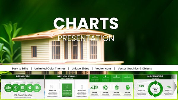
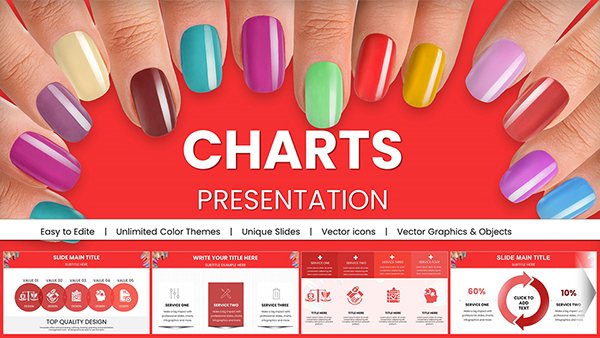
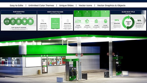
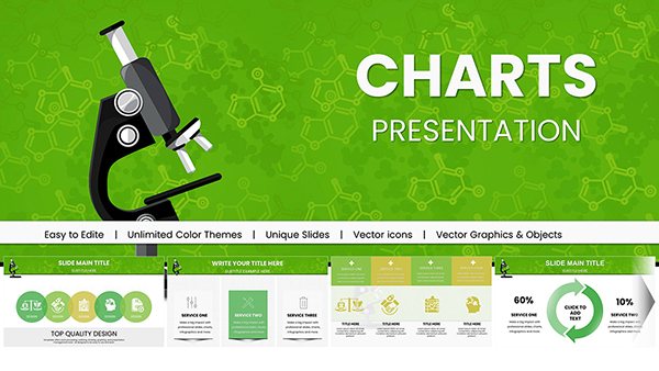
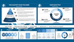
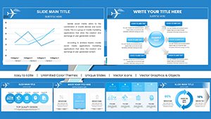
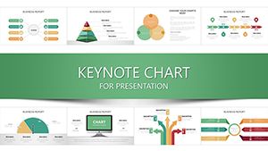
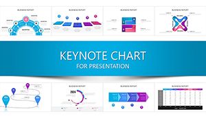
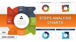
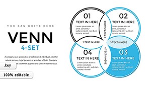
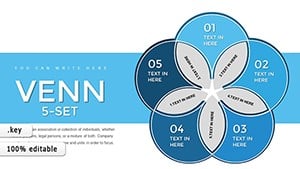
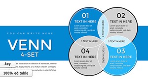
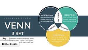
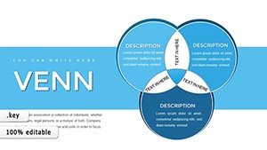
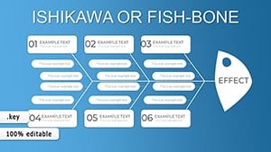
Business plan Keynote charts deliver precise, animated data representations tailored for Apple Keynote, turning numbers into narratives that captivate audiences. From bar graphs to radar plots, these templates support complex datasets with ease, integrating seamlessly into your presentation workflow.
Suited for analysts, executives, and planners, they emphasize clarity and interactivity, making financial forecasts or performance reviews more digestible and persuasive. With theme-matching colors and export versatility, they fit any boardroom or virtual meeting.
Harness the power of visuals to support your business vision. Scan our offerings and pick charts that enhance your story, simplifying sophisticated insights.


Keynote charts for business plans excel in rendering dynamic visuals that adapt to live data, eclipsing static images with smooth animations and drill-down capabilities. They feature formula integrations for auto-calculations, streamlining updates during reviews.
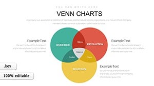
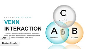
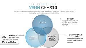
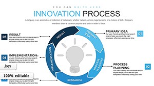
For venture pitches, donut charts showcase market shares vividly; in operations, process flows map efficiencies. This interactivity elevates engagement in planning sessions.
These implementations reveal charts` critical role in demystifying business data.
Beyond standard Keynote tools, our charts include preset styles and accessibility labels, ensuring inclusivity. They handle large datasets without lag, thanks to optimized vectors.
Optimize by aligning scales uniformly across slides and using legends sparingly. For trends, add sparklines for compact overviews. Drawing from data visualization principles, these tips ensure charts inform without overwhelming.
An e-commerce manager employs a combo chart template, merging sales bars with profit lines to spotlight correlations, animating reveals for investor demos. A HR lead uses bubble charts for talent mapping, sizing by experience and coloring by department for recruitment strategies.
In sustainability reports, waterfall charts dissect emission reductions, building cumulatively to net impact. These scenarios exemplify how charts crystallize strategies into actionable visuals.
Interact with demos to gauge fit. Our updates incorporate new chart types, keeping pace with analytical demands.
Yes, connect to Numbers or CSV for live updates.
Certainly, customize or disable for static views.
Over 20 types, from basics to advanced hybrids.
Fully compatible for cloud collaboration.
Patterns and labels ensure universal readability.
Make your data speak volumes. Acquire Keynote charts now to propel your business plans forward.
With precise visuals, turn analytics into advantages, captivating stakeholders every time.
Copyright © 2009-2026 ImagineLayout All rights reserved.