Business movement PowerPoint Charts
Chart the course of your enterprise with PowerPoint templates dedicated to business charts. These specialized slides dissect metrics, forecasts, and benchmarks to spotlight advancements and opportunities.
Data enthusiasts and decision-makers leverage them for transparent, trajectory-focused communications in reviews or forecasts.
Precision-engineered with formula integrations and responsive resizing.
Navigate our business movement charts section to harness data`s power.
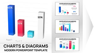
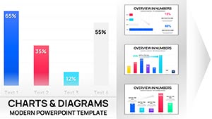
3-D Clustered Column Chart PowerPoint Template - Editable Charts for Financial Reports
ID: #PC01106
Clustered Column PowerPoint Charts - Editable PPTX
ID: #PC01102
Analytical Trend PowerPoint Charts: Decode Data with Precision
ID: #PC01064
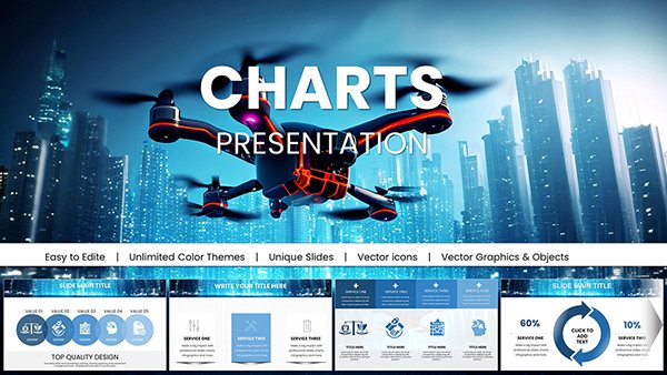
Presentations with Drone IT Technology PowerPoint Charts
ID: #PC01052
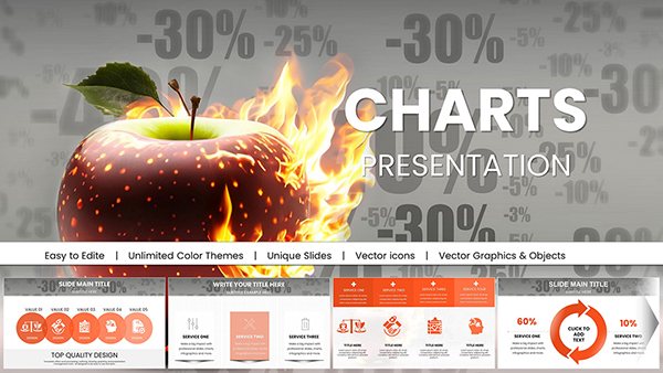
Burning Discounts PowerPoint Charts Template
ID: #PC01043
Virtual World Mask PowerPoint Charts - Immersive VR/AR Presentation Templates
ID: #PC01042
Medical Science PowerPoint Charts: Illuminating Health Data with Clarity
ID: #PC01040
Marketing PowerPoint Charts: Fueling Strategic Storytelling
ID: #PC01038
Comprehensive Legal Acts PowerPoint Charts for Professionals
ID: #PC01033
Top Marketing Ideas: PowerPoint Charts for Strategic Wins
ID: #PC01022
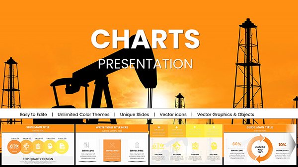
Oil and Gas Extraction PowerPoint Charts Template
ID: #PC01007
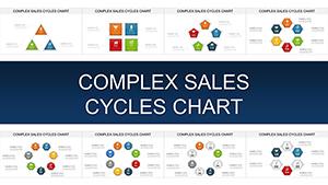
Master Complex Sales Cycles with Stunning PowerPoint Charts
ID: #PC00909
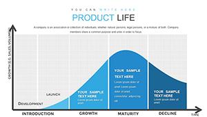
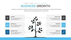
Product Lifecycle PowerPoint Charts Template: Visualize Success Stages
ID: #PC00840
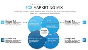
4CS and 7PS Marketing Mix PowerPoint Charts Template
ID: #PC00833
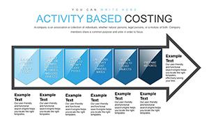
Activity-Based Costing Arrow PowerPoint Charts Template for Presentation
ID: #PC00823
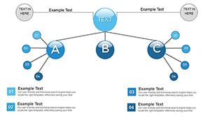
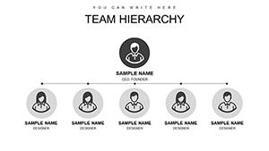
Organizations Work PowerPoint Charts Template
ID: #PC00820
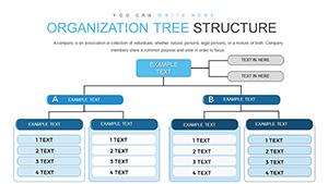
Org Tree Animated PowerPoint Charts - Ready to Present | ImagineLayout
ID: #PC00819
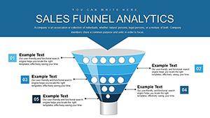
Sales Funnel PowerPoint Template - Fully Editable Analytics Charts Instant Download
ID: #PC00818
Marketing Mix Modeling PowerPoint Charts Template for Analysts
ID: #PC00754
Professional Column Chart PowerPoint Template - Fully Editable & Instant Download
ID: #PC00741
Time Management PowerPoint Charts Template
ID: #PC00720
Sales Growth Earnings PowerPoint Charts - Editable Forecast & Earnings Data Visuals
ID: #PC00697
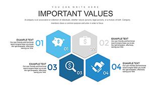
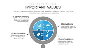
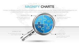
Analysis Magnifying Glass PowerPoint Charts Template
ID: #PC00688
Investment Management PowerPoint Charts Template
ID: #PC00586
Decoding Dynamics with PowerPoint Charts These employ directional cues like upward vectors, transforming data dumps into directional beacons - leaps ahead of unadorned plots.
Instance: A sparkline series tracks micro-trends within macros.
Pivotal Use Cases in Business Contexts Revenue Tracking: Waterfall decompositions of variances.Customer Insights: Churn cohorts via Sankey flows.Operational Efficiencies: Pareto slices for priority areas.Investment Returns: Bubble scales for risk-reward. Auto-formatting trims error risks.
Elevating Chart Narratives Annotate outliers; vary chart types per story phase. Validate sources in footers.
Compelling Chart Stories SaaS metrics: Retention curves against acquisition costs. Supply chain: Network diagrams for bottleneck hunts.
Dashboard compilations for at-a-glance governance.
Illuminate Paths to Prosperity Insight absorption jumps 70% with tailored charts.
Integrate these charts forthwith into your arsenal.
Frequently Asked Questions Turn data into directional force with these charts.