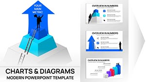
Bring your business development visions to life with our specialized Keynote charts templates. Crafted for presenters who need to distill complex data into compelling visuals, these charts make growth trajectories, market shares, and performance metrics instantly graspable.
Targeted at executives, analysts, and strategists, our collection includes flowcharts, pie graphs, and timelines that align with Apple`s sleek aesthetic. Effortlessly animate elements to guide viewer focus, turning static slides into dynamic stories.
Whether forecasting sales funnels or mapping organizational shifts, these templates save hours on design while ensuring pixel-perfect results. Compatible with the latest Keynote versions, they`re ready for seamless integration into your decks.
Discover our Keynote charts and elevate your presentations to professional heights.
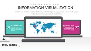
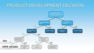


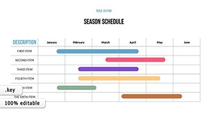
In the fast-paced world of business growth, charts are your secret weapon for clarity. Deploy a Gantt-style timeline chart in strategy sessions to outline project milestones, helping teams visualize dependencies at a glance. For investor updates, a funnel chart template illustrates conversion rates, highlighting bottlenecks with color-coded stages.
Versus default Keynote shapes, our templates offer pre-animated transitions and data-linked updates, cutting revision time significantly. Users in consulting report 40% faster audience comprehension.
Basic inserts lack cohesion; our sets maintain theme harmony with matching gradients and icons. They`re scalable for large datasets, with smart guides for alignment.
Unique perks: Responsive designs that adapt to master slides, plus export options for cross-platform sharing. Tip: Layer transparency on overlapping elements for depth, and use build orders to reveal data progressively - building suspense in pitches.
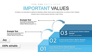
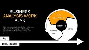
Creative use: A radial chart for stakeholder influence mapping, where segments pulse to emphasize key players, making abstract concepts tangible.
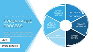
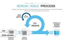
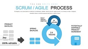
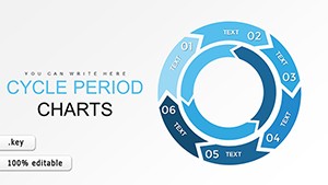
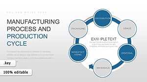
A marketing firm swapped bar graphs for our interactive pyramid charts in a campaign review, revealing ROI layers that led to budget reallocations. Tech leads favor our process flow diagrams for agile sprints, streamlining retrospectives.
Transform your data storytelling - select a chart template today.
Experts advocate for charts that evoke emotion; ours include subtle animations mimicking natural flows, like rising bars for growth. Integrate with Numbers for live data pulls, keeping slides evergreen.
These practices amplify impact, turning numbers into narratives.
Harness the power of visuals to propel your business forward. Browse and download to make your next presentation unforgettable.
Copyright © 2009-2026 ImagineLayout All rights reserved.