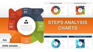
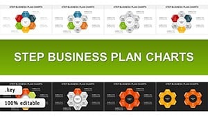
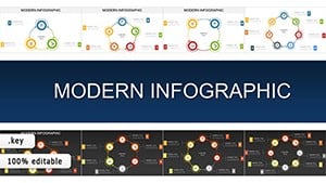
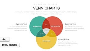
Business analysis Keynote Charts

Business analysis charts in Keynote serve as powerful instruments for unraveling organizational data, from financial overviews to market assessments. Aimed at strategists, managers, and consultants, they facilitate a deeper understanding of operations, helping to pinpoint opportunities and risks.

Envision an executive using a SWOT matrix to outline competitive positioning or a flow chart to map process efficiencies - these visuals make strategic planning more accessible. Advantages include robust customization, enabling alignment with corporate aesthetics, and smooth integration with Keynote's features for polished outputs.

They promote collaborative reviews, where teams can discuss findings backed by clear graphics. For those in dynamic environments, these templates adapt to evolving data, keeping analyses current. If strategic clarity is your aim, peruse our offerings and incorporate these analysis tools into your repertoire - initiate your enhanced analytical journey now.


View by: Last Added | Most Popular
  • like 2
    (168)
    Chemistry Lessons Keynote Charts and Template
    ID: #KC00976
    $20.00
  • like 3
    (560)
    International Flights PowerPoint Charts Template
    ID: #KC00974
    $20.00
  • like 5
    (629)
    Airplane Flights Keynote Charts - Download Presentation
    ID: #KC00972
    $18.00
  • like 2
    (583)
    Create Stunning Presentations with Graph Keynote Charts
    ID: #KC00934
    $24.00
  • like 5
    (88)
    Boost Your Productivity with Keynote Charts Templates | Download Now
    ID: #KC00933
    $24.00
  • like 4
    (495)
    Business Process Management Keynote Charts
    ID: #KC00929
    $24.00
  • like 3
    (803)
    Steps Analysis Keynote charts
    ID: #KC00918
    $18.00
  • like 4
    (1112)
    Step Business Plan Keynote charts
    ID: #KC00916
    $23.00
  • like 4
    (977)
    Modern Infographic Keynote charts for Presentation
    ID: #KC00913
    $15.00
  • like 3
    (1171)
    Venn Diagram Keynote Templates: Create Impactful Presentations
    ID: #KC00885
    $12.00
  • like 4
    (64)
    Graphic Venn Keynote charts
    ID: #KC00871
    $22.00
  • like 5
    (624)
    Science Technology and Society Venn Keynote charts
    ID: #KC00863
    $20.00
  • like 5
    (1082)
    Venn Problem Solving Keynote Charts: Presentations
    ID: #KC00862
    $19.00
  • like 3
    (1142)
    Streamline Your Keynote Presentation with Steps Processing Charts Template Download
    ID: #KC00809
    $20.00
  • like 4
    (1063)
    Business Process Modeling Keynote Charts - Professional Template Download
    ID: #KC00794
    $15.00
  • like 4
    (1136)
    Interactive Venn Keynote chart template
    ID: #KC00790
    $20.00
  • like 4
    (17)
    Venn - 5 Set Keynote charts
    ID: #KC00789
    $22.00
  • like 3
    (449)
    4-Set Venn Keynote Charts Template for Presentation
    ID: #KC00788
    $22.00
  • like 4
    (743)
    Venn Keynote Diagrams and Charts Template - Download
    ID: #KC00787
    $22.00
  • like 5
    (687)
    Venn Keynote Diagams and Charts - Presentation Template
    ID: #KC00786
    $24.00
  • like 5
    (97)
    Create Impressive Presentations with Our Data Flow Keynote Templates
    ID: #KC00785
    $20.00
  • like 3
    (601)
    Accumulation Keynote charts
    ID: #KC00721
    $15.00
  • like 5
    (1175)
    Cycle Relationship Keynote chart template
    ID: #KC00701
    $13.00
  • like 3
    (168)
    Stunning 3D Cube Keynote Charts with Marked Sides - Download Template for Professional Presentations
    ID: #KC00676
    $20.00


Core Strengths of Analysis-Focused Charts

These charts decode complex business scenarios, offering views into profitability, customer behaviors, and operational flows. They empower users to present findings with authority, fostering informed dialogues.

Standout Design Elements

  • Layered Insights: Build multi-level views for comprehensive breakdowns.
  • Interactive Components: Add clickable elements for detailed explorations.
  • Broad Range: From matrices to funnels, cover diverse analytical needs.
  • Seamless Edits: Modify with ease to reflect latest data.

This setup ensures analyses are not just accurate but also visually persuasive.

Deployment in Professional Settings

In finance, analysis charts evaluate investment returns, guiding portfolio adjustments with precision. Visualize a bubble chart sizing opportunities by potential - key for prioritization.

Strategic Use in Consulting

Consultants employ them to benchmark client performance against industry norms, using radar charts for multi-facet comparisons. This method outperforms narrative descriptions, providing at-a-glance overviews.

Our templates feature advanced filtering, allowing subset views, a step up from standard options. Leverage this for nuanced business reviews.

Guidelines for Effective Analysis Visualization

Anchor on reliable data sources and use color coding for categories, aligning with analytical best practices to maintain credibility.

  1. Frame your objective: Tailor charts to specific questions.
  2. Balance complexity: Avoid overloading with too many variables.
  3. Validate outputs: Cross-check with raw data for accuracy.

Eager to deepen your analyses? Select from our business templates and apply them in your Keynote workflows.

Competitive Edge Through Visual Analytics

Distinguished by their depth, these charts include trend forecasting lines, aiding proactive planning. Executives cite improved strategy sessions when visuals clarify ambiguities.

For market researchers, they segment demographics effectively, informing targeted campaigns. In operations, they optimize supply chains via flowchart depictions.

Illustration: Revamping Strategy in Manufacturing

A firm used analysis charts to map efficiency gaps, resulting in a 25% productivity uplift through restructured processes. Outcomes like these highlight practical impacts.

Advance your business acumen - grab our templates and redefine your analytical presentations.

FAQ

Which business analysis charts are most useful in Keynote?

SWOT diagrams, flowcharts, and heat maps are popular, offering versatile ways to explore data.

How do these charts facilitate strategic planning?

They organize information hierarchically, making it easier to identify patterns and formulate plans.

Can I import these into PowerPoint?

Absolutely, conversions maintain structure, allowing broader sharing.

What's key to accurate business chart customization?

Ensure data inputs are current and use intuitive legends for clarity.

How do analysis visuals influence team collaborations?

They provide common ground for discussions, accelerating consensus on actions.

Best approach for updating analysis charts?

Link to live data feeds where possible for automatic refreshes.