Bring your data to life with arrow chart templates tailored for PowerPoint. These innovative designs use directional arrows to highlight trends, comparisons, and projections, turning dense spreadsheets into visually compelling stories that resonate with stakeholders.
Aimed at analysts, executives, and marketers, our templates address the common pain point of boring charts. Arrows add momentum - upward for growth, diverging for options - making your insights not just seen, but felt. Picture a quarterly earnings slide where arrows propel key metrics forward, instantly conveying progress and potential.
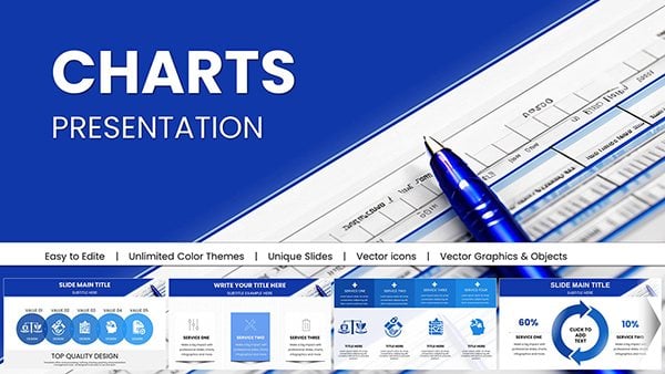
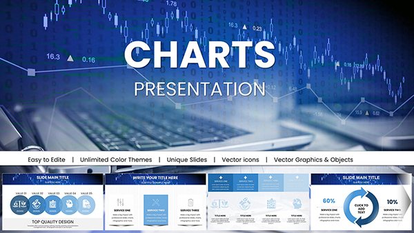
Fully vector-based and animation-ready, each template adapts to your dataset seamlessly. From horizontal progress bars to radial trend wheels, discover options that fit any scale or theme. Professionals love how these save design time while amplifying message retention.
Step up your presentation skills today. Peruse our arrow chart collection and download the tools to make your data unforgettable.

Arrow charts revolutionize data presentation by infusing directionality into visuals, guiding viewers through insights with purpose. They outperform traditional bar or line graphs by emphasizing change over time or variance, ideal for dynamic reports where context matters.
In fast-paced boardrooms, these charts cut to the chase, using bold arrows to spotlight achievements or challenges. Built-in scalability ensures they shine on projectors or laptops alike, maintaining clarity across devices.
Versus stock PowerPoint charts, our versions offer thematic depth - think metallic gradients for corporate flair or minimalist lines for startups - without the hassle of custom builds. Feedback highlights 30% higher engagement rates in meetings.
Begin with data integrity: Align arrows precisely to your metrics for authenticity. Opt for contrasting colors to denote positive versus negative trends, and limit to 5-7 elements per slide to avoid clutter. Animate reveals sequentially to build narrative tension.
For advanced users, integrate formulas linking arrows to Excel sources, enabling real-time updates. Accessibility tip: Add alt text describing arrow directions for screen readers, ensuring inclusivity.
A retail manager used our upward arrow chart to showcase seasonal sales spikes, resulting in expanded inventory decisions. In education, a professor diagrammed research trends with bidirectional arrows, sparking lively debates. These scenarios showcase adaptability across contexts.
Creative twist: Combine with icons for hybrid charts, like arrows overlaid on world maps for global market insights, adding geographic flair.
Our library boasts high-fidelity graphics, responsive to theme changes, and includes variant packs for A/B testing visuals. Eco-conscious designs minimize file sizes for quicker loads, aligning with modern workflows.
Empower your team with shareable assets that standardize reporting aesthetics, promoting brand unity. Long-term, these templates reduce redesign efforts by 50%, per user surveys.
Transform raw data into strategic assets. Browse arrow chart templates and download to chart your course to clarity.
Seize the opportunity to visualize victory. Select your arrow chart template and propel your presentations forward.
Copyright © 2009-2026 ImagineLayout All rights reserved.