Animated Keynote Charts

Animated Keynote charts are designed for professionals who need to explain data clearly, progressively, and with impact. When presenting financial results, performance metrics, forecasts, or analytical findings, static charts often overwhelm audiences. Animated chart templates for Keynote allow you to reveal information step by step, guiding attention and improving decision-making clarity. These templates are built specifically for business reporting, strategic analysis, and executive communication where structured data storytelling matters more than decoration.


View by: Last Added | Most Popular
  • like 4
    (482)
    Cycles Period Keynote Template: Animate the Rhythm of Recurring Business Patterns
    ID: #KC00907
    $18.00
  • like 4
    (89)
    Step Solutions Keynote Charts: Transform Complex Processes into Clear Visual Narratives
    ID: #KC00905
    $20.00
  • like 3
    (878)
    Porter's Five Forces Keynote Charts: Master Competitive Strategy
    ID: #KC00825
    $15.00
  • like 3
    (882)
    Precision Costing with Activity Based Costing Keynote Template
    ID: #KC00823
    $17.00
  • like 2
    (951)
    MYP Technology Keynote Charts Template
    ID: #KC00813
    $20.00
  • like 2
    (344)
    3D Arrows Effective Keynote Charts Presentation
    ID: #KC00805
    $20.00
  • like 3
    (747)
    3D Horizontal Split Pyramid Keynote Charts: Dynamic Data Visualization
    ID: #KC00748
    $15.00
  • like 3
    (601)
    Accumulation Keynote Charts: Visualize Capital Growth Effortlessly
    ID: #KC00721
    $15.00
  • like 4
    (579)
    Ball Pendulum Keynote Charts: Illustrate Energy Conversion
    ID: #KC00705
    $15.00
  • like 3
    (104)
    4 Steps Square Keynote Charts Template
    ID: #KC00686
    $12.00
  • like 3
    (1177)
    Master Your Sales Journey with 5-Level Funnels Keynote Template
    ID: #KC00661
    $12.00
  • like 5
    (284)
    Circular Concept Keynote Charts: Cycle Through Data with Elegance
    ID: #KC00642
    $15.00
  • like 2
    (888)
    Important Questions Cycle Keynote Charts Template
    ID: #KC00623
    $6.00
  • like 3
    (715)
    Strategic Balance Planning Keynote Charts
    ID: #KC00575
    $22.00
  • like 2
    (237)
    Quality Control Keynote Charts Template: Professional Visuals for Manufacturing Excellence
    ID: #KC00560
    $25.00
  • like 5
    (207)
    Infographic Design Keynote Charts: Cycles and Puzzles Unleashed
    ID: #KC00513
    $17.00
  • like 2
    (1149)
    Venn Animation Keynote Charts: Illuminate Overlaps That Spark Innovation
    ID: #KC00434
    $18.00
  • like 5
    (1079)
    Tactical Precision: Elevate Your Planning with Keynote Charts
    ID: #KC00374
    $17.00
  • like 4
    (444)
    Empower Your Team with Successful Staff Keynote Charts
    ID: #KC00337
    $16.00
  • like 5
    (184)
    Business Optimization Keynote Charts: Pyramid Power for Process Pros
    ID: #KC00334
    $20.00
  • like 3
    (1084)
    Variety of Goods Keynote Charts: Illuminate Market Dynamics
    ID: #KC00329
    $20.00
  • like 3
    (402)
    Social Media Keynote Charts Template: Visualize Connections Effortlessly
    ID: #KC00323
    $19.00
  • like 4
    (385)
    Spheres Divisible Keynote Charts: Visualize Investment Cash Flows with Precision
    ID: #KC00289
    $22.00
  • like 4
    (665)
    Methodology Keynote Charts Template: Streamline Your Business Narratives
    ID: #KC00226
    $24.00


Why Use Animated Charts Instead of Static Slides

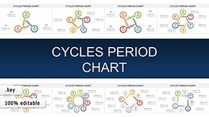
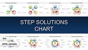
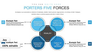
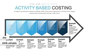
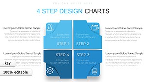
In business environments, clarity drives decisions. Standard Keynote shapes and default chart animations often lack structure and intentional sequencing. Animated chart templates are built with controlled transitions that introduce data in logical layers. Instead of showing all metrics at once, you can reveal quarterly results sequentially, highlight performance gaps, or compare targets versus actual results without distracting the audience.

This approach reduces cognitive overload. Executives and stakeholders absorb information more effectively when charts unfold progressively. Animated elements direct focus to the most important numbers first, then expand context gradually.

Designed for Executive and Analytical Contexts

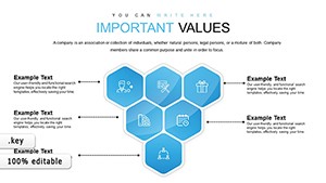
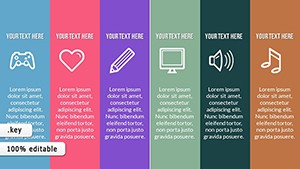
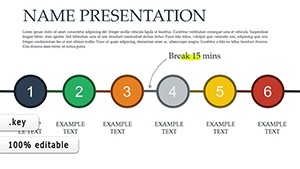
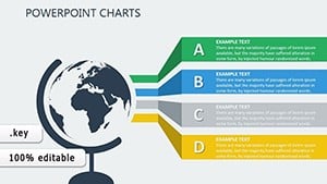
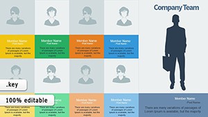
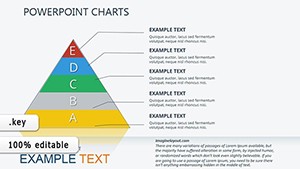
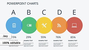
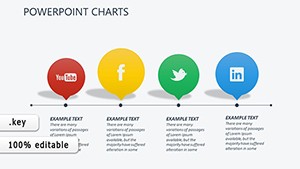
These animated Keynote charts are structured for:

  • Quarterly financial reporting
  • Sales performance analysis
  • Marketing KPI dashboards
  • Investment proposals
  • Operational efficiency reviews

Each layout ensures data hierarchy is clear. Titles, data labels, and motion timing are balanced to support professional environments where precision and credibility matter.

Data Storytelling Through Controlled Motion

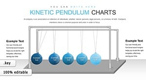
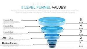
Animation in business presentations should not feel decorative. It should clarify relationships between numbers. For example, when presenting revenue growth across regions, animated bar progression allows you to compare markets sequentially. When explaining trend evolution, line charts can appear gradually to emphasize turning points and patterns.

This controlled motion helps consultants, analysts, and managers structure their narrative logically rather than relying on verbal explanation alone.

When Animated Charts Are the Better Choice

Animated charts are especially useful when:

  • You present complex datasets
  • You compare multiple time periods
  • You need to highlight variance or deviation
  • You pitch strategic recommendations based on metrics

Unlike static slides built from default Keynote tools, these templates integrate pre-built timing and transitions. This saves preparation time while maintaining professional consistency.

How This Category Differs from Standard Chart Templates

Standard chart templates focus on layout design. This category focuses on presentation flow. The primary value is not only visual clarity but controlled sequencing. These animated charts are developed specifically for presenters who need to manage audience attention in high-stakes business settings.

Rather than providing decorative effects, these templates prioritize:

  • Structured data hierarchy
  • Step-by-step metric reveal
  • Executive-ready formatting
  • Consistency across multi-slide reports

Best Practices for Using Animated Charts

To maximize effectiveness:

  • Limit each animation step to one core insight
  • Align animation timing with your verbal explanation
  • Avoid overlapping movements that compete for attention
  • Use animation to highlight decisions, not just numbers

In consulting, education, and corporate strategy presentations, animated charts improve engagement without sacrificing professionalism. They transform raw data into a structured narrative that supports confident decision-making.

FAQ

Are animated Keynote charts suitable for formal board presentations?

Yes. These templates are designed with professional timing and restrained transitions that support formal executive environments without appearing distracting.

Can I edit the data inside animated chart templates?

All charts are fully editable in Keynote. You can modify values, labels, colors, and animation timing according to your reporting needs.

Do animations work on all versions of Keynote?

Templates are built for modern versions of Keynote. It is recommended to use updated software to ensure smooth transitions and compatibility.

When should I avoid using animated charts?

If your presentation requires rapid slide transitions or contains minimal data, static charts may be sufficient. Animation is most effective when explaining layered insights or complex comparisons.