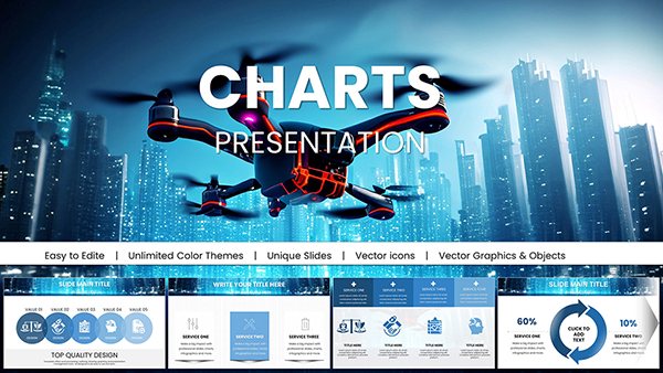
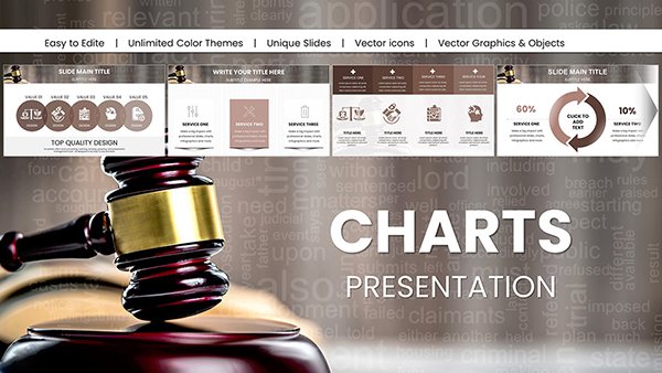
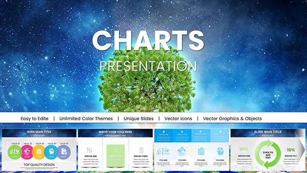
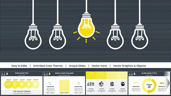
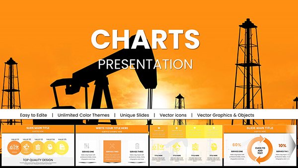
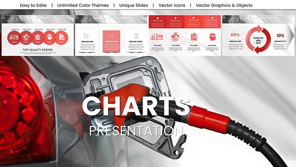
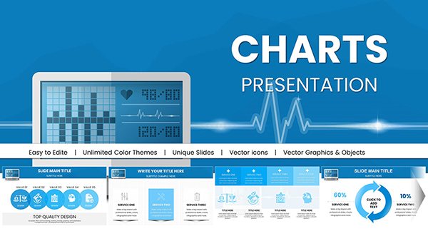
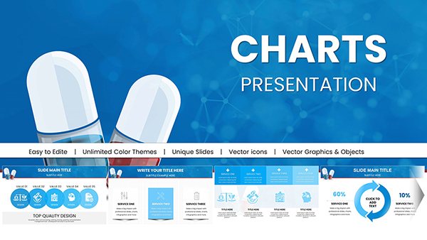
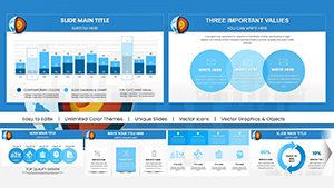
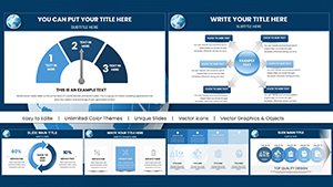
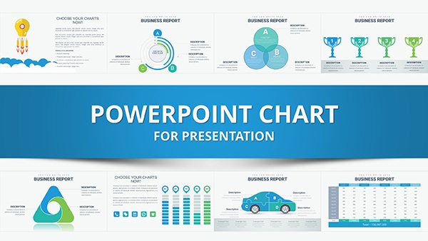
Analytics Keynote Charts

For those immersed in data analytics, our Keynote chart templates provide the precision needed to uncover and present trends effectively. Aimed at data scientists, marketers, and strategists, these designs handle everything from statistical overviews to predictive modeling visuals. With vector elements, they offer unlimited scalability, ensuring crisp displays in any format.

Key advantages encompass rapid deployment for tight deadlines, sophisticated aesthetics that command attention, and adaptability for evolving datasets. Analytics work often involves iterative reviews, and these templates facilitate quick updates, like swapping axes or refining legends, all within Apple Keynote's robust environment.

Envision deploying them in strategy sessions to graph consumer behavior patterns or in research briefs to illustrate correlation matrices. Such uses not only clarify findings but also drive informed actions. Motivated to sharpen your analytical edge? Check out our assortment and acquire the templates that will transform your data narratives.


View by: Last Added | Most Popular
  • like 5
    (13)
    Drone IT Technology Charts Keynote Template: Elevate Tech Innovations Visually
    ID: #KC01052
    $25.00
  • like 5
    (11)
    Medical Charts Keynote Template - Editable Healthcare Infographics
    ID: #KC01045
    $20.00
  • like 5
    (11)
    Futuristic Mask Charts Keynote Template
    ID: #KC01042
    $18.00
  • like 4
    (13)
    Medical Science Charts Template for Keynote Presentation
    ID: #KC01040
    $20.00
  • like 5
    (15)
    Marketing Charts Template for Keynote: Editable and Professional
    ID: #KC01038
    $20.00
  • like 5
    (16)
    Customizable Legal Charts Keynote Template: Clarify Complex Cases with Ease
    ID: #KC01033
    $25.00
  • like 5
    (1034)
    Ecology Charts Keynote Template - Save the Planet
    ID: #KC01027
    $20.00
  • like 4
    (579)
    Creative Marketing Ideas for Stunning Keynote Presentations
    ID: #KC01022
    $15.00
  • like 4
    (1081)
    Extraction Oil and Gas Company Keynote Charts: Strategic Energy Insights
    ID: #KC01007
    $22.00
  • like 4
    (791)
    Oil Price Keynote Charts: Forecast Energy Markets
    ID: #KC00999
    $18.00
  • like 4
    (522)
    Design Automatic Tonometer Keynote Charts Template: Illuminate Eye Health Data
    ID: #KC00978
    $18.00
  • like 3
    (445)
    Pill Pharmaceutical Medical Keynote Charts Template: Master Drug Data Storytelling
    ID: #KC00977
    $18.00
  • like 4
    (922)
    Geothermal Energy Charts for Keynote: Illuminate Renewable Insights
    ID: #KC00969
    $20.00
  • like 5
    (1026)
    Education-Focused Keynote Charts Pack: Spark Learning with Visuals
    ID: #KC00968
    $20.00
  • like 5
    (830)
    Best Choice Keynote Charts Template
    ID: #KC00939
    $25.00
  • like 2
    (56)
    Fishbone Diagram Keynote Template: Root Cause Analysis
    ID: #KC00889
    $20.00
  • like 2
    (1080)
    Catalog Design Keynote Charts Template - 39 Slides
    ID: #KC00865
    $15.00
  • like 2
    (158)
    Analytical Pyramid Keynote Charts: Elevate Your Architectural Presentations
    ID: #KC00845
    $22.00
  • like 3
    (607)
    4Cs & 7Ps Marketing Mix Keynote Charts Template
    ID: #KC00833
    $15.00
  • like 5
    (365)
    Margin Keynote Charts: Unlock Profitability Insights
    ID: #KC00770
    $22.00
  • like 3
    (525)
    Marketing Mix Keynote Charts Template
    ID: #KC00754
    $24.00
  • like 2
    (804)
    Affiliate Marketing Keynote Charts Template: Drive Business Growth Through Partnerships
    ID: #KC00736
    $22.00
  • like 5
    (611)
    6 Marketing Phases Keynote Charts Template: Master Your Strategy
    ID: #KC00722
    $12.00
  • like 4
    (1198)
    Time Management Keynote Charts for Marketers: Optimize Your Workflow
    ID: #KC00720
    $16.00


Key Benefits of Analytics Keynote Charts for Trend Analysis

In the fast-paced realm of data analytics, efficiency matters, and these charts deliver by providing pre-structured visuals that accelerate insight extraction. A marketer analyzing campaign performance could use a stacked bar template to segment results by channel, instantly revealing top performers and areas for optimization.

Visual sophistication elevates presentations, making abstract trends tangible. Consistent design elements, such as coordinated color schemes, enhance brand alignment and viewer trust. Scalability ensures versatility, from desktop edits to large-scale projections without degradation.

Economic value is evident: templates minimize design overhead, allowing focus on analysis. Feedback indicates higher stakeholder buy-in when data is presented through polished, intuitive charts rather than raw tables.

Implementation Scenarios in Analytics Workflows

For forecasting, line charts with trend lines predict future patterns based on historical data. A data scientist might customize one to show sales trajectories, adding confidence intervals for robustness.

In competitive intelligence, scatter plots map variables like price vs. quality across rivals. This visual comparison aids in positioning strategies, highlighting gaps in the market. Dashboard compilations aggregate multiple charts, offering holistic views for executive summaries.

Research applications include histogram templates for distribution analysis, such as user age groups in app usage studies. These help in segmenting audiences for targeted interventions, improving outcomes.

Personalizing Analytics Templates Within Keynote

Keynote empowers easy modifications: link data sources for automatic updates, alter gradients for emphasis, or insert tooltips for detailed hovers. Group related components for bulk changes, streamlining workflows.

For depth, layer visuals - like overlaying a trend line on a bar chart - to convey multifaceted insights. Review in presentation mode to fine-tune pacing, ensuring data unfolds logically.

Strategies for Optimal Analytics Presentations

  • Match chart types to data stories: use areas for cumulative trends, radars for multi-attribute comparisons.
  • Avoid overload by segmenting complex datasets across slides.
  • Employ color theory to denote significance, like reds for alerts.
  • Validate data accuracy post-customization to maintain credibility.
  • Integrate narratives to contextualize visuals, guiding audience interpretations.

These tactics ensure your analytics shine in professional contexts.

Analytics Charts vs. Built-In Keynote Features

Built-in options are adequate for basics, but analytics templates include specialized features like dynamic ranges and pre-set metrics displays. This reduces setup time significantly compared to manual configurations.

Vector quality surpasses standard renders, especially for print or zoom. Users prefer templates for their thematic relevance, leading to more impactful deliveries. Overall, they offer better ROI through reusability and polish.

Distinctive Features of Our Analytics Collection

Rooted in data visualization best practices, our templates emphasize accuracy and aesthetics. In one instance, a strategist utilized our funnel charts to track conversion rates, optimizing a campaign that boosted leads by 15%.

User-centric design includes intuitive controls for novices and pros alike. Export flexibility supports various formats, facilitating cross-platform sharing. Ongoing enhancements incorporate user suggestions, adding innovations like interactive elements.

We ensure reliability with thorough previews and simple transactions. Advance your data prowess - choose a template aligned with your analytical needs and unlock new efficiencies.

FAQ

How do analytics charts support predictive modeling?

They include trend lines and forecasting tools to visualize future scenarios based on current data patterns.

Are these suitable for real-time data updates?

Yes, link to live sources for dynamic refreshes during ongoing analyses.

What chart types are ideal for correlation analysis?

Scatter plots and matrices excel at showing relationships between variables.

Can I use them for mobile presentations?

Certainly, responsive designs maintain clarity on smaller screens.

How do they handle multivariate data?

Through layered or clustered visuals, allowing comprehensive views without confusion.