World Map PowerPoint Template - Editable & Versatile


Type: PowerPoint Maps template
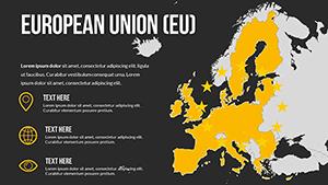
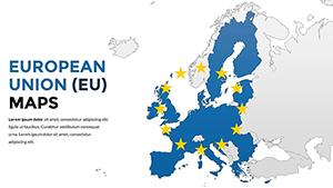
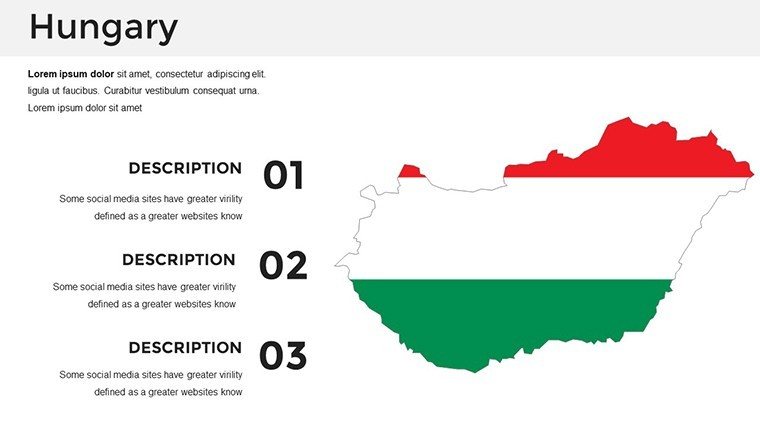
Category: Europe
Sources Available: .pptx
Product ID: PM00029
Template incl.: 36 editable slides
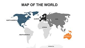
In today's interconnected world, visualizing global data is key to captivating your audience, whether you're pitching international expansion plans or teaching geography in a classroom. Our World Map PowerPoint Template offers a comprehensive solution with 50 fully editable slides designed to make your presentations stand out. Crafted for professionals like business analysts, educators, and marketers, this template transforms complex global information into clear, engaging visuals. Imagine seamlessly highlighting trade routes across continents or pinpointing market growth in emerging economies - all with just a few clicks. Compatible with Microsoft PowerPoint and Google Slides, it ensures flexibility across platforms. Say goodbye to bland stock maps and hello to professional-grade graphics that elevate your storytelling.
Unlock the Power of Global Visualization
Diving deeper, this template isn't just about maps; it's about empowering your narrative with precision and style. Each slide features high-resolution world maps that you can color-code, label, and annotate to fit your specific needs. For instance, if you're a corporate strategist presenting to stakeholders, use the regional breakdown slides to illustrate supply chain logistics from Asia to Europe. The template includes variations like political boundaries, time zones, and economic zones, allowing you to tailor content for diverse applications. With built-in icons for cities, flags, and data points, you can add layers of information without cluttering the design. This level of customization saves hours of manual work, letting you focus on delivering impactful insights rather than fiddling with shapes in PowerPoint.
Key Features That Set This Template Apart
- Fully Editable Elements: Every map, text box, and icon is customizable. Change colors to match your brand palette or resize elements for emphasis.
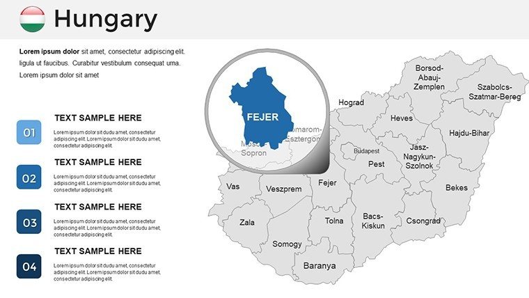
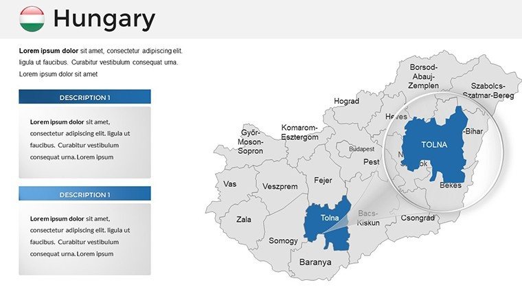
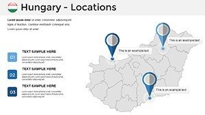
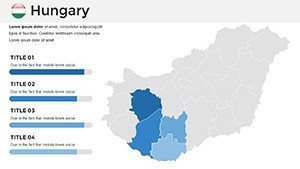
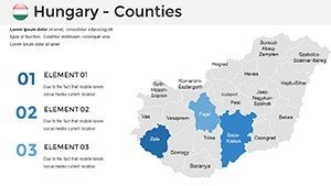
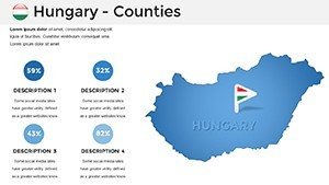
- 50 Diverse Slides: From full-world overviews to zoomed-in continental views, variety ensures you have the right map for any scenario.
- High-Quality Graphics: Vector-based designs maintain clarity even when projected on large screens.
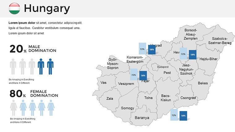
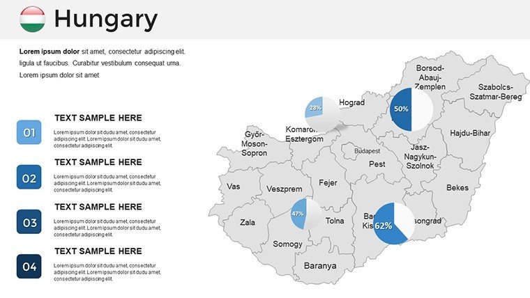
- Data Integration Ready: Easily insert charts, graphs, or infographics alongside maps for comprehensive data storytelling.
- Cross-Platform Compatibility: Works seamlessly in PowerPoint 2016+, Google Slides, and even Keynote with minor adjustments.
Beyond these basics, the template incorporates modern design principles inspired by leading visualization experts like Edward Tufte, emphasizing minimalism and data integrity. Avoid common pitfalls like overcrowded slides by using the pre-designed layouts that balance white space and information density.
Real-World Applications and Case Studies
Consider how this template shines in practical settings. In the business realm, a multinational corporation used similar map visuals to secure funding for a new African venture by clearly mapping resource distribution and market potential. Educators appreciate the template for interactive lessons; one history teacher customized slides to track ancient trade routes, engaging students with clickable hotspots. Marketers leverage it for campaign reports, such as a travel agency highlighting popular destinations with heat maps showing booking trends. These examples underscore the template's versatility - it's not just a tool but a catalyst for better communication.
Step-by-Step Guide to Customizing Your Maps
- Open the template in PowerPoint or Google Slides.
- Select a slide and click on map elements to edit colors via the format pane.
- Add labels or data points using the insert tool for text or shapes.
- Integrate your data: Copy-paste charts from Excel directly onto the slide.
- Animate transitions for dynamic presentations, like fading in regions sequentially.
- Save and export in PPTX or PDF format for sharing.
This straightforward process demystifies map creation, making it accessible even for beginners. For advanced users, experiment with layering multiple maps for comparative analysis, such as before-and-after scenarios in environmental reports.
Why Choose This Template Over Built-In Options
Standard PowerPoint maps often lack detail and flexibility, forcing users to rely on external images that pixelate or don't align. Our template outperforms by offering pre-aligned, editable vectors that integrate natively. Plus, with themed color schemes - like cool blues for oceanic themes or earthy tones for land-focused presentations - you achieve a cohesive look without design expertise. Think of it as upgrading from a bicycle to a sports car for your presentation needs; the efficiency gains are immense.
Enhancing Your Workflow with Tips and Tricks
To maximize value, pair this template with data sources like World Bank statistics for authentic insights. Use keyboard shortcuts in PowerPoint (e.g., Ctrl+D to duplicate slides) to rapidly prototype variations. For collaborative teams, upload to Google Slides for real-time edits. Always preview in slideshow mode to ensure animations flow smoothly. If presenting virtually, compress images to keep file sizes under 10MB for quick sharing. These pro tips, drawn from years of design consulting, help you present like a seasoned expert.
In environmental consulting, firms use map templates to visualize climate impact zones, aiding in policy advocacy. A case in point: An NGO mapped deforestation trends in the Amazon, using color gradients to show severity, which influenced donor decisions. Similarly, in sales, regional managers pinpoint high-potential areas, boosting targeted campaigns. The template's adaptability extends to non-profits, where volunteer coordinators map outreach efforts globally.
Elevate Your Presentations Today
Ready to transform how you present global data? This world map PowerPoint template is your gateway to professional, engaging slides that captivate and inform. Don't settle for ordinary - customize, present, and impress. Download now and start mapping your success story.
Frequently Asked Questions
- Are the maps fully editable? Yes, every element from colors to labels can be customized in PowerPoint or Google Slides.
- Does it work on Mac? Absolutely, compatible with PowerPoint for Mac and Google Slides on any device.
- Can I use it for commercial purposes? Yes, our templates are licensed for both personal and commercial use.
- What file format is provided? You'll receive a .pptx file, easily convertible if needed.
- Are there animation options? Pre-built animations are included, and you can add more as desired.