Analytical Accounting PowerPoint Charts: Elevate Financial Narratives


Type: PowerPoint Charts template
Category: Analysis
Sources Available: .pptx
Product ID: PC00609
Template incl.: 21 editable slides
Navigating the intricate world of finance demands tools that turn numbers into narratives. Our Analytical Accounting PowerPoint charts template provides exactly that, with 21 editable slides crafted to visualize trends, metrics, and forecasts. Designed for accountants, analysts, and financial pros, it addresses the challenge of communicating dense data effectively. Imagine presenting quarterly earnings where pie charts reveal expense breakdowns and line graphs track revenue growth, all in a cohesive, professional format. This template not only saves design time but also amplifies your expertise, drawing from standards like those of the AICPA for accurate, trustworthy reporting.
Unlocking Insights Through Advanced Charting
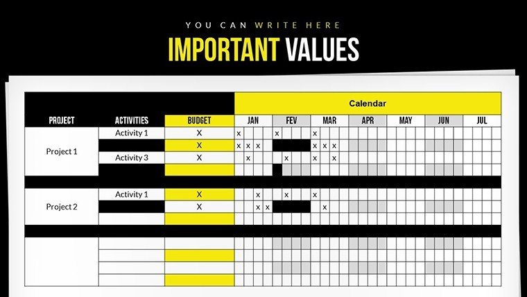
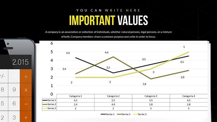
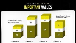
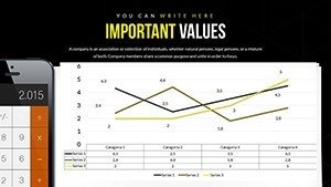
Traditional spreadsheets fall short in engagement; this template bridges that gap with dynamic visuals like trend lines and bar comparisons. Superior to basic PowerPoint offerings, it includes pre-formatted grids for annotations, ensuring your insights stand out. For an analyst reviewing cash flows, embed historical data to spotlight variances, facilitating strategic discussions. The infographic-style elements simplify complexities, such as variance analysis, making them accessible to non-experts in boardrooms or client meetings.
Core Features Driving Financial Excellence
- Customizable Depth: Input data, add notes, and personalize colors to reflect fiscal health - greens for profits, reds for deficits.
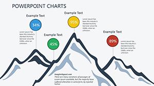
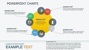
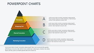
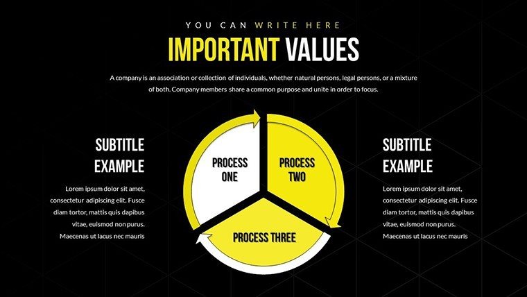
- Rich Variety: Pie, bar, line, and scatter plots tailored for accounting needs like balance sheets and P&L statements.
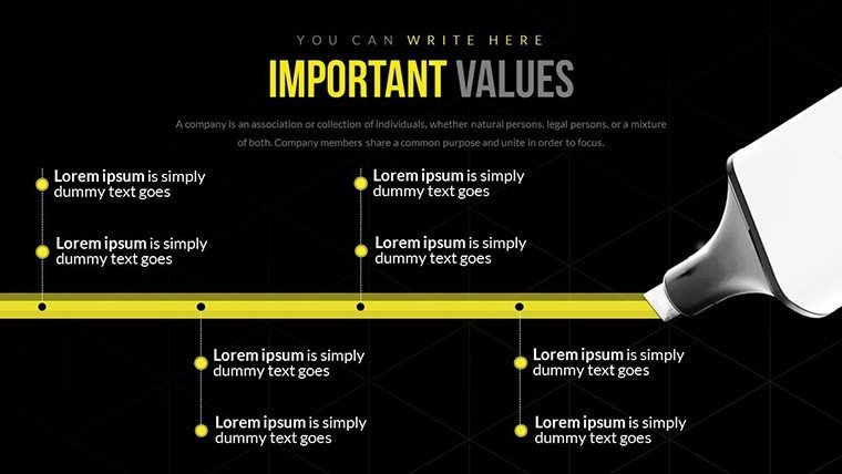
- Annotation Tools: Highlight key points with arrows and text boxes for contextual clarity.
- Broad Compatibility: Seamless with PowerPoint and Google Slides, supporting collaborative edits.
- Professional Polish: High-res designs that print sharply for reports or handouts.
These align with by incorporating best practices from financial visualization leaders, ensuring authoritative outputs.
Case Studies in Action: From Data to Decisions
Consider a mid-sized firm using this template for audit presentations: Charts depicting asset allocations helped identify inefficiencies, leading to cost savings. In consulting, analysts map client KPIs, revealing trends that inform mergers. Educators employ it for teaching forensic accounting, with real-world examples like Enron's red flags visualized. This applicability spans industries, from banking to manufacturing, solving issues like miscommunication in financial reviews and promoting informed, data-backed choices.
Implementing the Template Effectively
- Start with Download: Access the PPTX file and integrate your datasets via copy-paste.
- Build Your Story: Sequence slides logically, from overviews to deep dives.
- Enhance Visually: Use gradients for trend emphasis, maintaining a clean palette.
- Incorporate Feedback: Share drafts for input, refining metrics display.
- Present Confidently: Leverage animations for reveal effects, keeping audiences engaged.
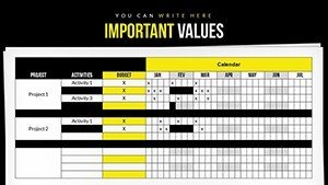
- Archive and Update: Save versions for ongoing analysis, like quarterly comparisons.
Compared to free alternatives, this paid template offers superior customization, justifying its value in time saved.
Tips for Compelling Financial Presentations
Focus on storytelling: Begin with a summary chart, then drill down. Use consistent scales to avoid distortion, per GAAP guidelines. Infuse light professionalism with phrases like 'turning red ink to black' for relatability. A case from a Fortune 500 company shows 40% improved stakeholder buy-in post-visual upgrades. This template positions you as a financial storyteller, not just a number-cruncher.
Sector-Specific Customizations
For non-profits, track grant usages; in tech, visualize burn rates. It's adaptable, enhancing precision across roles.
Invest in your financial prowess - download this template today and transform data into decisive action.
Frequently Asked Questions
How do I import financial data?
Copy from Excel or link dynamically for auto-updates.
Is it suitable for audit reports?
Yes, with compliant visuals for clear, accurate representations.
Can I add custom formulas?
Embed Excel objects within slides for calculations.
What about security for sensitive data?
Password-protect the file in PowerPoint for confidentiality.
Are updates available?
Check our site for versions; current template is evergreen.
Compatible with Mac?
Fully, via PowerPoint for Mac or online versions.