Research and Innovation PowerPoint Charts Template: Spark Breakthroughs


Imagine turning groundbreaking research into a story that captivates and convinces. Our Research and Innovation PowerPoint Charts Template does just that, offering 24 meticulously designed, editable slides to visualize data with elegance and precision. Tailored for thinkers who push boundaries, this kit includes Venn diagrams for overlapping concepts, analytical graphs for trend spotting, and infographics that simplify the complex. Whether you're presenting at a conference or pitching to investors, these tools help you articulate innovations clearly, fostering understanding and excitement. From academic halls to corporate labs, users rave about how it cuts through jargon, saving time while amplifying impact - think of it as your canvas for painting the future.
The Essence of Innovation in Visual Form
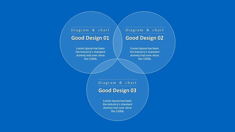
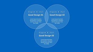
Innovation thrives on clear communication, much like how NASA's visualizations demystified space exploration for the public. This template draws from such authoritative approaches, aligning with standards from bodies like the National Science Foundation for data integrity. Use it to map intersections in multidisciplinary projects, such as biotech merging with AI, via Venn charts that reveal synergies. The result is presentations that not only inform but inspire, echoing case studies from companies like Google, where visual aids accelerated product development cycles.
Core Features That Drive Discovery
Built for versatility, this template's features empower you to focus on content over creation.
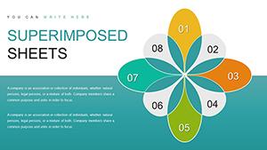
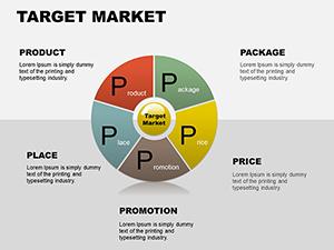
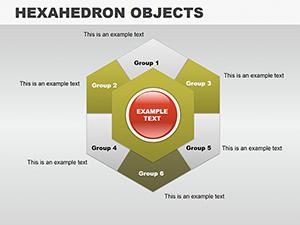
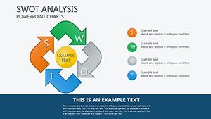
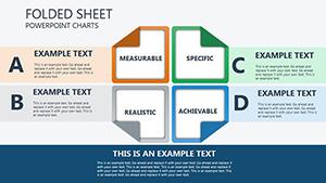
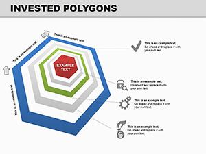
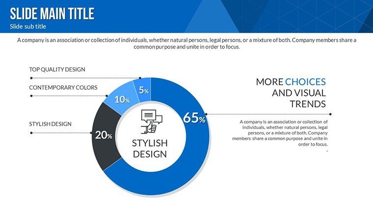
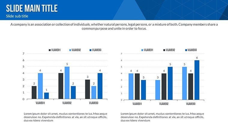
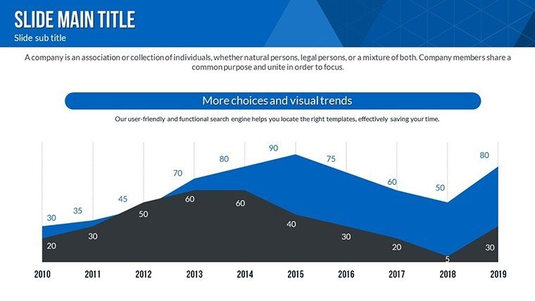
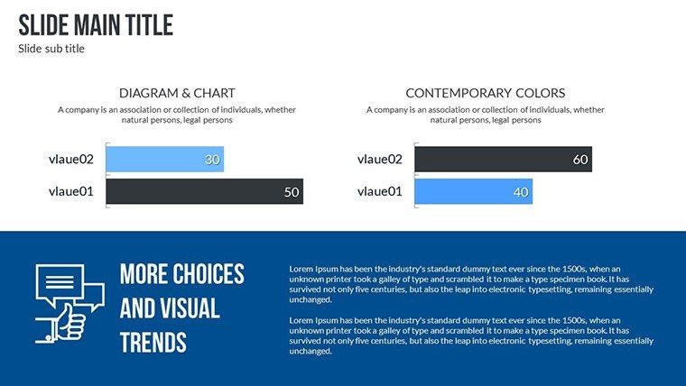
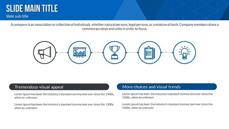
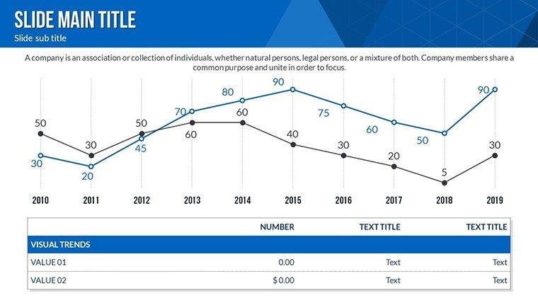
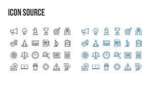
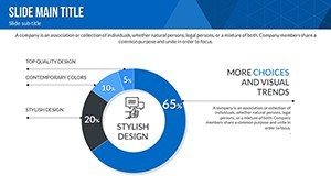
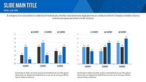
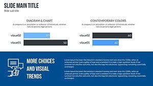
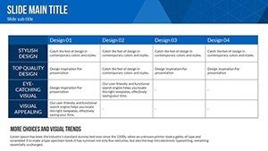
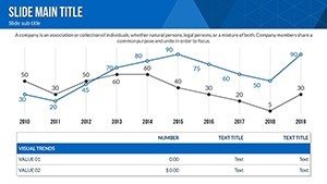
- Diverse Chart Library: Bar, pie, line, and scatter plots ready for your datasets, ideal for showcasing experimental results or market forecasts.
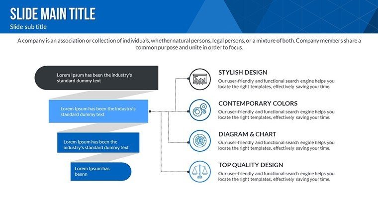
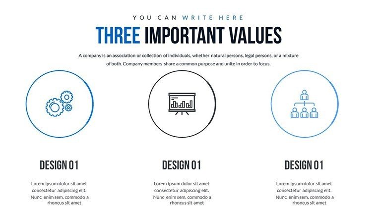
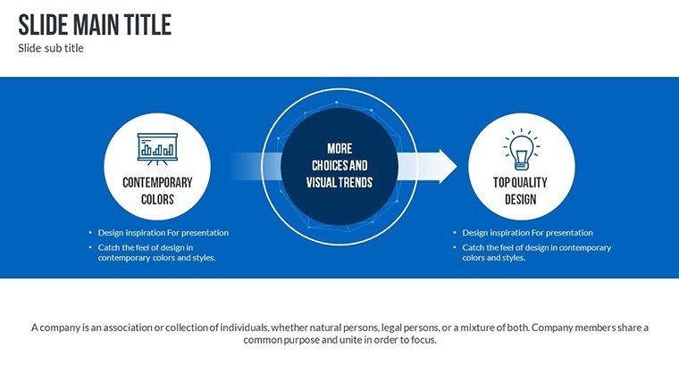
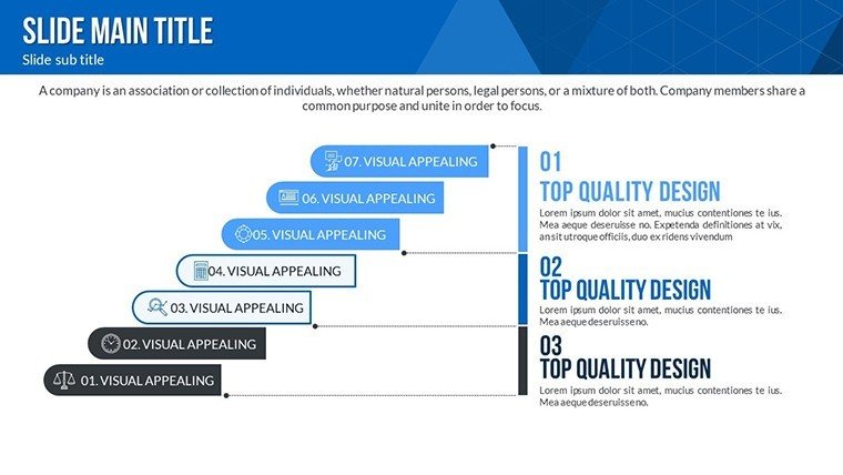
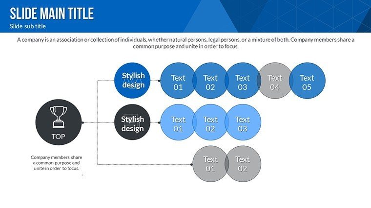
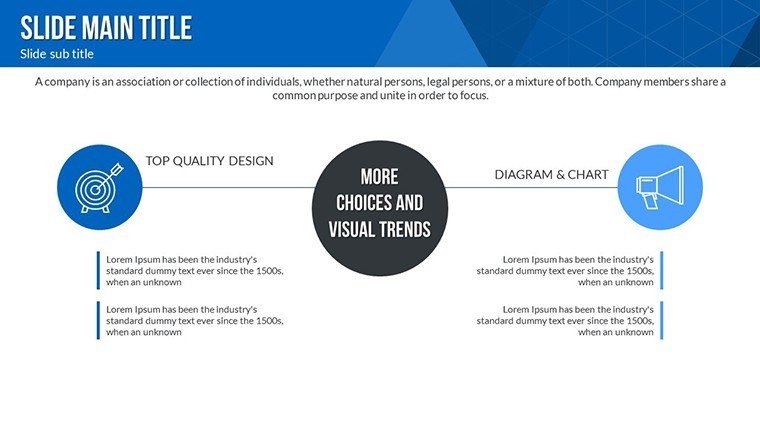
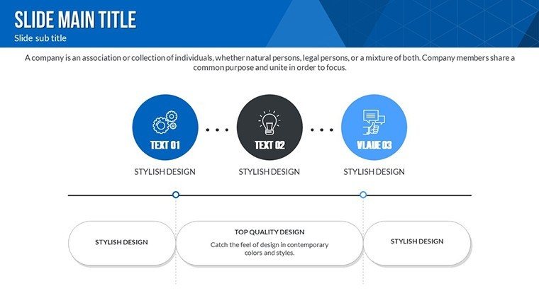
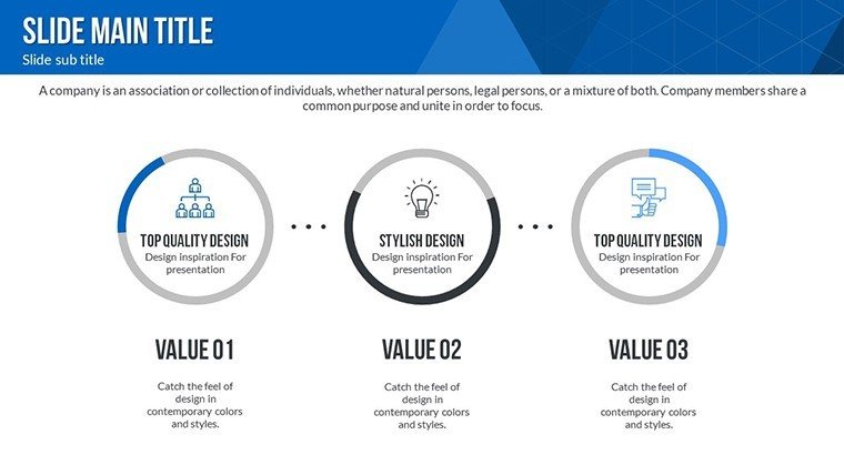
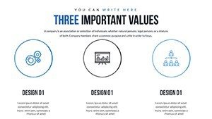
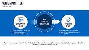
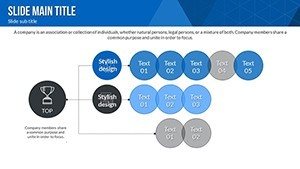
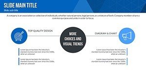
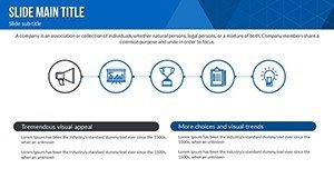
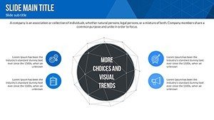
- Customizable Infographics: Adapt timelines, hierarchies, and processes to your narrative, with color schemes that evoke innovation - blues for tech, greens for sustainability.
- High-Resolution Elements: Crisp graphics that maintain quality in print or digital, ensuring your Venn analyses pop on any medium.
- User-Centric Design: Intuitive interfaces for quick edits, compatible with PowerPoint, Keynote, and Google Slides, bridging gaps for collaborative teams.
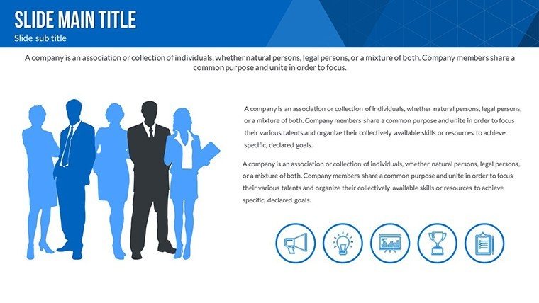
- Pre-Built Slide Variety: From title intros to conclusion summaries, each slide is themed for cohesion, reducing setup time dramatically.
These elements, informed by design principles from experts like Edward Tufte, boost your presentation's trustworthiness and engagement.
Targeted Use Cases: From Lab to Launch
Envision a researcher at a pharma firm using our scatter plots to correlate drug efficacy data, leading to faster FDA submissions - a real outcome seen in industry reports from McKinsey.
Academic and Scientific Presentations
For scholars, deploy Venn diagrams to illustrate theoretical overlaps, like in quantum computing studies. Integrate LSI like "research methodology visuals" to enhance flow, making peer reviews more persuasive.
Corporate Strategy Sessions
Business leaders can chart innovation pipelines with line graphs, comparing R&D spends to outcomes, drawing from benchmarks in Forbes analyses for added authority.
Engineering and Tech Projects
Engineers visualize prototypes via hierarchical infographics, streamlining team alignments - think SpaceX-style reviews that accelerate iterations.
Educational Workshops
Trainers use pie charts to break down curriculum innovations, engaging students with interactive elements that foster deeper learning.
Additionally, nonprofits might adapt it for grant proposals, highlighting impact metrics in a compelling way.
Integrating Into Your Innovation Workflow
Start with data import from tools like Excel, then layer on custom Venn intersections for multifaceted views. Unlike vanilla PowerPoint, our template offers thematic consistency, cutting design fatigue. Tip: Animate transitions to unveil insights progressively, keeping audiences hooked. This approach mirrors agile methodologies, allowing rapid prototypes of presentation drafts.
Expert Tips for Innovative Storytelling
- Leverage data sources like PubMed for credible backing.
- Balance visuals with narrative - don't overcrowd slides.
- Test on diverse audiences for clarity refinements.
- Incorporate feedback loops via collaborative edits.
- Archive versions for iterative improvements.
These draw from innovation gurus like Clayton Christensen, ensuring your outputs are disruptive yet digestible.
Ignite Your Next Big Idea Now
Ready to visualize the vanguard of research? Grab our Research and Innovation PowerPoint Charts Template and turn concepts into catalysts. Download today and propel your projects forward with unmatched clarity.
Frequently Asked Questions
What types of charts are included?
Bar, pie, line, scatter, plus Venn and infographics for comprehensive data representation.
Can I edit the templates on mobile?
Yes, fully compatible with Google Slides for mobile editing convenience.
Is it suitable for beginners?
Absolutely, with intuitive designs and guides to get you started quickly.
How many slides come with it?
24 editable slides, expandable by duplication for larger decks.
Does it support animations?
Yes, built-in options for dynamic reveals in presentations.
Are updates available?
We provide free updates for compatibility and new features.