Analysis Circle PowerPoint Charts Template: Decode Data Dynamics
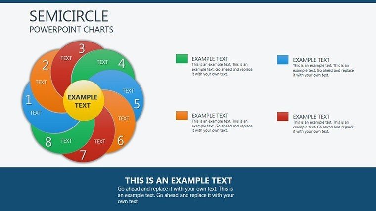
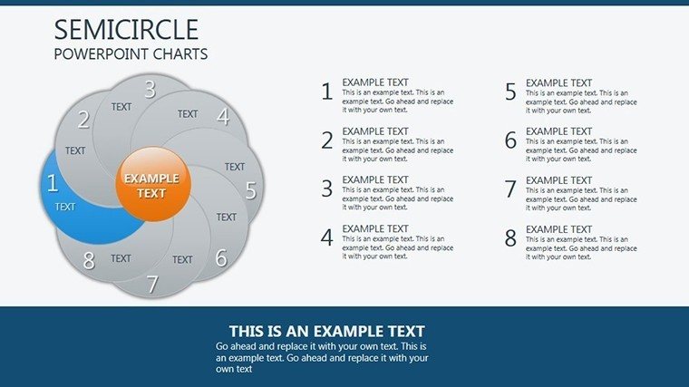
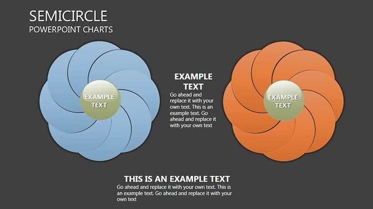


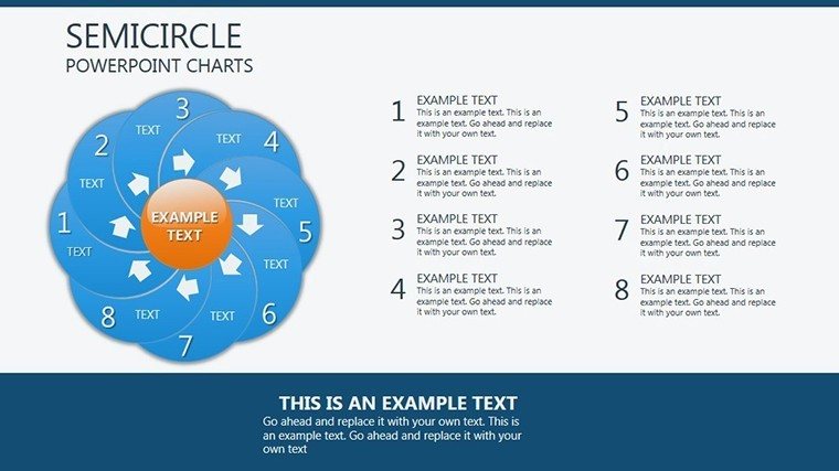


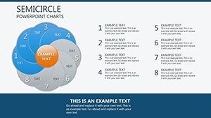
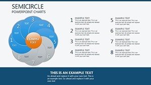
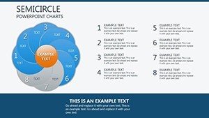
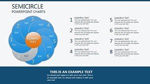


Data whispers secrets, but our Analysis Circle PowerPoint Charts Template shouts them clearly. Featuring 20 editable slides, this powerhouse uses circular designs to unravel patterns, relationships, and trends with visual panache. Ideal for strategists dissecting market shifts or teachers illustrating cycles, it merges pie-like segments with analytical depth for immersive storytelling. Forget flat graphs; embrace circles that encircle insights, as seen in how circular economies are visualized in UN reports. This template not only saves design time but amplifies your message, turning complex analyses into accessible adventures.
The Circular Advantage in Analysis
Circles symbolize wholeness, making them perfect for holistic views. Modeled after expert frameworks from Bain & Company, this template ensures authoritative breakdowns, like in sustainability reports where circles map resource cycles per EPA standards.
Key Features for In-Depth Exploration
Designed for depth and ease, features include:
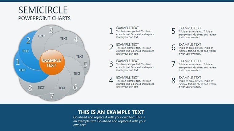
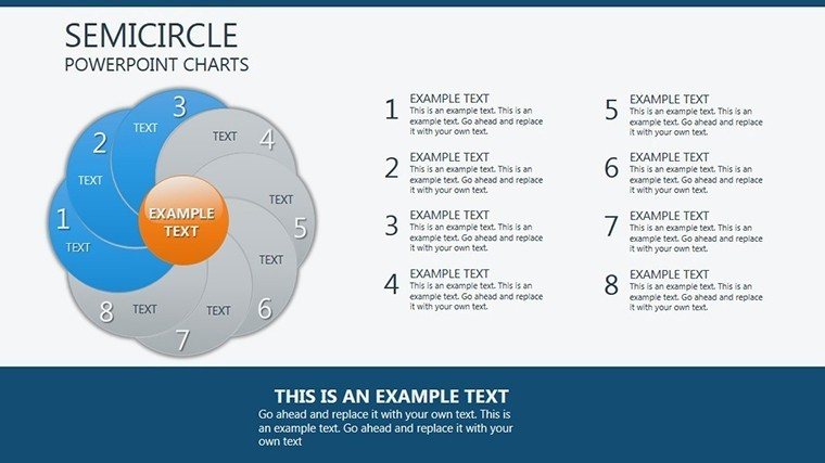
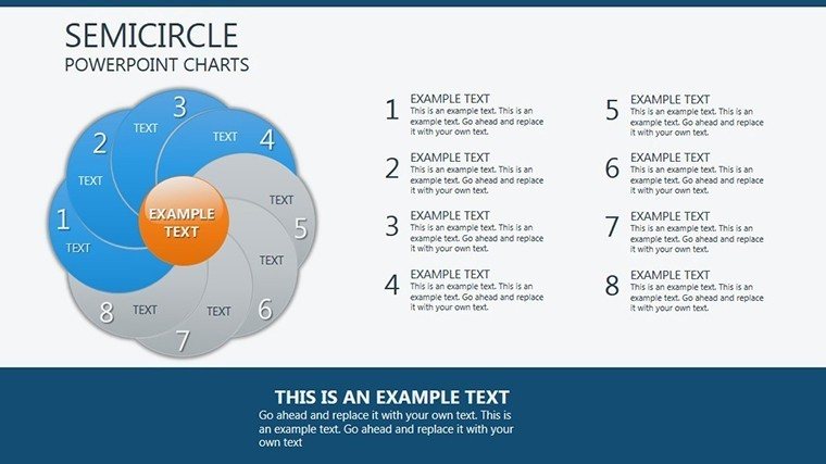
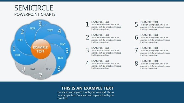
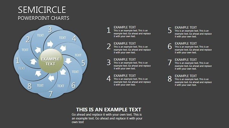
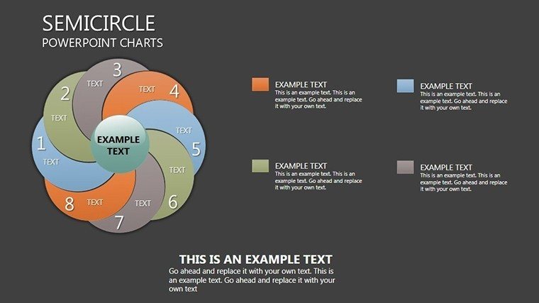
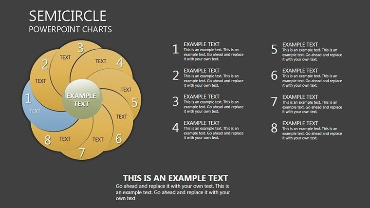
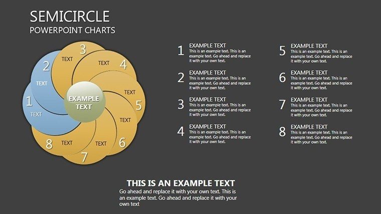
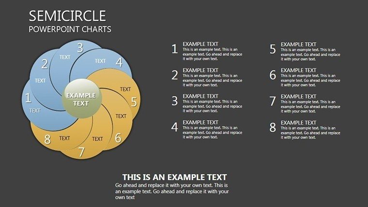
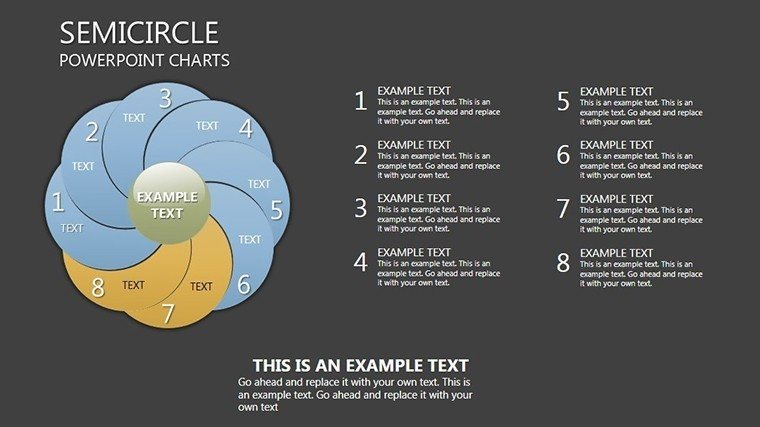
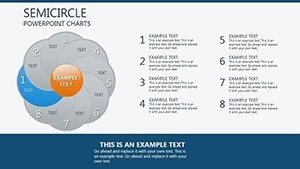
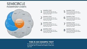
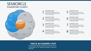
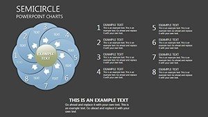
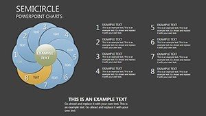
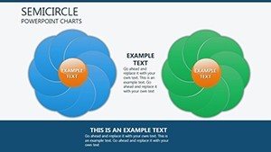
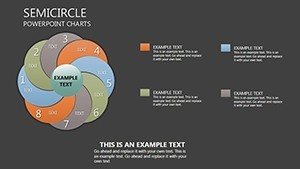
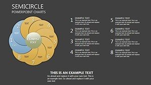
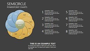
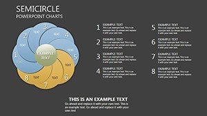
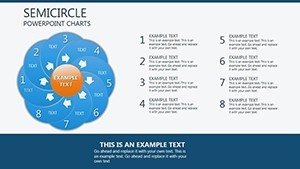
- Dynamic Circle Charts: Interactive segments for trends and correlations.
- Extensive Customization: Fonts, colors, styles to brand your analysis.
- Easy Integration: Plug-and-play with PowerPoint tools.
- Varied Layouts: From basics to advanced multi-layer circles.
- Professional Polish: High-res for impactful delivery.
Backed by visualization principles from authorities like Stephen Few.
Practical Use Cases: Circles in Action
An analyst at a consulting firm uses circles to map client feedback loops, boosting satisfaction scores as per Gartner studies.
Professional Data Navigation
Simplify metrics with LSI-integrated "circular data models."
Educational Clarity
Illustrate concepts like life cycles engagingly.
Innovative Thought Leadership
Communicate visions in executive summaries.
Versatile for various sectors.
Workflow Optimization with Circles
Import, customize, present - faster than standard tools.
Tips for Circular Mastery
- Focus on key segments.
- Use colors strategically.
- Layer for complexity.
- Animate for emphasis.
- Validate with peers.
From design luminaries.
Circle Your Success Now
Download and revolve your analyses into revelations.
Frequently Asked Questions
What makes circle charts unique?
They provide holistic views of interconnected data.
Editable in Google Slides?
Yes, cross-platform compatibility.
Good for beginners?
Intuitive with guides.
Slide count expandable?
Yes, duplicate as needed.
Supports data import?
Seamless from Excel.
Free updates?
Yes, for ongoing enhancements.