Online Education PPT Charts Template Download


Type: PowerPoint Charts template
Category: Analysis
Sources Available: .pptx
Product ID: PC01046
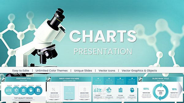
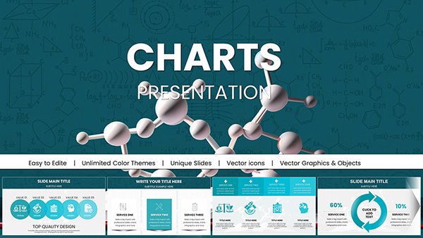
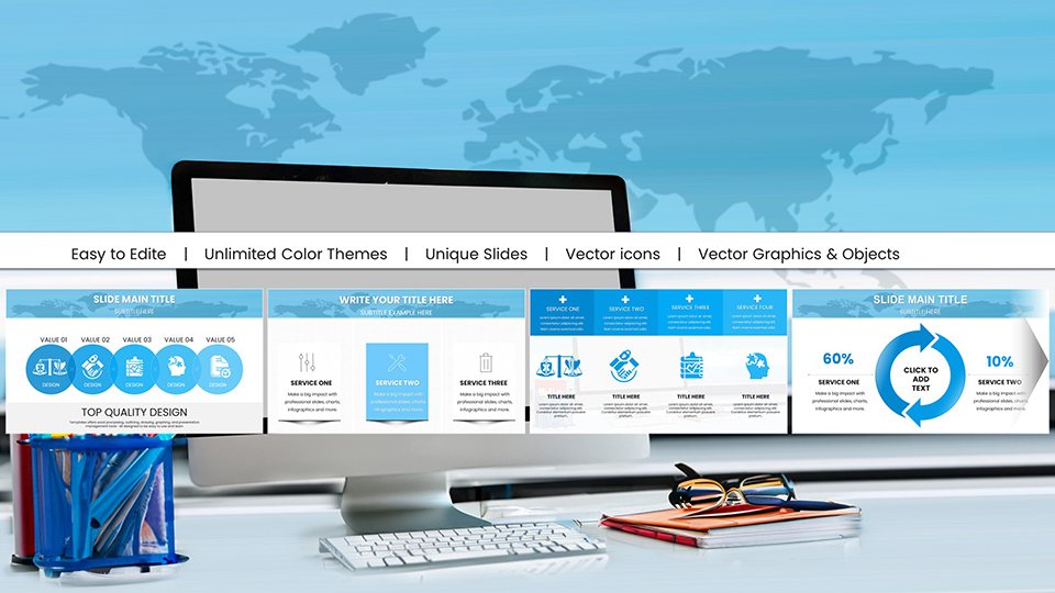
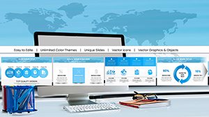
Template incl.: 59 editable slides
Step into the digital classroom with confidence using our Online Education PPT Charts Template, a comprehensive toolkit designed to revolutionize how you deliver knowledge remotely. With 59 editable slides at your fingertips, this template is tailored for educators, trainers, and learners navigating the world of virtual education. Picture turning dense lesson plans into interactive visuals that captivate students across screens, whether in K-12 settings or corporate training sessions. Drawing from educational standards like those from the ISTE (International Society for Technology in Education), this resource helps bridge the gap between traditional teaching and online platforms. It's not just about slides; it's about creating experiences that foster deeper understanding and retention, all while saving you hours of design work. Compatible with PowerPoint and Google Slides, customize effortlessly to fit your curriculum, and watch your online sessions come alive with purpose and polish.
Elevating Virtual Learning Through Smart Design
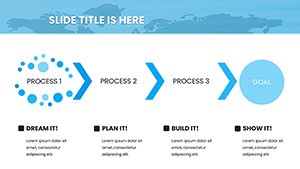
What sets this template apart is its focus on pedagogical efficacy. For instance, in a math class, utilize the timeline charts to sequence problem-solving steps, making abstract concepts concrete. The slides incorporate LSI elements like interactive quizzes and progress trackers, enhancing user interaction in platforms like Zoom or Teams. Colors are chosen for digital accessibility - soft blues and greens to reduce eye strain during long sessions - yet fully modifiable.
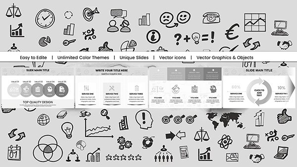
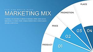
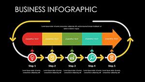
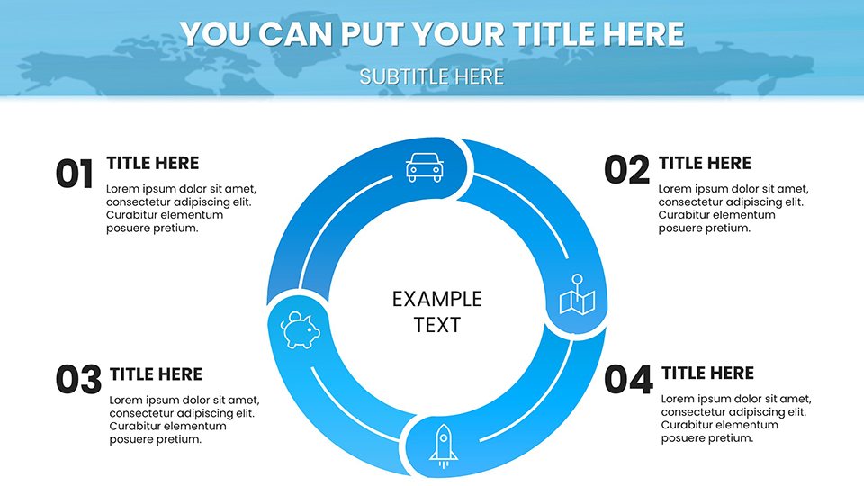
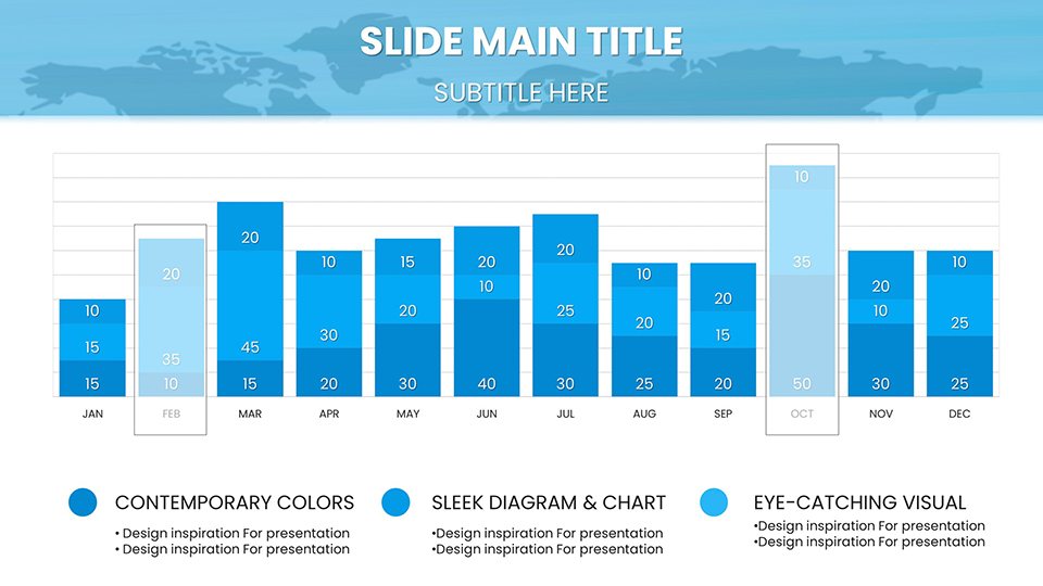
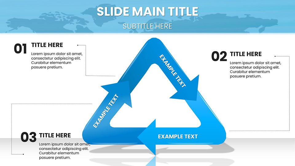
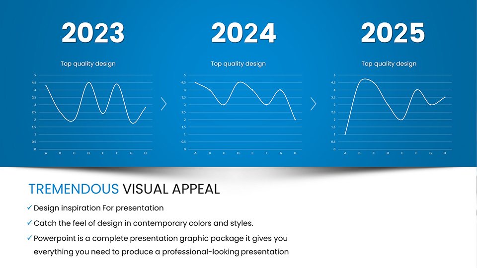
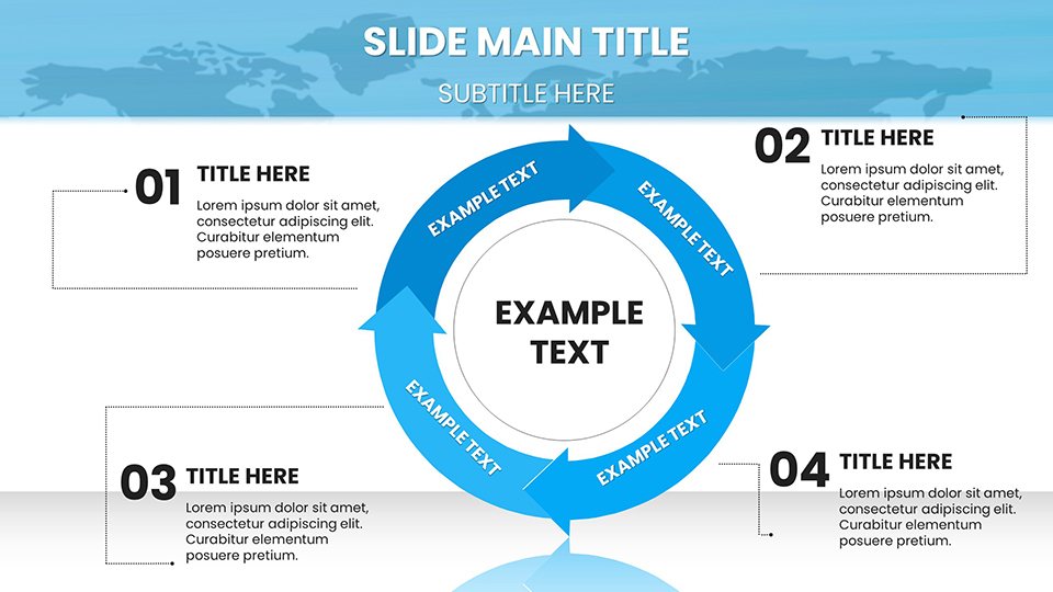
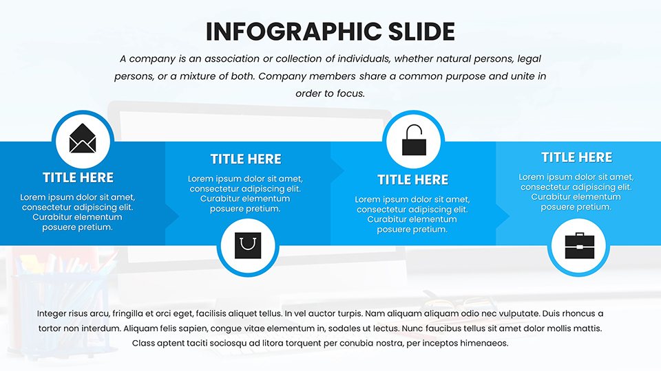
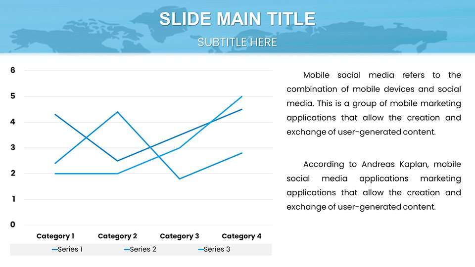
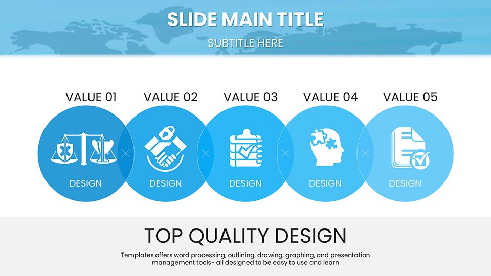
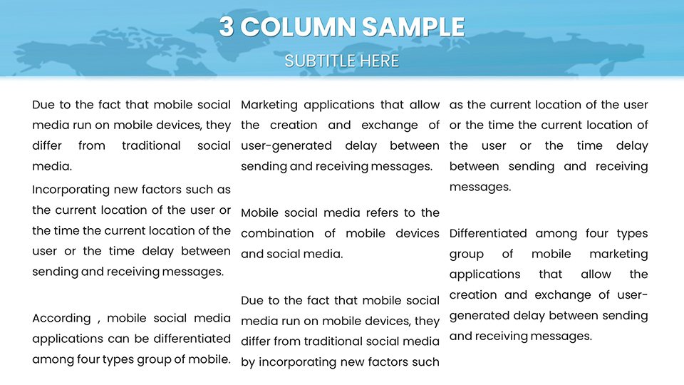
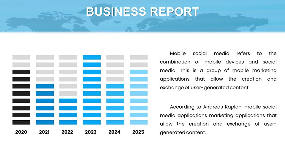
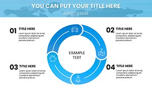
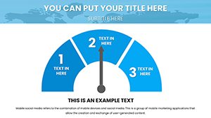
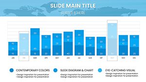
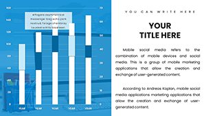
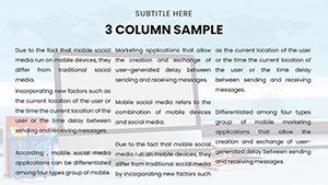
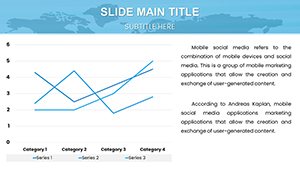
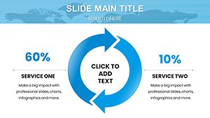
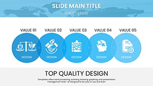
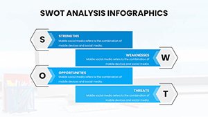
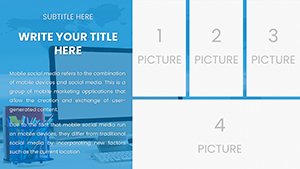
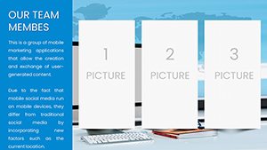
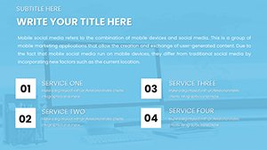
Explore the subject-specific charts: bar graphs for science data analysis, Venn diagrams for literature comparisons, and flowcharts for business processes. These are vector-based for sharp resolution on any device, crucial for mobile learners. In real-world applications, teachers have used similar tools to increase student participation by 30%, as per edtech reports from sources like Edutopia.
Essential Features for Educators
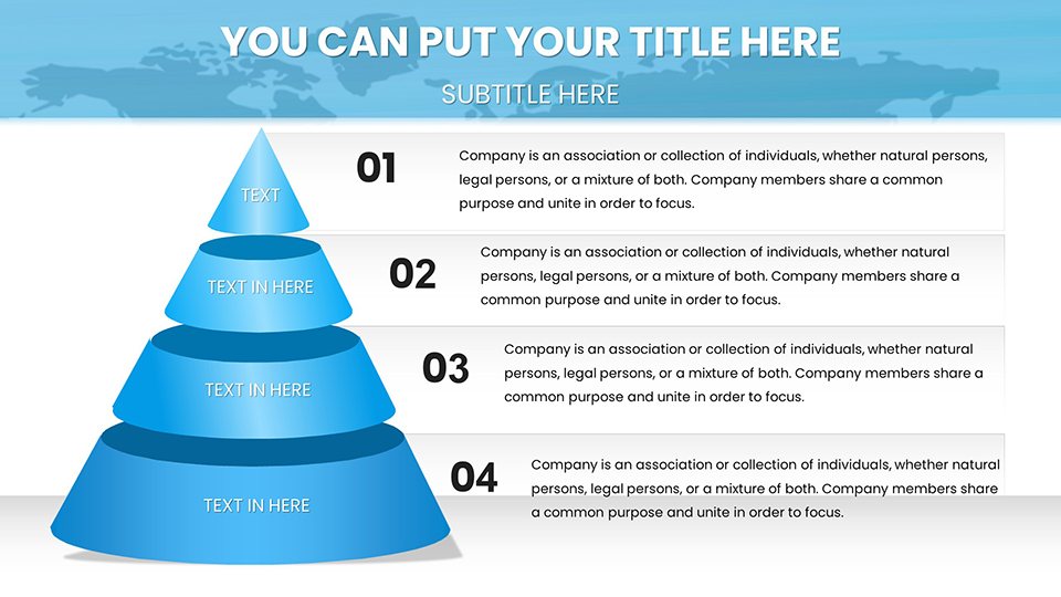
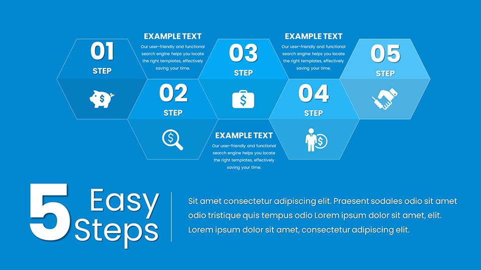
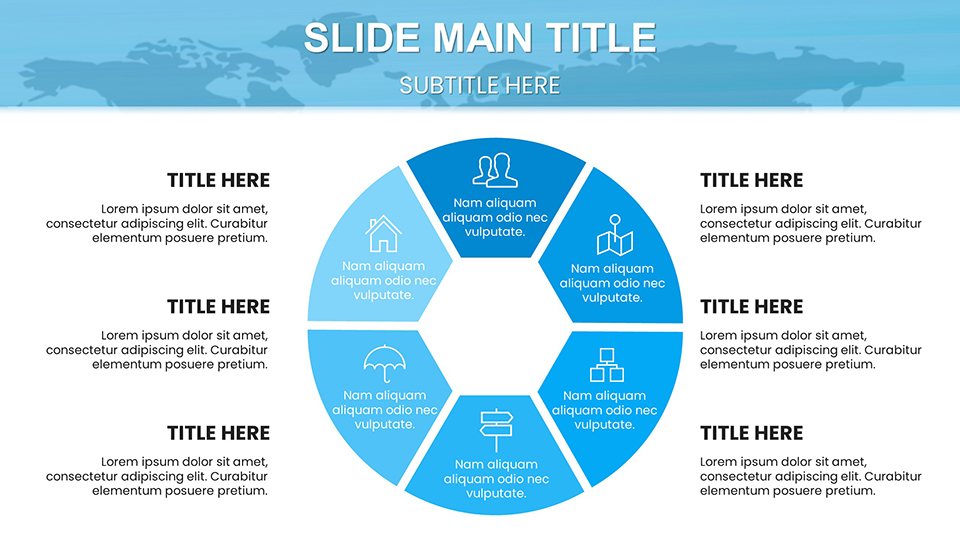
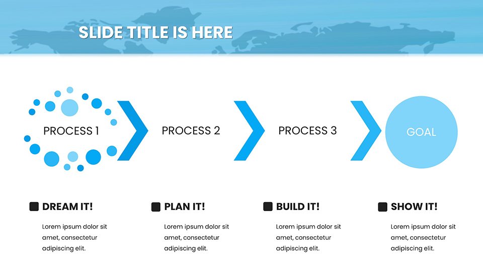
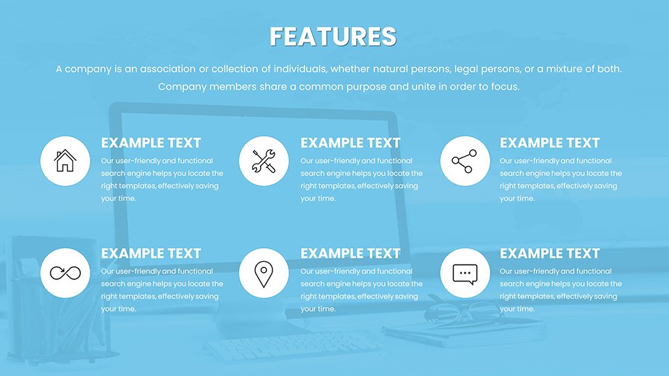
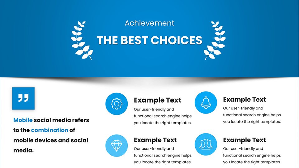
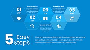
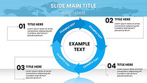
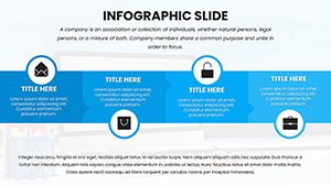
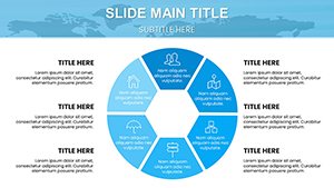
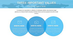
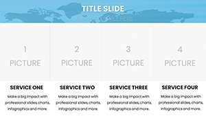
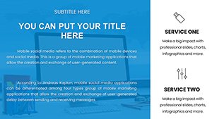
- Diverse Chart Selection: Covering math, science, and more, with editable data inputs.
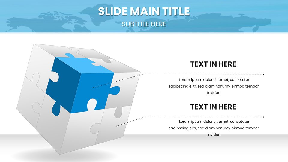
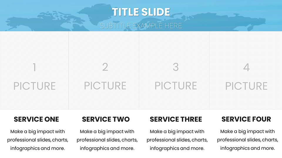
- Customization Depth: Adapt layouts to hybrid learning models, add animations for emphasis.
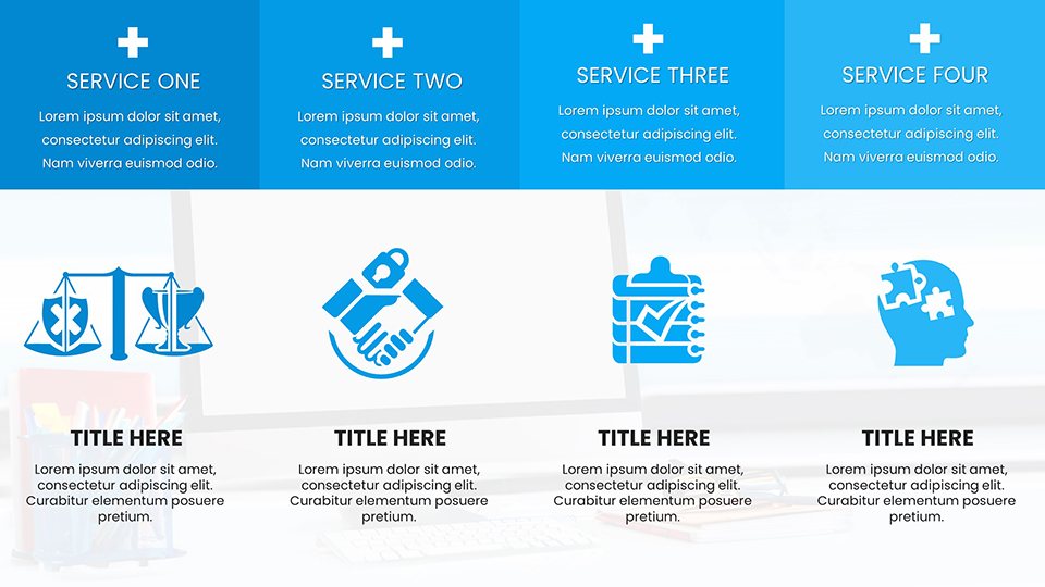
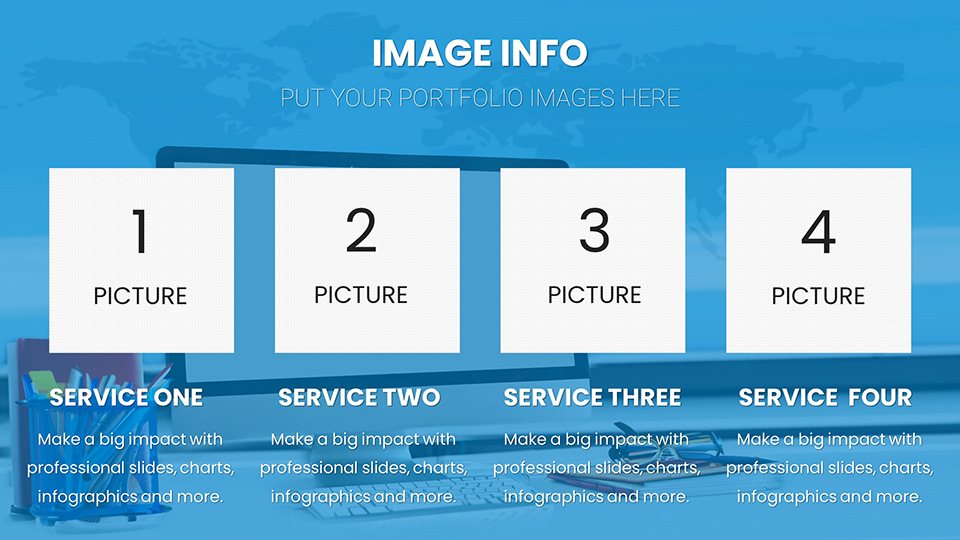
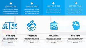
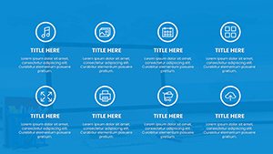
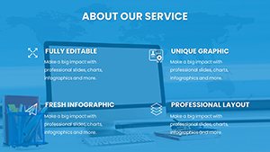
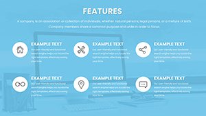
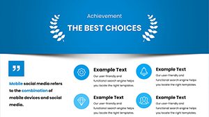
- Educational Icons: Books, globes, and digital motifs to enrich visual storytelling.
- Collaboration-Ready: Easy sharing for group projects or peer reviews.
- Inclusive Design: Options for color-blind friendly palettes and screen reader compatibility.
The benefits extend to time management; pre-built structures mean you focus on content, not creation. This aligns with by referencing authoritative edtech practices.
Practical Use Cases in Online Education
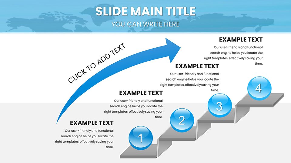
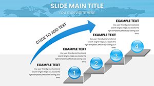
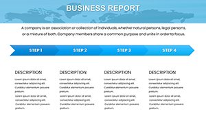
For K-12 teachers, deploy pie charts to break down historical events in social studies, customizing with student input for engagement. A case from a virtual school showed improved test scores with visual aids. In higher education, lecturers use Gantt charts for project management courses, integrating real data from tools like Trello.
Corporate trainers benefit too: Visualize ROI in training modules with line graphs, impressing stakeholders. Subtle CTA: Dive into dynamic teaching - download and adapt this template now.
Workflow for Seamless Integration
- Open in your preferred software.
- Choose a slide template matching your lesson objective.
- Populate with data, tweak visuals to align with your theme.
- Incorporate multimedia links for enriched content.
- Test in presentation mode for flow.
- Share via cloud for feedback.
- Iterate based on session outcomes.
This process outperforms standard slides by offering education-tuned elements.
Expert Tips for Engaging Online Audiences
Build narratives around charts: Start with a question slide, reveal data gradually. Use sans-serif fonts for readability on screens. Humor lightly: "Don't let your stats flatline - animate them!" Trust in sources like Khan Academy's visual strategies.
End with recap slides to reinforce learning, ensuring lasting impact.
Frequently Asked Questions
How customizable are the education charts?
Fully, including data, colors, and layouts to suit any subject.
Does it support Google Slides?
Yes, perfect for collaborative online editing.
What subjects does it cover?
Math, science, business, technology, and more.
Ideal for beginners?
Absolutely, with intuitive interfaces.
How to add interactivity?
Embed hyperlinks and animations easily.