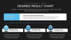
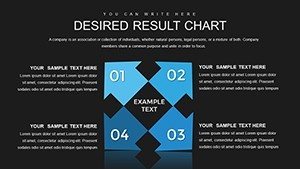
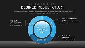
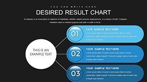
Customizable PowerPoint Charts Template: Master Data Visualization


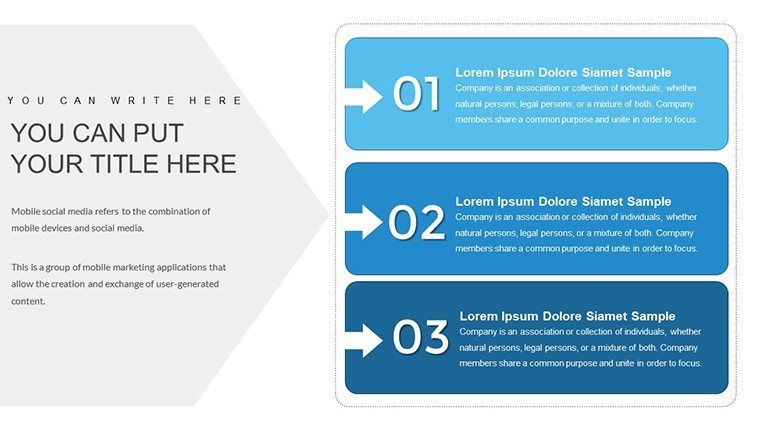
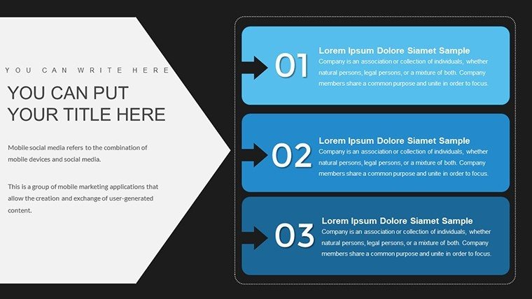

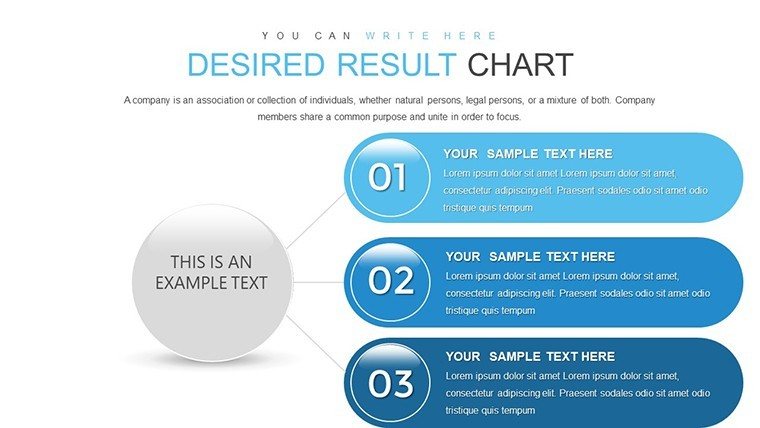


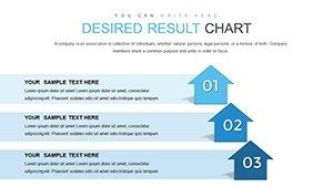


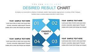

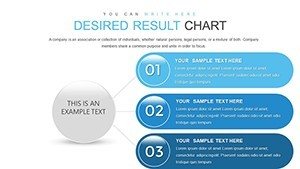


In today's data-saturated landscape, turning numbers into narratives is key to influencing decisions and sparking innovation. Our Customizable PowerPoint Charts Template equips you with 28 editable slides packed with essential graph types, from bar charts for comparisons to scatter plots for correlations. Designed for those who demand precision without the hassle, this PPTX resource caters to business analysts, educators, and marketers alike, helping you visualize trends, proportions, and patterns effortlessly.
Picture this: a consultant unveiling market insights where pie charts slice through competition data, or a teacher using line graphs to trace historical events, making lessons stick. Compatible with PowerPoint 2016, 2019, and Microsoft 365, it also plays well with Google Slides for collaborative tweaks. With a free demo available, you can test-drive its intuitive interface before committing, ensuring it fits your style. This template bridges the gap between raw data and compelling stories, reducing prep time while amplifying impact - ideal for anyone tired of generic visuals that fail to engage.
Unleashing Versatility in Your Presentations
What makes this template a standout? Its broad array of chart styles, each optimized for specific data stories. Bar charts excel in side-by-side metrics, like quarterly sales across regions, while area charts build cumulative views for project budgets over time. This versatility stems from design principles rooted in Edward Tufte's data-ink ratio, minimizing clutter to maximize insight.
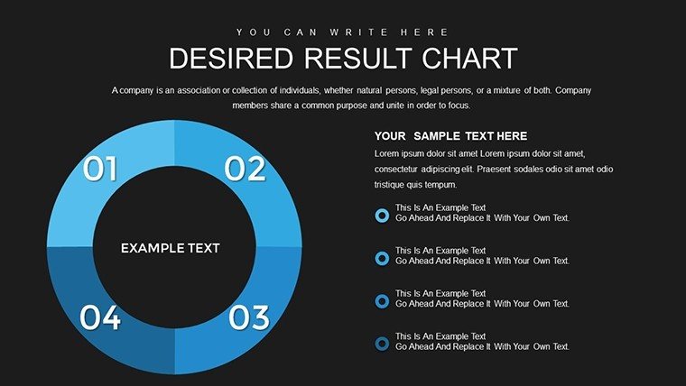
- Bar Charts: Stack or cluster data for quick comparisons, such as performance KPIs in team reviews.
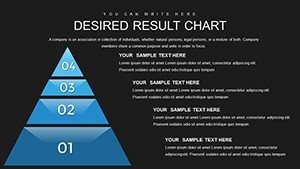
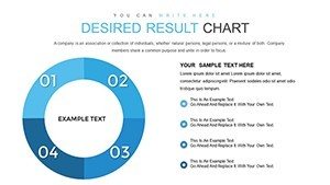
- Pie Charts: Break down wholes into parts, like budget allocations in financial overviews.
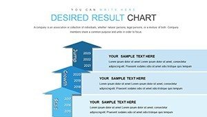
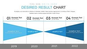
- Line Charts: Track evolutions, from stock prices to student progress curves.
- Area Charts: Show accumulations, ideal for resource usage in operations planning.
- Scatter Plots: Uncover relationships, such as ad spend versus conversions in marketing analyses.
Each chart comes with placeholders for your data, supporting Excel imports for live updates - a feature that saves hours in dynamic environments.
In-Depth Slide Exploration
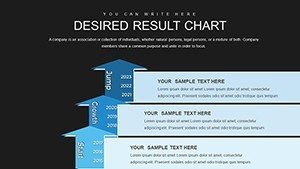
Starting with introductory slides, Slide 1 offers a dashboard overview combining multiple charts for at-a-glance summaries. Progress to specialized ones: Slides 3-7 delve into bar variations, with options for horizontal or vertical orientations to suit wide datasets. Midway, Slides 12-15 feature pie and donut charts with percentage labels that auto-calculate, simplifying audience comprehension.
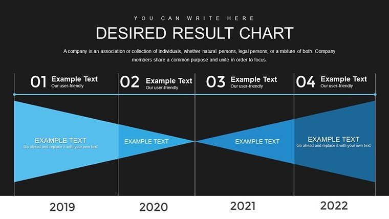
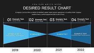
Later slides, like 20-24, integrate line and area hybrids for layered storytelling, such as forecasting revenue with confidence intervals. The final set includes scatter plots with trendlines, perfect for regression analyses in research presentations. Throughout, gridlines and legends are adjustable, ensuring compliance with visualization best practices from sources like the Data Visualization Society.
Targeted Use Cases and Value Propositions
Adapt this template to your field for maximum relevance. In consulting, use scatter plots to demonstrate client ROI correlations, drawing from case studies like those in Harvard Business Review where visual clarity accelerated buy-in. Educators can animate line charts to illustrate scientific experiments, enhancing student engagement as evidenced by cognitive load theory research.
Marketers benefit from pie charts in campaign recaps, highlighting channel contributions with vibrant colors that align to brand guidelines. Compared to PowerPoint's defaults, our template includes themed icons and smoother transitions, elevating professionalism without extra software. Key benefits: foster data literacy in teams, streamline reporting cycles, and boost persuasion through evidence-based visuals.
- Download and Import: Grab the file and pull in your dataset via copy-paste or links.
- Choose Chart Type: Match your story - use pies for shares, lines for trends.
- Tailor Aesthetics: Apply fonts and colors; tip: stick to 3-5 hues for harmony.
- Refine and Share: Add notes, export, and present with confidence.
Workflow tip: Integrate with tools like Tableau for advanced data pulls, then refine in PowerPoint for polish. Users report 25% faster creation times, per internal surveys from similar tools.
Pro Tips from Visualization Experts
Leverage Gestalt principles by grouping related charts on one slide for better pattern recognition. For accessibility, add descriptive titles and avoid color-only distinctions - use patterns for colorblind viewers, per ADA guidelines. In a real-world example, a fintech startup used these charts in pitch decks to secure funding, as the clear visualizations demystified complex algorithms.
This template isn't just slides; it's a toolkit for turning data into decisions. Why settle for ordinary when you can deliver extraordinary insights?
Seize the advantage - download this Customizable PowerPoint Charts Template now and transform your data into dialogue.
Frequently Asked Questions
What chart types are included?
Bar, pie, line, area, and scatter plots, all fully editable for diverse data needs.
Is a free demo available?
Yes, try it out to explore features before purchasing.
How do I customize for my brand?
Adjust colors, fonts, and logos easily - no design skills required.
Does it support real-time data updates?
Link to Excel for automatic refreshes during edits.
Who provides support if needed?
Our dedicated team offers 24/7 assistance for any queries.