Venn Keynote Diagrams Template


Ever tried explaining overlapping strategies to a room full of skeptics, only to watch eyes glaze over? Enter the Venn Keynote Diagrams template - a set of 14 editable slides that make intersections crystal clear, turning abstract concepts into shared "aha" moments. Tailored for strategists, teachers, and analysts who juggle multiple variables, this template uses timeless Venn designs to map relationships, whether it's comparing market competitors or linking historical events. With its clean lines and flexible layouts, you'll craft presentations that not only inform but invite collaboration, fostering deeper discussions right from the slide.
Venn diagrams aren't relics; they're precision tools for modern communication. This template revives them with contemporary styling - soft curves for approachable vibes or sharp edges for corporate edge - ensuring they fit any deck. Built for Keynote's ecosystem, slides scale perfectly across devices, from MacBooks to conference projectors, keeping your flow uninterrupted.
Mastering Overlaps: Core Features Explored
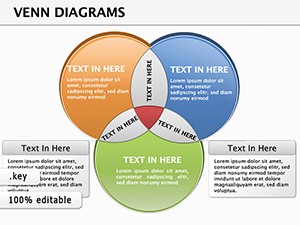
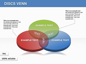
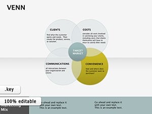
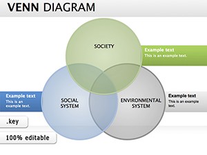
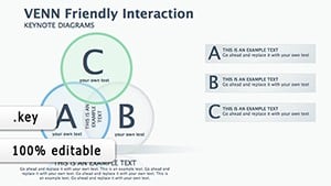
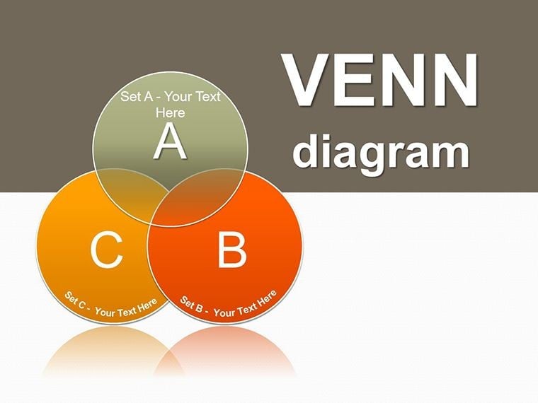
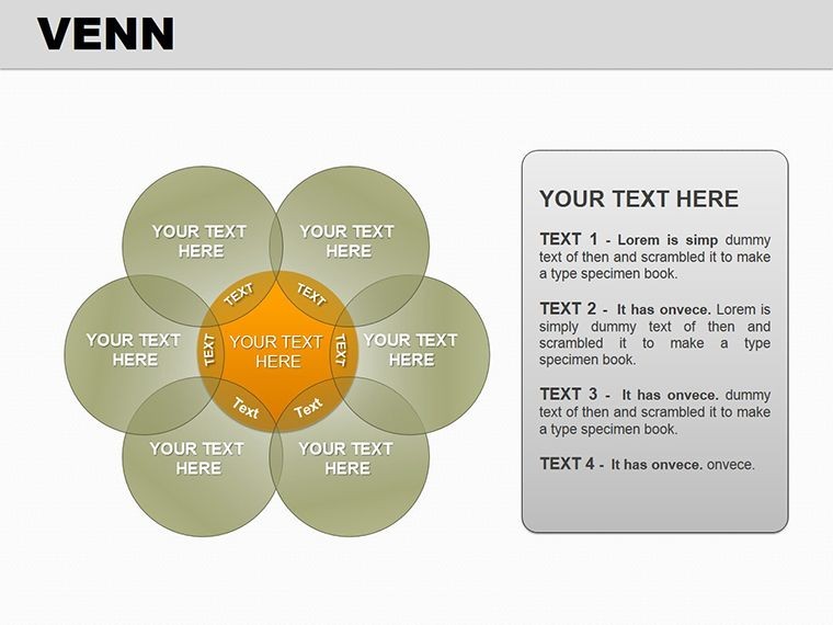
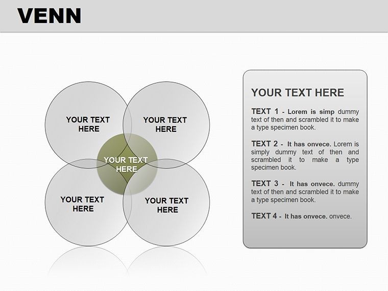
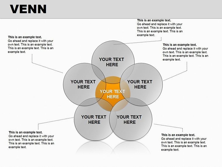
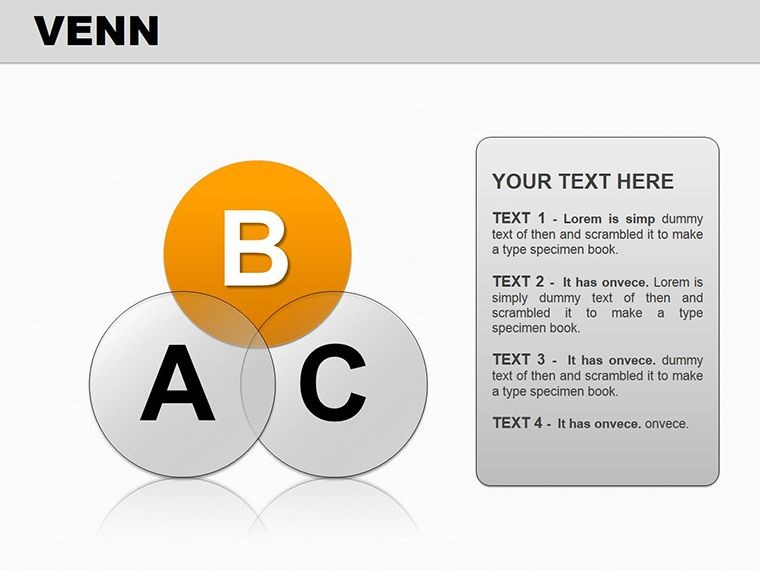
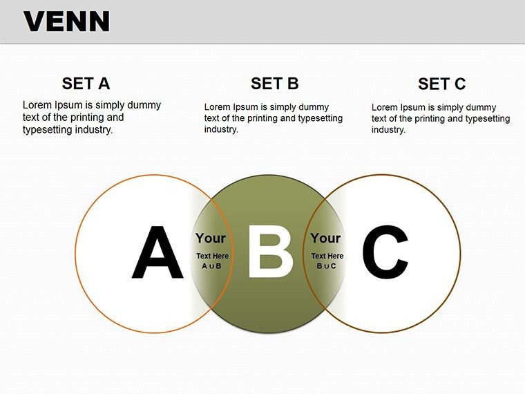
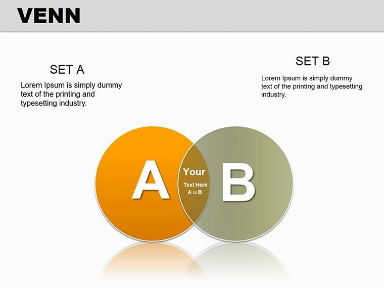
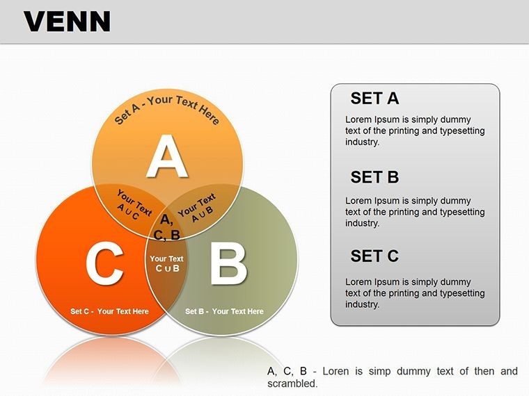
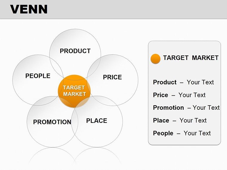
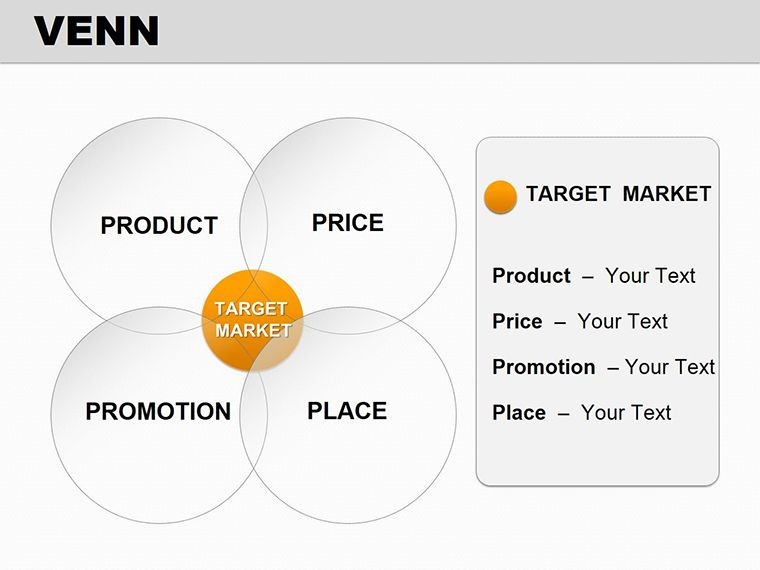
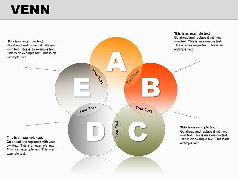
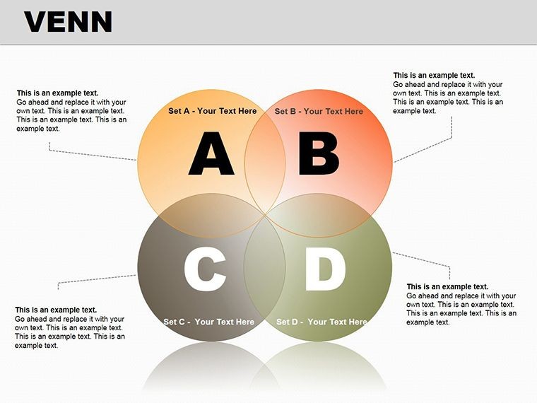
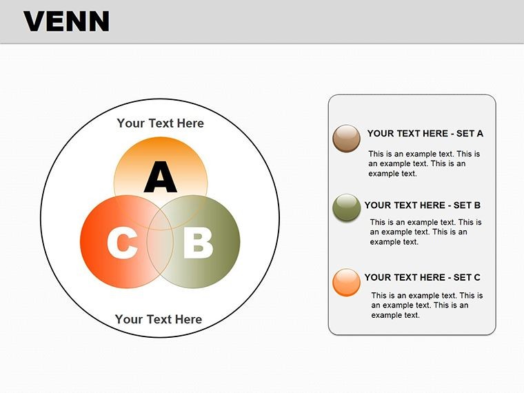
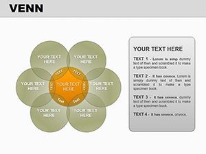
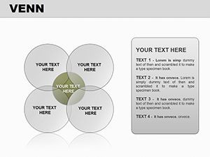
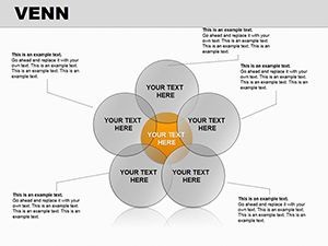
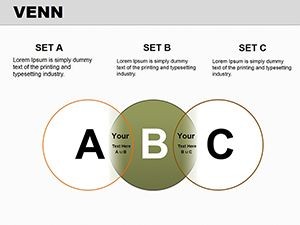
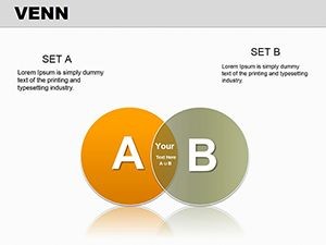
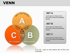
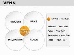
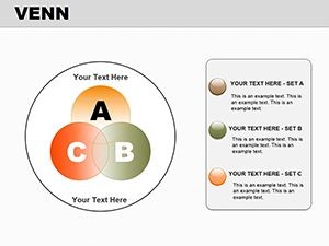
The heart of this template lies in its variety: from dual-circle basics for binary choices to triple and quadruple sets for multifaceted analyses. Each slide comes prepped with placeholder text and color-coded zones, so swapping in your content feels like filling in a puzzle. Need to highlight unions? The shaded overlap areas draw focus instantly, while exclusion zones use negative space to underscore differences.
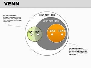
For added flair, incorporate subtle gradients that blend across circles, mimicking real-world fluidity - like how team roles merge in agile projects. And don't overlook the linear Venns for timeline integrations, where overlaps mark milestone synchronicities. These elements, drawn from proven visual storytelling techniques, ensure your diagrams resonate without overwhelming.
- Effortless Edits: Resize circles independently or link them for proportional harmony, all via Keynote's intuitive handles.
- Theme Sync: Match fills to your color scheme, with built-in swatches for quick brand alignment.
- Interactive Potential: Layer hyperlinks in overlaps for drill-down details during live sessions.
From Blank Canvas to Boardroom Ready: A Quick Guide
- Define Your Sets: List 2-4 elements; keep labels concise to avoid clutter.
- Select Slide Type: Dual for contrasts, triple for balances - preview in the template navigator.
- Populate Content: Drop text into zones; use bullet points for sub-details within each circle.
- Refine Visuals: Adjust transparency for subtle blends, ensuring readability from afar.
- Test Flow: Animate circle builds to reveal intersections progressively, building narrative tension.
This method, echoed in consulting playbooks from firms like Bain, streamlines prep while amplifying clarity.
Where Venns Shine: Targeted Use Cases
Business pros, this is your secret weapon for competitive analysis. Map product features against rivals' - the overlap screams unique selling points, prompting immediate strategy pivots. In education, breathe life into lessons: visualize literary themes' intersections, helping students grasp nuances faster than rote lists.
Project managers, use it for risk mapping - circles for threats, overlaps for mitigations - turning potential pitfalls into proactive plans. Even in therapy sessions or team retrospectives, Venns foster empathy by charting shared experiences. Across these, the template's adaptability means no rework; just tweak and deploy.
Versus clunky SmartArt, these slides offer superior control - no pixelated exports or rigid grids. Integrate with Keynote's charts for hybrid views, like Venns feeding into bar graphs for data-backed stories.
Industry-Specific Twists
Consultants: Bold outlines for client deliverables, emphasizing collaborative wins.
Researchers: Neutral tones for peer reviews, with export options for publications.
HR Leads: Warm hues to illustrate skill gaps and training overlaps.
Such customizations keep your visuals relevant, sparking tailored conversations.
Pro Strategies to Amplify Your Message
Layer in icons within circles for instant recognition - gears for processes, people for teams. Cap diagrams at 20% slide real estate to leave room for your voice. For global audiences, enable right-to-left adaptations effortlessly.
Embed this into your creative process: start with a mind map, then Venn-ify key nodes. Paired with timelines, it chronicles evolution - like how ideas converged in a famous innovation case from IDEO. This holistic approach crafts decks that linger.
Secure this template for $25 and redefine your diagrams. It's the edge that turns good presentations into great ones.
Frequently Asked Questions
What's the maximum number of sets in one diagram?
Up to four circles per slide, with scalable layouts for clarity.
Is it compatible with Google Slides?
Primarily for Keynote, but exportable to Google via PDF or images.
How customizable are the colors?
Fully - use hex codes or Keynote's eyedropper for precise matches.
Can animations be removed for static prints?
Yes, toggle off in the build order pane for clean outputs.
Does it include example data?
Placeholder sets are ready, like business vs. competitor features.
What's the file format?
Native .key file, optimized for Keynote 10+.