Positive and Negative Effects of Technology Keynote Charts Template


Type: Keynote Charts template
Category: Relationship, Pie, Spheres
Sources Available: .key
Product ID: KC00561
Template incl.: 21 editable slides
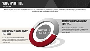
Technology's dual-edged sword shapes our world, offering innovations alongside challenges. This Keynote charts template delves into that balance with 21 editable slides, perfect for educators, analysts, and policymakers. Using relationship diagrams, pie charts, and spheres, it helps present tech's impacts - from productivity boosts to privacy concerns - in a visually balanced way.
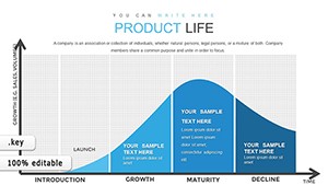
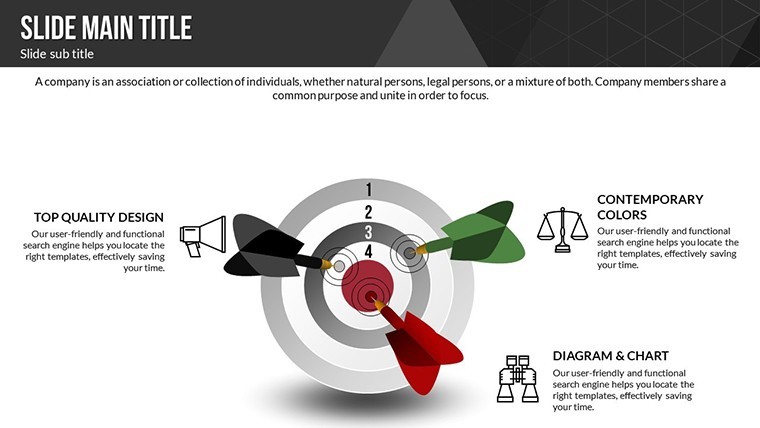
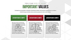
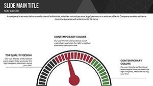
Think of facilitating a workshop where participants grasp tech's pros and cons through interactive pies dividing benefits like connectivity (60%) vs. drawbacks like addiction (40%). Exclusive to Keynote on Mac, it delivers crisp, animated visuals that make complex discussions accessible and thought-provoking.
Core Features for Balanced Tech Discussions
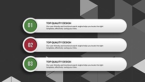
This template's strength lies in its editable prowess. The 21 slides feature colorful variations and custom animations, with vector icons and PNGs for added depth. Alter text to include specific examples, like AI's job creation vs. displacement, or recolor spheres to highlight environmental impacts.
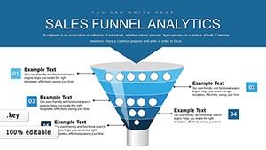
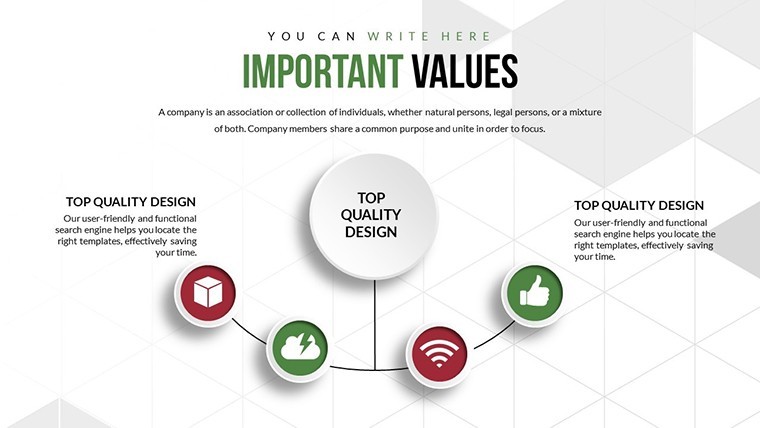
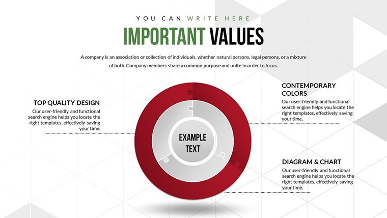
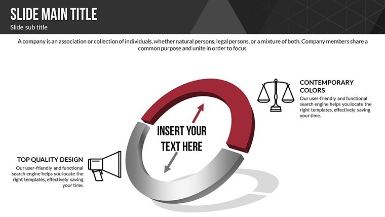
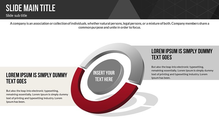
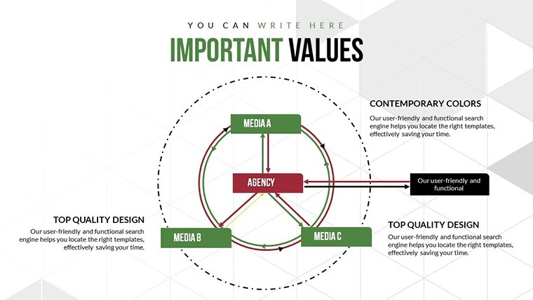
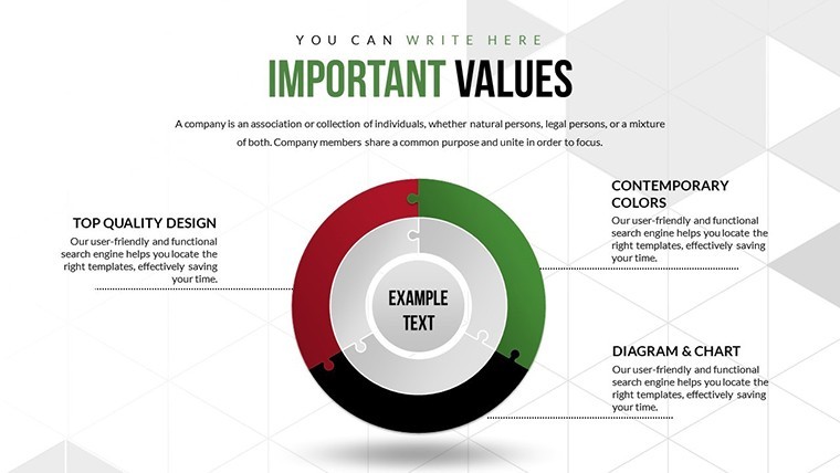
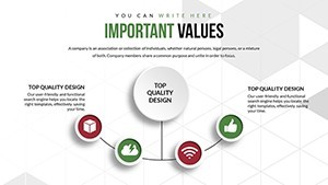
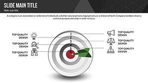
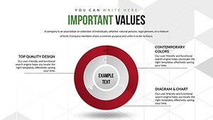
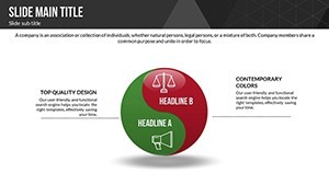
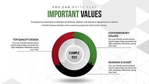
Relationship charts connect cause and effect, pies quantify percentages, and spheres represent multifaceted views - all fully modifiable. This setup supports authoritative presentations, aligning with insights from sources like the Pew Research Center on tech's societal roles.
- Animated Effects: Dynamic reveals for emphasizing shifts in tech influence.
- Vector Assets: Scalable icons for professional, high-res visuals.
- Easy Edits: Change photos or text swiftly for personalized content.
- PNG Inclusions: Ready-to-use images for quick enhancements.
By focusing on trustworthiness, the template encourages data-backed claims, such as citing MIT studies on tech's economic effects.
Practical Applications for Tech Impact Analysis
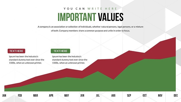
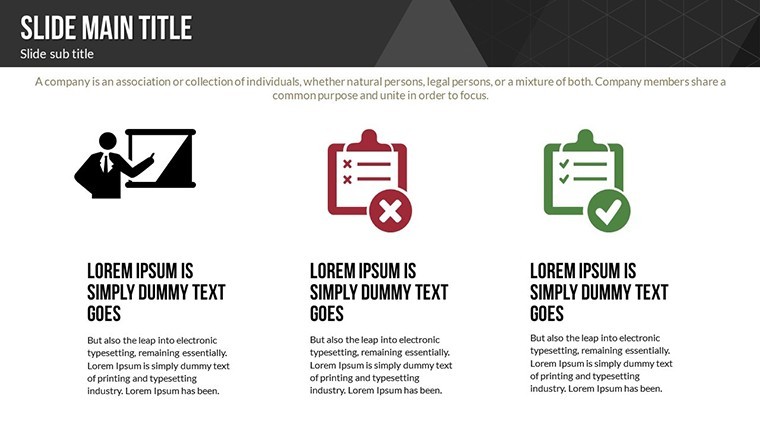
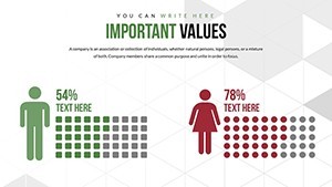
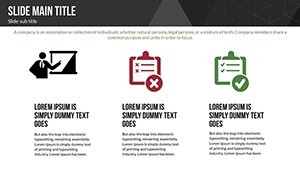
Harness this for varied scenarios. Educators teaching digital literacy can use pie charts in slides 4-7 to break down social media's positives (networking) and negatives (misinformation), fostering classroom debates with real stats from Common Sense Media.
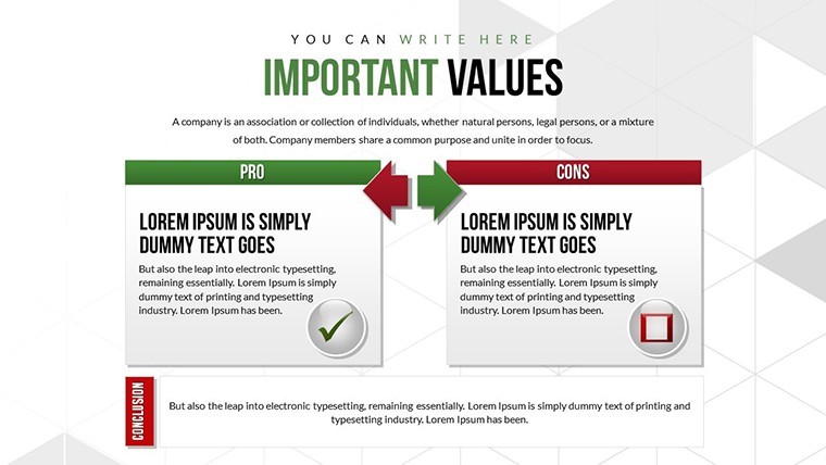
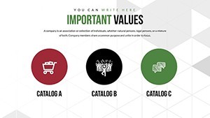
Analysts in tech firms might employ relationship diagrams to map AI ethics, showing positives like efficiency gains against negatives like bias. For environmental talks, spheres can visualize tech's carbon footprint vs. green innovations, referencing IPCC reports. Policymakers could adapt for reports on 5G deployment, balancing speed advantages with health concerns.
- Research Topics: Gather data on tech effects and populate charts.
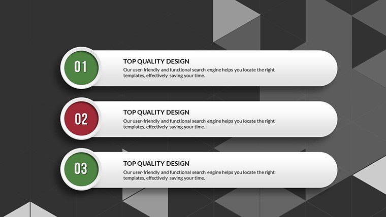
- Design Balance: Use pies for proportional views of pros/cons.
- Add Multimedia: Insert videos of tech demos for vivid examples.
- Engage Audiences: Animate transitions to guide discussions fluidly.
Outshining basic templates, its sphere elements offer 3D-like depth for nuanced topics, saving design time. Integrate with apps like SurveyMonkey for live polls, embedding results into slides for interactive sessions.
Tips for Crafting Insightful Tech Narratives
Blend LSI seamlessly: explore "digital divide implications" or "tech sustainability models." Maintain an inspiring tone - portray tech as a tool for progress, with charts illuminating paths forward. For , draw on expert views like those from Tim Berners-Lee on web ethics.
From academic lectures to corporate trainings, this template versatility shines, with export features for wider sharing.
Embrace Balanced Tech Views - Customize Today
This template isn't just slides; it's a framework for informed dialogue on technology. Priced at $20, it's accessible for all. Start exploring the effects of tech now - download and inspire change.
Frequently Asked Questions
What chart styles does it offer?
Relationship, pie, and sphere charts for multifaceted tech analyses.
Is it only for Mac users?
Yes, .key format for Keynote, with export options available.
How can animations be used?
To highlight transitions between positive and negative aspects dynamically.
Suitable for beginners?
Definitely, with straightforward editing tools.
Can I include external data?
Yes, import stats easily for customized content.
What's unique about spheres?
They provide a rounded, holistic view of complex effects.