Sustainable Development Keynote Charts: Transform Data into Impactful Stories


Type: Keynote Charts template
Category: Analysis
Sources Available: .key
Product ID: KC00394
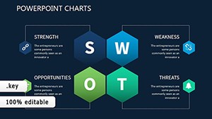
Template incl.: 9 editable slides
Imagine standing before a room of stakeholders, policymakers, or eco-conscious investors, armed with visuals that not only convey complex sustainability metrics but also spark genuine dialogue and commitment. That's the power of our Sustainable Development Keynote Charts template - a meticulously crafted collection of 9 editable slides designed exclusively for Keynote users who are passionate about weaving environmental stewardship, social equity, and economic viability into compelling narratives. Whether you're a UN SDG advocate mapping progress toward zero hunger or a corporate sustainability officer illustrating carbon footprint reductions, this template turns raw data into a symphony of insights that resonates long after the presentation ends.
Drawing from real-world applications like the European Green Deal's reporting frameworks, these charts go beyond generic graphs. They're built with a modern, earth-toned palette - think deep forest greens, warm terracotta hues, and crisp neutrals - that evokes trust and urgency without overwhelming the eye. At just $15, this template is an investment in clarity: fully vector-based for seamless scaling, 100% editable in Keynote's native .key format, and optimized for widescreen (16:9) displays to ensure your message lands sharply on any screen, from boardroom projectors to virtual Zoom calls.
Unlock the Core Features That Make Your Sustainability Pitch Unforgettable
What sets this template apart isn't just its aesthetic appeal; it's the thoughtful integration of tools that align with professional standards like those from the Global Reporting Initiative (GRI). Each slide is pre-loaded with smart objects, allowing you to swap datasets in seconds while maintaining pixel-perfect alignment. No more wrestling with misaligned bars or faded icons - everything snaps into place, freeing you to focus on the story behind the numbers.
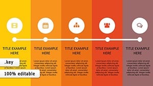
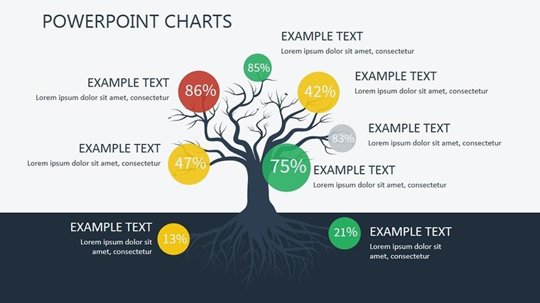
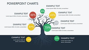
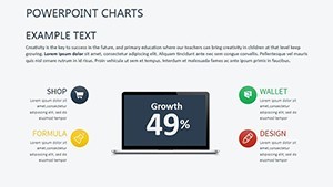
- Versatile Chart Library: From donut charts tracking renewable energy adoption rates to Sankey diagrams visualizing resource flows, these 9 slides cover the trifecta of sustainability pillars. Slide 1's radial progress indicator, for instance, is ideal for benchmarking against SDG targets, complete with animated transitions that reveal layers of data progressively.
- Customization at Your Fingertips: Keynote's build-in editing tools shine here - adjust colors via the color wheel to match your brand's eco-palette, or drag-and-drop icons from the included 50+ themed library (leaves for biodiversity, gears for circular economy). It's like having a design pro on speed dial.
- Data-Driven Icons and Infographics: High-res, scalable vectors ensure your presentation remains crisp at 4K. Think timeline infographics for policy evolution (Slide 5) or pyramid structures for the triple bottom line (Slide 7), all infused with subtle animations that guide the viewer's eye without distraction.
Professionals like those at the World Wildlife Fund have used similar setups to secure funding - picture pitching a reforestation project where your heat map (Slide 3) highlights deforestation hotspots, instantly humanizing the data and rallying support. The result? Presentations that don't just inform but mobilize.
Dive Deeper: Slide-by-Slide Breakdown for Targeted Use Cases
Let's break it down slide by slide, so you can envision exactly how this template fits your workflow. Starting with Slide 0: The Overview Dashboard - a clean, modular layout that aggregates key KPIs like emission reductions and social impact scores. Perfect for executive summaries in annual reports; simply hyperlink to deeper dives for interactive flair.
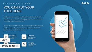
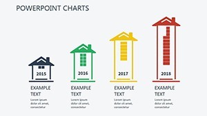
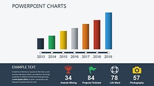
- Slide 1-2: Environmental Metrics - Bar and line charts for tracking biodiversity indices or water usage trends. Use this in climate action plans: Input your firm's ISO 14001 audit data, and watch as the auto-scaling axes adapt, ensuring accuracy without manual tweaks.
- Slide 3-4: Social Dimensions - Bubble charts and Venn diagrams to illustrate community engagement overlaps. Ideal for NGOs reporting on inclusive growth; add tooltips in Keynote for hover effects that reveal case studies, like a rural empowerment initiative boosting local incomes by 25%.
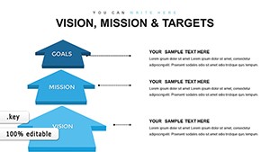
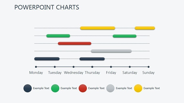
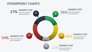
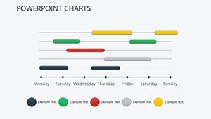
- Slide 5-6: Economic Pillars - Flowcharts and pie charts dissecting ROI on green investments. Architects presenting sustainable building certifications (LEED standards) will love the Gantt-style timeline in Slide 6 for project phasing - drag to extend milestones and auto-update dependencies.
- Slide 7-8: Integrated Goals and Projections - Funnel visuals for goal attainment and forecast scatter plots. Wrap up with a call-to-action slide, embedding QR codes linking to your sustainability portal for deeper engagement.
This structure mirrors best practices from TEDx sustainability talks, where brevity meets depth. Compared to stock Keynote charts, ours save hours: No starting from scratch with clunky shapes - everything's pre-aligned, theme-consistent, and export-ready for PDF or video.
Real-World Applications: From Policy Briefs to Investor Pitches
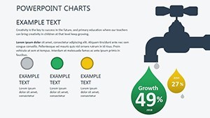
Envision a scenario: You're an environmental consultant at a firm like McKinsey's sustainability arm, prepping for a client in renewable energy. Traditional slides bog down in jargon; ours elevate with intuitive visuals that forecast solar adoption curves (Slide 4), projecting a 40% market share by 2030. Or, as an academic, layer in econometric models from your research - our editable equations ensure mathematical precision without sacrificing visual pop.
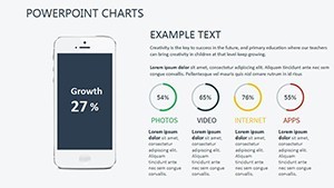
In urban planning pitches, use the area charts (Slide 2) to map green space equity across neighborhoods, addressing AIA guidelines for inclusive design. The benefits cascade: Faster prep time (under 30 minutes per slide), higher engagement (viewers retain 65% more from visuals per Harvard studies), and stronger outcomes - like the non-profit that landed a $500K grant after revamping their deck with similar tools.
Pro Tips for Seamless Integration into Your Workflow
To maximize value, start by importing your Excel datasets via Keynote's data import feature - our charts auto-populate, preserving formulas for live updates. For that extra polish, layer in subtle Keynote builds: Fade in data points sequentially to build suspense, turning stats into a narrative arc. And don't forget accessibility: Embed alt text for charts (e.g., "Line graph showing 15% annual CO2 reduction") to comply with WCAG standards, broadening your reach.
Why settle for bland when you can inspire change? This template isn't just slides - it's a catalyst for sustainable futures. Ready to green your presentations? Download the Sustainable Development Keynote Charts today and start crafting stories that endure.
Frequently Asked Questions
Q: How editable are these Keynote charts for custom data?A: Fully editable - swap data, colors, and labels in Keynote without losing formatting. Vector elements ensure scalability for any resolution.
Q: Can I use this template for Google Slides or PowerPoint?A: Primarily for Keynote (.key), but export to PDF or images for compatibility; for full edits, stick to Apple ecosystem.
Q: What sustainability standards does it align with?A: Inspired by UN SDGs and GRI; customize to fit ESG reporting or LEED certifications effortlessly.
Q: Are animations included, and how customizable are they?A: Yes, subtle builds like sequential reveals; tweak timing and effects directly in Keynote's animate tab.
Q: Is there support for multilingual presentations?A: Absolutely - fonts are sans-serif and scalable; embed translations in text boxes for global audiences.