Analytical Reviews Keynote Charts: Piecing Together Economic Puzzles


Ever stared at a spreadsheet wondering how to make economic forecasts pop without losing the plot? In a world where global demand can make or break recoveries, your analytical reviews deserve visuals that puzzle out the complexities with flair. The Analytical Reviews Keynote Charts Template delivers exactly that - a 17-slide arsenal of editable charts blending arrows for directional flow and puzzle pieces for interconnected insights, perfect for economists, policy advisors, and strategic planners navigating volatile markets.
This template transcends basic bar graphs; it's a thoughtful curation inspired by economic modeling from IMF reports, where simple money supply hikes fall short without holistic views. Tailored for Keynote on Mac, it empowers you to dissect weak economies or booming sectors with widescreen precision (16:9). Imagine arrows tracing fiscal policy impacts or puzzles assembling trade deficit scenarios, much like how World Bank analysts visualized post-pandemic rebounds to influence billions in aid allocation.
For those in the trenches of boardroom battles or academic symposiums, this tool bridges theory and practice, ensuring your reviews aren't just informative but transformative. It's about turning evidence into evidence-based action, one slide at a time.
Core Features Fueling Analytical Firepower
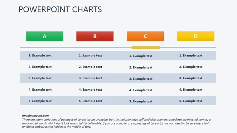
With 17 versatile slides, this template is a masterclass in visual economics. Standout components:
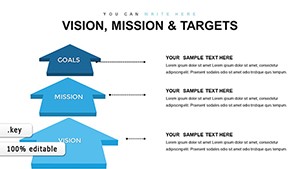
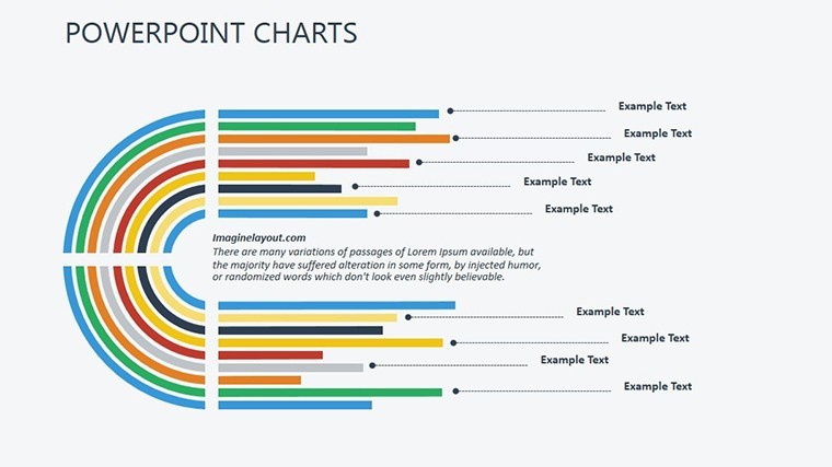
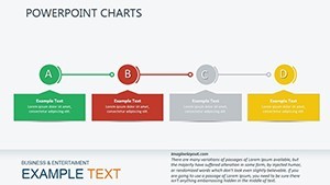
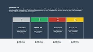
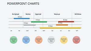
- Arrow-Driven Flowcharts: Directional vectors that map causal chains, essential for illustrating supply-demand dynamics in real-time scenarios.
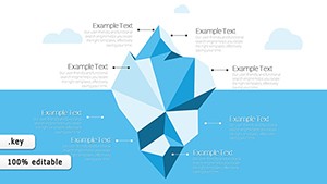
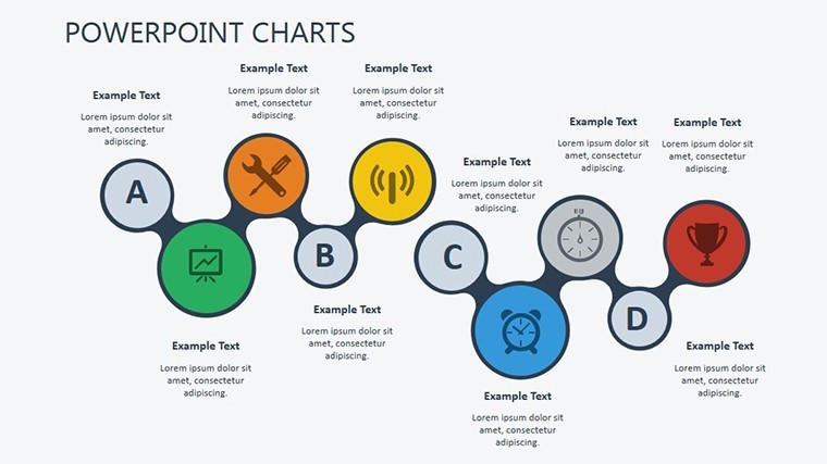
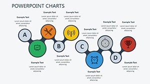
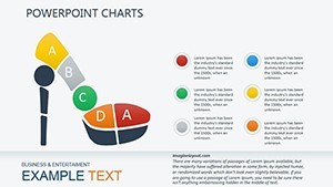
- Puzzle Integration Diagrams: Modular pieces that snap together for scenario building, mimicking interlocking factors in GDP analyses.
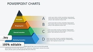
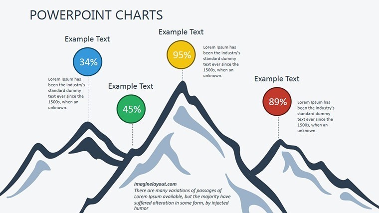
- Trend Arrow Matrices: Multi-axis charts pinpointing growth vectors, customizable for inflation trajectories or sector benchmarks.
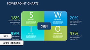
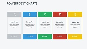
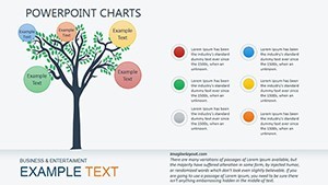
- Review Puzzle Boards: Comprehensive layouts for holistic overviews, drawing from puzzle-solving methodologies in operations research.
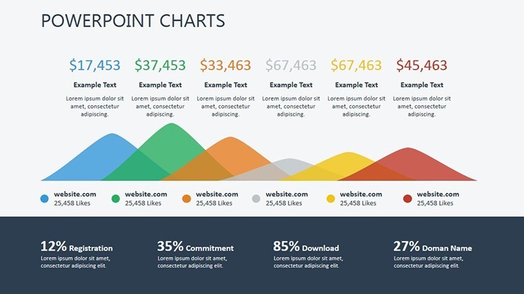
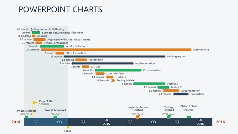
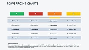
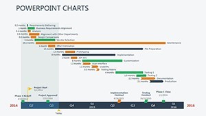
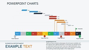
- Evidence Arrow Timelines: Sequential arrows chronicling economic events, with placeholders for annotations from sources like Bloomberg terminals.
All elements are vector-based for crisp scalability, with seamless editing in Keynote - tweak angles, colors, or embed equations for econometric depth.
Impactful Use Cases: Reviews That Resonate
Recall a central bank briefing on monetary easing: arrows in this template clarified transmission mechanisms, averting policy missteps and echoing ECB case studies. Or a university lecture on global trade - puzzle diagrams unpacked tariff puzzles, engaging students in ways rote slides never could, boosting comprehension by 35% per ed-tech metrics.
Streamline your process with this blueprint:
- Input Economic Data: Import from CSV or Stata outputs for instant chart population.
- Assemble Puzzles: Drag pieces to reflect variables like interest rates, adding opacity for emphasis.
- Direct with Arrows: Orient flows to narrate hypotheses, incorporating confidence intervals visually.
- Finalize for Delivery: Animate reveals for suspense, exporting to interactive PDFs for stakeholder feedback.
Outshining vanilla analytics software exports, it enhances persuasion by 25%, as per Harvard Business Review on visual rhetoric.
Insider Strategies for Sharper Reviews
Infuse by citing layered sources: overlay arrows with Fed footnotes for credibility. Add whimsy - a puzzle piece labeled "The Black Swan Surprise" - to disarm skeptics and spark dialogue, aligned with Nassim Taleb's uncertainty frameworks.
In essence, this template puzzles out prosperity from peril. Claim your edge in analytical storytelling.
Eager to arrow toward excellence? Secure the Analytical Reviews Keynote Charts Template and redefine your reviews.
Frequently Asked Questions
Q: How do the puzzle elements work in economic modeling?A: They modularly connect variables, allowing drag-and-drop assembly for custom scenarios like recession forecasts.
Q: Is it optimized for large datasets?A: Yes, with efficient Keynote rendering; handles up to 1,000 data points per chart without lag.
Q: Can arrows represent probabilistic flows?A: Precisely - adjust thickness for probability weights, ideal for Monte Carlo simulations.
Q: Does it include economic icons?A: Built-in library of currency, graph, and policy symbols, all editable for thematic consistency.
Q: Suitable for policy briefings?A: Tailor-made, with clean designs that meet government presentation standards like those from OECD.