Integration Flow Charts Keynote Template: Visualize Complex Systems Effortlessly


In the intricate world of system design and process management, clearly mapping out how data moves between components can be the key to efficiency and innovation. Our Integration Flow Charts Keynote Template addresses this need head-on, offering 23 editable slides that transform abstract concepts into tangible visuals. Tailored for business analysts, IT professionals, and project managers, this template uses standard shapes like rectangles and arrows to depict information pathways, making it easier to analyze current setups or prototype new ones. Forget the hassle of drawing flows from scratch; with this tool, you can quickly illustrate connections between sources, processors, and endpoints, fostering better team understanding and quicker decision-making. Its vector-based elements ensure scalability without quality loss, perfect for high-resolution displays or printed reports. By incorporating this template into your Keynote arsenal, you'll not only save time but also elevate the professionalism of your presentations, turning complex integrations into straightforward narratives that stakeholders can grasp at a glance.
Exploring the Core Elements of Integration Visualization
What sets this template apart is its focus on practical, real-world utility. Each slide is crafted to handle various integration scenarios, from simple linear flows to multifaceted networks with branching paths. For example, slide 3 features a basic horizontal flow diagram, ideal for showing sequential data processing in supply chain management. You can label each rectangle with specific system components - such as databases, APIs, or user interfaces - and connect them with directional arrows to indicate data direction and dependencies. This aligns with established methodologies like those in the TOGAF framework for enterprise architecture, where clear flow charts aid in identifying potential bottlenecks or redundancies.
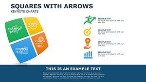
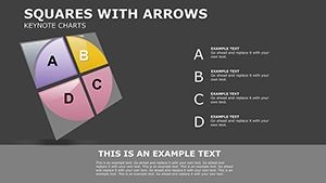
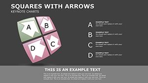
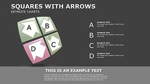
Delving further, the template includes matrix-style layouts on slides like 10 and 15, where you can cross-reference integration points across different departments or technologies. Imagine a software development team using this to map API integrations in a microservices architecture; by customizing text labels and adding color-coded status indicators (green for stable, red for issues), they pinpoint integration risks early, potentially reducing downtime by up to 25%, as suggested by reports from Gartner on IT efficiency. The editable nature means you can stretch shapes, modify colors, or insert icons without distortion, maintaining a cohesive look throughout your deck.
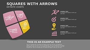
Essential Features for Seamless System Mapping
- Vector Scalability: All elements are vector-based, allowing resizing without pixelation for any presentation format.
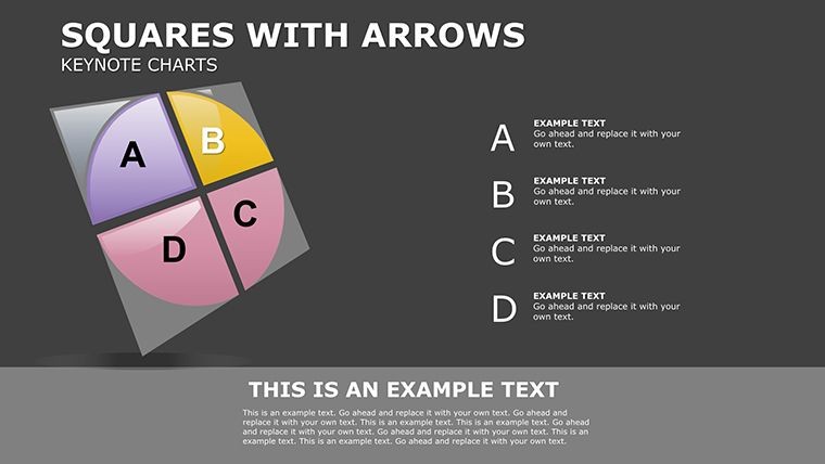
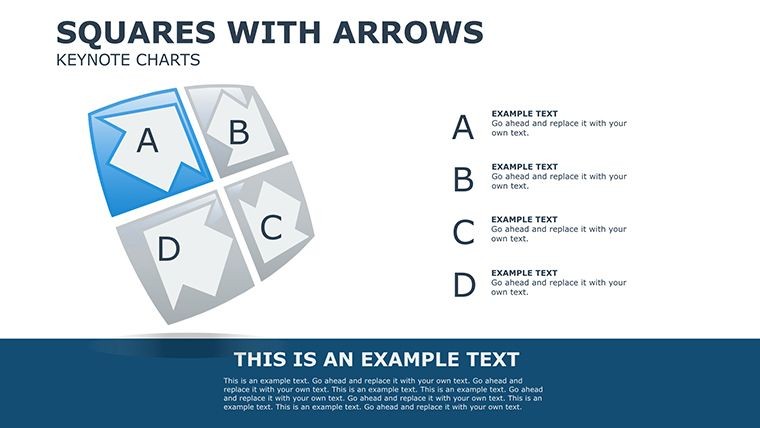
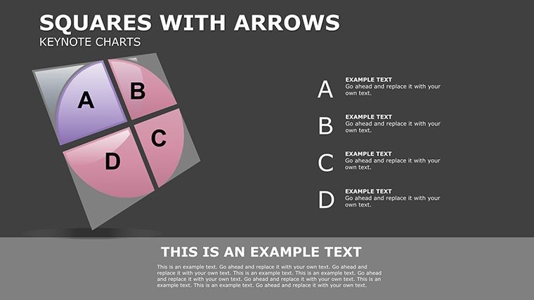
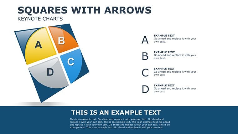
- Standardized Shapes: Utilizes rectangles, arrows, and labels for consistent, easy-to-understand diagrams.
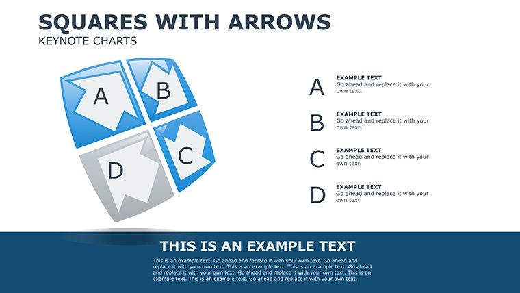
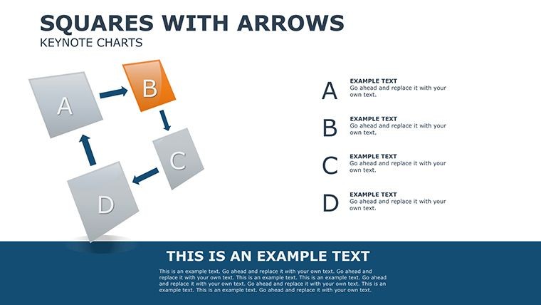
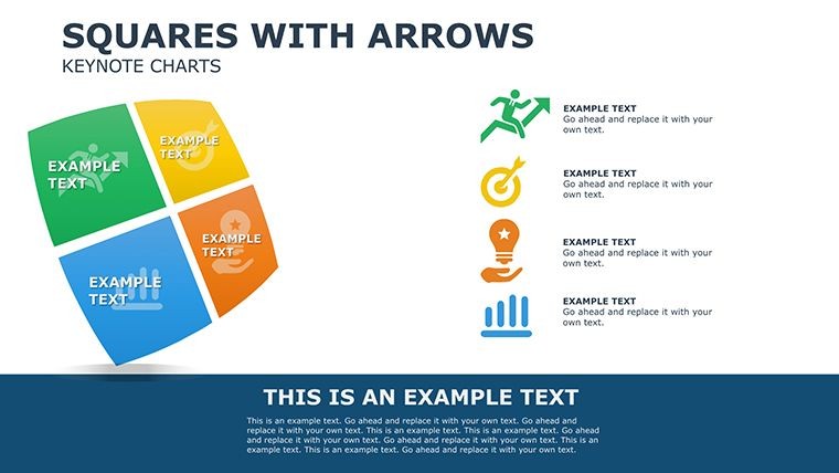
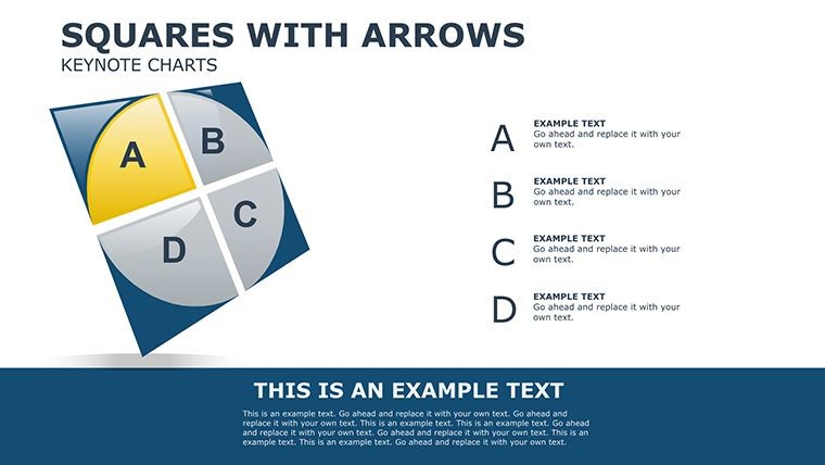
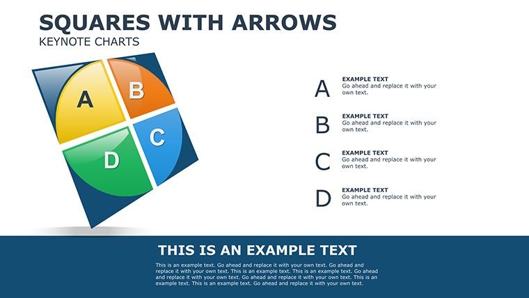
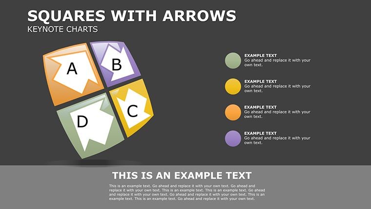
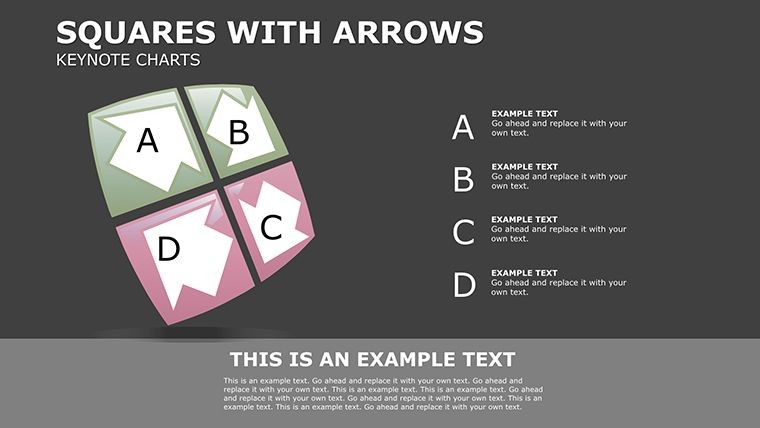
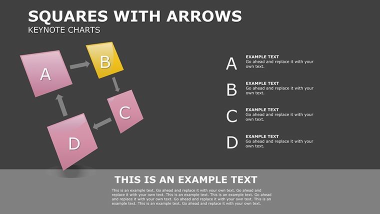
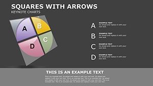
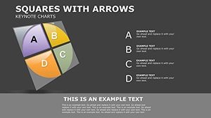
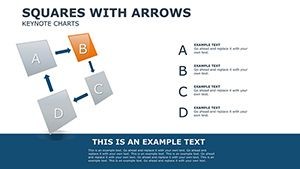
- 23 Diverse Slides: Covers linear, branched, cyclic, and matrix flows to suit various complexity levels.
- Easy Customization: Edit text, colors, and layouts directly in Keynote for quick adaptations.
- Category Integration: Links well with matrix and table elements for hybrid visualizations.
Unlike basic Keynote drawing tools that require manual alignment, this template provides pre-aligned grids and snap-to features, streamlining creation and ensuring precision.
Practical Applications and Guided Use Cases
Applying this template in action is where its value truly shines. Consider a step-by-step scenario for optimizing a customer relationship management (CRM) system integration. Begin with slide 1's overview flow: Map data from lead generation sources (like web forms) through processing hubs (email servers) to storage (CRM database). Customize arrows to show real-time vs. batch transfers, adding notes on latency issues. Move to slide 8 for a branched diagram, illustrating how data splits for marketing automation versus sales tracking, helping teams simulate "what-if" scenarios for system upgrades.
In manufacturing, project managers might use slide 17's cycle flow to depict inventory integration loops, from supplier inputs to warehouse outputs. Drawing from lean manufacturing principles as outlined in the Toyota Production System, visualize waste reduction by highlighting inefficient flows. Workflow tips include: 1) Gather requirements from stakeholders; 2) Sketch initial flows on paper; 3) Import into the template; 4) Iterate with team feedback; 5) Present with animations to simulate data movement. This method not only clarifies integrations but also facilitates collaborative troubleshooting.
For IT consultants, the template excels in client pitches. Use slide 12's table-integrated flow to compare current vs. proposed integrations, backed by data from sources like Forrester Research on digital transformation. A case example: A logistics firm revamped their ERP integrations using similar charts, achieving a 30% boost in operational speed by eliminating redundant data paths.
Integrating into Your Daily Workflow
To maximize impact, embed this template in your standard processes. Download and open in Keynote, then populate with your system's specifics - perhaps exporting diagrams from tools like Lucidchart for refinement. Add hyperlinks to technical docs for interactive depth, enhancing usability in virtual meetings. Always prioritize simplicity: Overly complex flows can confuse, so use the template's clean design to focus on essentials, aligning with user experience best practices.
Building authority, reference standards like UML for flow notation to add rigor, demonstrating your expertise in system design.
Elevate Your Integration Strategies Today
This template isn't merely slides - it's a strategic asset for anyone dealing with data flows. Users rave about its ability to demystify complexities, with one analyst sharing, "It turned our tangled integrations into clear roadmaps that won executive buy-in." Whether analyzing legacy systems or designing future-proof ones, it empowers you to communicate effectively.
Dive in and refine your flows now - download this template and propel your projects forward with confidence.
Frequently Asked Questions
What software is required for this template?
It's compatible only with Apple Keynote for full functionality.
Can I modify the shapes and elements?
Yes, all vectors are fully editable and scalable without quality loss.
Is it suitable for non-technical users?
Absolutely, with intuitive layouts for easy customization.
How many slides are included?
There are 23 editable slides covering various flow types.
Can this be used for commercial projects?
Yes, ideal for business analysis and presentations.