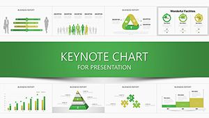
Technical Keynote Charts: Elevate Data Precision


When technical details matter, generic slides fall short. Our Technical Keynote charts template delivers 13 professional, editable slides optimized for conveying intricate information with finesse. Aimed at engineers, data scientists, and IT specialists using Mac's Keynote, this resource combines pie charts for distribution analysis, tables for structured data, and arrows for process flows. Picture streamlining a system architecture pitch or a software roadmap - these slides make it effortless, with stylish designs that command attention and foster credibility.
The Edge of Technical Visualization in Keynote
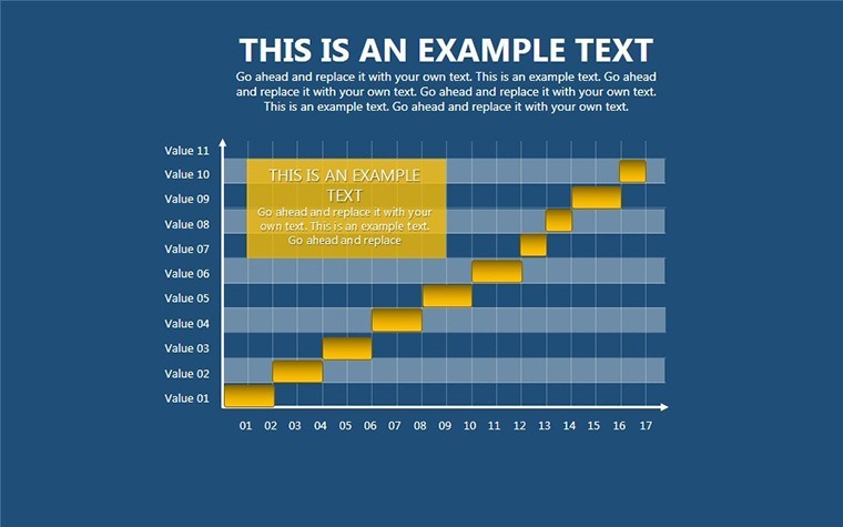
Rooted in design principles from visualization experts like Alberto Cairo, who advocates for functional beauty in charts, this template avoids fluff for focused utility. Each slide is fully customizable, letting you resize elements, alter colors, and insert specifics without hassle. For instance, use pie charts to break down budget allocations in engineering projects, where segments clearly show resource distribution, or arrows to map workflow sequences in DevOps pipelines.
Benefits abound for technical audiences. In IT, static reports often obscure insights; here, dynamic tables allow real-time updates, enhancing collaboration. A case from IEEE publications notes that well-designed technical visuals can reduce misinterpretation by 50% in complex diagrams. With .key compatibility, it's Mac-native, ensuring no export woes. Professionals save hours, redirecting energy to analysis rather than design.
Essential Features for Technical Mastery
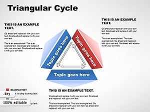
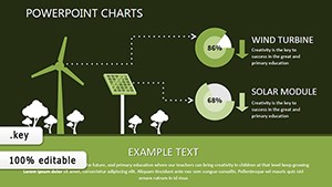
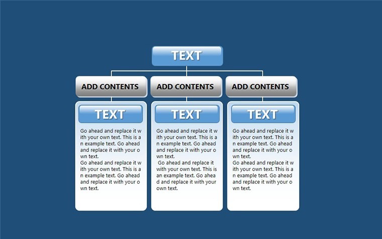
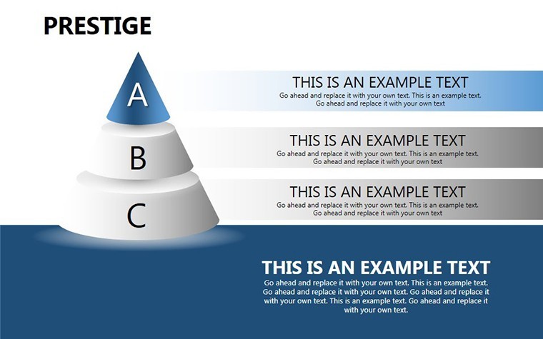
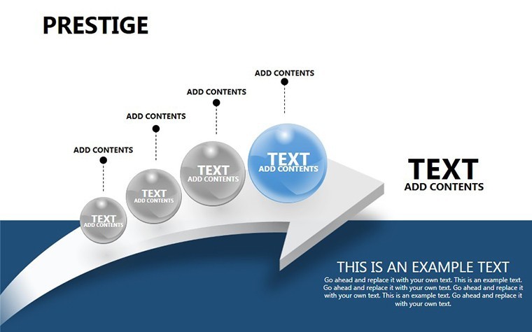
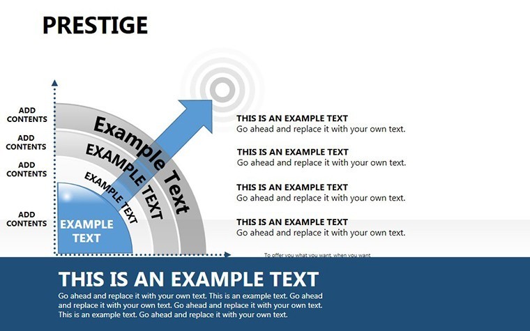
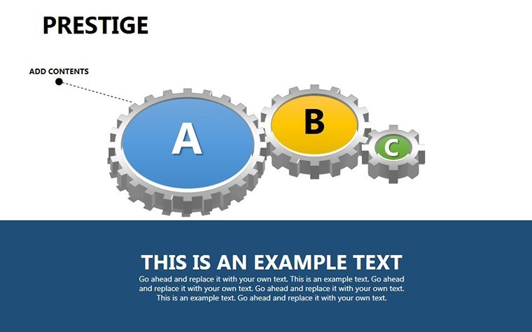
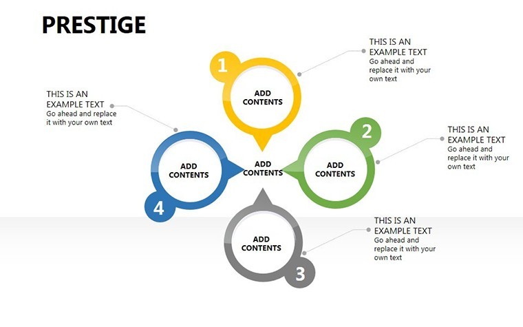
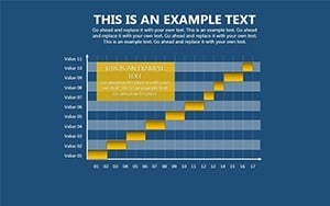
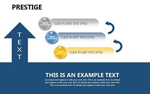
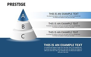
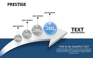
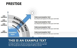
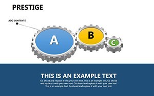
- 13 Diverse Slides: Mix of pie, table, and arrow formats for comprehensive coverage.
- Professional Styling: Clean, modern aesthetics that suit corporate or academic settings.
- Editable Elements: Adjust everything from data points to layouts intuitively.
- Integration Ready: Add to existing presentations seamlessly.
- High-Quality Vectors: Scale without pixelation for sharp projections.
Implementation is simple: Download, open in Keynote, and edit. An R&D team might use arrow charts to illustrate innovation pathways, clarifying stages from ideation to deployment.
Applications in Technical Fields
This template thrives in high-stakes environments. For software engineers, pie charts visualize code coverage metrics, highlighting areas needing attention. In manufacturing, tables organize quality control data, while arrows depict assembly lines. Unlike basic tools, these offer thematic consistency, elevating your tech talks.
Consider a cybersecurity firm using these for threat landscape overviews - pies for attack type distributions, arrows for response flows. Insights from Gartner reports show such visuals aid in faster decision-making. For academics, they structure research findings, making peer reviews more impactful.
Guide to Tailoring Technical Charts
- Choose a slide type based on your data need.
- Populate with your metrics or labels.
- Customize visuals for emphasis.
- Test for clarity in presentation mode.
- Export or share as needed.
Tips: Use monochromatic schemes for technical gravitas, per UX guidelines from Nielsen Norman Group. Ensure data accuracy to build trust.
Boosting Technical Communication
Enhance with annotations for depth, like callouts on arrows. In telecom, map network topologies; in biotech, table experiment results. The template's versatility positions you as a technical authority.
Step up your game - this is your tool for precise, persuasive tech presentations.
FAQ
- What chart types are included?
- Pie for distributions, tables for data, arrows for processes.
- Is it Mac-only?
- Yes, .key for Keynote compatibility.
- Suitable for which fields?
- Engineering, IT, data science, manufacturing.
- Can I add animations?
- Yes, Keynote's tools integrate well.
- How editable?
- Fully, from colors to content.