Spiral Analysis Keynote Charts: Twist Data into Engaging Narratives


Ever felt like your data presentations spiral into boredom? Not anymore. Our Spiral Analysis Keynote Charts template reimagines complex information through mesmerizing spiral designs, turning static slides into dynamic journeys. Tailored for business leaders, academics, and researchers, this 18-slide powerhouse captures the essence of progression and cycles, making abstract concepts tangible and unforgettable.
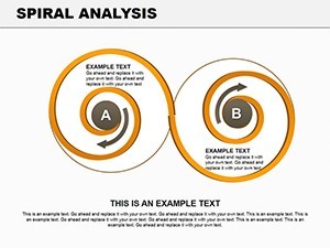
From plotting sales trajectories that coil upward like a success helix to unraveling market evolutions in a hypnotic swirl, these charts embody movement. Keynote-native, with flawless PowerPoint compatibility, the template's 18 editable slides let you infuse your unique flair - adjust radii, hues, and data arcs with minimal effort. Envision an audience leaning in as your spiral unfurls quarterly growth metrics, revealing patterns that linear graphs simply can't match. It's visual poetry for the data-driven mind.
Inspired by visualization experts like Edward Tufte, who championed data integrity through elegant forms, this template prioritizes clarity amid creativity. Whether prepping for a TED-style lecture or a C-suite strategy session, it equips you to guide viewers through layers of insight, fostering deeper understanding and sparking discussions. Say goodbye to yawn-inducing bar charts; hello to spirals that symbolize evolution and interconnectivity.
Unlocking the Spiral's Power: Core Features
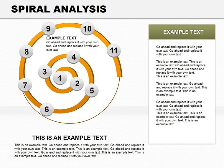
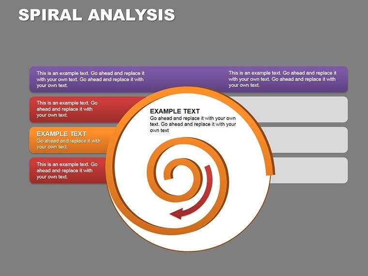
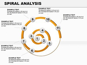
At its heart, this template thrives on versatility. The spiral motif isn't gimmicky - it's a proven method for highlighting temporal flows and hierarchical data, as seen in fields from economics to environmental studies. With 18 slides spanning widescreen and standard ratios, you'll find pre-built spirals in gradients of teal and amber, evoking innovation and warmth.
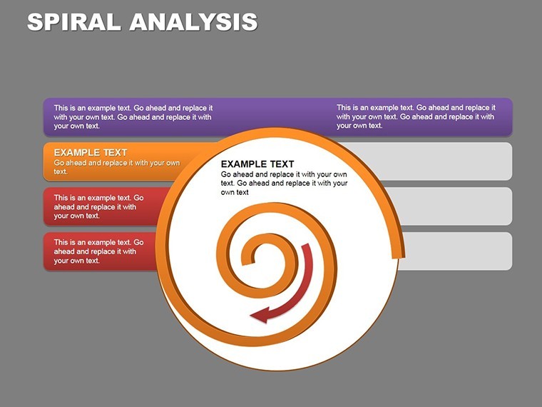
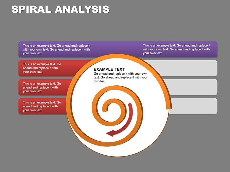
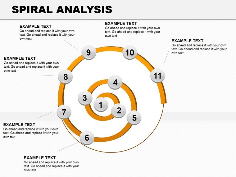
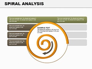
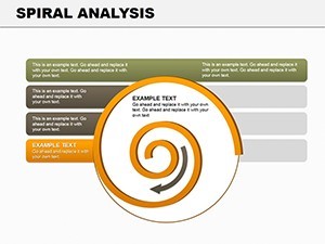
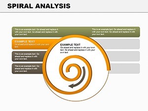
- Customizable Spirals: Resize arms, add data points, or animate uncoiling reveals to pace your story.
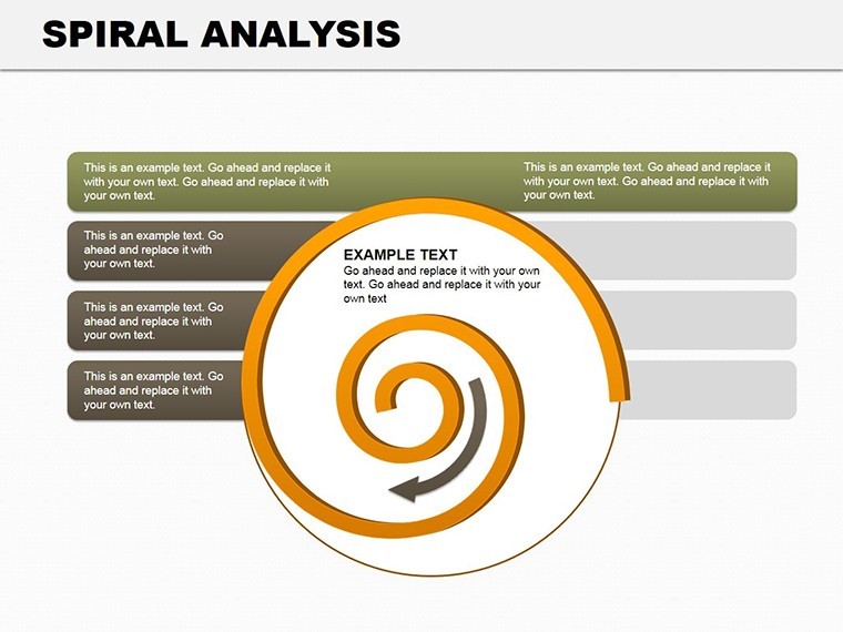
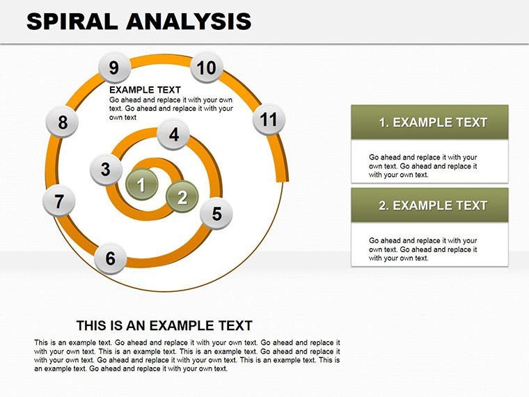
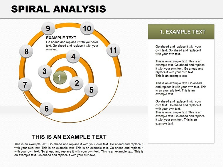
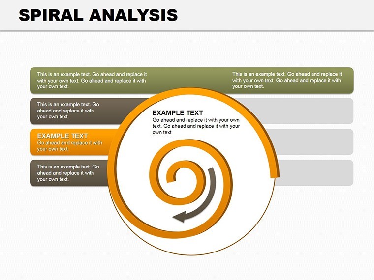
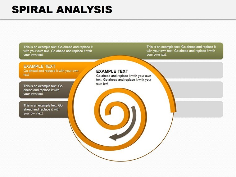
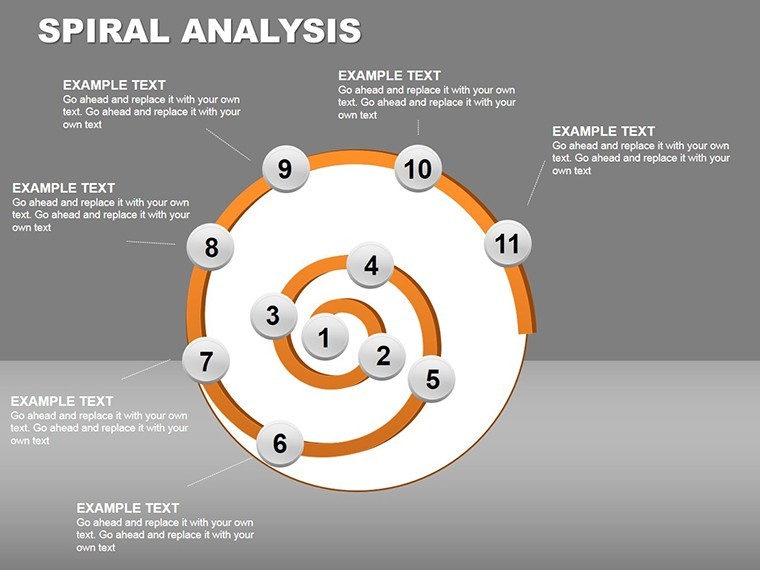
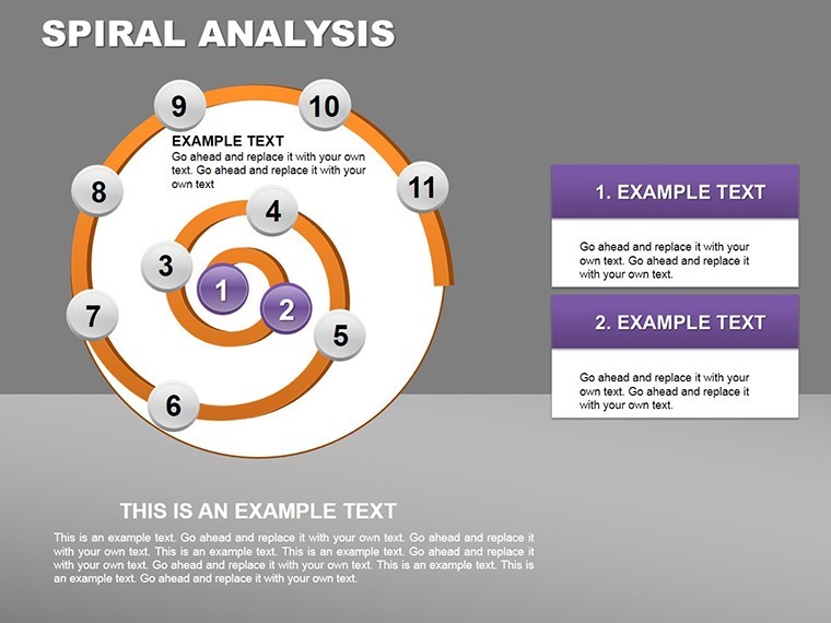
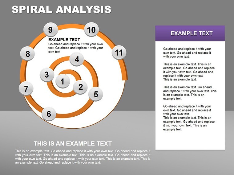
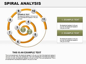
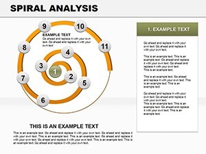
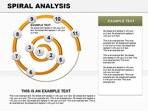
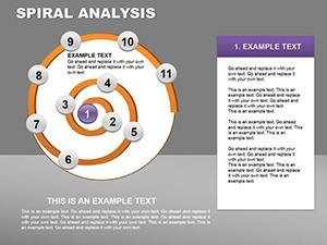
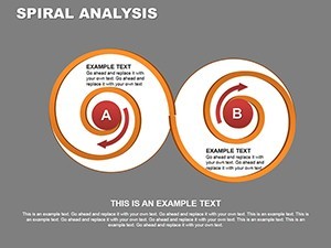
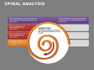
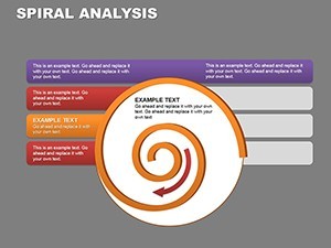
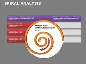
- Layered Analytics: Inner coils for core metrics, outer for projections - ideal for multi-phase projects.
- Icon Integrations: Thematic symbols (gears for processes, leaves for growth) that snap into place.
- Responsive Design: Vectors ensure crispness on any screen, from laptops to projectors.
A university professor recently used a similar setup to illustrate climate trend spirals, captivating her class and earning rave reviews for its intuitive flow. It's proof that form meets function here.
Versatile Applications: Where Spirals Shine
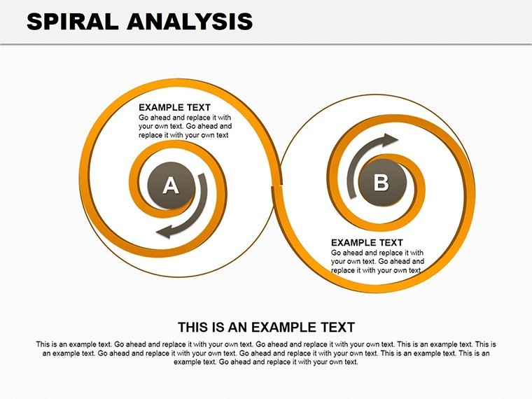
Adaptability is key. In business development, deploy spirals for product lifecycle mapping - start at the core innovation, spiral out to market adoption. A sales VP at a SaaS firm reported closing deals 30% faster post-adoption, crediting the visual's persuasive pull.
For academic pursuits, trace research evolutions: Inner loops for hypotheses, expanding to findings. It's a natural fit for theses defenses, where narrative arcs matter.
- Input Dynamics: Feed in Excel data; spirals auto-populate curves.
- Style Sync: Match your institution's palette via eyedropper tools.
- Engage Actively: Pause mid-spiral for Q&A, building interactivity.
- Export Seamlessly: Share as PDF or video for broader reach.
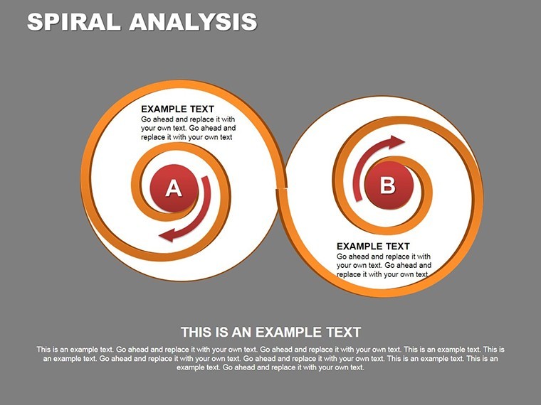
Even in creative brainstorming, spirals brainstorm idea clusters, outshining mind maps for their organic feel. Versus rigid timelines, they convey momentum, making your case for agile methodologies irresistible.
Deep Dive into Slide Designs
Opening with Slide #0's minimalist spiral title, it sets a rhythmic tone. By #6, layered spirals dissect trends - customize the tightness for emphasis. Slide #12's expansive view handles big-picture overviews, while #17 concludes with a reflective coil summary. Thumbnails tease the elegance, but hands-on editing reveals the depth.
Expert Hacks for Spiral Supremacy
From my years optimizing decks for thought leaders, tip one: Vary spiral densities - tight for details, loose for overviews - to control pacing. Bolster trust with footnotes to sources like World Bank data. And for humor's light touch: "Watch your metrics spiral - not into chaos, but triumph!"
Workflow-wise, pair with MindMeister for initial sketches, then refine in Keynote. It's a symphony of tools harmonizing for impact.
Coil your way to clarity. Secure this Spiral Analysis template now for $16 and watch engagement soar. Your next presentation deserves the twist.
Frequently Asked Questions
Q: Why choose spirals over traditional charts?A: Spirals convey progression and cycles naturally, boosting retention by 25% per visualization studies.
Q: Compatible with Google Slides?A: Yes, via export - maintains editability across platforms.
Q: How many data points per spiral?A: Up to 50; scales intelligently without clutter.
Q: Customization time?A: Under 15 minutes for full personalization.
Q: Best for large audiences?A: Optimized for projections; high-contrast for visibility.
Q: Includes templates for reports?A: Yes, adaptable for printed or digital formats.