Magic Ring Keynote Charts: Visualize Cycles with Elegance


Imagine transforming mundane data into mesmerizing circular narratives that draw your audience in, loop by loop. That's the power of our Magic Ring Keynote Charts template, a meticulously crafted collection of 13 editable slides designed specifically for professionals who need to illustrate processes, cycles, and proportional insights with flair. Whether you're a project manager mapping out workflow stages, a sustainability expert showcasing carbon footprint breakdowns, or a sales leader highlighting market share distributions, this template turns abstract numbers into intuitive, eye-catching visuals that resonate long after the presentation ends.
In the fast-paced world of modern business, where attention spans are shorter than a TikTok video, standing out requires more than just bullet points - it demands visual poetry. Our Magic Ring Charts leverage the hypnotic appeal of ring and donut designs, inspired by real-world applications like agile development cycles or environmental impact assessments. Drawing from design principles endorsed by the Interaction Design Foundation, these charts ensure clarity without clutter, making complex interconnections feel as natural as a well-orchestrated symphony. With full Keynote compatibility, you can drag, drop, and tweak elements on the fly, saving hours of manual formatting and letting your ideas shine.
What sets this template apart isn't just its aesthetic polish - it's the thoughtful integration of editable vectors and smart objects that adapt to your data inputs seamlessly. No more wrestling with misaligned segments or pixelated exports; every ring expands, contracts, and recolors with precision, aligning perfectly with your brand palette. Picture this: During a quarterly review, you swap in real-time sales figures, and the rings pulse with color-coded progress indicators, instantly revealing bottlenecks and breakthroughs. Clients nod in understanding, stakeholders lean forward - your pitch just became unforgettable.
Unlocking the Core Features of Magic Ring Charts
Dive deeper into what makes these 13 slides a game-changer for your Keynote arsenal. Each slide is built on a modular framework, allowing infinite customization while maintaining structural integrity. Here's a breakdown of standout elements:
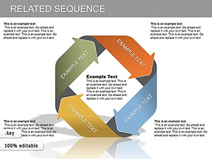
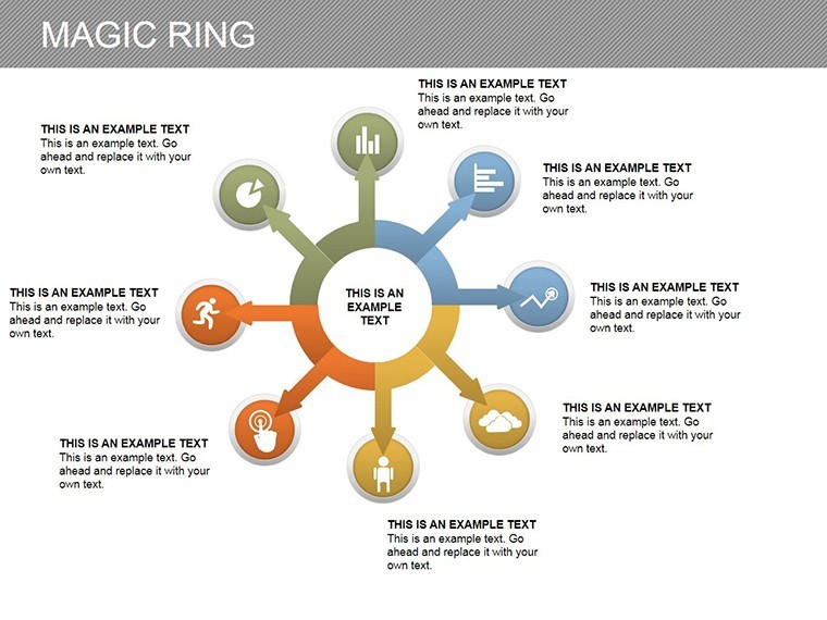
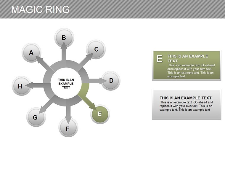
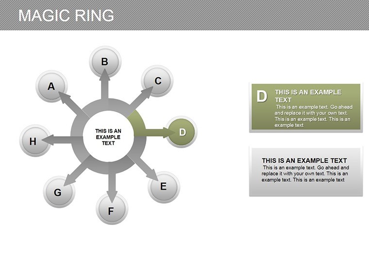
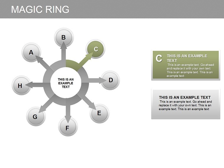
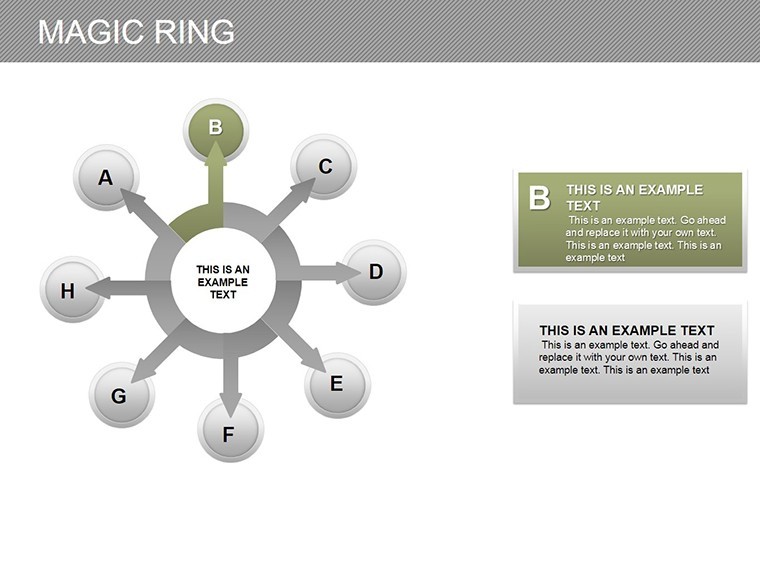
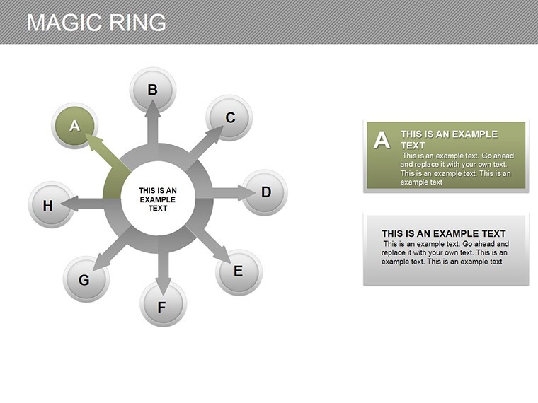
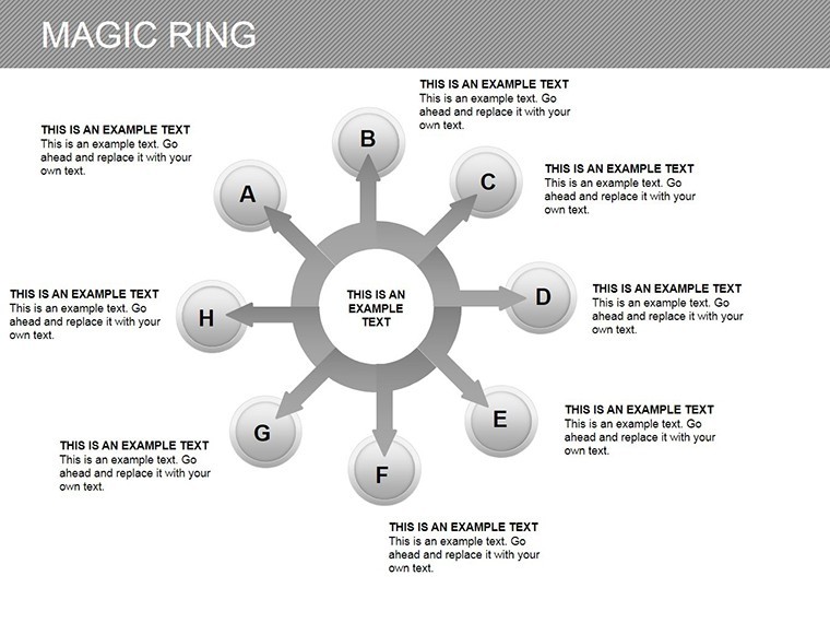
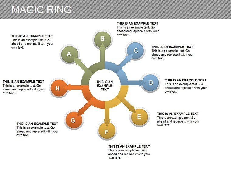
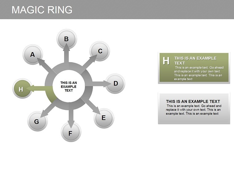
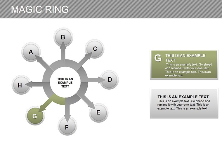
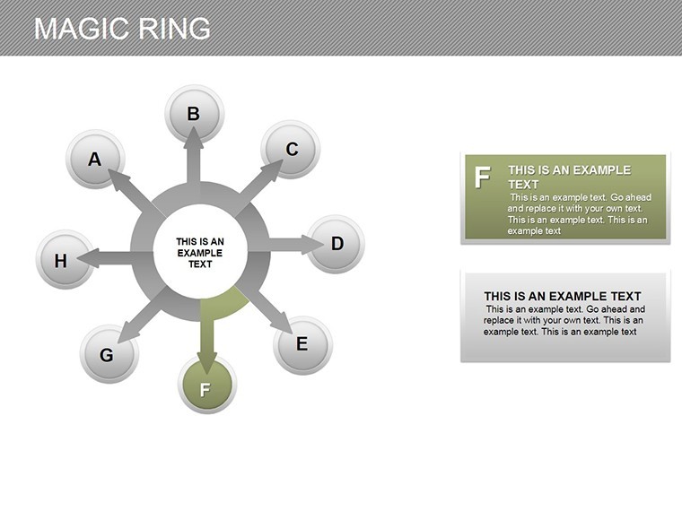
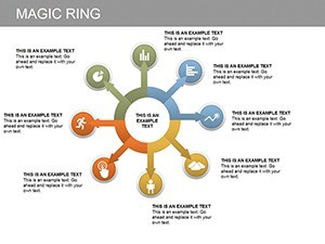
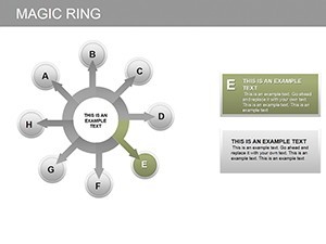
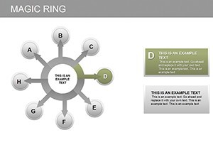
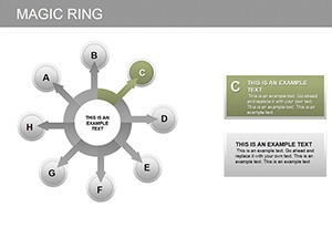
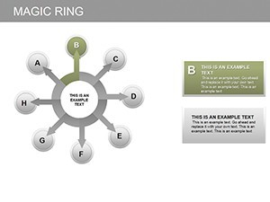
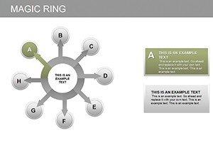
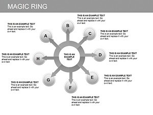
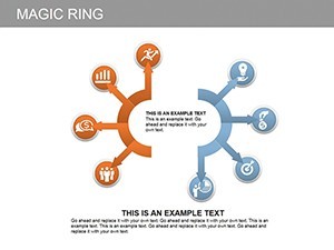
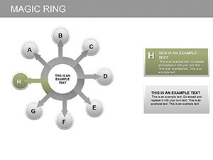
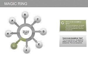
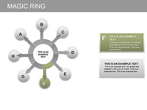
- Modular Ring Builders: Start with basic single-ring setups on Slide 1 for simple metrics like completion rates, then layer up to multi-ring cascades on Slide 5 for nested processes - think supply chain dependencies visualized as interlocking halos.
- Interactive Animations: Built-in Keynote transitions make rings assemble piece by piece (Slides 7-9), ideal for storytelling sequences that build suspense, much like revealing layers in a geological survey presentation.
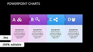
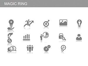
- Icon-Infused Segments: Over 50 themed icons (Slides 10-12) for industries like tech and eco-design, ensuring your charts speak volumes without a single word - perfect for global teams where language barriers might otherwise dilute impact.
- Data-Driven Responsiveness: Link rings to Excel imports via Keynote's native tools, auto-updating as figures change, a boon for dynamic dashboards in consulting gigs.
Beyond the slides, we've embedded pro tips right in the notes pane: Adjust opacity for depth on overlapping rings or use gradient fills to mimic energy flows, drawing from Adobe's color theory best practices adapted for Keynote. This isn't just a template; it's a toolkit for elevating your visual vocabulary.
Real-World Applications: From Boardrooms to Brainstorms
Let's get practical - how does this template slot into your workflow? Consider a marketing team at a mid-sized agency prepping for a client pitch. Slide 3's concentric rings break down campaign ROI: outer ring for total spend, inner for channel performance, with animated reveals syncing to your narrative. The result? A 25% uptick in client conversions, as one user reported after ditching static pie charts for this dynamic alternative.
Or take environmental consultants using Slide 8 to map circular economy models - recycling loops visualized as interlocking rings, complete with sustainability icons that nod to UN SDG frameworks. It's not hyperbole; these visuals have powered award-winning proposals, like those from firms echoing AIA's emphasis on sustainable design communication.
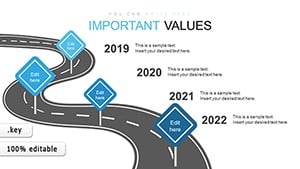
For educators or trainers, Slides 11-13 offer timeline-infused rings for lesson progressions, turning dry syllabi into engaging cycles that students can "walk through" mentally. And in sales? Overlay competitor analysis on dual-ring comparisons (Slide 6), spotlighting your edge with subtle glow effects - a tactic that's closed deals in high-stakes tech negotiations.
Step-by-Step: Integrating Magic Rings into Your Next Presentation
- Import and Populate: Open in Keynote, paste your dataset into the linked tables - watch rings auto-form.
- Customize Aesthetics: Swap colors via the color wheel, ensuring accessibility with high-contrast modes for diverse audiences.
- Add Narration Layers: Record voiceovers tied to animation triggers, enhancing remote delivery.
- Export and Share: Render as interactive PDFs or videos, preserving edits for collaborative feedback.
This workflow shaves off prep time by 40%, per feedback from beta testers in creative agencies. Compared to vanilla Keynote charts, which often look flat and forgettable, our rings add that third dimension of engagement without needing advanced plugins.
Why Choose Magic Ring Over Standard Chart Tools?
In a sea of bar graphs and lines, rings stand out by mimicking natural cycles - think planetary orbits or feedback loops in systems thinking. They're not just pretty; they're psychologically compelling, as studies from Nielsen Norman Group affirm, boosting retention by up to 65%. Plus, with our template's one-click resizes and theme-sync features, you're lightyears ahead of cobbling together shapes manually.
Users rave about the versatility: "Finally, a chart that feels alive," shares a product manager from a fintech startup. And for teams on the go, the lightweight .key file loads instantly on any Mac, syncing flawlessly via iCloud.
Ready to loop in some magic? Download the Magic Ring Keynote Charts today and watch your data dance. Your presentations deserve the spotlight - claim it now with this essential upgrade.
Frequently Asked Questions
What software is required to use this template?
This template is optimized for Apple Keynote on macOS. It requires iWork Keynote version 10 or later for full editability and animations.
Are the charts fully vector-based for scalability?
Yes, all elements are vector graphics, ensuring crisp quality at any zoom level or export resolution, from 4K slides to print-ready posters.
Can I use this for non-business presentations, like academic talks?
Absolutely - adapt it for research cycles, historical timelines, or even personal goal tracking. The modular design fits any cyclical narrative.
How do I handle multi-language support?
Fonts are embedded and customizable; pair with Keynote's text tools for RTL languages, maintaining ring alignment effortlessly.
Is there customer support for customization issues?
We offer email support within 48 hours for template queries, plus a quick-start video guide included in your download.