Empower Your Market Insights with Service Financial Analyst Keynote Charts


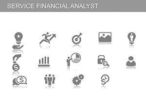


For financial analysts navigating the complexities of market sectors, precision in presentation is paramount. The Service Financial Analyst Keynote Charts template delivers exactly that, with 17 editable slides spanning hierarchy, process, pie, and analysis categories. This tool is crafted for economist experts specializing in securities, enabling deep dives into company activities like share issuances and providing actionable buy/sell/hold recommendations. Fulfill your search for robust visualization aids by transforming data into strategic narratives - whether pitching to clients or internal teams. Imagine dissecting a firm's organizational structure via hierarchy charts or forecasting trends with pie breakdowns, all while adhering to SEC guidelines for accuracy and trust.
This template's value shines in its targeted applications, saving analysts time on design to focus on insights. Benefits encompass enhanced decision-making through clear visuals, compatibility with Keynote for smooth workflows, and scalability for various report sizes. For instance, in investment banking, use it to model merger processes, referencing high-profile cases like the Disney-Fox acquisition for contextual depth. Its professional edge positions you as an authority, fostering client confidence in your recommendations.
Navigating the Slides for Comprehensive Analysis
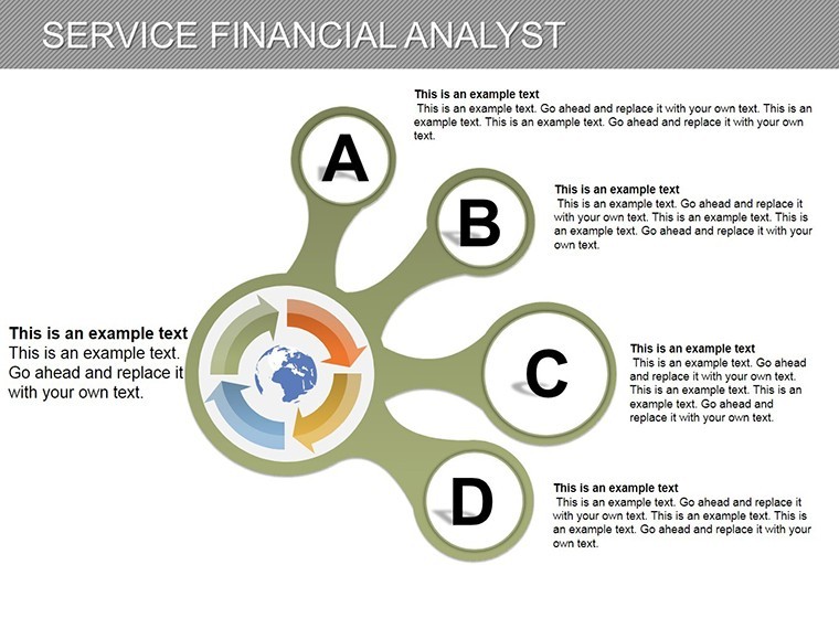
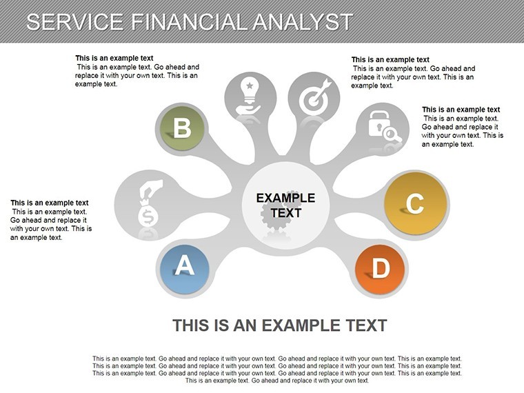
The 17 slides are strategically organized. Slides 1-4 emphasize hierarchy charts, ideal for corporate structures. Slide 2's tiered diagram can outline executive reporting lines, customizable with names and roles, drawing from org chart best practices in Harvard Business Review articles. Animate levels to build hierarchy progressively, aiding comprehension in team meetings.
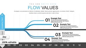
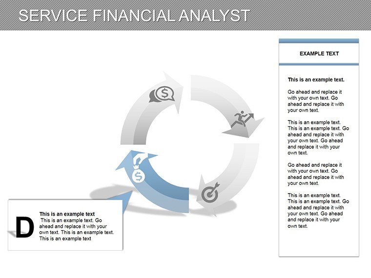
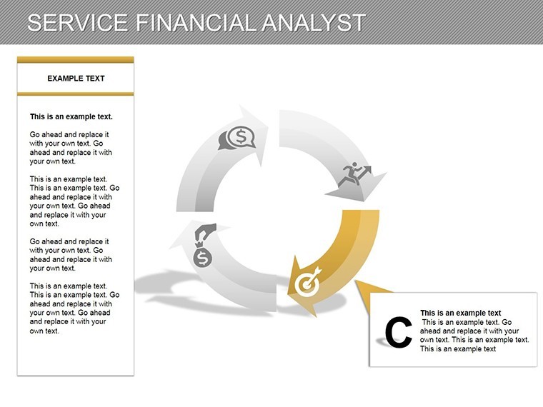
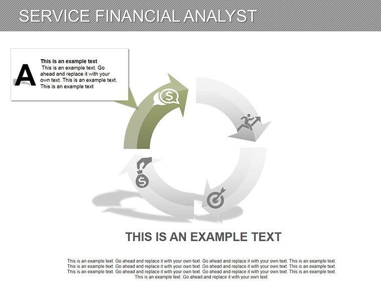
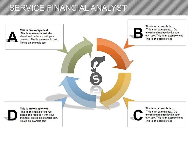
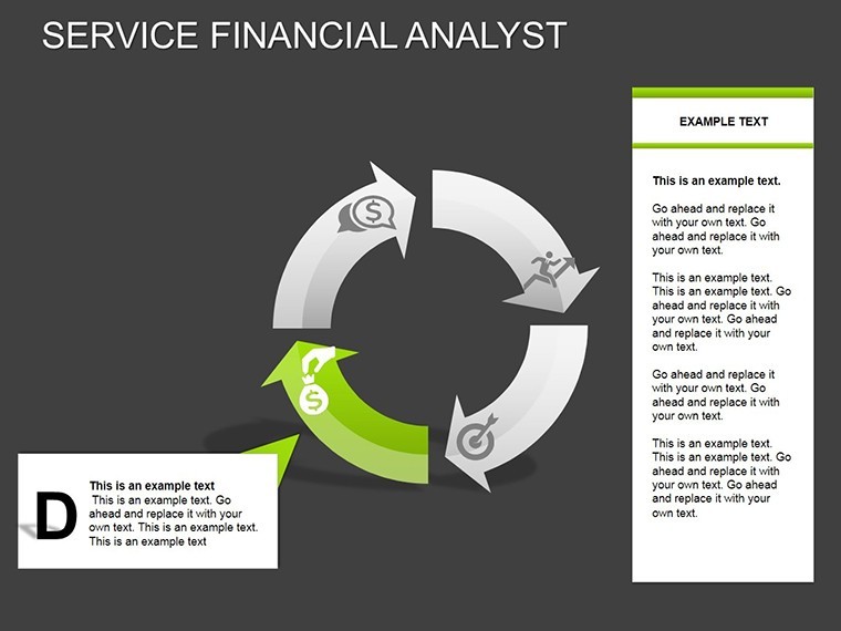
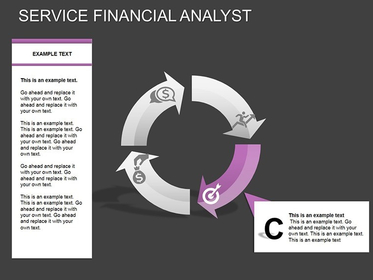
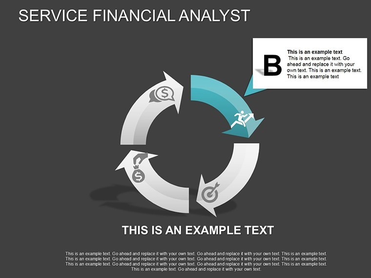
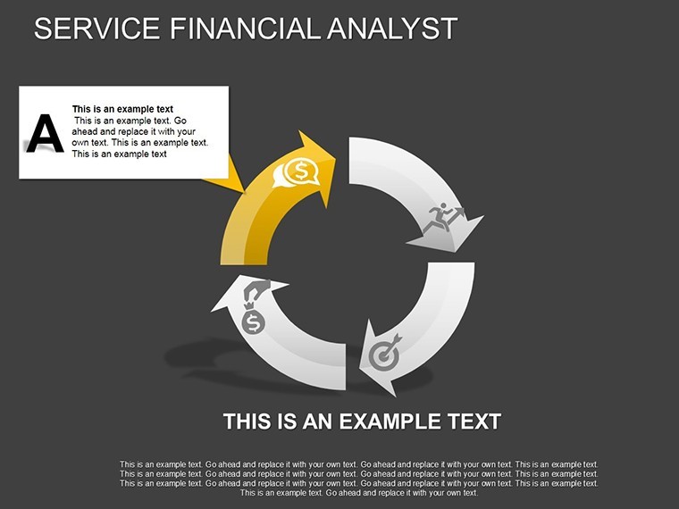
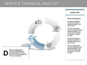
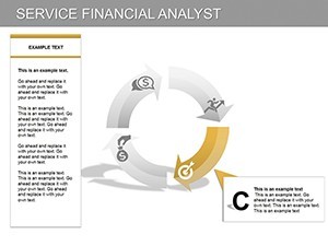
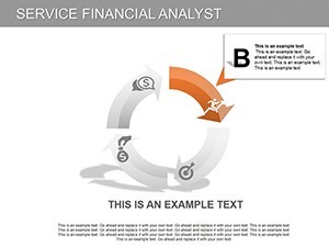
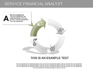
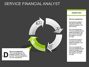
Process charts dominate Slides 5-9, perfect for sequential analyses like due diligence workflows. Slide 6 maps stock issuance steps - from filing to trading - incorporating LSI such as 'IPO processes' fluidly. Vector editing ensures crisp visuals, and tips include color-coding stages for risk levels, aligned with CFA ethical standards.
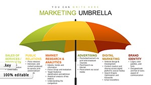
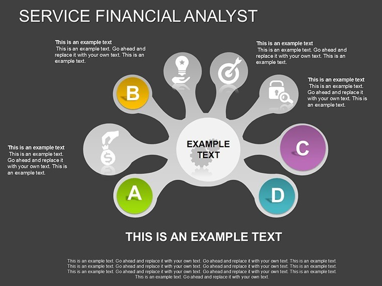
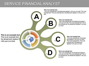
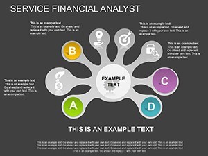
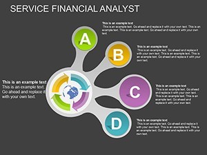
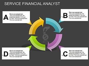
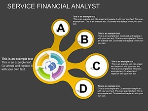
Pie and analysis hybrids in Slides 10-17 round out the set. Slide 11's pie chart segments portfolio allocations, backed by data from tools like Bloomberg, while Slide 14 combines pies with processes for valuation models. A unique feature: embed real-time charts via links, turning presentations into interactive sessions. Compared to generic slides, this offers sector-specific tailoring, reducing errors in recommendations.
Strategic Use Cases for Economists and Specialists
In practice, this template excels in securities analysis. Step-by-step for a buy recommendation: select a process slide, input company metrics, visualize growth hierarchies, and conclude with pie-based risk assessments. Reference Warren Buffett's value investing principles for boost, showing how charts mirror his annual reports. For market sector specialists, use to explore biotech firms' R&D processes, citing FDA approval sequences.
Workflows integrate seamlessly - import from financial software, edit collaboratively, and export for compliance reviews. Value props include time efficiency and visual appeal, with users noting improved stakeholder buy-in. Light touch: think of these charts as your 'crystal ball' for market foresight, minus the mysticism - pure data-driven clarity.
The Edge in Financial Storytelling
What elevates this template is its focus on analyst needs, from pie precision for allocations to hierarchy for governance. Its 17 slides provide depth without excess, with animations that underscore key points. Trust accrues through polished outputs that echo professional reports, potentially swaying investment decisions. In a field where data overload is common, this streamlines to essentials, empowering bolder recommendations.
Step up your analysis - acquire Service Financial Analyst Charts and turn data into decisive action today.
FAQ
- What categories do the slides cover? Hierarchy, process, pie, and analysis for comprehensive financial visuals.
- Is it geared toward securities analysis? Yes, perfect for exploring company activities and buy/sell/hold advice.
- How flexible are the edits? Fully editable elements, including shapes, data, and integrations.
- Can it handle complex market data? Absolutely, with scalable vectors and media support for in-depth presentations.
- What's the ideal audience? Professional economists and market sector specialists.
- Does it include animations? Built-in options to enhance dynamic storytelling.