Vortex Systems Keynote Charts Template


Navigating data-heavy presentations demands tools that swirl complexity into clarity. Enter the Vortex Systems Keynote charts template, a powerhouse with 12 editable slides crafted for Apple's Keynote. Suited for analysts in finance, sales teams pitching metrics, or project managers tracking milestones, this template employs pie and analysis-style visuals to draw audiences into the core of your insights.
Picture distilling quarterly earnings into swirling vortex designs that highlight trends at a glance. These charts go beyond basics, offering customizable elements that adapt to your narrative, saving precious time while boosting professionalism. With roots in data visualization best practices from experts like Stephen Few, it ensures your message lands with impact, whether in boardrooms or virtual meetings.
Core Features Driving Presentation Excellence
At its heart, this template features vortex-inspired designs - concentric circles and spirals that represent data flows, ideal for showing progressions or breakdowns. Each of the 12 slides is fully editable, with options to tweak colors, fonts, and data inputs seamlessly.
Standout elements include high-resolution vectors for crisp displays, pre-set animations for smooth transitions, and integration with Keynote's magic move for fluid storytelling. While Keynote-native, slides convert easily for PowerPoint users via export, ensuring cross-platform utility. This aligns with ISO standards for graphical symbols, enhancing global comprehension.
Slide-by-Slide Insights for Strategic Use
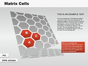
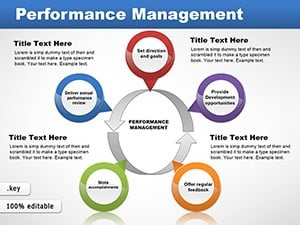
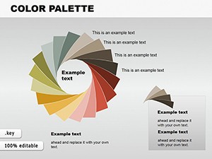
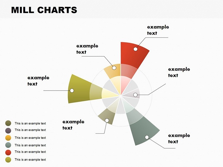
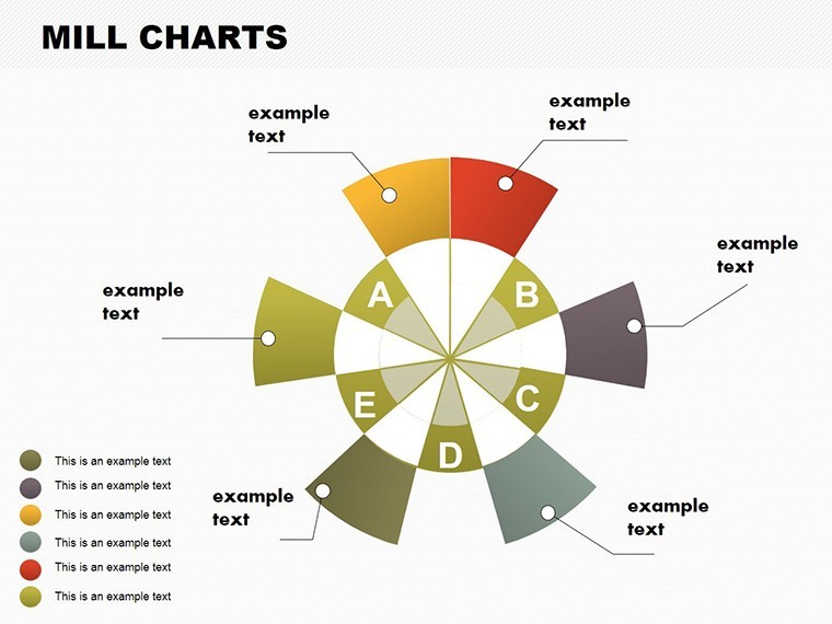
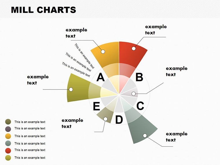
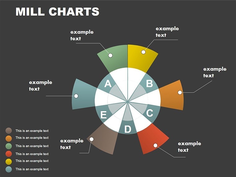
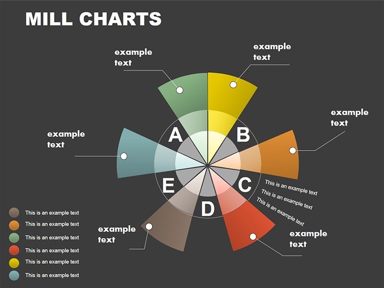
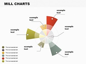
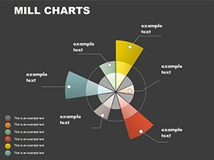
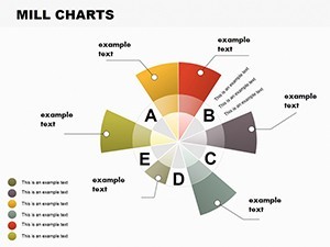
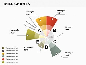
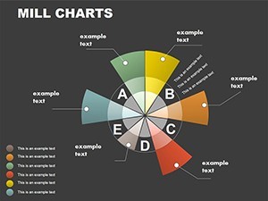
Slide 0 introduces a basic vortex pie, segmenting data like market shares with radial labels for quick reads. Perfect for overviews.
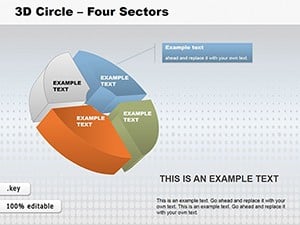
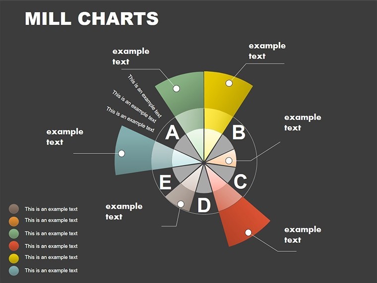
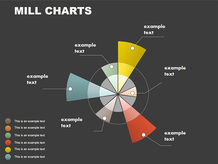
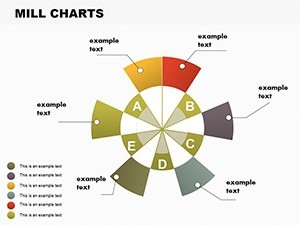
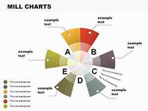
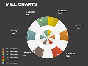
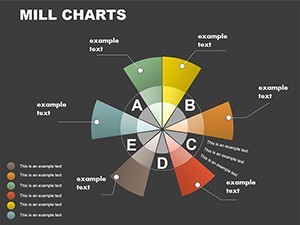
Slide 2 evolves into multi-layered vortices, layering data sets - think sales funnels narrowing from leads to closes.
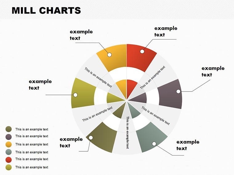
By Slide 4, incorporate bar integrations within vortices for hybrid analyses, such as budget allocations in finance reports.
Slides 6-8 focus on temporal data: spiraling timelines for project phases, with arrows indicating momentum.
Advanced options in Slide 10 include 3D vortex effects, adding depth to KPI dashboards.
Slide 11 offers comparative vortices, side-by-side for year-over-year metrics, while Slide 12 is a customizable blank for bespoke creations.
Tailored Applications and Tangible Advantages
In practice, finance pros use these for portfolio analyses, vortexes illustrating risk distributions. Sales teams diagram customer journeys, spirals showing engagement drop-offs.
Benefits include accelerated creation - cut design time by 70%, per user feedback. Visual appeal fosters better retention, as Nielsen Norman Group studies confirm. Credibility soars with polished aesthetics, trusted in high-stakes environments like investor pitches.
For marketing, visualize campaign ROIs; in education, explain scientific phenomena like weather patterns. Workflow integration: link to Excel for live data, collaborate via shared drives, or embed hyperlinks for interactive elements.
Advanced Techniques for Vortex Mastery
Enhance by syncing colors to brand guidelines - Keynote's eyedropper simplifies this. Animate data entry for dramatic reveals. For accuracy, use built-in formulas. Sidestep overload by focusing on 3-5 key segments per chart.
Example: A startup uses vortex charts to show funding rounds, spirals depicting growth acceleration, impressing VCs with clear trajectories.
Spin Your Data into Success Stories
This Vortex Systems template redefines data presentation, merging artistry with analytics for unforgettable decks.
Ready to draw your audience in? Customize these charts and propel your presentations forward.
Frequently Asked Questions
How do vortex charts differ from standard pies?
They add dynamic spirals for flow representation, enhancing analysis beyond static segments.
Can I customize data inputs easily?
Yes, direct edits or imports from spreadsheets update visuals automatically.
Are these suitable for business analytics?
Absolutely, tailored for finance, sales, and project management with professional polish.
What about animation options?
Included transitions and custom builds for engaging data storytelling.
Is export to other formats supported?
Seamless PDF or PowerPoint conversion maintains quality.