Activity Based Costing Keynote Charts: Precision in Financial Visualization


Dive into the world of sophisticated financial modeling with our Activity Based Costing (ABC) Keynote Charts template. Crafted for accountants, financial analysts, and cost managers, this comprehensive set includes 26 editable slides that demystify cost allocation. Unlike traditional methods that lump overheads indiscriminately, ABC focuses on activities driving costs, enabling sharper decision-making. Picture a manufacturing executive using these charts to pinpoint inefficiencies in production lines, leading to cost savings of up to 15% as per industry benchmarks from the Institute of Management Accountants. This template empowers you to illustrate direct and indirect costs vividly, transforming dense data into digestible insights. With categories spanning cycles, processes, and pies, it's versatile for everything from budgeting sessions to strategic planning, all while allowing seamless color and theme adjustments in Keynote.
Mastering Cost Allocation Through Visuals
Activity-based costing revolutionizes how businesses attribute expenses, linking them directly to outputs. This approach, popularized in the 1980s by experts like Robin Cooper and Robert Kaplan, highlights value-adding activities versus non-essential ones. Our template embodies this by providing charts that map cost drivers, such as machine setups or quality inspections. For a real-world touch, consider how a healthcare provider might use these to allocate nursing costs per patient procedure, aligning with standards from the Healthcare Financial Management Association. By downloading this, you're not just getting slides - you're acquiring a toolset for forensic financial analysis that boosts accuracy and stakeholder buy-in.
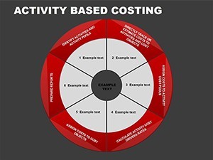
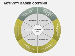
In-Depth Slide Overview: Building Blocks for ABC
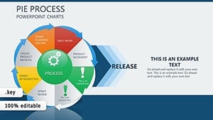
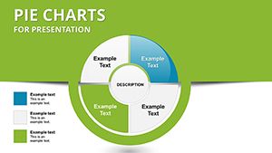
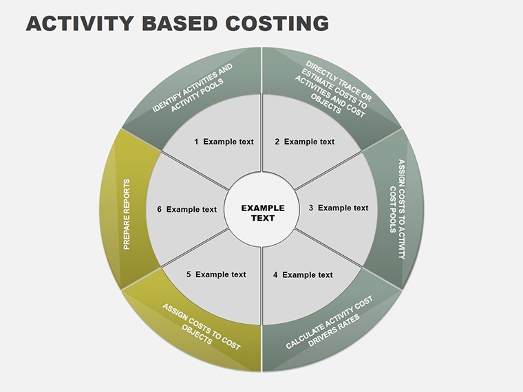
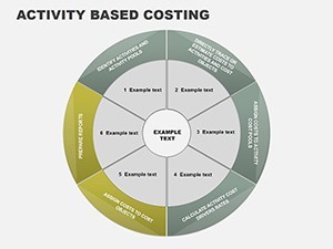
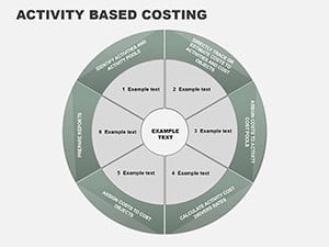
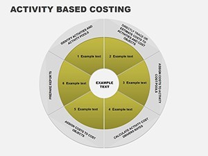
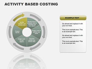
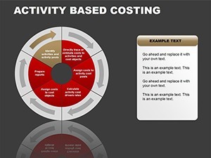
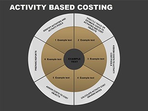
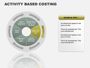
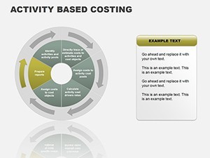
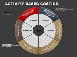
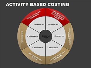
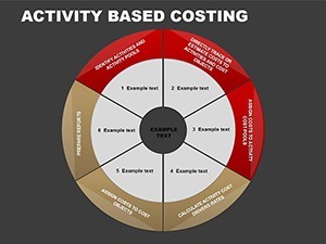
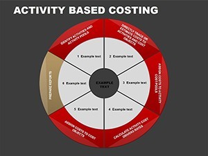
- Slide 1: ABC Fundamentals - Overview pie chart showing cost distribution basics.
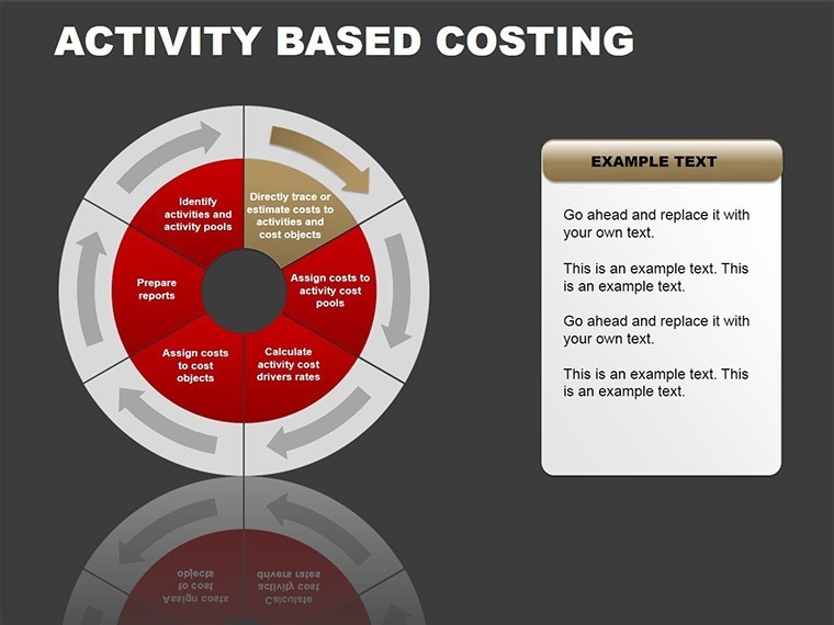
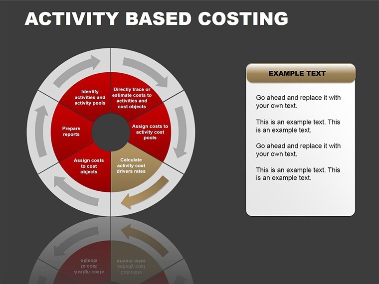
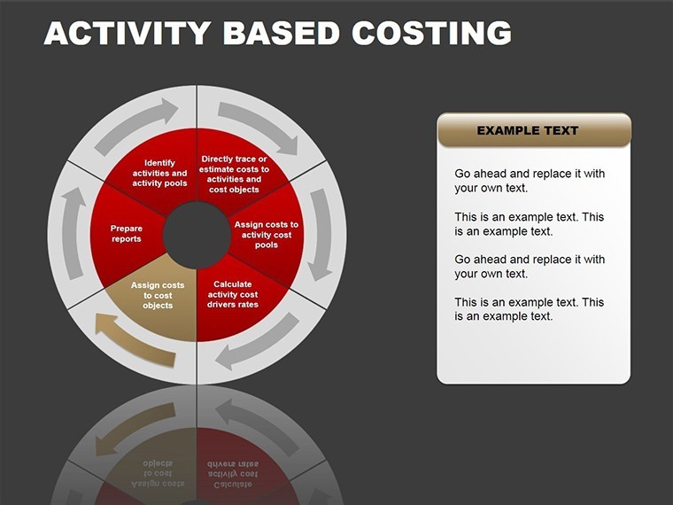
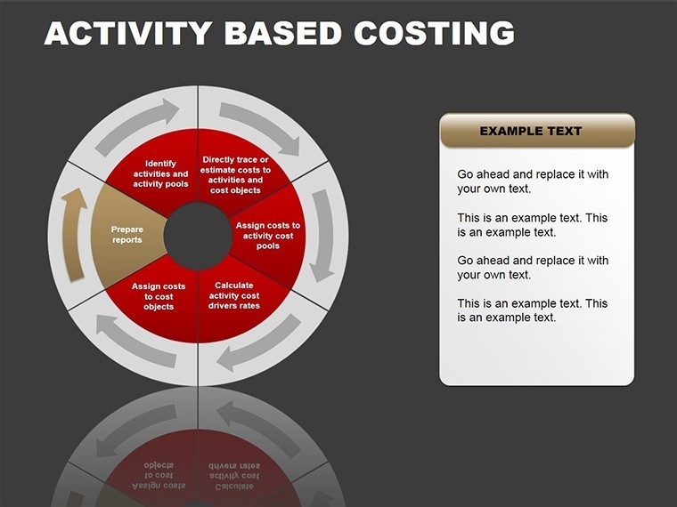
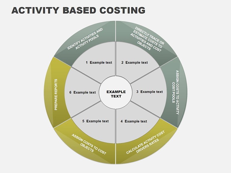
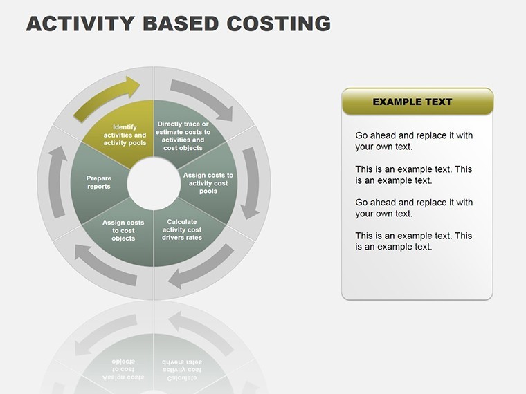
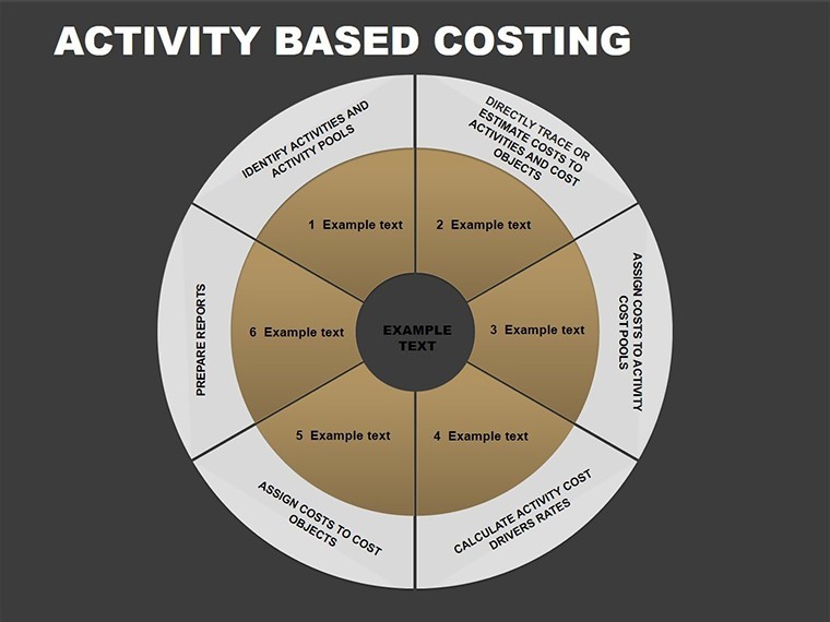
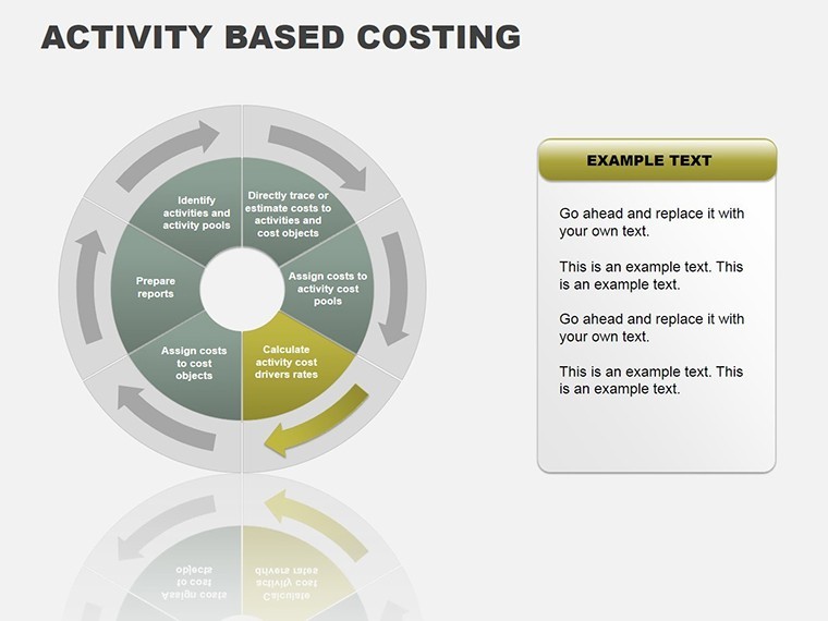
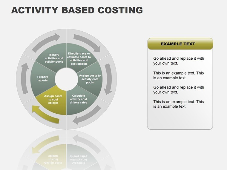
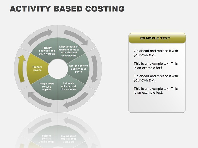
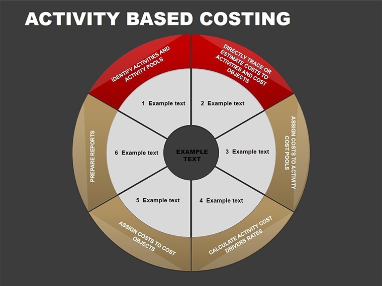
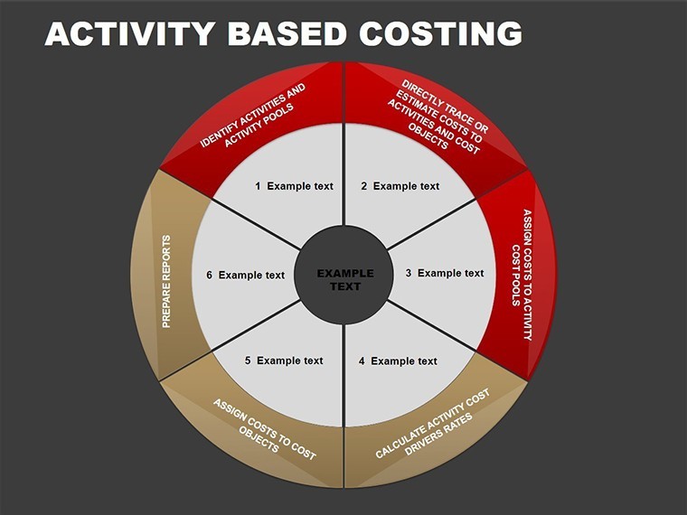
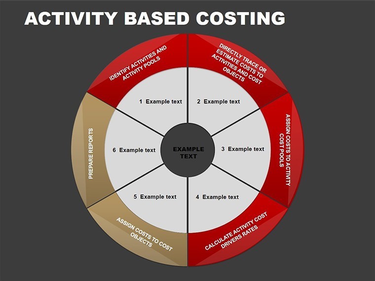
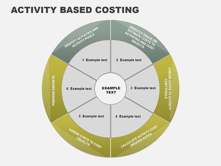
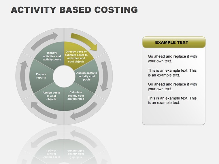
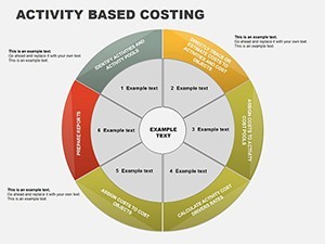
- Slide 2: Activity Identification - Cycle diagram for listing key activities.
- Slide 3: Cost Driver Mapping - Process flow with arrows linking drivers to costs.
- Slide 4: Resource Allocation Pie - Segmented pie for resource breakdown.
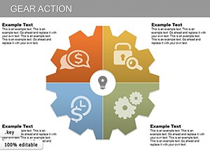
- Slide 5: Overhead Analysis - Bar-integrated cycle for indirect cost visuals.
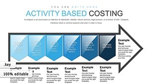
- Slide 6-10: Detailed Process Cycles - Variations for manufacturing, service, and retail scenarios.
- Slide 11-15: Comparative ABC vs. Traditional - Side-by-side pies and processes highlighting differences.
- Slide 16-20: Case Study Integrations - Editable templates for inserting real data examples.
- Slide 21-24: Advanced Metrics - Incorporating KPIs like cost per unit in dynamic charts.
- Slide 25: Summary Dashboard - Holistic view combining all elements.
- Slide 26: Customization Guide - Tips for tailoring to your needs.
These slides leverage Keynote's vector capabilities for crisp, professional outputs, compatible across Mac and iPad versions.
Practical Scenarios: Applying ABC in Action
In a consulting firm, an analyst could use these charts to advise clients on product profitability, revealing hidden losses in low-volume items. Or in education, professors teaching managerial accounting might employ them to simulate real business environments. This template addresses common pitfalls like over-simplification in standard costing, offering nuanced views that foster better resource utilization. Drawing from authoritative sources like the CMA certification guidelines, it ensures your presentations meet professional standards.
Guided Workflow: Implementing ABC in a Report
- Open the template in Keynote and select a base slide, e.g., Slide 3.
- Input activities: Label with specifics like "Order Processing" or "Inventory Management."
- Assign costs: Use editable fields to enter data from your ERP system.
- Visualize drivers: Adjust pies to reflect proportions accurately.
- Compare methods: Duplicate slides for side-by-side traditional vs. ABC views.
- Present and iterate: Use animations to reveal insights step-by-step.
This method tackles the challenge of communicating complex finances, making abstract concepts concrete and persuasive.
Pro Tips from Financial Design Experts
Keep color schemes consistent with corporate guidelines - use Keynote's eyedropper for precision. Integrate with tools like Excel for data import, enhancing trustworthiness. Unlike generic chart makers, this template avoids bloat, focusing on ABC-specific elements for efficiency. For , cite sources within slides; our design supports footnotes seamlessly. In comparisons, ABC charts often outperform traditional ones in clarity, as evidenced by studies in the Journal of Accountancy.
Embracing ABC through visuals isn't just trendy - it's essential for competitive edge in cost-conscious industries. This template, with its process infographics and cycle diagrams, positions you as a forward-thinking professional.
Elevate Your Financial Narratives
Incorporate LSI terms like cost tracing diagrams and activity pools naturally to enrich content. The result? Presentations that not only inform but drive operational improvements.
Transform your costing strategies - secure this template now and lead with data-driven confidence.
Frequently Asked Questions
What makes ABC charts different from traditional costing visuals?
They focus on activities as cost drivers, providing more accurate allocations than volume-based methods.
Can I integrate real-time data into these slides?
Yes, link to spreadsheets or use Keynote's data tools for dynamic updates.
Is this suitable for non-finance audiences?
Absolutely, the visuals simplify concepts for executives and teams.
How do I customize for different industries?
Edit labels and examples to fit, like manufacturing vs. services.
Does it support team collaboration?
Keynote's sharing features allow real-time edits.
Are there export options?
Export to PDF, PowerPoint, or video for versatility.