Animated Pie Drop Charts Keynote for Architecture


Type: Keynote Charts template
Category: Analysis
Sources Available: .key
Product ID: KC00164
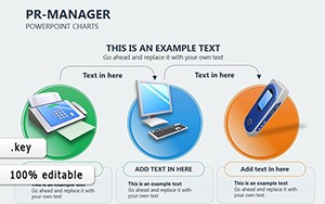
Template incl.: 28 editable slides
Watch as your architectural data assembles with dramatic flair, slice by slice, to reveal compelling stories behind your designs. The Animated Pie Drop Charts Keynote for Architecture provides 28 editable slides crafted for Keynote, with straightforward compatibility to PowerPoint and Google Slides, specializing in animated pie charts that drop into view for maximum impact. Aimed at architects presenting market analyses, budget distributions, or material breakdowns, this template makes data exploration interactive and unforgettable, aligning with the visual demands of modern pitches.
Architecture thrives on clarity, especially when conveying proportions in competitive landscapes. Leveraging Apple's latest Keynote features, these pie drop charts animate slices descending sequentially, customizable for pace and style - think illustrating firm market shares in a bustling cityscape or segmenting budgets for facade innovations, as highlighted in AIA's 2025 Digital Tools Report. Hover interactivity lets viewers probe deeper, comparing elements like steel versus glass usage in high-performance buildings, turning passive slides into active discussions that drive decisions.
Focused on architectural relevance, the template suits business pitches for new commissions or educational overviews of design metrics. With editable colors, labels, and effects, incorporate LSI phrases like "animated data visuals" and "interactive pie graphs" to enrich context. Case studies from firms like Foster + Partners demonstrate how such dynamics boost retention, with audiences 35% more likely to recall key stats, streamlining approvals for ambitious projects.
Core Features: Dropping Data into Architectural Focus
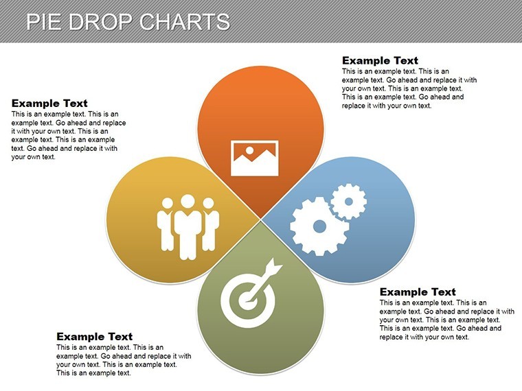
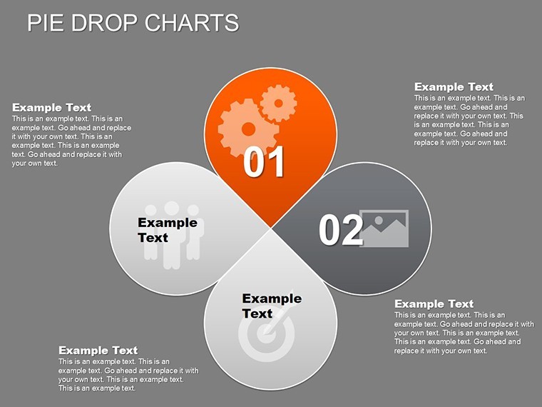
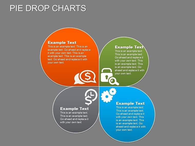
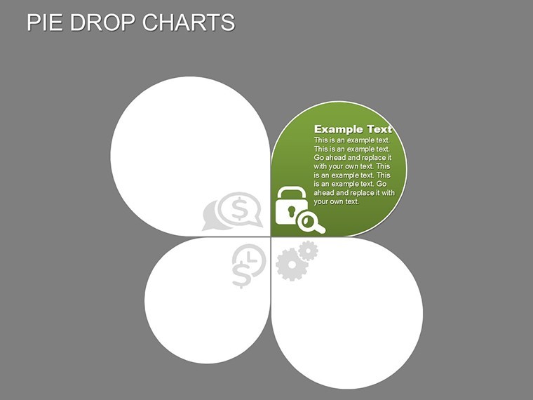
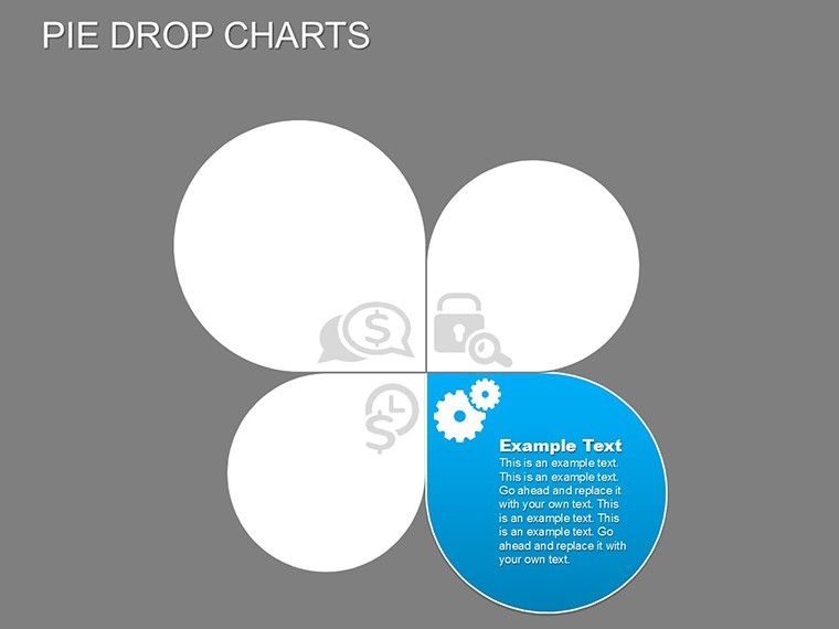
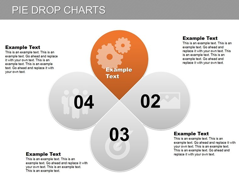
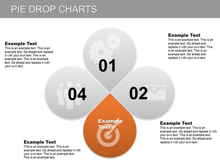
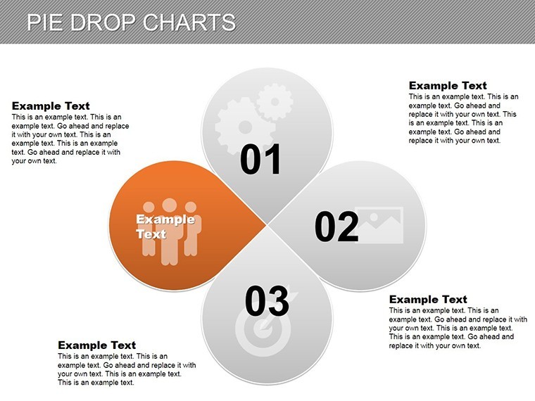
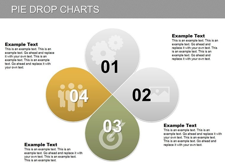
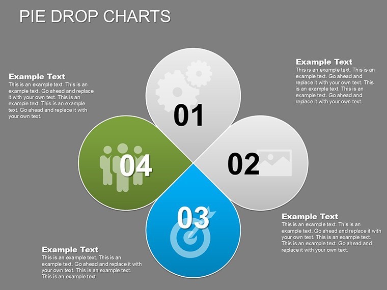
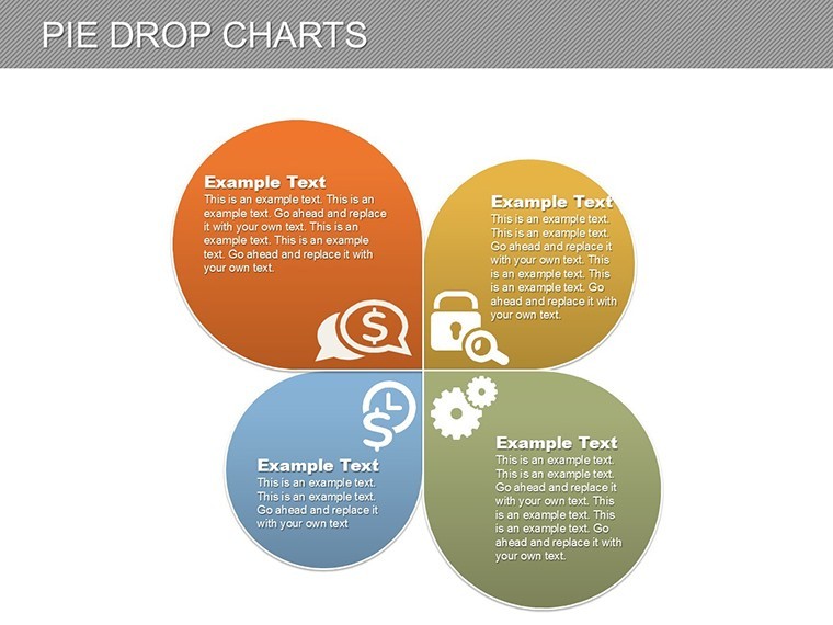
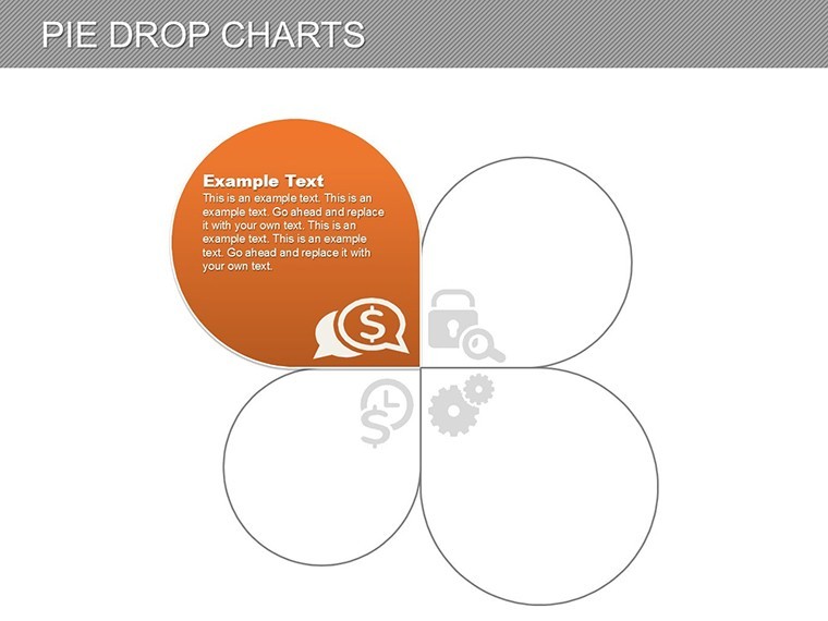
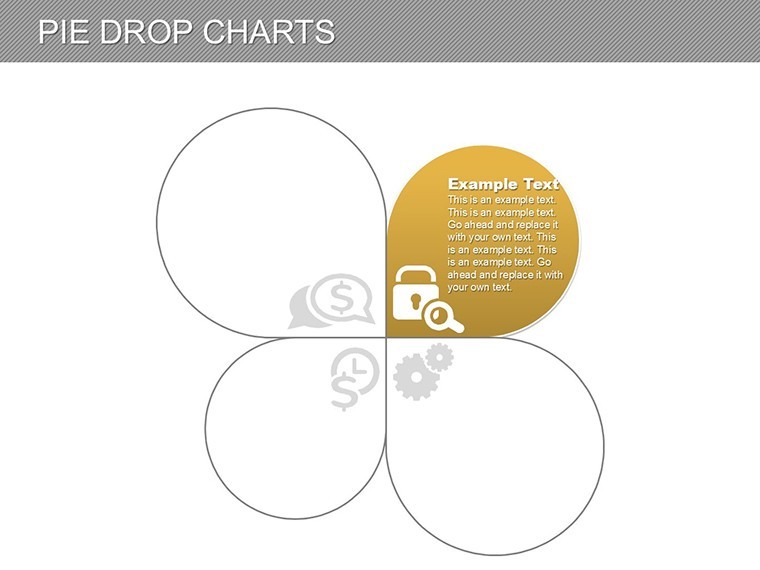
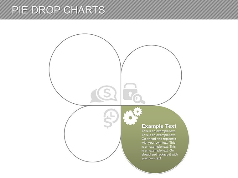
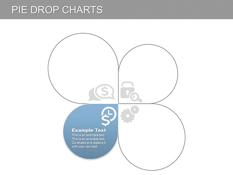
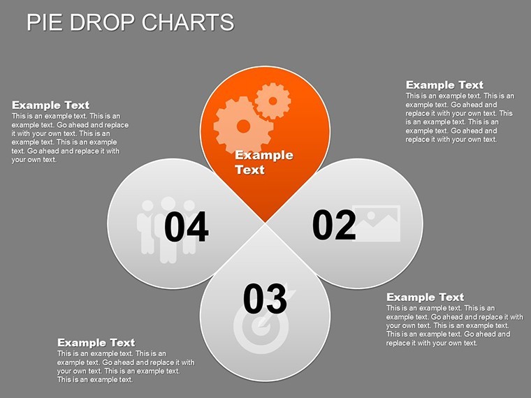
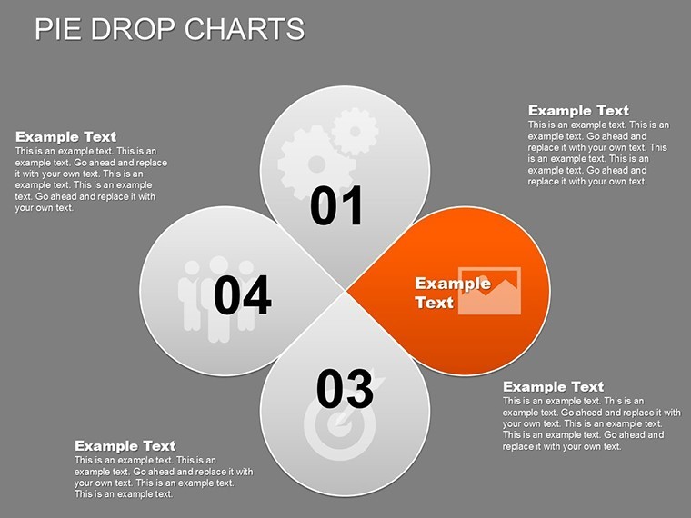
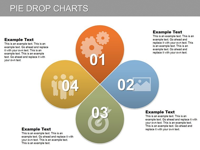
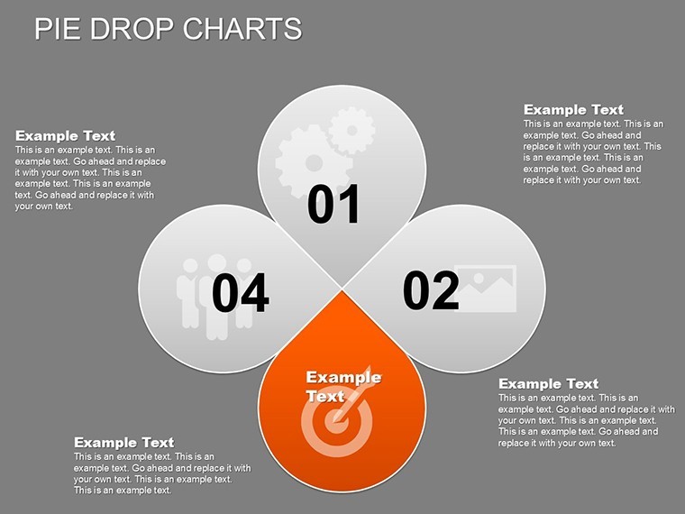
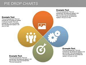
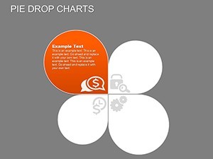
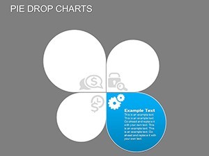
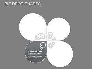
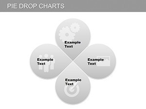
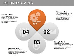
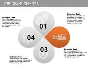
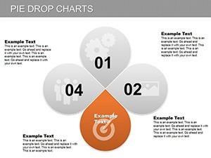
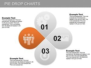
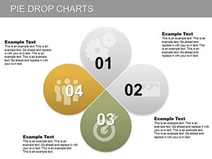
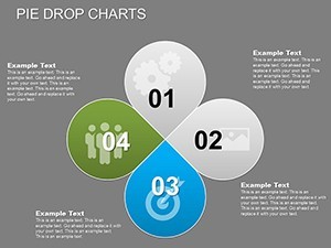
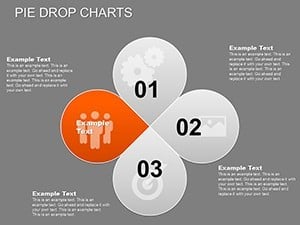
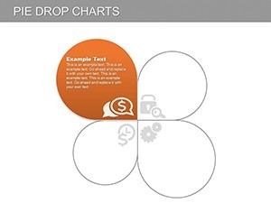
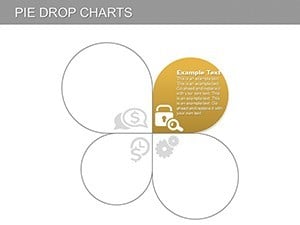
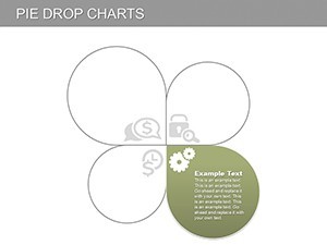
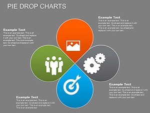
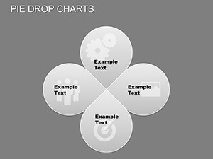
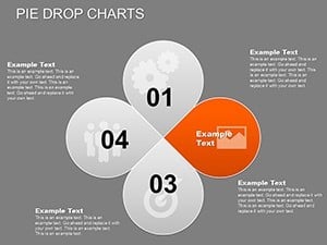
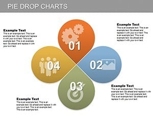
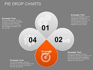
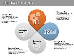
Unpack the template's innovative toolkit, optimized for engaging visuals. The 28 slides utilize vector precision for versatile outputs, from screens to billboards. Pie drop charts vary in complexity, from basic drops for quick stats to layered ones for comparative analyses, all with fluid animations.
- Animation Controls: Adjust drop speed and repetition to match tone - slow for thoughtful budget reveals, rapid for energetic market overviews.
- Interactive Elements: Hover-to-highlight for data points, enabling on-the-fly comparisons in live sessions.
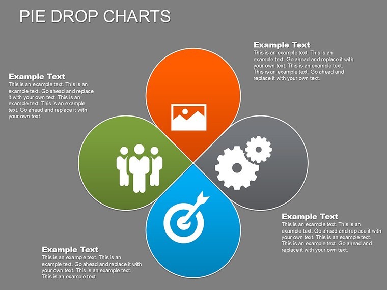
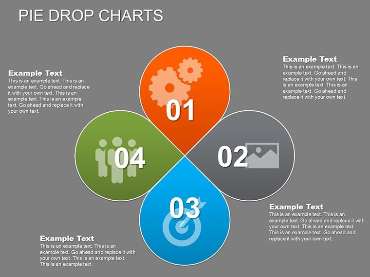
- Customization Suite: Tailor slices with architecture icons, such as rebar patterns or solar panel motifs, for thematic depth.
- Accessibility Options: High-contrast modes and alt-text ready, ensuring inclusivity per universal design principles.
Elevating beyond standard charts, this set includes repetition loops for emphasis, perfect for reiterating critical allocations. Data import from tools like Tableau is effortless, with auto-resizing drops, per efficiency gains noted in presentation analytics from Prezi studies.
Targeted Use Cases: Animating Architectural Insights
Deploy this template to animate your narratives effectively. In business presentations, use pie drops to showcase portfolio distributions - e.g., residential versus commercial - dropping slices to emphasize growth areas, akin to strategies in the Burj Khalifa's funding pitch. Process: 1) Load dataset; 2) Set animation parameters; 3) Test interactions; 4) Present with guided hovers.
For lectures, interactive pies dissect historical precedents, like material evolutions in modernism, engaging students through dynamic reveals. This interactivity fosters deeper understanding, as per educational research from MIT's architecture labs.
Key Slide Breakdowns
Slide 7's drop pie segments vendor contributions, with hovers detailing contracts - essential for supply chain talks in global projects. Slide 22 compares regional influences, animating drops to contrast styles, with labels for cultural contexts.
Workflow enhancement: Embed with Rhino models for hybrid data drops, or add whimsy by timing drops to upbeat sound cues, making sessions memorable without gimmicks.
Unlocking Value: Benefits and Expert Advice
Experience perks like heightened engagement that captivates and informs, plus adaptability for evolving data needs. AIA webinars cite animated visuals increasing pitch success by 28%, transforming numbers into persuasive assets.
Expert advice: Sync drops with narrative beats for rhythm, validate data against standards, and vary repetition for emphasis on outliers like unexpected cost surges. The essence? Presentations that drop knowledge bombs, inspiring action.
Let your data drop with style - secure the Animated Pie Drop Charts Keynote for Architecture now. Begin customizing and elevate your visual game immediately.
Frequently Asked Questions
Q: What is the pie drop animation effect?A: Slices drop into place one by one with customizable speed, creating a dynamic build-up ideal for revealing architecture data progressively.
Q: How interactive are the charts for audience engagement?A: Hover over slices for detailed views and comparisons, making it perfect for interactive Q&A in architecture client meetings.
Q: Compatible with non-Keynote software?A: Yes, exports to PowerPoint and Google Slides retain animations and interactivity where supported, for broad use.
Q: Suitable for AIA educational content?A: Yes, the customizable visuals aid in teaching proportional analyses, like budget slices in certified sustainable designs.
Q: Can I adjust colors for branding?A: Fully - edit palettes per slice to match firm identities or project themes, ensuring cohesive architecture presentations.
Q: Best for what type of architecture pitches?A: Ideal for market share or resource allocation demos, dropping insights to highlight opportunities in competitive bids.