Benchmarking Analysis Charts for Keynote: Gain Competitive Edges


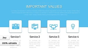
In today's fast-paced business landscape, staying ahead means learning from the best. Our Benchmarking Keynote charts template provides 12 editable slides to systematically evaluate competitors and integrate superior practices into your operations. Aimed at executives, analysts, and consultants, this tool facilitates deep dives into economic activities, from performance metrics to innovation strategies. Visualize comparisons in cycles, pies, and arrow-driven flows, making abstract benchmarking concrete. It's invaluable for strategy sessions where you dissect rival strengths to fortify your own. With easy edits and Keynote compatibility, you bypass design hurdles, focusing on insights that drive growth. Users find it transformative, turning data into actionable plans that enhance efficiency and profitability.
Mastering the Science of Competitive Analysis
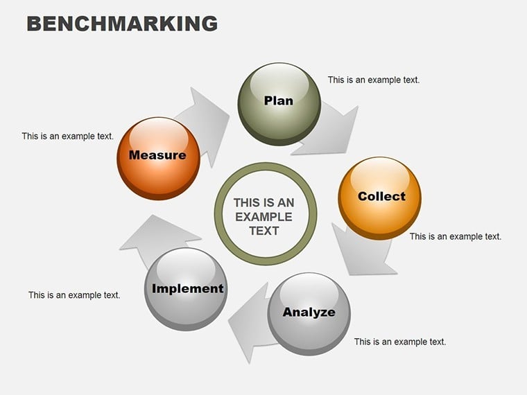
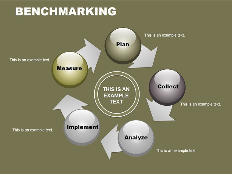
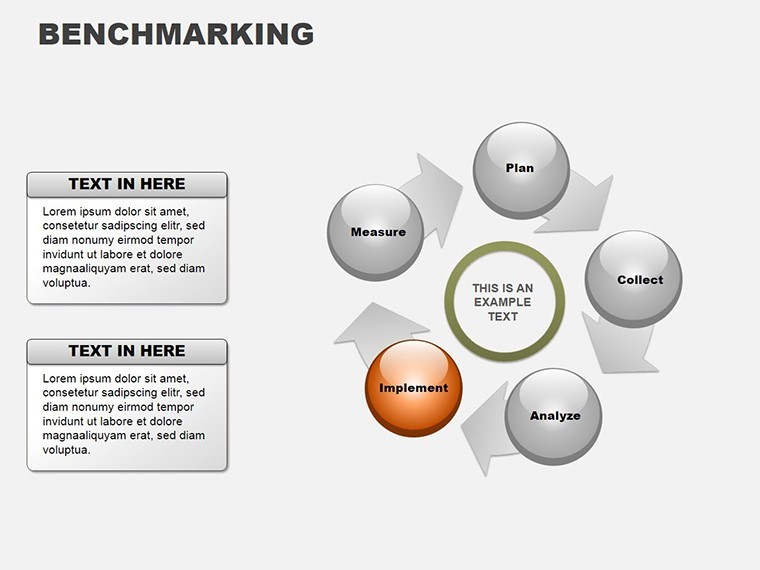
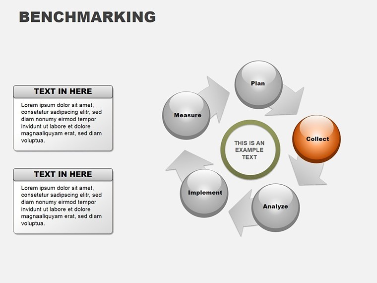
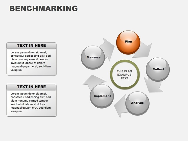
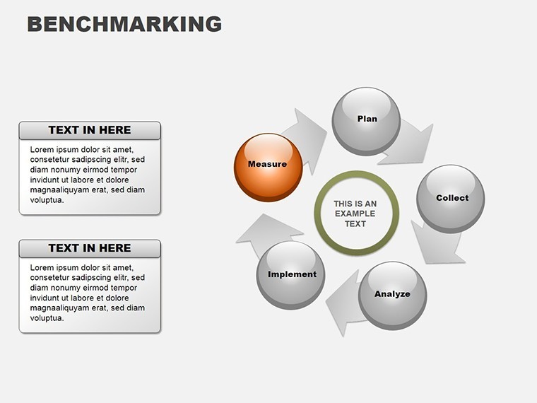
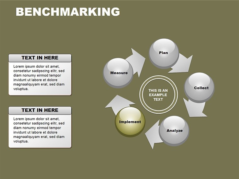
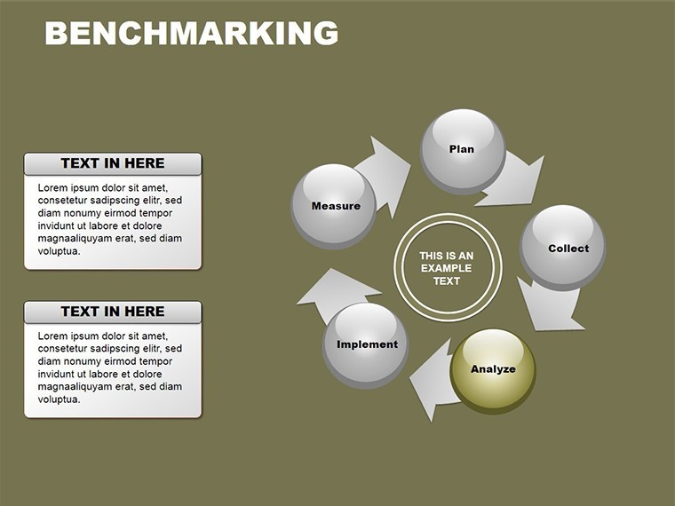
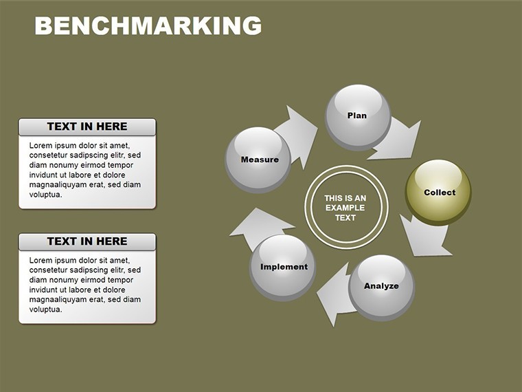
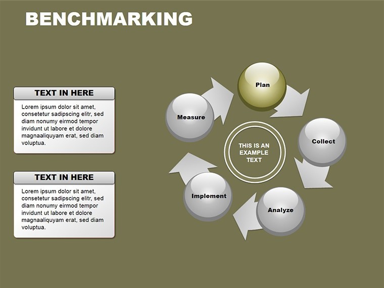
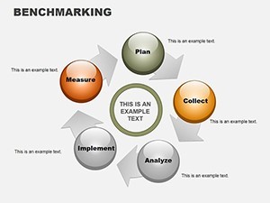
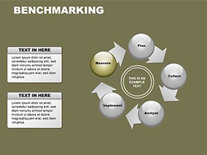
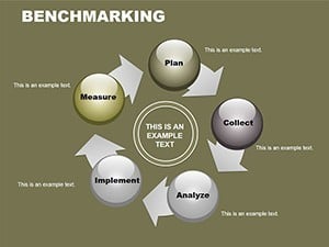
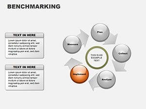
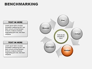
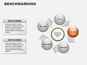
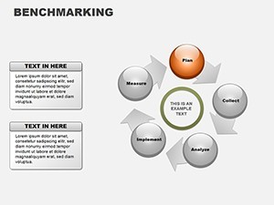
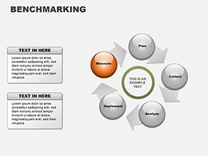
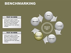
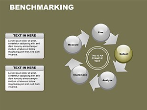
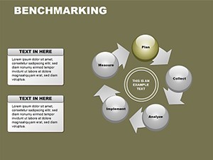
Benchmarking, as defined by frameworks from the American Productivity & Quality Center (APQC), involves methodical comparison to foster improvement. This template's slides embody that with cycle charts for ongoing processes, pie breakdowns for share analyses, and arrows for directional strategies. One slide might compare key performance indicators (KPIs) across firms, using pies to show market dominance. Another could map best practice adoption paths with arrows indicating implementation steps. In a manufacturing case, a company used benchmarking visuals to adopt lean techniques from leaders like Toyota, reducing waste by 25% - inspired by real lean methodology studies. This template empowers such transformations, providing structures that reveal gaps and opportunities with precision.
Core Features for Strategic Depth
- Systematic Toolset: Includes evaluation matrices, organization charts, and utilization flows for comprehensive benchmarking.
- Editable Elements: Customize data points, labels, and visuals to reflect your specific comparisons.
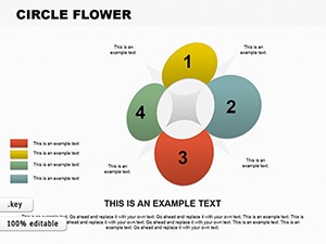
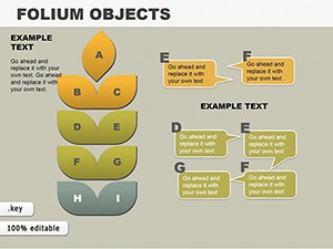
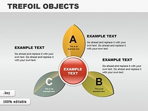
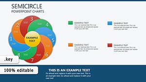
- Multi-Chart Integration: Combines cycles, pies, and arrows for multifaceted views.
- Color and Theme Sync: Adapts to your branding for professional coherence.
- High-Impact Graphics: Resolution-optimized for clear projections in boardrooms.
Refined through business analyst feedback, these ensure relevance in competitive landscapes.
Strategic Applications and Success Stories
Deploy this in scenarios demanding insight. In finance, benchmark portfolio returns against indices with pie allocations. Consultants use it for client audits, arrow charts guiding improvement roadmaps. A tech startup benchmarked user engagement against giants like Google, refining features for a 30% uptake boost - drawing from startup growth narratives. Superior to generic tools, it offers tailored frameworks that convey authority.
Implementation Workflow Guide
- Identify benchmarks and select relevant slides.
- Input competitor data into charts for visual comparison.
- Organize findings with arrows for action plans.
- Evaluate and refine with cycle feedback loops.
- Present and iterate based on audience input.
Tips: Use data validation for accuracy, per ISO standards, and incorporate narratives for persuasive delivery.
Propel Your Strategy Forward
This template is your ally in competitive arenas, blending analysis with visualization. Ideal for reports that influence decisions. Acquire it now and benchmark your way to excellence.
Frequently Asked Questions
What types of benchmarking does it support?
Internal, competitive, and functional, with adaptable charts for each.
Can I add my own metrics?
Yes, fully editable for custom KPIs and data sets.
Compatible with Keynote on Mac only?
Primarily, but exportable to other formats for broader use.
How many comparisons per slide?
Up to 6 for clarity, with options to layer for depth.
Any templates for specific industries?
General but customizable; examples included for adaptation.
Download format details?
.zip with .key files, ready for immediate integration.