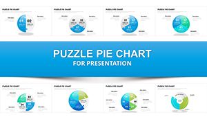
Pie Process Evolution Charts for Keynote: Depict Change Dynamically


Ever struggled to convey the nuances of transformation in a presentation? Our Pie Process Keynote charts template is your solution, offering 20 editable slides dedicated to illustrating movements, modifications, and evolutions. Tailored for strategists, educators, and innovators, this collection turns abstract changes into visual journeys. Think of it as a toolkit for showing progress in project timelines, organizational shifts, or scientific processes. Each slide builds on pie chart foundations but infuses them with process-oriented elements like arrows and stages, making explanations intuitive. Users appreciate the time savings - no more wrestling with shapes when you can start with polished, ready-to-adapt designs. Fully compatible with Keynote on Mac and iOS, it integrates seamlessly, allowing you to focus on your message. Whether pitching business transformations or teaching biological evolutions, these charts make complex ideas accessible, sparking engagement and deeper insights among your audience.
The Art of Visualizing Transformation
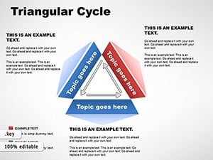
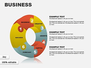
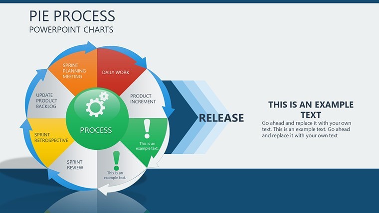
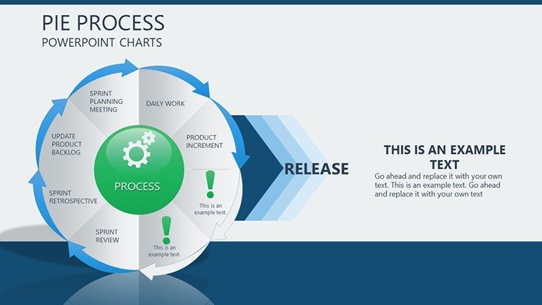
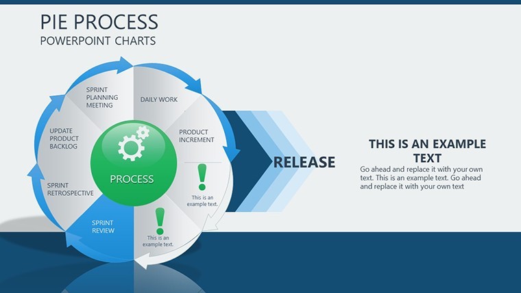
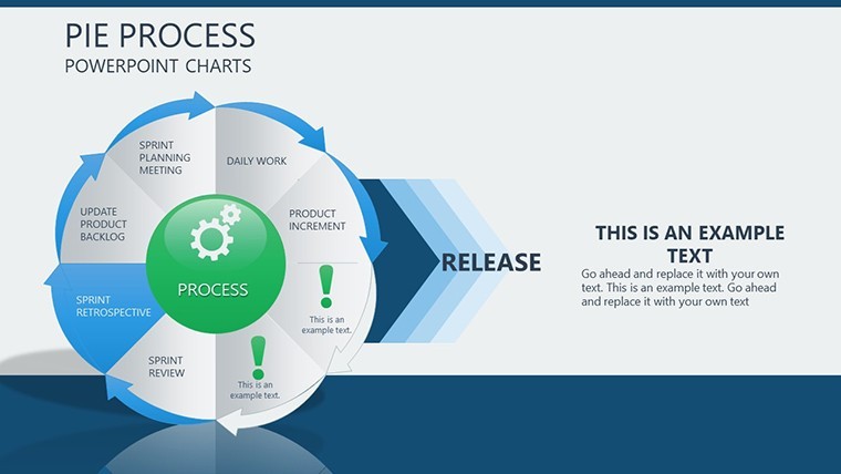
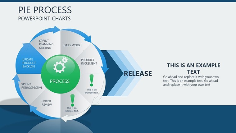
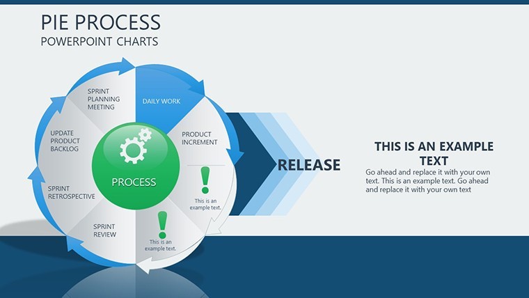
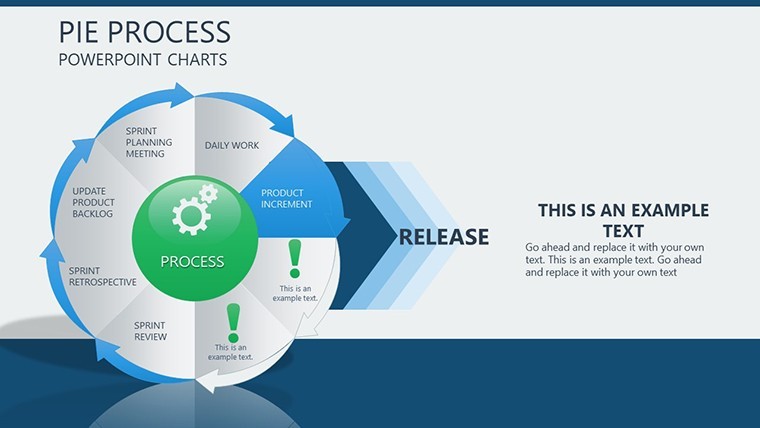
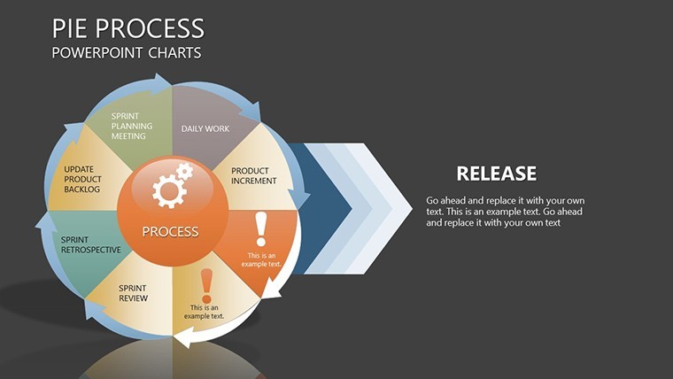
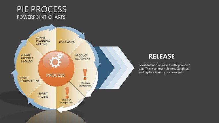
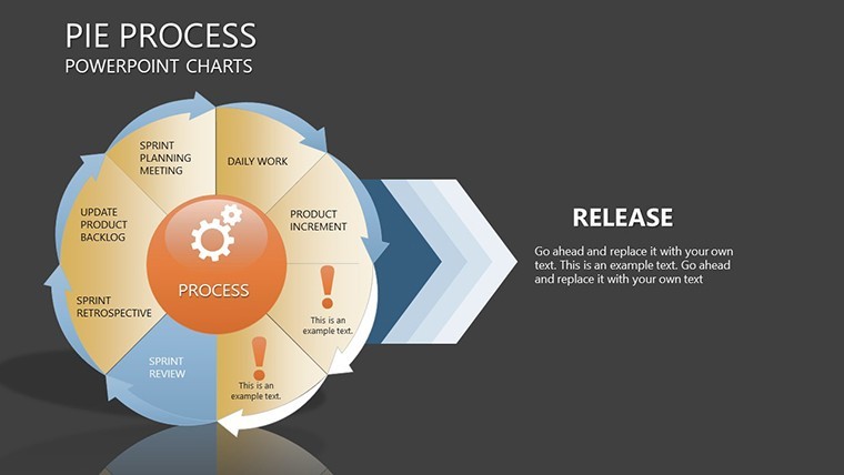
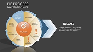
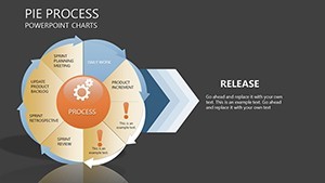
Pie charts evolved for processes draw from evolutionary design theories, emphasizing sequential flow as per Don Norman's user-centered principles. This template's 20 slides include phased pies that segment changes over time, such as a slide showing market evolution with expanding slices representing growth phases. Another might detail software update cycles, with each pie slice exploding to reveal sub-steps. In a case from environmental consulting, similar charts mapped climate policy changes, helping policymakers visualize incremental impacts - aligned with IPCC reporting styles. This approach not only clarifies evolutions but also highlights interdependencies, turning static data into narrative arcs that resonate.
Essential Features for Adaptive Presentations
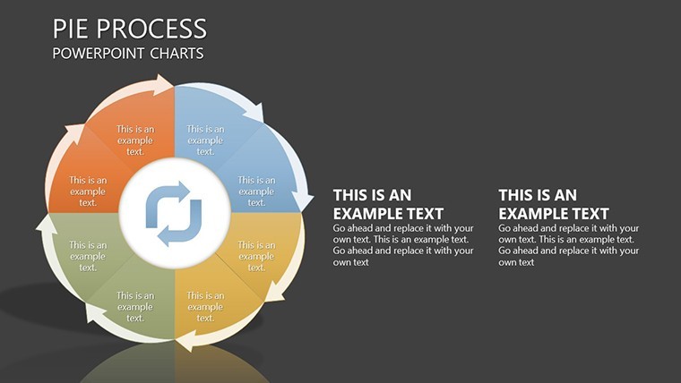
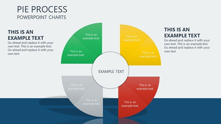
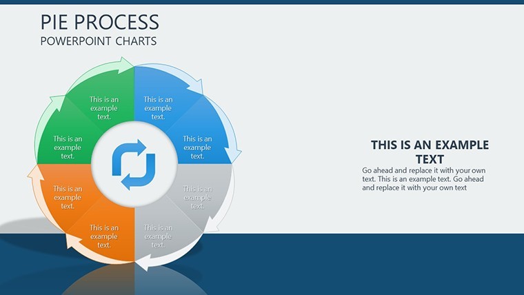
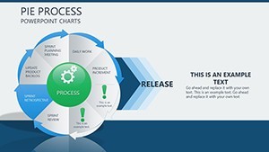
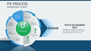
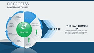
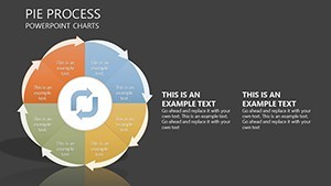
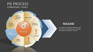
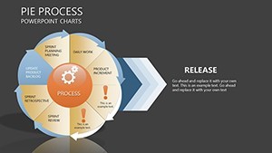
- Step-by-Step Layouts: Slides designed for sequential revelations, perfect for building suspense in stories of change.
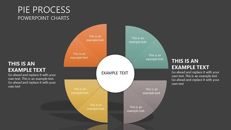
- Full Editability: Modify pies, add annotations, or resize elements to fit your specific evolution narrative.
- Process Indicators: Incorporated arrows and timelines that guide viewers through transformations.
- Theme Compatibility: Auto-adjusts to your Keynote theme for cohesive looks.
- High-Resolution Graphics: Ensures crisp visuals on any display, from laptops to projectors.
Developed with input from presentation pros, these features address common pain points like alignment and scaling.
Diverse Applications in Action
Apply this template where change is key. In business, it excels at depicting merger integrations, with pies showing pre- and post-states for clarity - mirroring Harvard Business Review case studies. Educators use it for historical timelines, like evolutionary biology, making abstract concepts concrete. A hypothetical urban development firm utilized pie processes to outline city planning evolutions, impressing stakeholders with visual progress maps. Unlike basic tools that force manual builds, this offers instant sophistication, enhancing perceived expertise.
Workflow Tips for Maximum Impact
- Select a slide that matches your change stages.
- Input data to populate pies, watching as proportions adjust automatically.
- Add process arrows and labels for directional flow.
- Test animations to simulate evolution in real-time.
- Finalize and present, adapting on the fly if needed.
Enhance with accessibility features like alt text for images, following ADA guidelines, and vary pie colors for color-blind friendly designs.
Advance Your Presentation Game Now
This template isn't just slides; it's a catalyst for conveying evolution effectively. Suited for agile environments where change is constant. Grab it today and watch your ideas transform.
Frequently Asked Questions
How do the pies represent processes?
By segmenting changes into stages with visual cues like arrows, showing progression clearly.
Can I animate the evolutions?
Yes, Keynote's built-in animations let slices appear sequentially for dynamic storytelling.
Suitable for large datasets?
Best for up to 10 stages per pie; duplicate slides for extended evolutions.
File compatibility details?
.key format, works across Keynote versions with full functionality.
Any industry restrictions?
None - versatile for business, science, education, and more.