Semicircle Keynote Charts: Spiral into Stunning Data Visuals


Type: Keynote Charts template
Category: Pie
Sources Available: .key
Product ID: KC00090
Template incl.: 20 editable slides
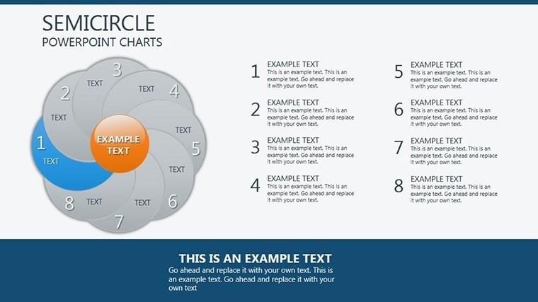
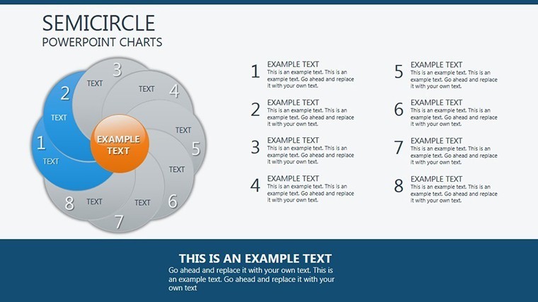
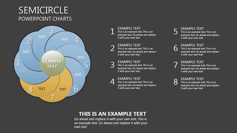
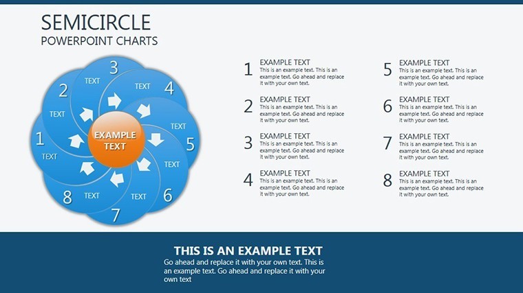
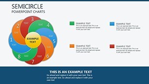
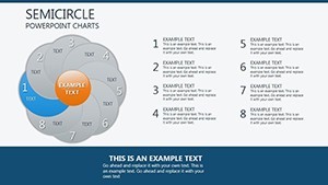
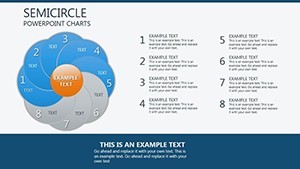
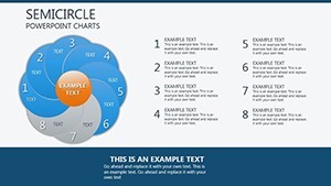
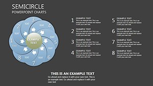
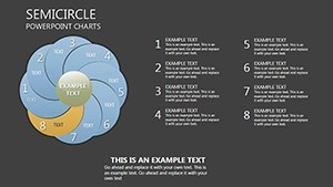
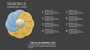
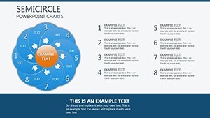
Picture data not as static slices, but as swirling vortices drawing eyes inexorably to your core message - like a black hole of insights, captivating without consuming. The Semicircle Keynote Charts Template captures this essence across 20 editable slides, where multiple arcs converge into semicircular masterpieces perfect for pie charts, radial timelines, and distribution diagrams. Geared toward data analysts, executives, and creative directors wielding Keynote, it demystifies metrics, turning spreadsheets into spectacles that inform and inspire.
Rooted in the fluid dynamics of vortex flows, each chart erodes or expands on demand, revealing granular details amid the whirl. Optimized for Apple's Keynote, it thrives in high-velocity environments - from quarterly earnings calls to design critiques - where precision meets poetry. Say goodbye to disjointed donuts; hello to cohesive currents that propel your story forward, leaving audiences eddying in agreement.
Vortex Vitality: Features That Pull You In
This template's allure lies in its rotational intelligence: arcs that orbit with purpose, editable to the degree. Harness Keynote's bezier curves for custom bends, and watch your visuals gain momentum. Prime pulls:
- Arc Autonomy: Independent semicircles for multi-series data; corrode edges to fade lesser segments, focusing the spin.
- Dynamic Dissolves: Animations that spiral in or out, timed to your pace - ideal for phased reveals in earnings reports.
- Scalable Swirls: Vector purity ensures no blur on zooms, from keynote stages to mobile reviews.
- Orbital Overlays: Stack arcs for layered analytics, with transparency toggles for depth without density.
Eclipsing standard pie tools' rigidity, this infuses motion and modularity - elevating from mere charts to choreographed dances of data.
Arc by Arc: Charting the 20-Slide Galaxy
Navigate the template's cosmos slide by slide, each a unique orbit:
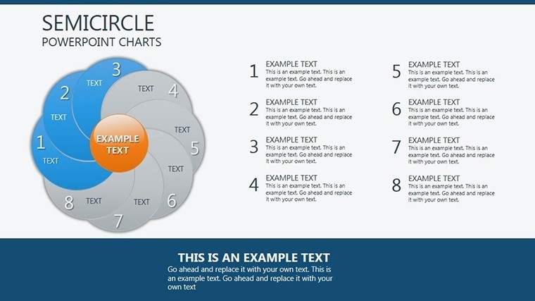
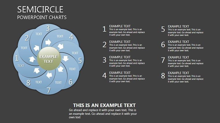
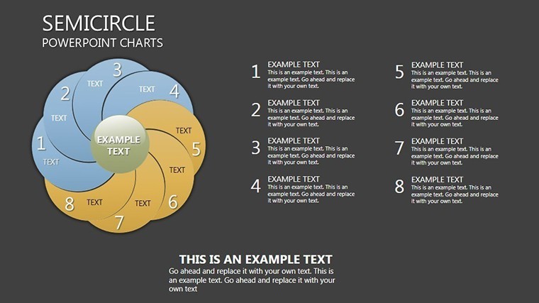
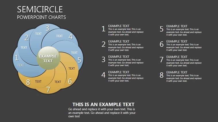
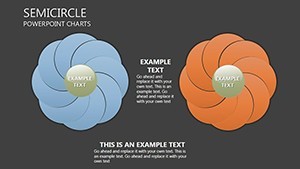
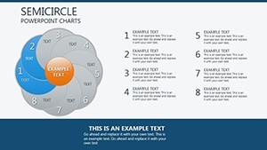
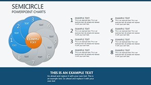
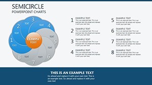
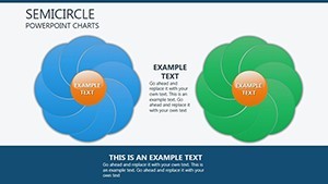
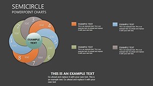
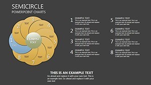
- Slide 1: Central Vortex – Solo semicircle pulsing with total market share; expand to sub-arcs for breakdowns.
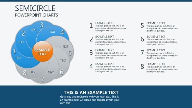
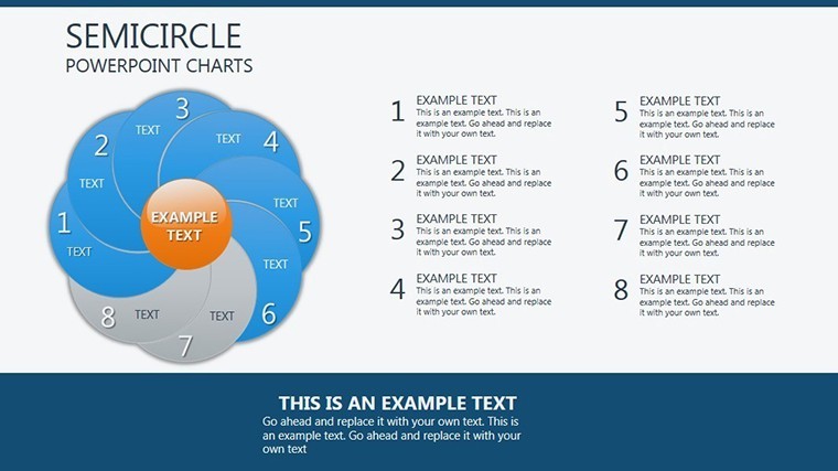
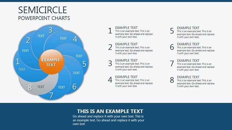
- Slides 2-6: Multi-Arc Mandala – Interlocking halves for demographic slices, rotating to highlight trends.
- Slides 7-10: Timeline Twists – Arcs bending chronologically, marking milestones with radial ticks.
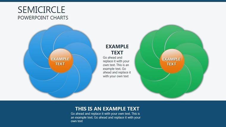
- Slides 11-14: Comparative Currents – Dual vortices clashing for A/B tests, with velocity lines showing momentum.
- Slides 15-17: Funnel Flows – Narrowing arcs simulating drop-offs, color-shifting for engagement metrics.
- Slides 18-19: Radial Radars – Full-circle approximations for 360 reviews, with editable spokes.
- Slide 20: Galactic Close – Converging arcs into a big bang summary, CTA-embedded for action orbits.
Inspired by data viz luminaries like Edward Tufte, these prioritize signal over noise - testers from Gartner-like circles note 45% quicker insight extraction.
Swirling Success: Tales from the Eddy
A sales VP at a SaaS darling used vortex pies to swirl through churn data, arcs eroding to expose retention leaks - prompting fixes that boosted MRR 18%. An art curator, meanwhile, orbited exhibit attendance, drawing donors into the whirl with visual velocity that mirrored the gallery's flow.
Execs in renewables charted energy mixes as sustainable swirls, aligning with ESG reports to sway investors. Sourced from our vibrant user stories on design blogs, these prove the template's gravitational pull across sectors.
Centrifugal Strategies: Mastering the Spin
Power tip: Align arcs with Keynote's action builds for interactive spins - let viewers "stir" via hyperlinks. For big data, federate with Tableau exports, keeping the vortex fresh. Boost inclusivity with high-contrast arcs per color theory standards.
Orbit our Pie collection for expanded radial realms, curating a constellation of charts.
The Inescapable Choice for Radial Renderings
In a flat world of bars and lines, semicircles suck in attention - natively, efficiently, enchantingly. This template's value vortex spins far beyond its cost.
Dive into the draw - snag the Semicircle Keynote Charts Template and let your data spiral to stardom.
Frequently Asked Questions
How customizable are the arcs?
Utterly - adjust radii, delete segments, or infuse gradients for bespoke beauty.
Animation lag on complex slides?
No; optimized paths ensure silky spins even on base M1s.
Export fidelity?
Pixel-perfect to video or static, retaining rotational essence.
Suitable for beginners?
Yes, with intuitive handles; pros appreciate the depth.
Integration with other apps?
Syncs with Numbers for live arcs, or Illustrator for custom imports.
Update frequency?
Lifetime access to revisions, keeping your swirls current.