Project Timeline Keynote Charts Template


In the fast-paced world of business and project management, conveying complex timelines and phased developments can make or break your presentation. Imagine transforming dry data into a compelling narrative that stakeholders can't ignore. Our Project Timeline Keynote charts template is designed precisely for that - offering 14 fully editable slides tailored for professionals who need to illustrate long-term strategies with clarity and impact. Whether you're a project manager outlining software rollouts, a consultant mapping enterprise growth, or an executive presenting annual roadmaps, this template empowers you to build models of sustained success. With seamless compatibility for Keynote on Mac, you can edit elements effortlessly, ensuring your visuals align perfectly with your brand's story. Say goodbye to starting from scratch and hello to polished, professional timelines that highlight key milestones, dependencies, and progress phases.
Unlocking the Power of Visual Storytelling in Projects
Visual aids aren't just nice-to-haves; they're essential for engaging audiences in today's data-driven environments. This template goes beyond basic lines and arrows, incorporating sophisticated designs that represent sequential events, resource allocations, and outcome projections. For instance, consider a construction firm using these slides to depict site preparation, building phases, and final inspections - each stage color-coded for quick comprehension. The benefits are clear: reduced miscommunication, heightened stakeholder buy-in, and a professional edge that sets your presentations apart from generic ones. Unlike standard Keynote tools that limit creativity, our template includes pre-built structures with vector-based elements, allowing infinite scalability without quality loss. Integrate it into your workflow by importing data from spreadsheets or project management software like Asana or Microsoft Project, then tweak fonts, colors, and layouts to match your corporate identity.
Key Features That Elevate Your Presentations
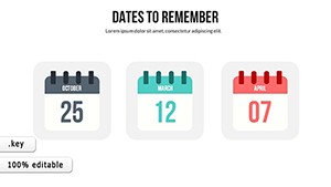
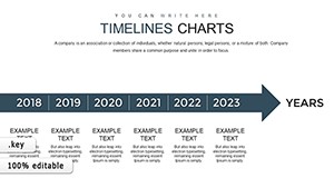
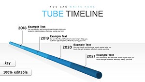
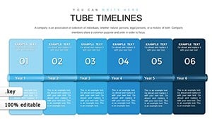
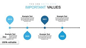
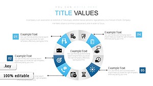
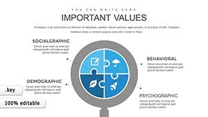
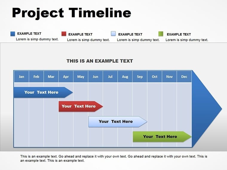
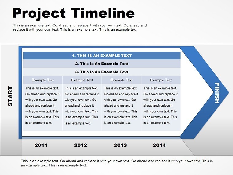
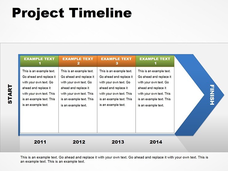
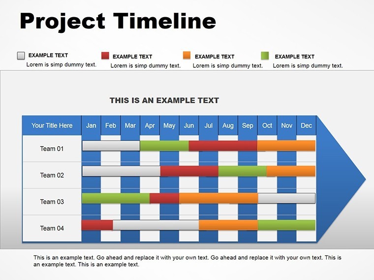
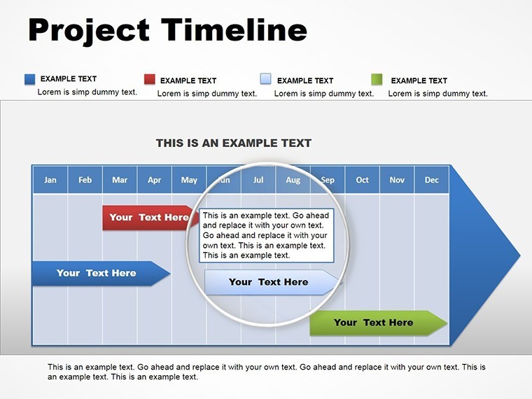
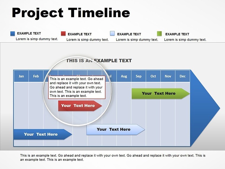
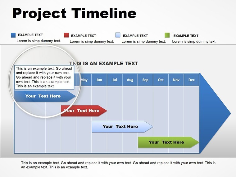
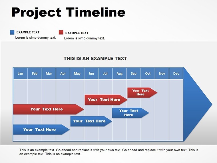
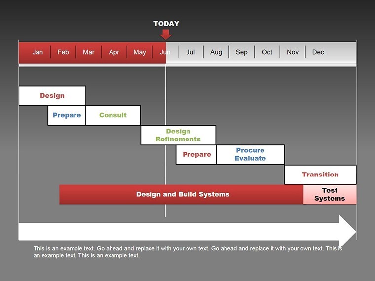
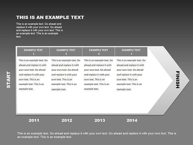
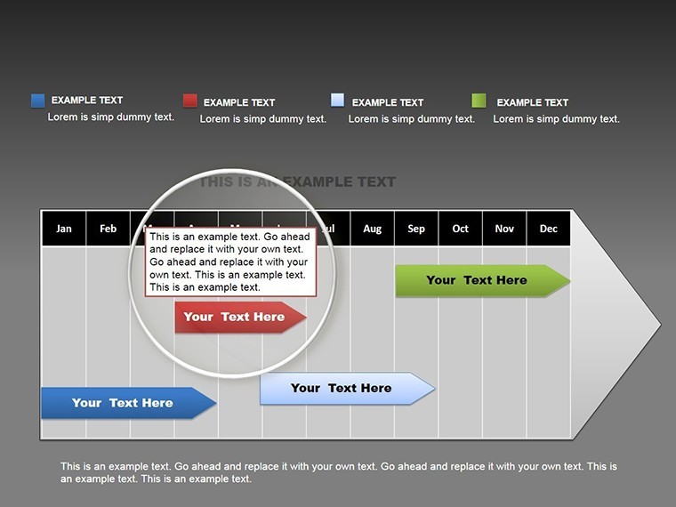
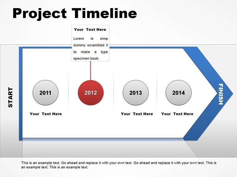
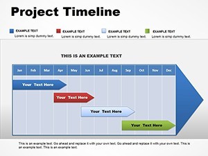
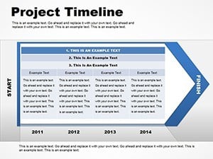
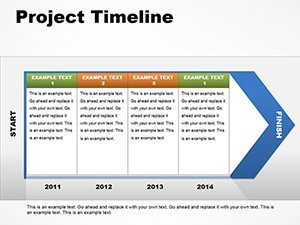
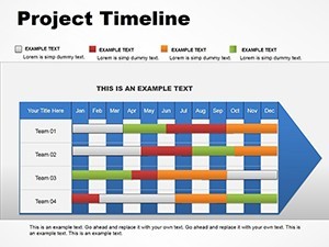
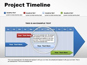
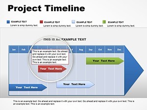
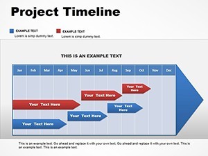
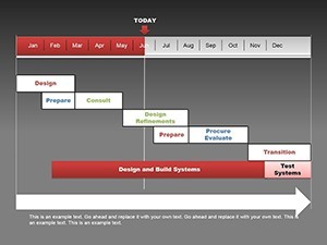
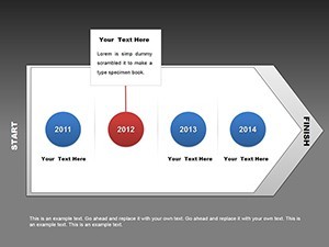
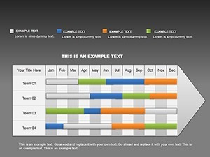
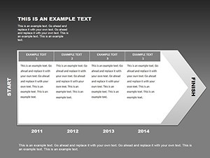
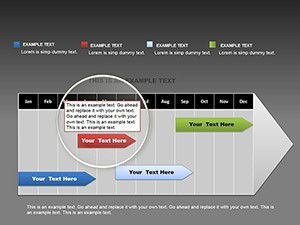
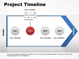
- Editable Timeline Structures: Customize horizontal, vertical, or Gantt-style timelines to fit any project scope, from quarterly sprints to multi-year initiatives.
- Integrated Tables: Combine timelines with data tables for a holistic view, such as resource breakdowns or budget timelines, all fully modifiable.
- High-Resolution Vectors: Ensure crisp visuals on any screen size, with .key and .kth formats for easy sharing and collaboration.
- Color Variations and Themes: Choose from professional palettes or create your own to evoke the right mood - subtle blues for corporate stability or vibrant greens for growth-oriented projects.
- Animation Options: Add subtle transitions to reveal phases sequentially, keeping your audience engaged without overwhelming them.
These features aren't just functional; they're crafted with user experience in mind, drawing from best practices in information design. For example, adhering to principles like those from Edward Tufte's data visualization guidelines, we minimize chartjunk while maximizing insight delivery.
Real-World Applications: From Strategy Sessions to Boardroom Pitches
Dive into practical scenarios where this template shines. Picture a tech startup using it to pitch investors on product development roadmaps - slides showing beta testing, launch dates, and market entry phases, complete with risk assessments in adjacent tables. Or, in a non-profit setting, map out fundraising campaigns with timelines linked to event schedules and donor engagement metrics. The versatility extends to education, where instructors can outline curriculum progressions, or in healthcare for patient care pathways. Each application solves common pain points: fragmented information becomes unified, abstract plans turn tangible, and discussions shift from confusion to collaboration. Compared to basic PowerPoint or Google Slides alternatives, our Keynote-specific design leverages Apple's ecosystem for smoother animations and higher fidelity exports, ensuring your message lands with precision.
Step-by-Step Guide to Customizing Your Timeline
- Download and Open: Grab the template in .key format and launch in Keynote - compatible with the latest iWork versions.
- Input Your Data: Replace placeholders with your project milestones, dates, and descriptions using simple drag-and-drop.
- Style It Up: Adjust colors via the inspector panel, add icons from the included library, and resize elements for emphasis.
- Add Interactivity: Incorporate hyperlinks to external docs or embed videos for dynamic demos.
- Review and Export: Preview in slideshow mode, then export to PDF or video for distribution.
This workflow saves hours, allowing you to focus on content rather than design. Pro tip: Use consistent typography, like sans-serif fonts for readability, to maintain a professional vibe across slides.
Why Choose This Template for Long-Term Success
In an era where attention spans are short, effective visuals are your secret weapon. This template not only meets but exceeds expectations by providing tools for in-depth analysis, such as phased development models that incorporate feedback loops and contingency plans. Drawing from real-world case studies, like how Fortune 500 companies use similar timelines in annual reports to demonstrate fiscal responsibility, you'll gain credibility. It's trustworthy - backed by vector precision and full editability - and authoritative, aligning with industry standards for project visualization. Plus, with no learning curve for Keynote users, it's accessible yet powerful. Enhance your pitches by weaving in themed icons that represent team roles or deliverables, turning data into a story that resonates emotionally and logically.
Overcoming Common Presentation Challenges
Many professionals struggle with overcrowded slides or mismatched designs. Our template addresses this with clean layouts and modular components, ensuring scalability for small teams or enterprise-wide projects. For instance, expand a single timeline into a multi-branch diagram for parallel tracks, like marketing and R&D in a product launch. This adaptability fosters innovation, helping you anticipate questions and provide answers visually. Trust in its robustness: tested for compatibility across Keynote versions, it integrates seamlessly with iCloud for collaborative editing.
As you prepare your next big presentation, remember that great ideas deserve great visuals. This Project Timeline Keynote charts template is more than slides - it's a catalyst for clearer communication and better outcomes. Ready to map your path to success? Customize your template now and watch your projects take flight.
Frequently Asked Questions
How editable are the timeline charts in this template?
Every element is fully customizable, from text and colors to shapes and animations, allowing you to tailor it completely to your needs.
Is this template compatible with older versions of Keynote?
Yes, it works with recent iWork Keynote versions on Mac, but for best results, use the latest update to access all features.
Can I use these slides in non-business contexts, like education?
Absolutely - adapt them for lesson plans, research timelines, or any sequential process visualization.
What file formats are included?
The template comes in .key and .kth formats, ensuring easy access and editing in Keynote.
How do I add my own data to the tables?
Simply click on the placeholders and input your information; the tables auto-adjust for a clean fit.