 Click to zoom
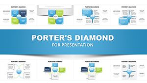
Risk Matrix Template for Keynote | 33 Fully Editable Charts | Instant Download
| Format | .pptx |
| Slides | 33 unique layouts |
| Aspect ratio | 16:9 |
| Compatibility | PowerPoint |
| Animated | No |
| Language | English |
| License | Commercial |
| File size | — |
| Version | v1.0 |
| Last updated | February 2026 |
What's inside
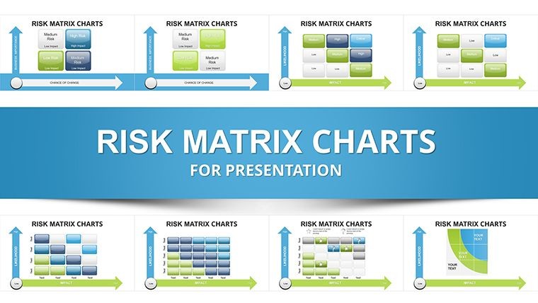
Create powerful risk assessment presentations with this professional Risk Matrix Keynote template featuring 33 fully editable slides. Perfect for strategic planning, project management, and business consulting. Instant download and easy customization.
Why Choose This Risk Matrix Keynote Template?
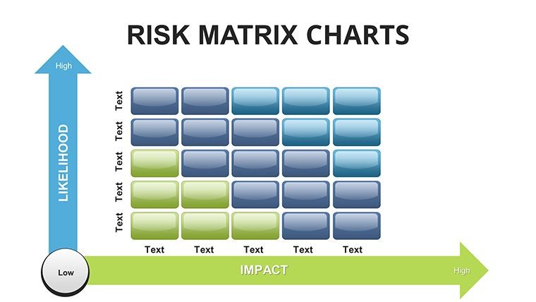
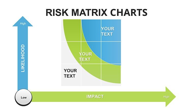
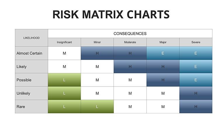
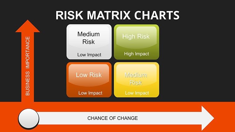
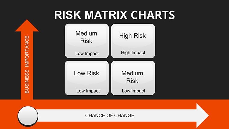
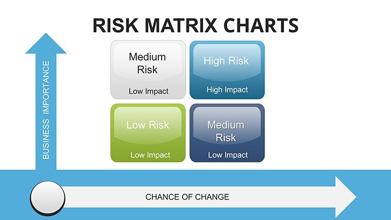
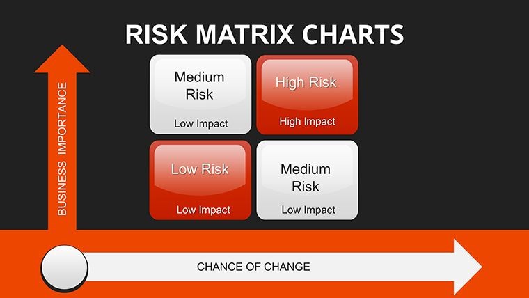
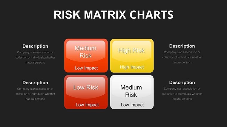
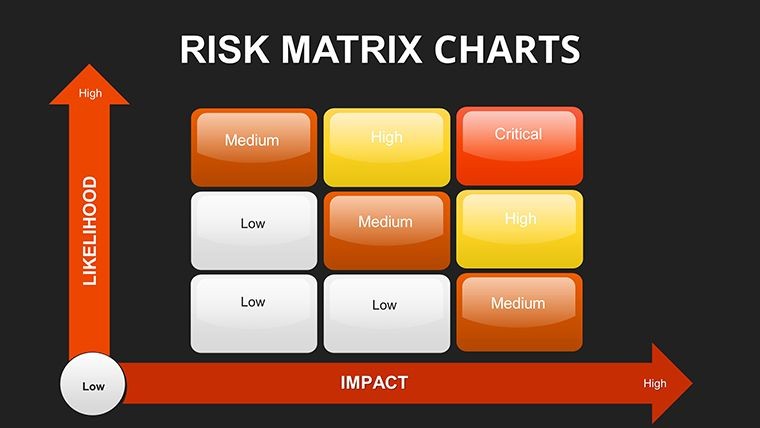
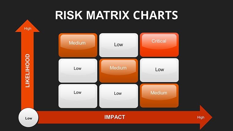
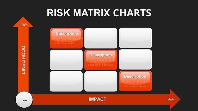
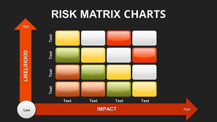
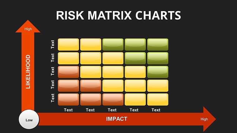
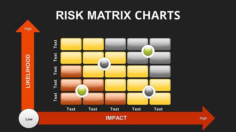
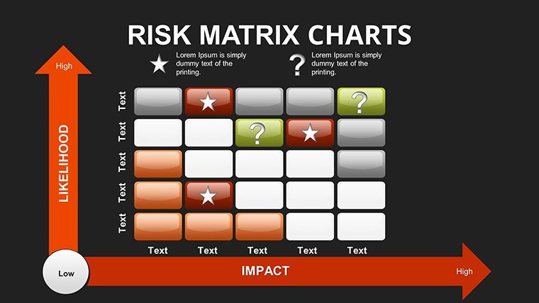
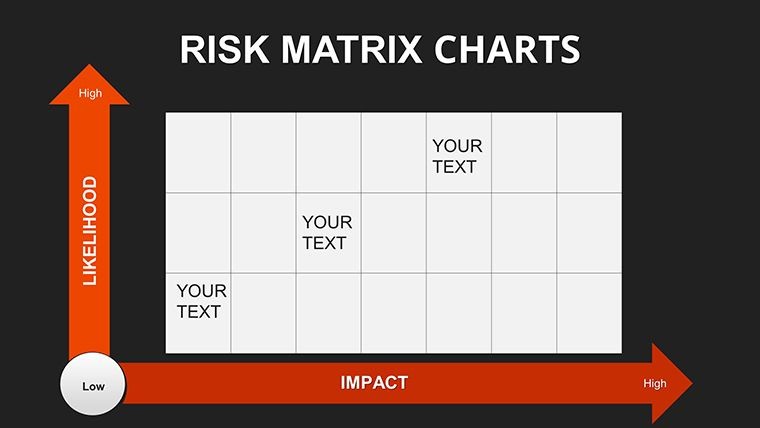
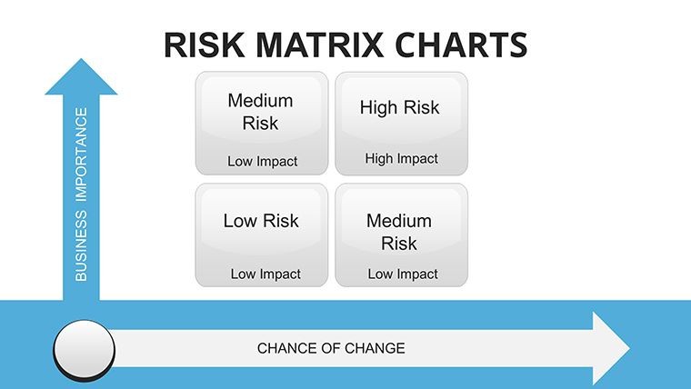
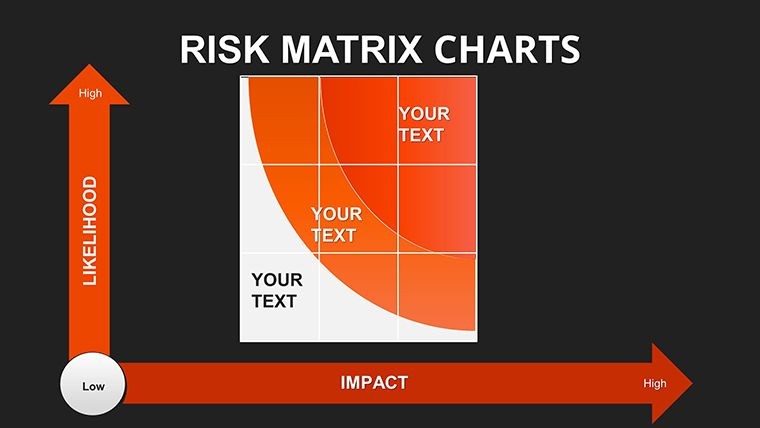
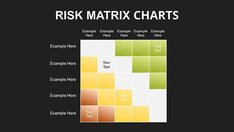
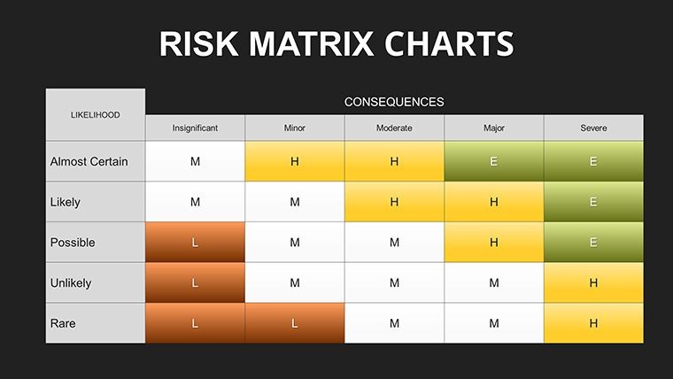
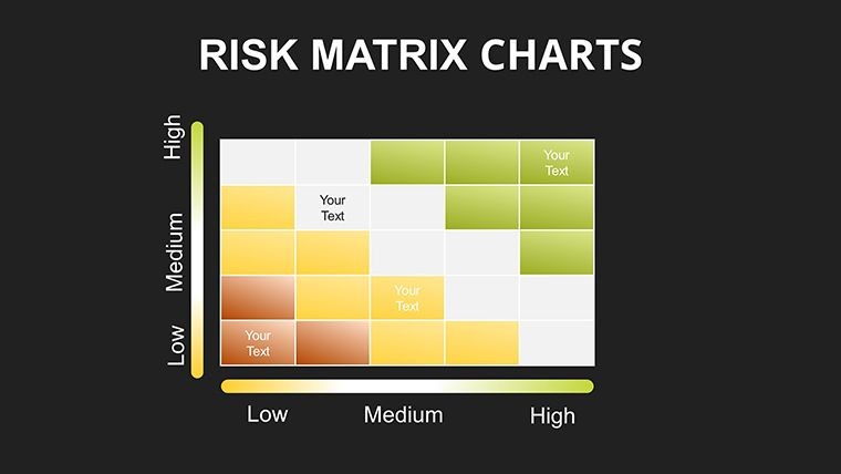
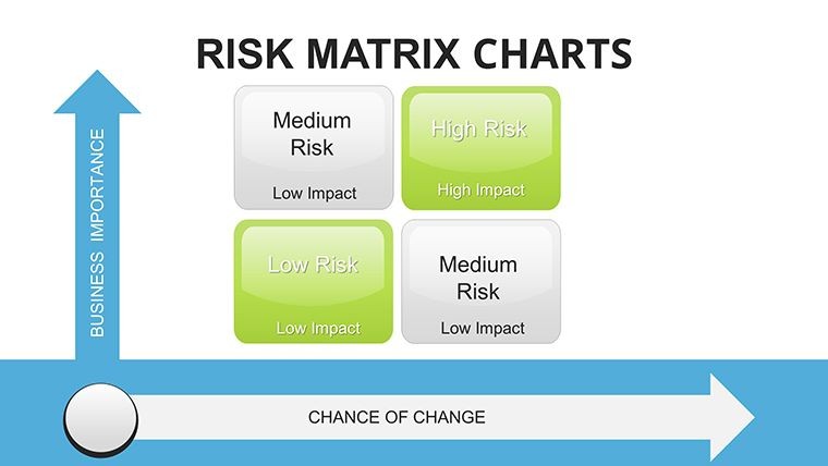
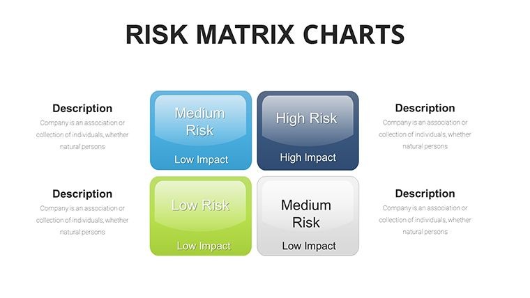
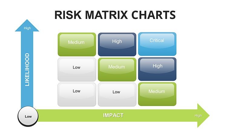
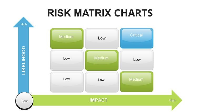
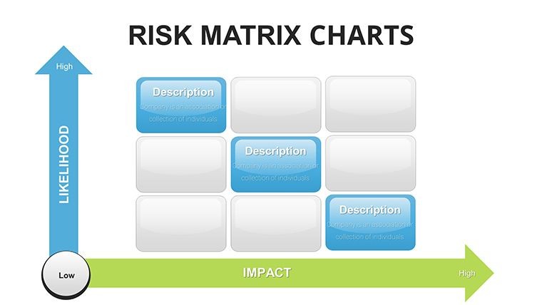
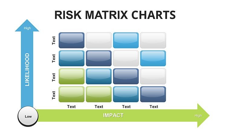
Risk assessment is fundamental to informed decision-making in any organization. Our Risk Matrix Keynote template helps you visualize risks by combining likelihood and impact into clear, actionable matrices. This allows teams to prioritize effectively and communicate findings with impact.
Designed for professionals dealing with uncertainties in fast-paced environments, it provides 33 fully editable slides that turn complex data into compelling stories. Whether following ISO 31000 frameworks or custom approaches, these charts support proactive strategy development.
Key Features
Versatile Matrix Designs
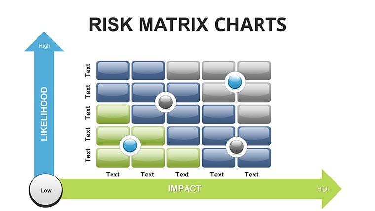
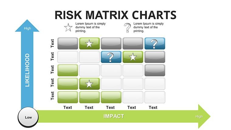
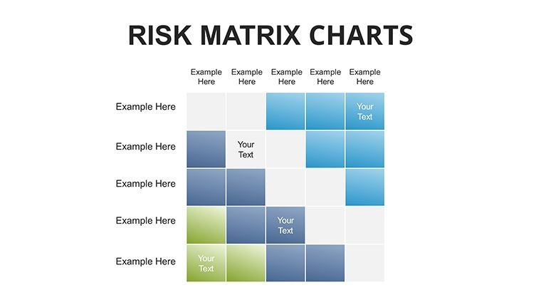
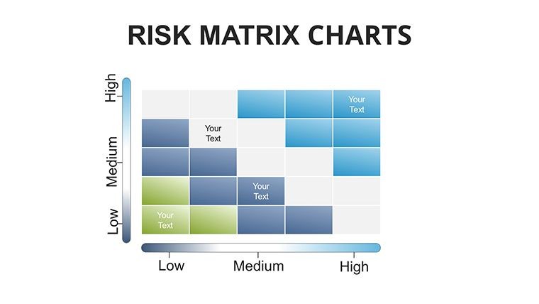
Choose from multiple configurations including 2x2 up to 5x5 risk grids. Includes color-coded heat maps, icons, and mitigation elements to match your analysis needs. All slides feature high-quality infographics ready for customization.
Professional Enhancements
Benefit from over 50 risk-specific icons, smooth animations, and seamless data integration. Fonts, colors, and shapes can be modified instantly to align with your branding guidelines.
How to Use in Your Presentations
Open the .key file in Keynote and select your preferred matrix slide. Replace the sample data with your risk details, adjusting likelihood and severity scores. Customize severity colors (e.g., red for critical) and add specific notes or action plans.
Utilize animations to guide your audience through the risk landscape step by step. This approach works exceptionally well for building stakeholder consensus during high-stakes reviews.
Ideal Professional Scenarios
Project managers use it to map operational risks and present contingency plans to leadership. Consultants leverage the matrices to provide visual risk insights to clients across industries. Executives rely on them for comprehensive enterprise risk management updates.
Internal operations teams apply these charts for compliance reporting and process improvement discussions. The templates support both quantitative scoring and qualitative analysis for well-rounded presentations.
Frequently Asked Questions
How many slides are included?This Risk Matrix Keynote template includes 33 fully editable slides with various chart configurations and supporting visuals.
Is it fully editable and brandable?Yes, every element including matrices, colors, text, icons, and layouts can be customized using Keynote's native tools to perfectly match your corporate identity.
What versions of Keynote is it compatible with?It is compatible with the latest versions of Apple Keynote on Mac and works smoothly for professional presentations.
Can I use it for client projects?Yes, the license allows use for both internal and client-facing commercial presentations.
How do I input my own data?Simply replace the placeholder content in the matrices or integrate data from spreadsheets. Built-in elements support quick updates for accurate risk scoring.
Good for
- Project roadmaps and sprint plans
- Product launch timelines
- Quarterly or annual review decks
- Company history and milestone summaries
Licence
reviews
The waterfall with connectors is clean.
The connectors show the flow between bars.
Used this for a profit bridge analysis.
The starting and ending bars are emphasized.
Better than default Excel waterfalls.
FAQ
Will it work in Google Slides?
Are fonts embedded?
Can I use this for client work?
What's the refund policy?
Do you update the template after purchase?
Similar templates
See all Keynote Charts →
All 33 slides