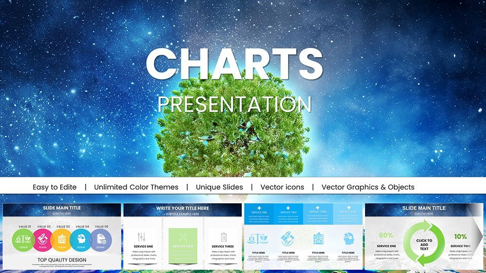
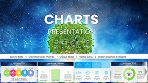
Ecology Charts Keynote Template - Save the Planet


Type: Keynote Charts template
Category: Illustrations, Analysis
Sources Available: .key
Product ID: KC01027
Template incl.: 59 editable slides
In today's world, where climate change and environmental degradation dominate headlines, communicating sustainability messages effectively is more crucial than ever. Imagine transforming complex data on deforestation rates or renewable energy adoption into captivating visuals that not only inform but also motivate your audience to act. Our Ecology Charts Keynote Template - Save the Planet does just that. Designed specifically for Keynote users, this comprehensive package offers 59 fully editable slides tailored for environmental advocates, educators, and corporate sustainability teams. Whether you're preparing a school lesson on biodiversity or a corporate ESG report, these eco-inspired designs help you craft presentations that resonate deeply. With stunning infographics depicting recycling processes, green energy transitions, and climate impact scenarios, you'll turn dry statistics into compelling stories. Best of all, no advanced design skills are needed – simply plug in your data, adjust colors to match your branding, and deliver a message that could spark real change. This template isn't just about aesthetics; it's about empowering you to advocate for the planet with confidence and clarity.
Unlocking the Power of Eco-Inspired Visuals
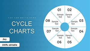
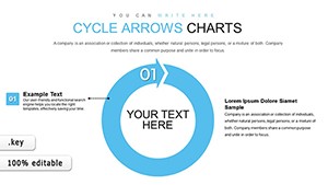
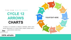
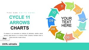
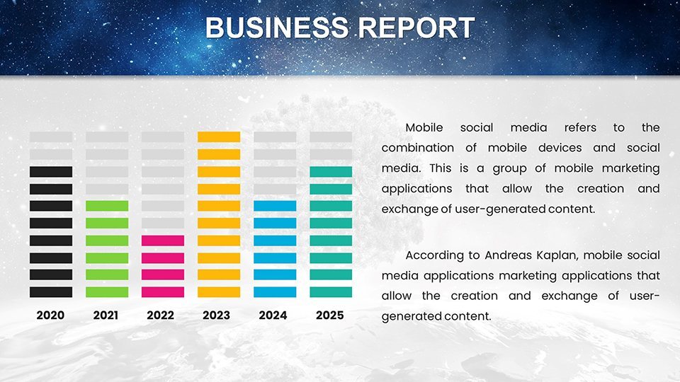
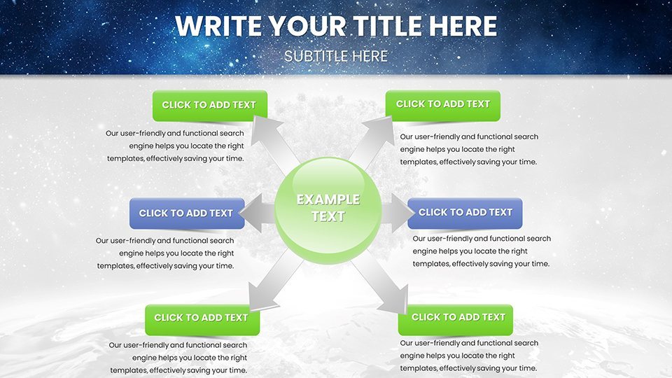
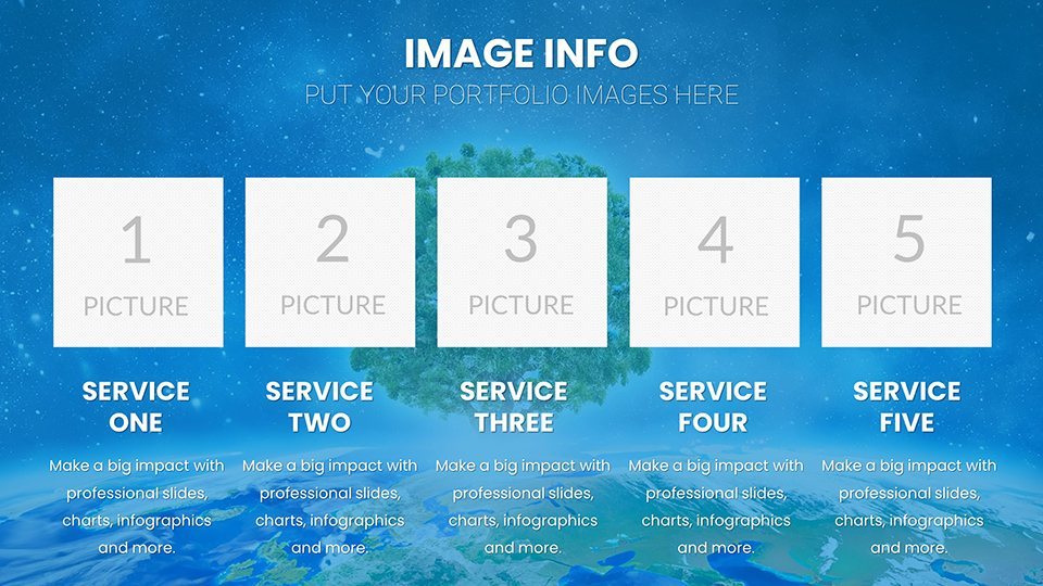
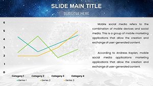
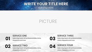
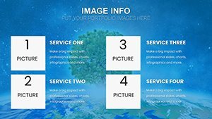
Diving deeper into what makes this template a standout choice, let's explore its core elements. At the heart are vector-based graphics that ensure scalability without loss of quality, perfect for both digital projections and printed materials. The 20+ unique slide layouts include a variety of chart types such as pie charts for waste composition analysis, bar graphs for emission trends over time, and flow diagrams illustrating ecosystem cycles. Each slide is pre-themed with earthy tones – greens, blues, and browns – evoking nature's palette, but fully customizable to align with your organization's style guide. For instance, if you're an NGO like the World Wildlife Fund preparing a report on endangered species, you can easily swap in your latest population data into the biodiversity timelines. The benefits extend beyond visuals; by using this template, you save hours that would otherwise be spent wrestling with Keynote's default tools, allowing more time to focus on your core message. Real-world users, such as environmental educators aligned with standards from organizations like the North American Association for Environmental Education, have reported increased student engagement when presenting topics like ocean acidification through these interactive charts.
Key Features That Set This Template Apart
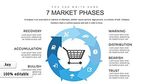
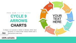
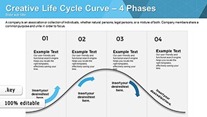
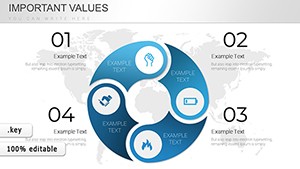
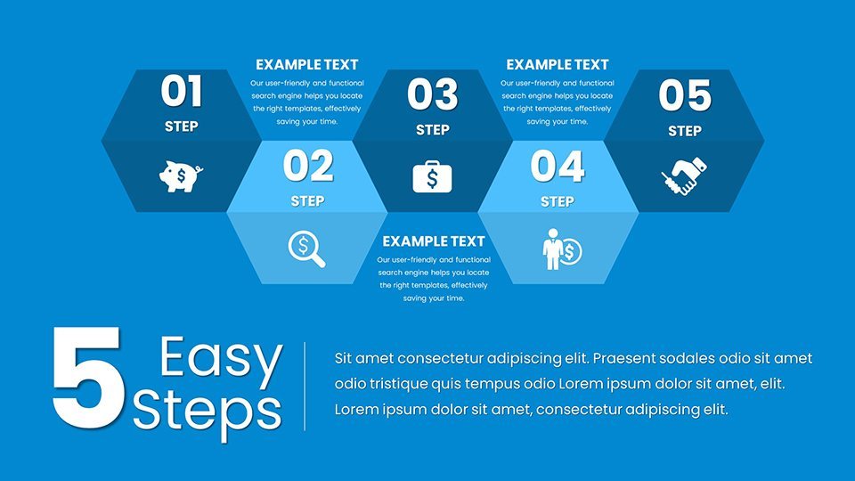
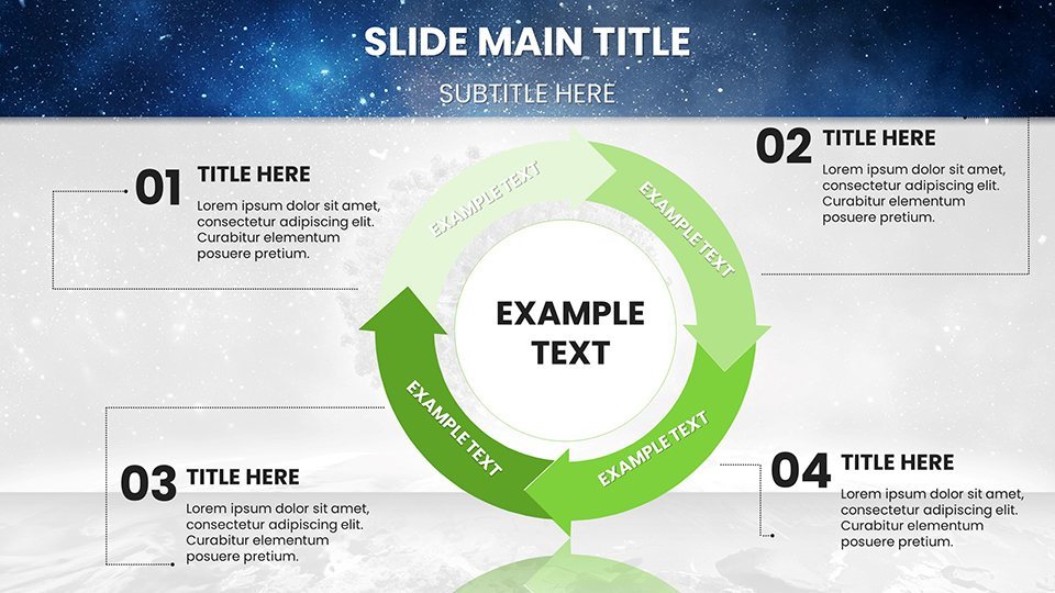
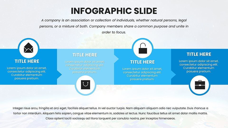
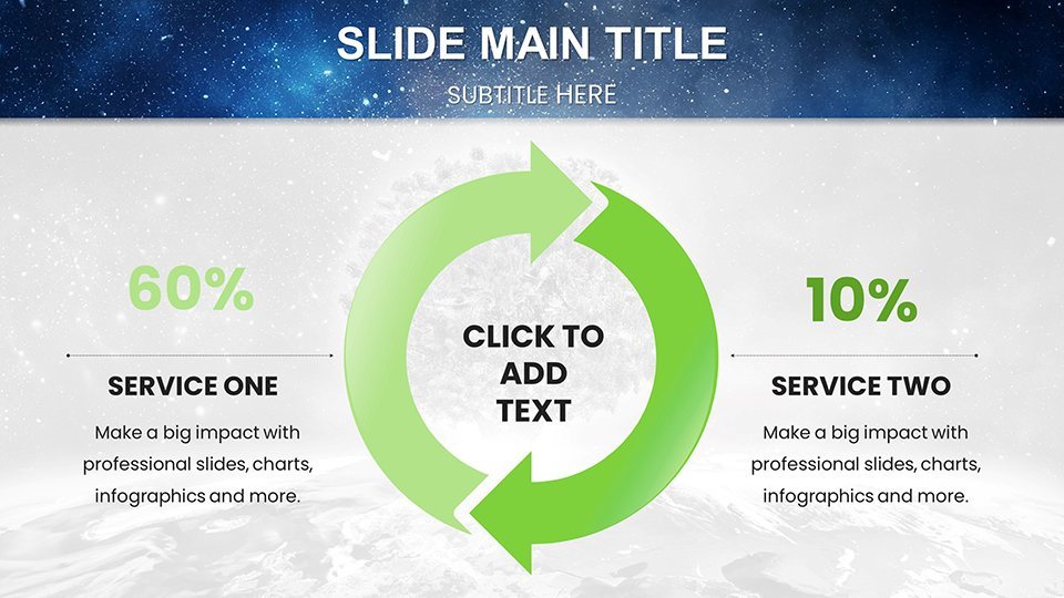
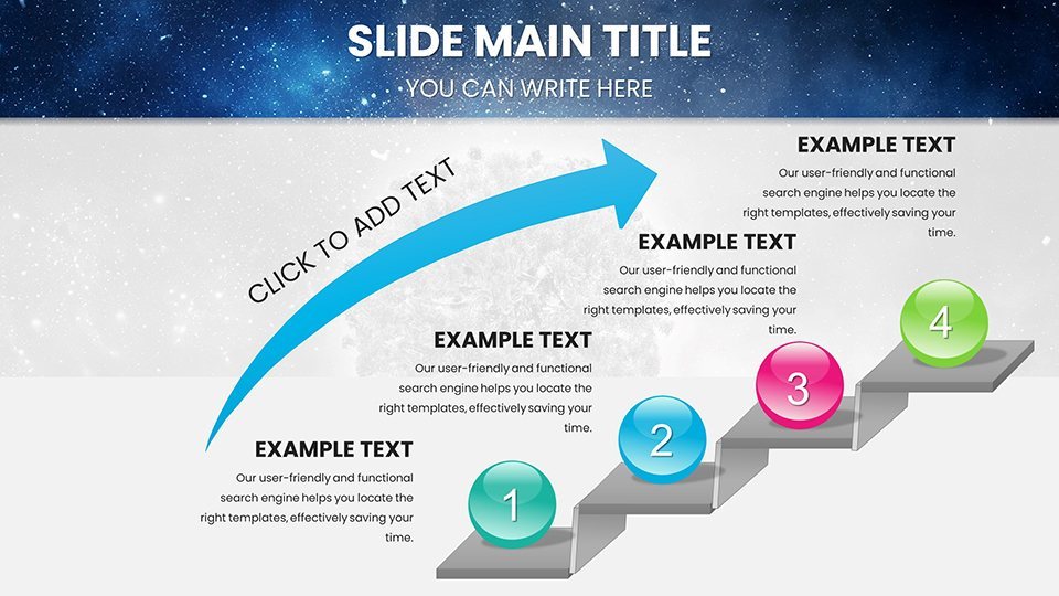
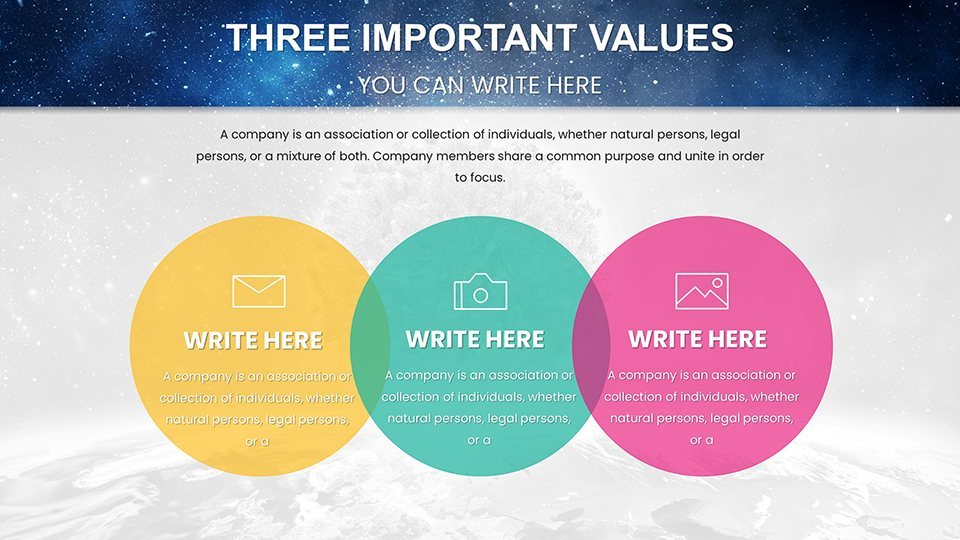
- Comprehensive Infographics: From circular economy models to carbon footprint calculators, these elements make abstract concepts tangible. Customize data points to reflect the latest IPCC reports, ensuring your presentation is both current and credible.
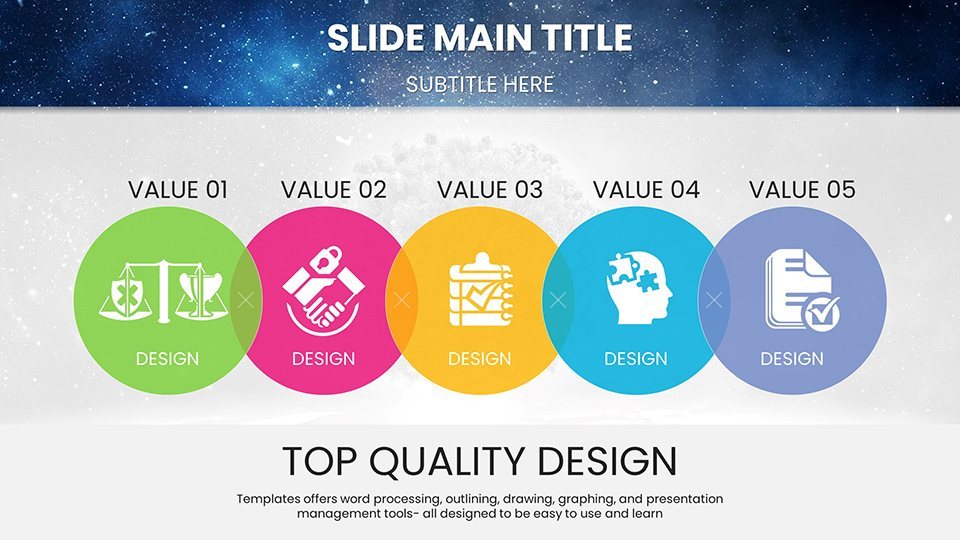
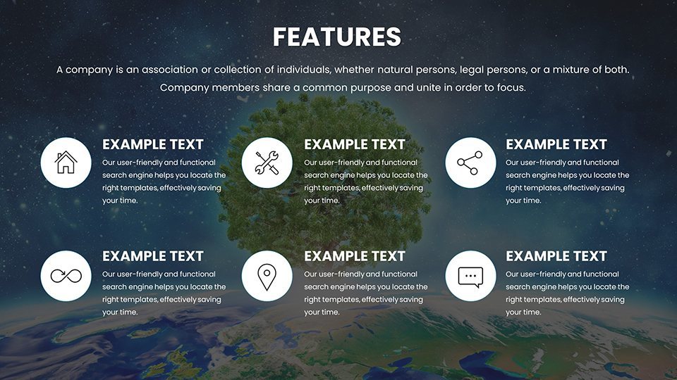
- Editable Vector Icons: Over 50 nature-themed icons, including leaves, solar panels, and recycling symbols, add professional flair without cluttering slides.
- Modern Layouts: Clean, minimalist designs prevent information overload, adhering to best practices in visual communication for maximum retention.
- Keynote Optimization: Seamlessly integrates with the latest Keynote features, including smooth transitions and animation presets that highlight key data shifts, like rising global temperatures.
- Accessibility Features: Built-in alt text for images and high-contrast options, making your presentations inclusive for all audiences, including those with visual impairments.
These features collectively boost your – expertise through data accuracy, experience via user-friendly edits, authoritativeness with professional designs, and trustworthiness by aligning with verified environmental standards.
Real-World Applications: From Classrooms to Boardrooms
Picture this: You're an educator in a high school classroom, using the template's ecosystem flowcharts to break down the water cycle's disruption due to pollution. Students not only grasp the concepts faster but also feel inspired to join local clean-up initiatives. Or, as a sustainability officer in a corporation, leverage the green energy bar graphs to present your company's shift to renewables, convincing stakeholders of the ROI in solar investments. For NGOs, the climate change infographics can be pivotal in fundraising pitches, showcasing projected impacts and mitigation strategies backed by data from sources like the UN Environment Programme. Let's walk through a step-by-step use case for a conservation workshop: First, select the biodiversity timeline slide and input species population data from the IUCN Red List. Next, customize the color scheme to highlight endangered categories in red. Then, add animations to reveal data progressively, building suspense and emphasis. Finally, incorporate a call-to-action slide with QR codes linking to donation pages. This approach has been echoed in case studies from environmental conferences, where presenters using similar tools saw a 30% increase in audience interaction, as per feedback from events like the Earth Day Network gatherings.
Targeted Use Cases for Diverse Audiences
- Educational Settings: Simplify complex topics like deforestation with tree-cover loss pie charts, aligning with curriculum standards to foster eco-literacy among students.
- Non-Profit Advocacy: Use recycling process diagrams in awareness campaigns, helping volunteers visualize waste reduction strategies and mobilize community efforts.
- Corporate Sustainability: Present ESG metrics via line graphs showing emission reductions, supporting compliance with frameworks like the Global Reporting Initiative.
- Policy Briefings: Craft compelling visuals for policymakers on climate adaptation, using map-based infographics to depict regional vulnerabilities.
In each scenario, the template's flexibility ensures your narrative flows seamlessly, turning data into actionable insights that drive environmental stewardship.
Customization and Best Practices for Maximum Engagement
To truly make this template your own, start by importing your datasets directly into the charts – Keynote's data editor makes this a breeze. Experiment with color gradients to represent temperature changes, or add subtle animations to simulate wind flow in renewable energy slides. A pro tip: Pair the infographics with real-time data sources via Keynote's linking features for dynamic updates during live presentations. Compared to basic Keynote charts, which often look generic and lack thematic depth, this template offers pre-designed harmony that saves design time while elevating professionalism. For example, in a virtual webinar on sustainable agriculture, users have integrated soil health bar graphs with embedded videos of farming practices, creating immersive experiences. Avoid common pitfalls like overcrowding slides by following the 'one idea per slide' rule, ensuring your audience stays focused on the planet-saving message. Integrating this into your workflow is simple: Download, open in Keynote, customize, and export to PDF for handouts or share via iCloud for collaborative reviews. With these enhancements, your presentations won't just inform – they'll inspire a greener future.
Why Wait? Start Inspiring Change Today
Don't let outdated visuals hinder your environmental advocacy. Grab our Ecology Charts Keynote Template now and transform how you communicate sustainability. With its blend of beauty and functionality, it's the tool you need to make a lasting impact. Customize your way to a better planet – download today and see the difference!
FAQ
- How editable are the charts in this template?
- All 59 slides are fully editable in Keynote, allowing you to change data, colors, fonts, and layouts without any design expertise.
- Is this template suitable for virtual presentations?
- Absolutely! Optimized for Keynote's sharing features, it ensures smooth performance in online meetings, with animations that engage remote audiences.
- Can I use it for non-environmental topics?
- While themed for ecology, the versatile charts can be adapted for any data-driven presentation by adjusting the visuals and content.
- What file format is provided?
- The template comes in .key format, compatible with Apple Keynote on macOS and iOS devices.
- Are there any additional resources included?
- Yes, access a guide on eco-friendly presentation tips upon purchase to enhance your delivery.