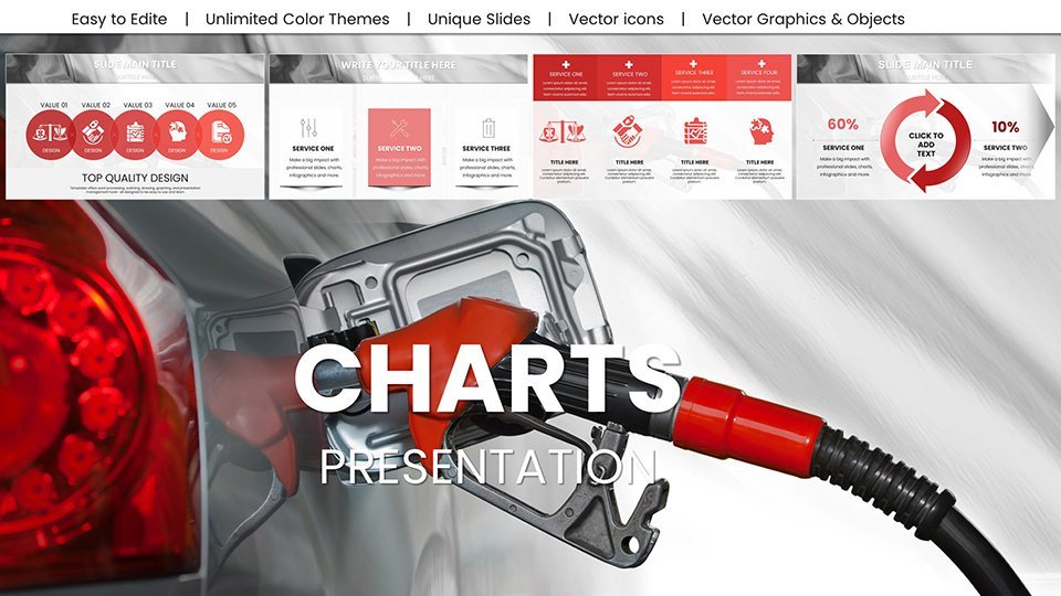
Oil Price Keynote Charts: Forecast Energy Markets


Type: Keynote Charts template
Category: Graphs, Illustrations
Sources Available: .key
Product ID: KC00999
Template incl.: 59 editable slides
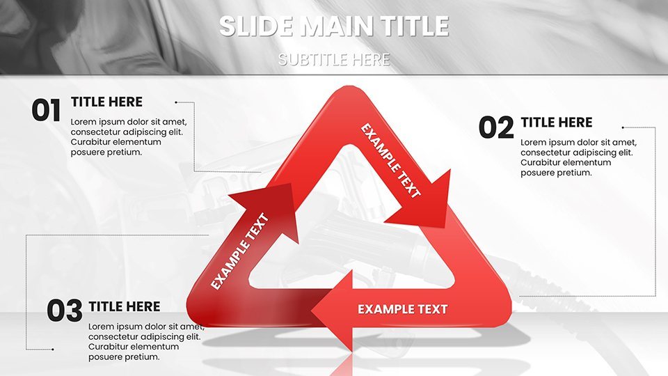
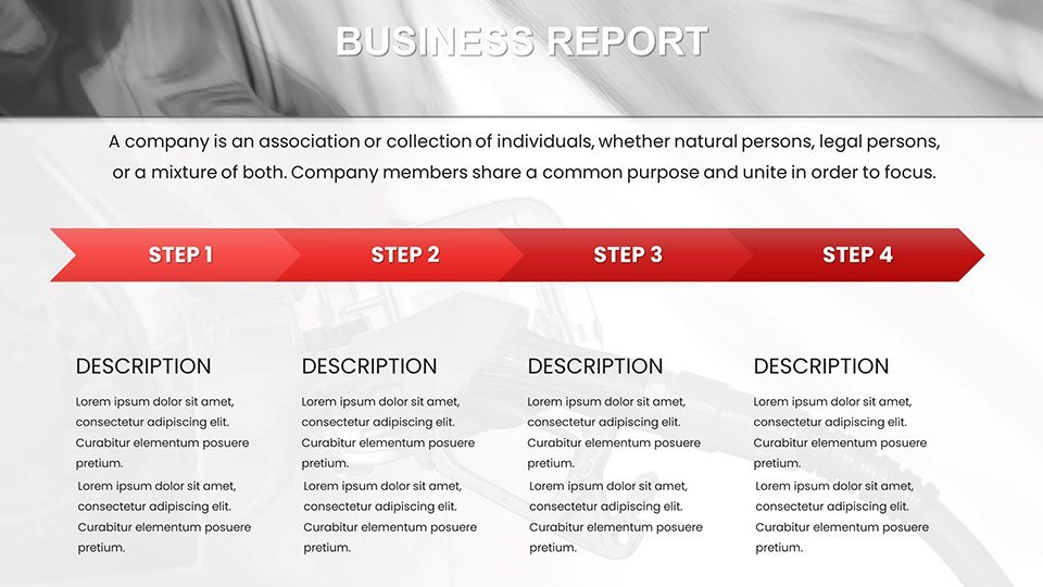
Envision a boardroom where the flicker of a projected chart doesn't just show numbers - it ignites strategic conversations. The Oil Price Keynote Charts template delivers exactly that: 59 editable slides engineered for energy professionals to unpack barrel-by-barrel realities with finesse. From financial analysts dissecting Brent crude swings to executives plotting merger synergies, this tool turns opaque market data into crystal-clear pathways forward.
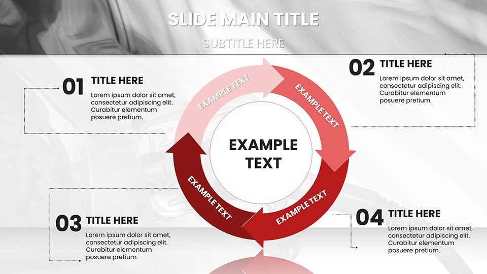
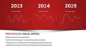
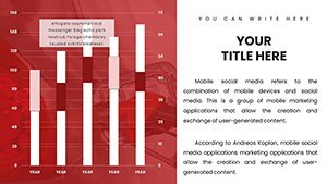
Crafted for Keynote's robust ecosystem (versions 2016+), it excels in blending raw inputs with polished outputs, like a stacked column chart on slide 12 that dissects OPEC quotas against global demand. No steep learning curve - just intuitive drag-and-drop for your latest EIA reports, yielding forecasts that feel alive, not archival. Educators in business schools find it invaluable too, using bubble charts to simulate geopolitical shocks, where size represents volume traded and color hue signals risk levels.
This isn't a one-size-fits-all; it's oil-centric, with icons of rigs and pipelines that anchor your narrative in industry authenticity. Benefits abound: Spot correlations between supply disruptions and stock valuations faster, arming you for those pivotal Q&A moments. Whether briefing investors or training teams, these visuals bridge data to decisions, saving you from the drudgery of manual charting. Let's drill down into what makes this template a powerhouse.
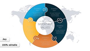
Standout Features for Energy Insights
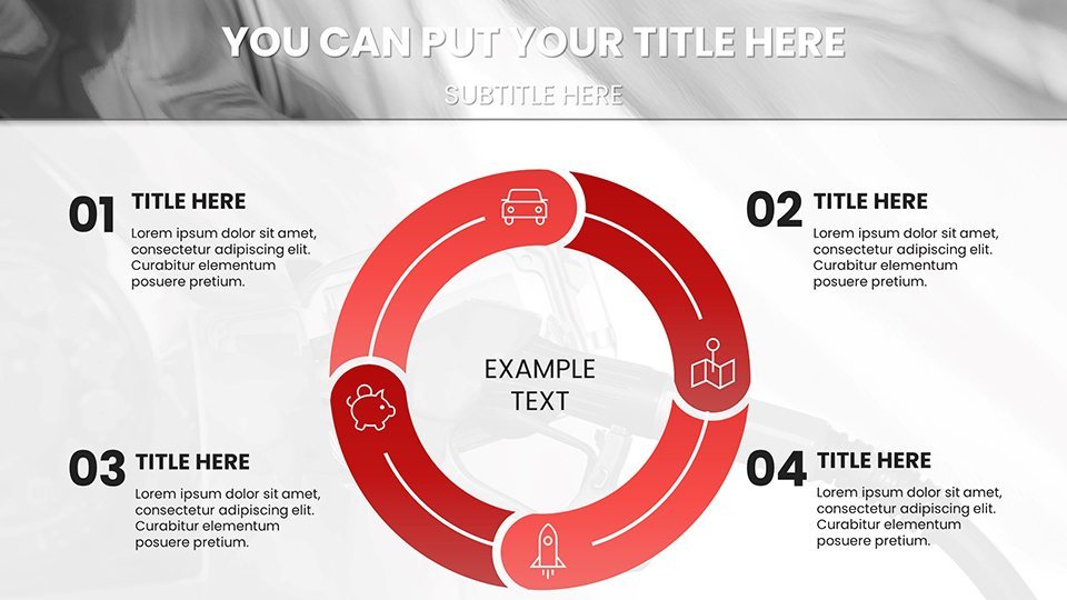
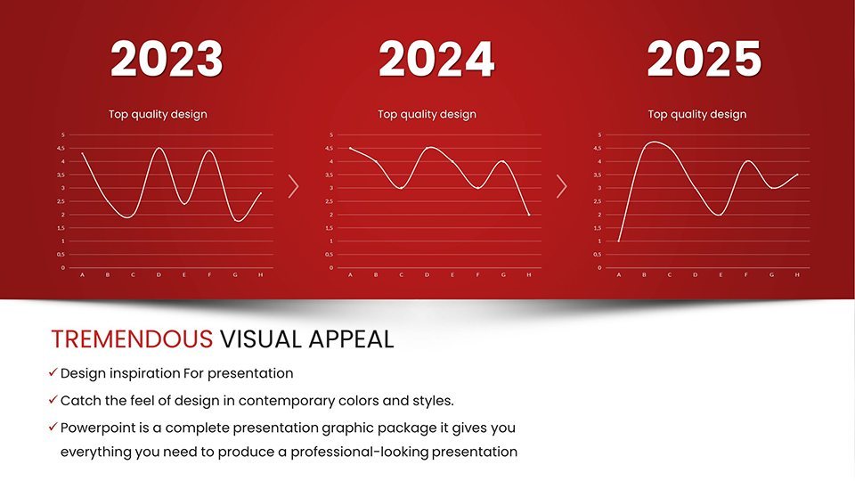
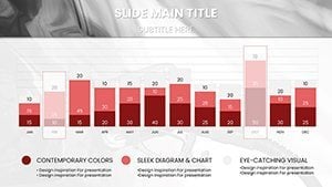
At the heart are features that prioritize usability without sacrificing sophistication. The executive summary slide (slide 5) offers a radar chart comparing WTI and Brent benchmarks, with spokes for volatility metrics - scale it to your timeframe, and it recalibrates on the fly. Customization reigns: Swap gradients from sunset oranges to corporate grays, or embed formulas for auto-updating totals.
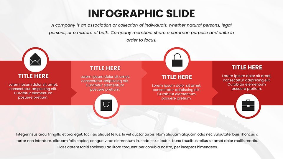
Explore the timeline series: Gantt-style bars for production cycles, annotated with event markers for milestones like shale booms. All elements are vector-sharp, zooming flawlessly for hybrid meetings. And the interactivity? Hyperlink datasets to live feeds, so your projections evolve as markets do - a nod to agile practices in trading floors worldwide.
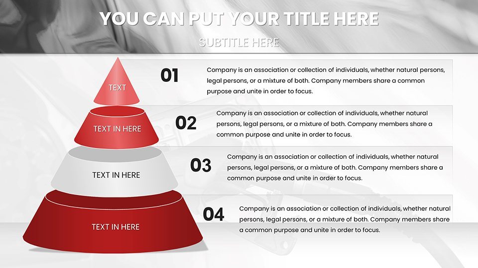
- Projection Tools: Funnel charts for refining throughput, with drag handles for scenario tweaking.
- Correlation Maps: Heatmaps linking prices to currencies, auto-gradienting for intensity.
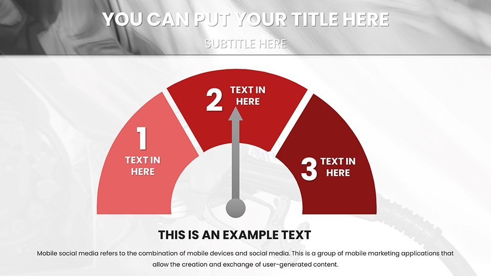
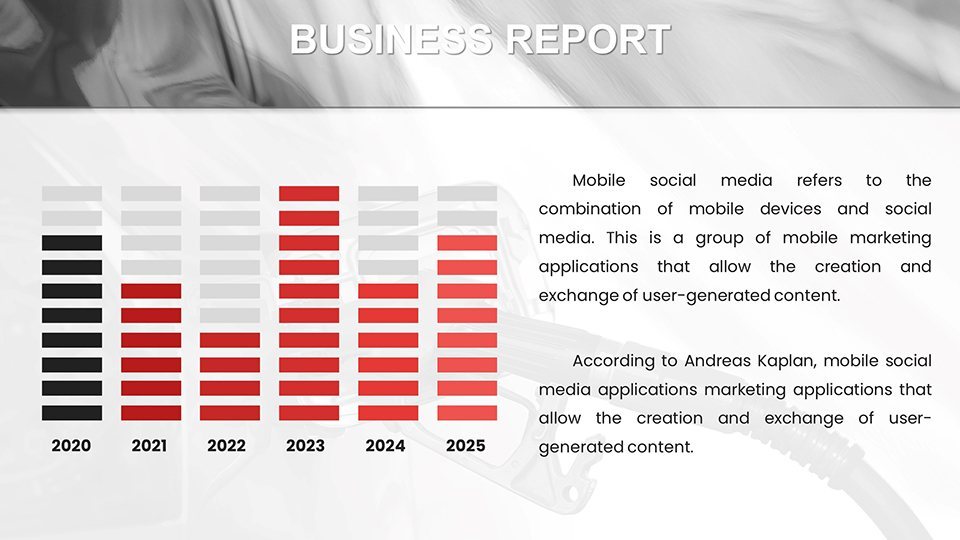
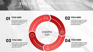
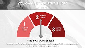
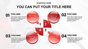
- Dashboard Widgets: Modular gauges for real-time spot prices, resizable for focus slides.
Versus basic Keynote inserts, this cuts build time dramatically, focusing your energy on interpretation over illustration.
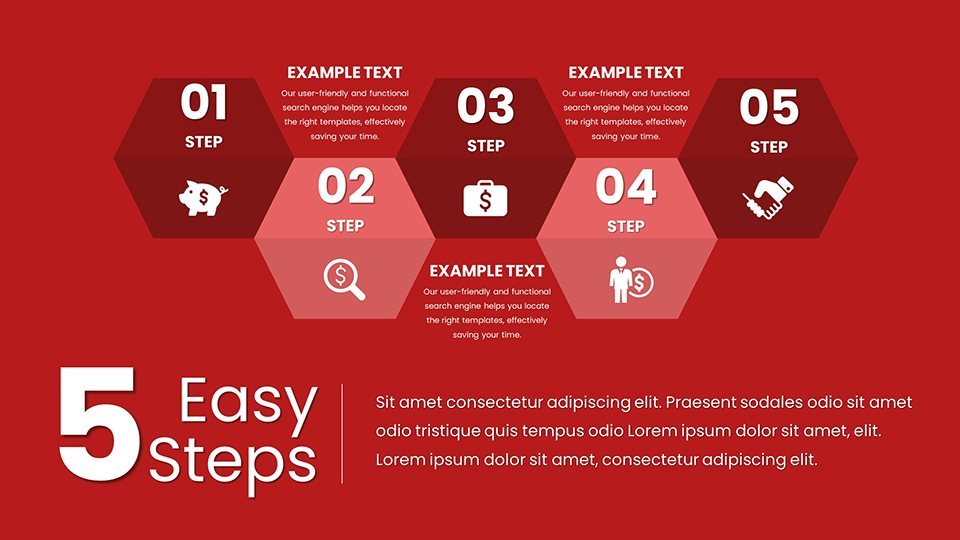
Targeted Use Cases: Powering Professional Narratives
Financial Analysts: Precision in Predictions
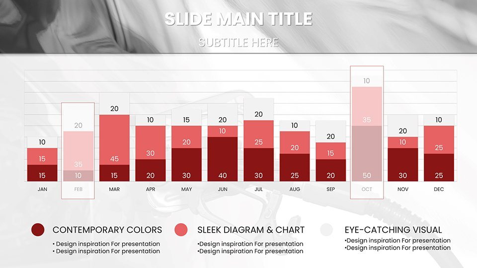
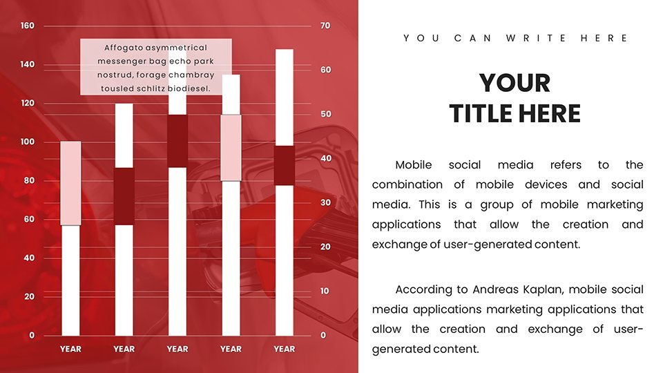
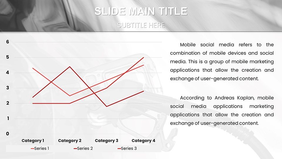
For quants eyeing derivatives, slide 28's combo chart merges candlesticks with moving averages - import your Bloomberg exports, align peaks and troughs, and reveal hedging sweet spots. Workflow: Step one, validate data sources. Step two, apply smoothing filters via built-in options. Step three, sequence the build-out to mimic market ticks, captivating even skeptical auditors. Echoing strategies from hedge fund playbooks, it demystifies volatility for clearer risk assessments.
Energy Executives: Strategic Storytelling
Lead with impact in C-suite huddles using the waterfall chart on slide 37, cascading from upstream costs to downstream profits. Layer in sensitivity analysis by duplicating and varying inputs - watch margins shift visually. One executive swapped static tables here for this dynamic flow, transforming annual reviews into forward-looking forums that aligned teams on diversification plays.
- Input baseline revenues from ERP systems.
- Adjust for variables like carbon taxes.
- Present with pause points for discussion prompts.
Academics and Consultants: Illuminating Complexities
Lecturers, harness the polar area chart for renewable transitions - wedge sizes for oil dependency, angles for adoption rates. Students edit collaboratively via shared Keynote files, debating policy levers in real time. Consultants appreciate the export options: High-res PNGs for whitepapers, preserving fidelity for client deliverables.
This template outpaces vanilla tools by embedding energy-specific LSI - like "barrel equivalents" labels - streamlining your prep for niche audiences.
Pro Tips for Seamless Integration
Maximize with master slide overrides: Lock in your footer with disclaimers, freeing slide-specific edits. For color-blind friendly decks, toggle to monochromatic schemes with pattern fills instead of hues. Animate sparingly - a subtle pulse on forecast lines draws eyes without distracting, akin to Bloomberg terminal cues.
Workflow hack: Batch-edit data via Keynote's find-and-replace for units (e.g., $/bbl to euros), then rehearse with presenter view for timed reveals. These refinements, honed from sector conference keynotes, ensure your deck doesn't just inform - it influences.
In a market as fluid as oil, static slides won't cut it. This template keeps you ahead, blending data depth with design flair.
Ignite Your Next Energy Pitch
Secure your edge today - grab the Oil Price Keynote Charts template and forecast with flair that fuels success.
Frequently Asked Questions
Which Keynote versions are supported?
Designed for Keynote 2016 and newer, with full compatibility across recent macOS updates.
Are there templates for other commodities?
This focuses on oil, but its charts adapt easily to natural gas or metals with minor tweaks.
How do I import external data?
Use Keynote's table import from CSV or copy-paste from spreadsheets, with auto-chart linking.
Can animations be turned off?
Yes, all transitions are optional - disable via the animate tab for static exports.
What file formats can I export to?
Export to PDF, PowerPoint, or images, retaining editability where possible.
Is mobile editing supported?
Fully editable on iPad via Keynote app, ideal for on-the-go refinements.