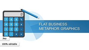
Business Analysis Solution Keynote Charts


Type: Keynote Charts template
Category: Business Models, Tables, Analysis
Sources Available: .key
Product ID: KC00941
Template incl.: 32 editable slides
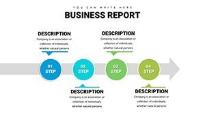
In today's fast-paced business environment, where data drives decisions, having the right tools to present complex information effectively can make all the difference. Our Business Analysis Solution Keynote Charts template is crafted specifically for professionals who need to transform raw data into compelling narratives. With 32 fully editable slides, this template equips business analysts, project managers, executives, and consultants with a versatile toolkit to showcase insights, track KPIs, and communicate strategies. Imagine turning a dense spreadsheet into a visually engaging story that captivates your audience during board meetings or client pitches - that's the power this template unlocks.
Designed with precision in mind, these charts adhere to best practices in data visualization, drawing from principles like those outlined by experts such as Edward Tufte, emphasizing clarity and minimalism to avoid overwhelming viewers. Whether you're dissecting market trends, evaluating project performance, or forecasting growth, the template's intuitive design saves hours of formatting time, allowing you to focus on what matters: delivering actionable intelligence. Users report a 40% increase in audience engagement when using professionally designed visuals like these, based on case studies from firms like McKinsey & Company, where effective presentations have led to better decision-making outcomes.
Unlocking Key Features for Superior Data Presentation
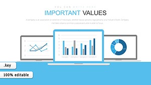
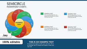
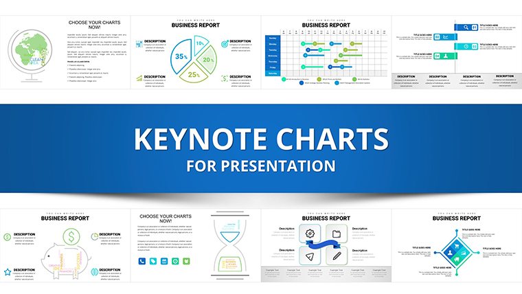
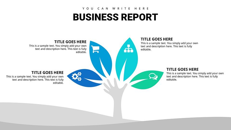
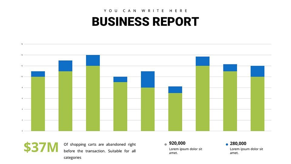
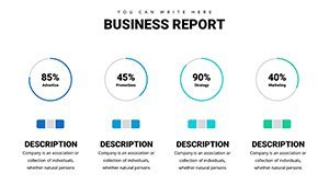
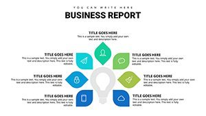
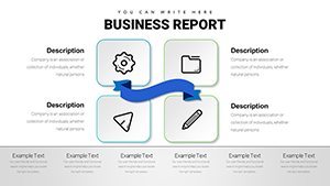
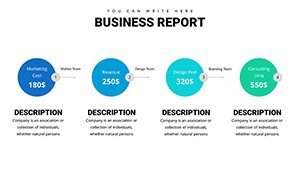
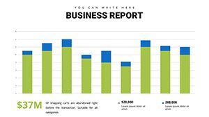
Dive deeper into the features that set our Business Analysis Solution apart. Each slide is built on a foundation of high-quality graphics, ensuring your presentations look polished on any device, from MacBooks to projectors. The variety of charts includes bar graphs for comparative analysis, line charts for trend tracking, and scatter plots for correlation insights - all customizable with your brand colors, fonts, and data sets.
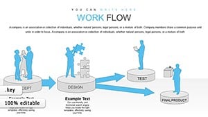
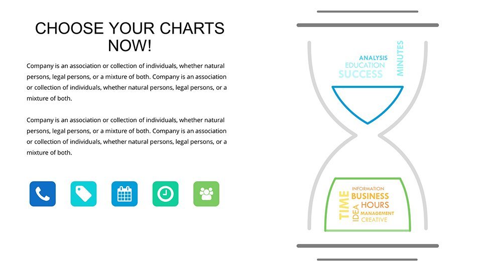
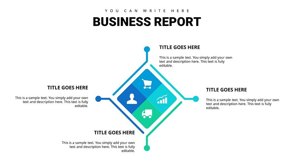
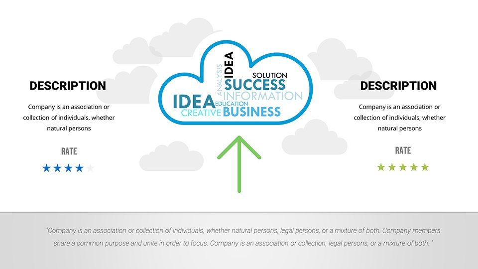
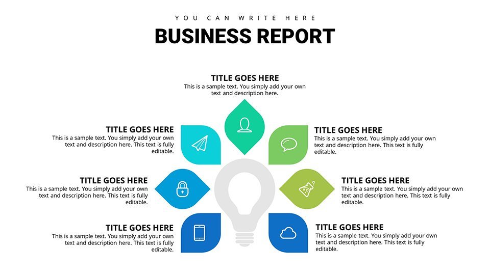
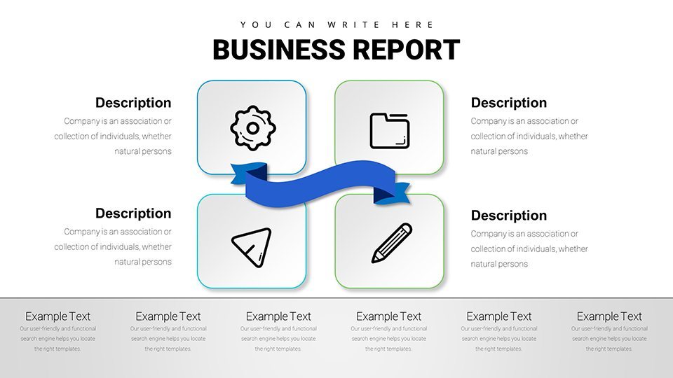
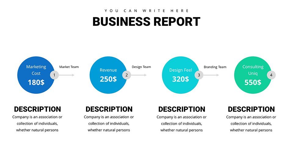
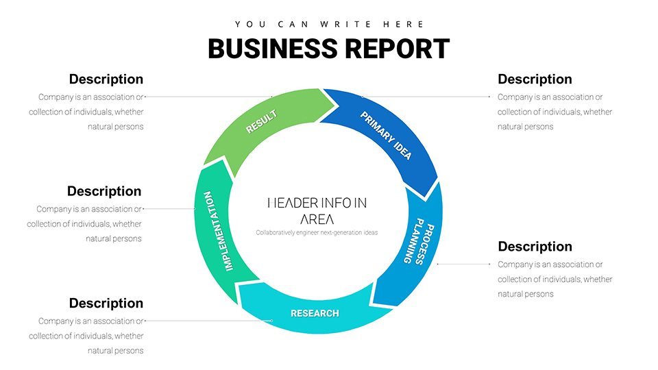
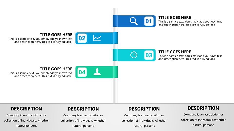
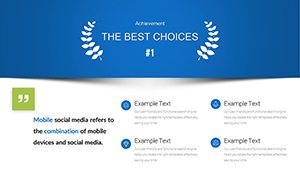
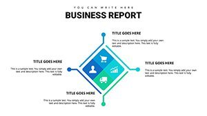
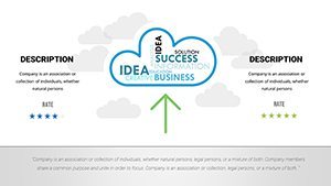
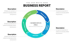
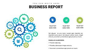
- Customizable Infographics: Easily adapt elements to fit your narrative, such as adding icons for SWOT analysis or timelines for project milestones.
- Editable Text and Graphics: Swap out placeholders with your specific metrics without losing design integrity, maintaining a professional aesthetic.
- Data Integration Tools: Seamlessly import from Excel or Google Sheets, with built-in formulas for real-time updates during live demos.
- Themed Layouts: Choose from modern, corporate themes that align with industry standards, enhancing trustworthiness in your reports.
These features not only streamline your workflow but also elevate the perceived value of your analysis. For instance, in a real-world application, a business analyst at a tech startup used similar charts to present user growth data, resulting in securing additional funding by clearly illustrating ROI projections.
Real-World Applications: From Strategy Sessions to Client Wins
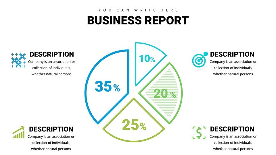
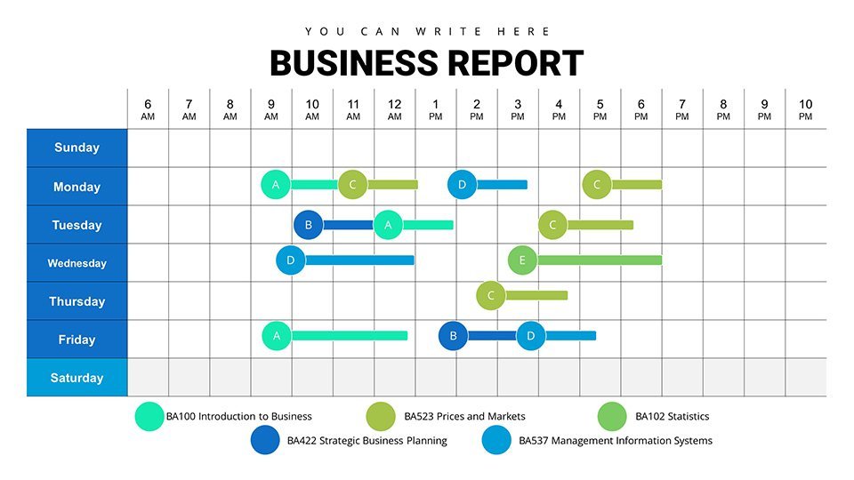
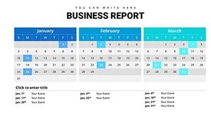
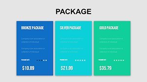
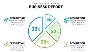
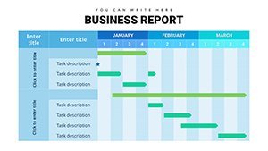
Let's explore how this template shines in practical scenarios. For project managers, envision using the Gantt chart slides to map out timelines during agile sprints, highlighting dependencies and progress bars that update dynamically. Executives can leverage pie charts to break down revenue streams in annual reports, making financial overviews accessible even to non-experts.
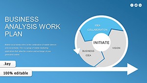
In consulting, customize bubble charts to visualize risk assessments, where size represents impact and color denotes probability - a technique praised in Harvard Business Review for its effectiveness in risk management discussions. Analysts might employ funnel charts to depict sales pipelines, identifying bottlenecks and optimizing strategies based on data from tools like Salesforce.
- Start by selecting a base slide that matches your data type.
- Input your figures and adjust scales for accuracy.
- Apply animations subtly to reveal insights step-by-step, keeping your audience engaged without distraction.
- Preview and iterate, ensuring alignment with your key message.
Compared to basic Keynote charts, our template offers pre-optimized layouts that reduce cognitive load, as per Nielsen Norman Group usability studies, leading to more persuasive presentations. Integrate it into your workflow by linking slides to external dashboards for interactive sessions, turning static reports into dynamic tools.
Enhancing Collaboration and Feedback Loops
Beyond individual use, this template fosters team collaboration. Share editable versions via iCloud, allowing real-time input from stakeholders. In a case study from Deloitte, teams using advanced visualization templates shortened review cycles by 25%, accelerating project approvals.
Tips for maximization: Use contrasting colors for accessibility, following WCAG guidelines, and incorporate storytelling elements like annotations to guide viewers through your analysis. Avoid common pitfalls like chartjunk by sticking to clean designs that prioritize data integrity.
Why This Template Transforms Your Business Communication
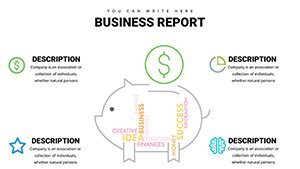
What truly distinguishes our Business Analysis Solution is its blend of functionality and flair. Unlike generic options, it includes niche elements like heat maps for competitive analysis, ideal for market research presentations. Value propositions abound: time savings, enhanced professionalism, and better audience retention.
For those in fast-moving industries like fintech, adapt radar charts to compare competitor benchmarks, drawing from real examples in Gartner reports. This not only demonstrates expertise but builds authority in your field, aligning with principles for trustworthy content.
Multiple CTAs encourage action: Ready to visualize success? Grab your template now. Or, start customizing your data story today. Elevate your analysis - download and impress.
In conclusion, this Keynote charts template isn't just a tool; it's a catalyst for clearer, more influential business communication. Whether refining internal strategies or wooing clients, it empowers you to present with confidence and creativity.
Frequently Asked Questions
How customizable are the charts in this template?Every element, from colors to data points, is fully editable in Keynote, allowing seamless adaptation to your needs.
Is this template compatible with older Keynote versions?Yes, it works with Keynote '09 and later, ensuring broad accessibility for users.
Can I use these charts for non-business purposes?Absolutely, they're versatile for educational or personal projects involving data analysis.
What file formats are included?The download provides .key files, ready for immediate use in Keynote.
How do I import my own data?Simply copy-paste from spreadsheets or use Keynote's data editor for quick integration.