Best Choice Keynote Charts Template


Type: Keynote Charts template
Category: Business Models, Tables, Analysis
Sources Available: .key
Product ID: KC00939
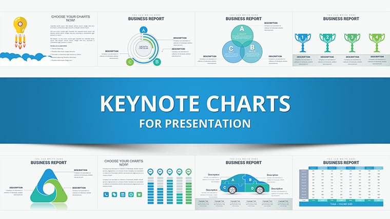
Template incl.: 35 editable slides
Making the right choice in presentations often hinges on how well you convey options and outcomes. Our Best Choice Keynote Charts Template, with 35 editable slides, is engineered to spotlight decisions through dynamic data visualization. Ideal for professionals, students, educators, and entrepreneurs, it simplifies comparing alternatives - from product selections to strategic paths - into digestible, impactful formats. Picture pitching to investors with clear bar graphs showing market potentials, or teaching concepts with pie charts that slice through complexity.
Grounded in decision science from thinkers like Daniel Kahneman, this template uses visual cues to mitigate biases, promoting rational analysis. Entrepreneurs using akin tools have seen pitch success rates climb, as per Startup Genome reports, by making choices visually intuitive. It tackles issues like bland slides by infusing variety, ensuring your message lands with precision and persuasion.
Standout Features for Decision-Driven Designs
Explore features that empower your choices. The template boasts a rich array of charts, all ready for personalization to fit your scenario seamlessly.
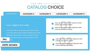
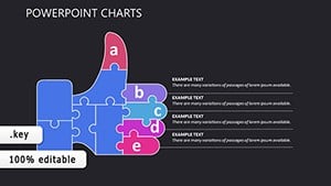
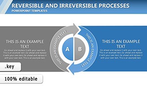
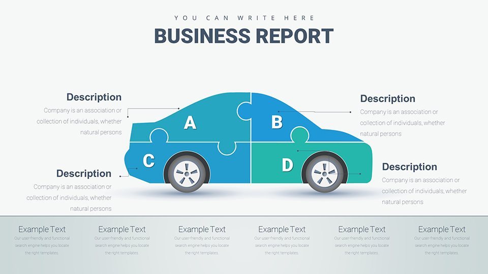
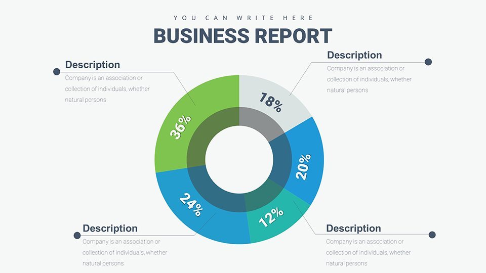
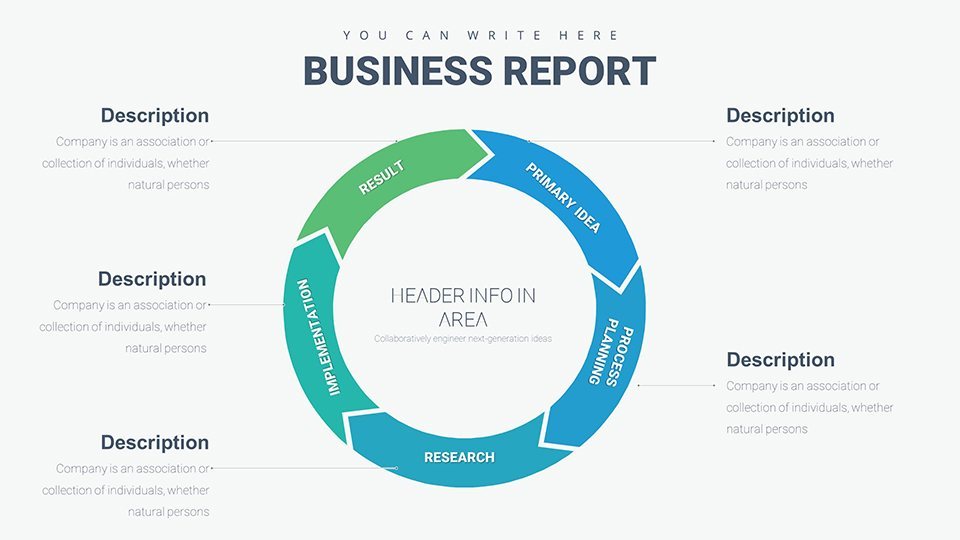
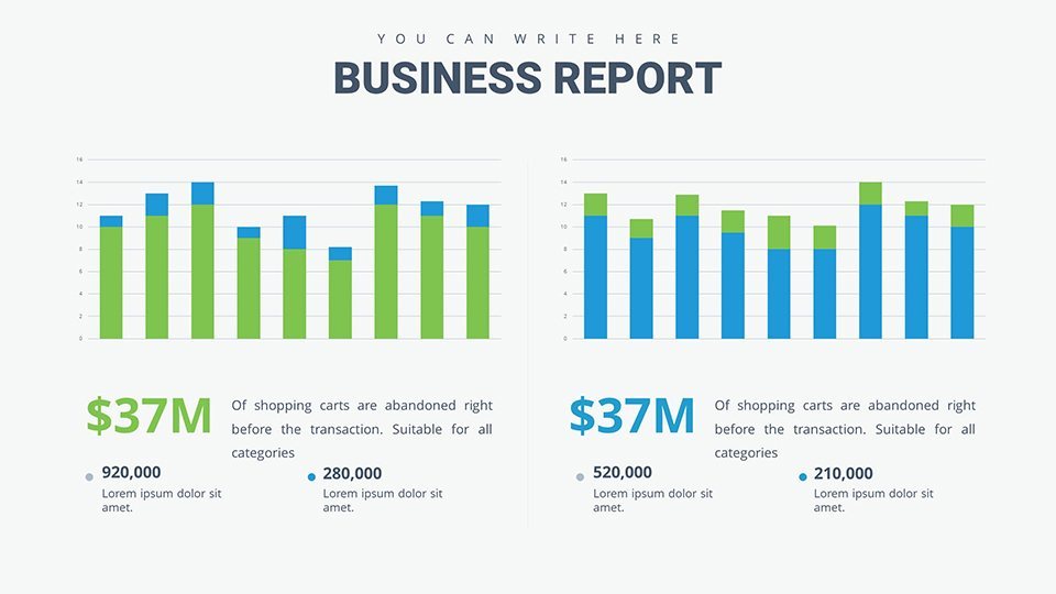
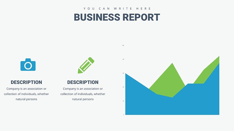
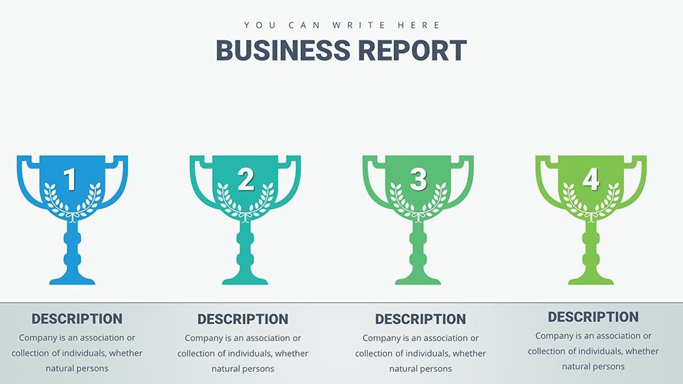
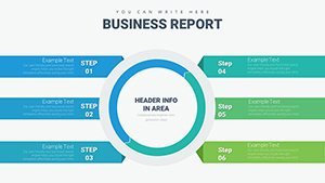
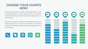
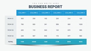
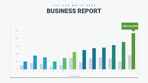
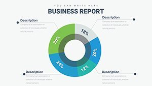
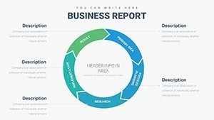
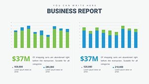
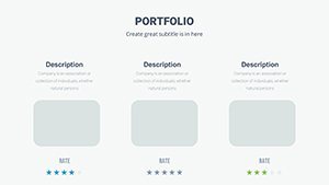
- Varied Chart Types: Bar graphs for quantitative comparisons, pie charts for proportional breakdowns, and more for multifaceted decisions.
- Flexible Layouts: Resize, recolor, and rearrange elements to align with your branding or emphasis needs.
- Cross-Device Compatibility: Edit on Mac or iPad, present anywhere without glitches.
- Quick Integration: Drag-and-drop data from sources like CSV files for instant updates.
These attributes turn data into decisions. A student, for instance, might use a decision tree slide to analyze case studies, enhancing learning outcomes as noted in educational journals.
Use Cases: Empowering Choices in Every Arena
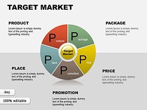
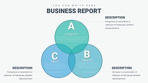
This template excels in diverse applications. Professionals can deploy radar charts for vendor evaluations in procurement, streamlining selections per ISM guidelines. Students and educators benefit from matrix charts in debates, fostering critical thinking.
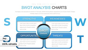
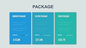
Entrepreneurs, craft SWOT pies for business plans, highlighting strengths vividly to attract funding. Workflow: Assess options, select chart, input criteria, visualize scores.
- Define your decision criteria.
- Choose a comparative chart slide.
- Populate with weighted data.
- Animate for step-by-step reveals.
Outshining basic tools, it includes pre-scored templates for faster insights, backed by efficiency studies from McKinsey. Link to decision software for advanced integrations, amplifying its role in strategic planning.
Pro Tips for Choice Visualization
Optimize by using legends sparingly and focusing on key metrics, per data viz principles. Add narratives to charts for context, turning numbers into stories.
In practice, an analyst compared investment options with bubble charts, leading to optimized portfolios, mirroring successes in finance from Bloomberg analyses.
Elevating Your Decision Presentations
Its uniqueness lies in choice-centric designs, like weighted bar sets for pros/cons. Benefits include sharper insights, engaged audiences, and confident choices.
For innovators, adapt to A/B testing visuals, informed by tech trends from Forrester. CTAs: Choose excellence - download today. Or, decide on impact now. Unlock choices - customize pronto.
This template reimagines how you present options, fostering better decisions across boards.
Frequently Asked Questions
What chart types are best for decisions?Bar and pie for comparisons, matrices for multi-criteria evaluations.
Can I add my own icons?Yes, easily insert and customize for personalized touches.
Is it suitable for group presentations?Absolutely, with collaborative editing features in Keynote.
How to handle multiple options?Use expandable slides or groupings to organize without clutter.
Does it include templates for scoring?Yes, pre-built scoring charts for quick assessments.