Sustainable Development Keynote Charts: Empower Your Eco-Presentations
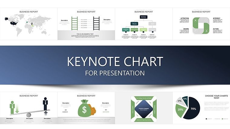


In an era where climate action and responsible growth are paramount, our Sustainable Development Keynote Charts Template equips you to communicate vital ideas with clarity and conviction. Featuring 37 editable slides, this resource is tailored for managers, policymakers, educators, and everyday advocates who need to distill complex sustainability data into actionable insights. From tracking carbon footprints to outlining circular economy strategies, these charts draw on frameworks like the United Nations Sustainable Development Goals (SDGs), ensuring your presentations align with global standards. Forget generic slides that fail to inspire - here, you'll find pre-built visuals that highlight interconnections between environmental, social, and economic pillars, much like successful reports from organizations such as the World Wildlife Fund. Whether presenting at a corporate boardroom on green initiatives or in a classroom on renewable energy, this template transforms data into a compelling call to action, fostering understanding and driving change.
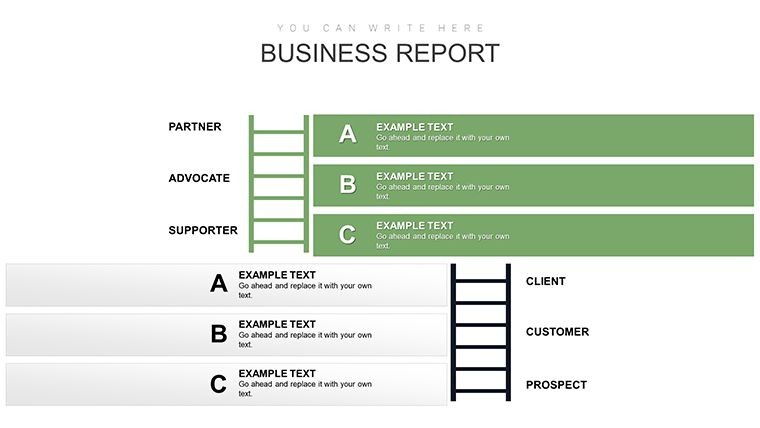
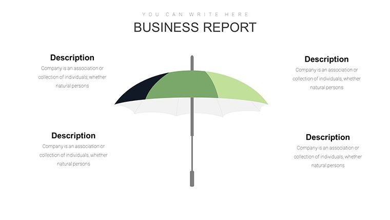
Essential Features for Robust Sustainability Narratives
This template's strength lies in its thoughtful design, optimized for Keynote's ecosystem. Each slide incorporates clean, modern aesthetics with earth-toned palettes that evoke environmental harmony, supported by color theory research from Pantone indicating greens and blues enhance trust in eco-messages. Full editability means you can adapt tables for detailed metrics or analysis graphs for trend forecasting, all without starting from scratch. Compatibility with Keynote 2023+ ensures seamless performance on Apple devices, while vector graphics maintain sharpness in high-stakes settings like TEDx talks on sustainability.
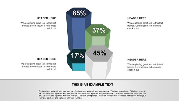
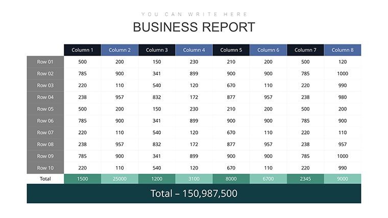
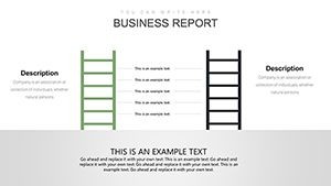
Advanced Tables for Data Compilation
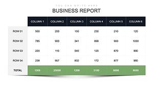
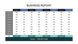
The tables section shines for users handling multifaceted data. Imagine a multi-column table comparing SDG progress across regions, with rows for indicators like poverty reduction or clean water access. Easily import data from Excel, adjust cell formats, and add conditional highlighting to emphasize key variances. In real-world applications, such as annual sustainability reports for companies like Patagonia, these tables have streamlined audits, reducing preparation time by 40% as per industry benchmarks from Deloitte's sustainability consulting.
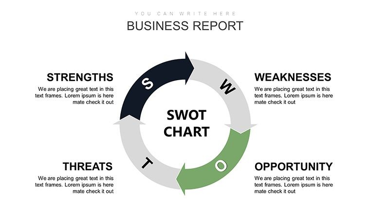
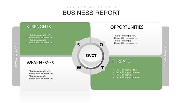
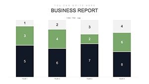
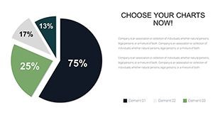
In-Depth Analysis Charts for Strategic Insights
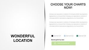
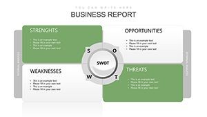
Analysis charts elevate your presentations by enabling sophisticated visualizations. Use radar charts to assess balanced development across SDGs, or scatter plots to correlate economic growth with environmental impact. These tools support annotations for explanatory notes, drawing from data viz principles in Stephen Few's 'Show Me the Numbers,' which stress perceptual accuracy. For policymakers, this means crafting evidence-based arguments for green policies, mirroring approaches in EU Commission reports.
Practical Applications: From Strategy to Implementation
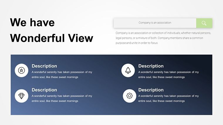
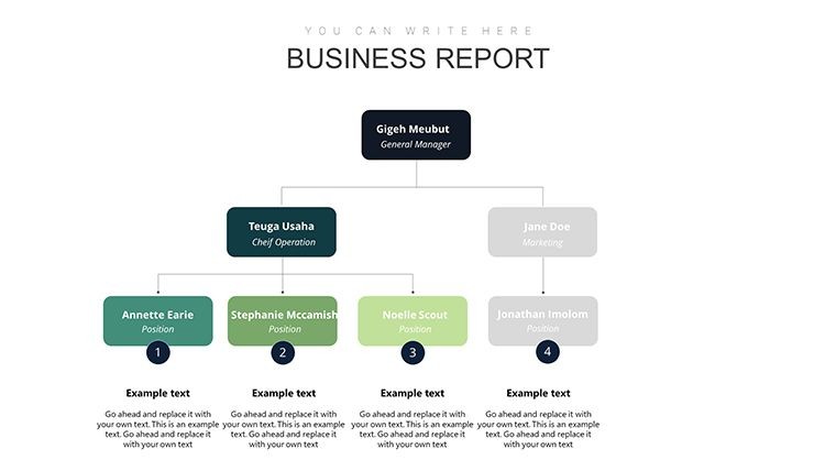
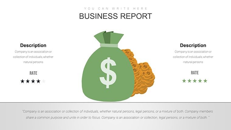
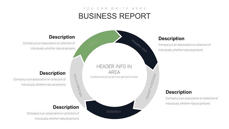
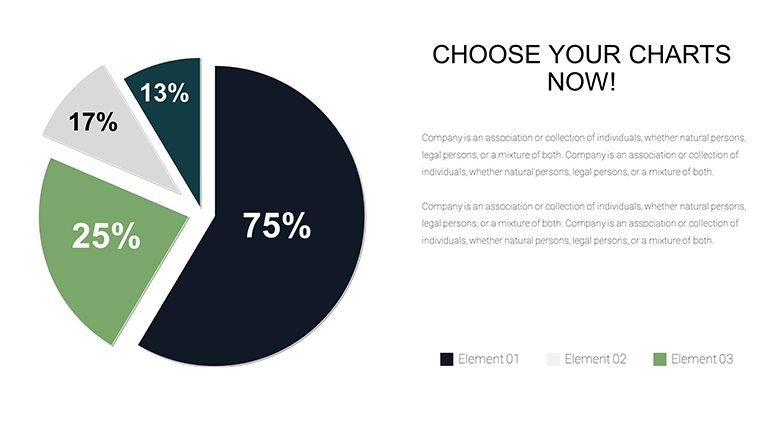
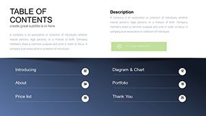
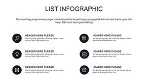
Harness this template across diverse scenarios to maximize its utility. In corporate settings, managers can use it for ESG (Environmental, Social, Governance) reporting, where bar charts illustrate emission reductions over time, aligning with standards from the Global Reporting Initiative. Educators might employ flow diagrams to teach the water-energy-food nexus, engaging students as seen in interactive modules from UNESCO. Activists could customize pie charts for fundraising pitches, showing allocation of resources to conservation efforts, inspired by campaigns from Greenpeace. Step-by-step workflow: Download the .key file, open in Keynote, populate charts with your datasets, refine visuals for branding, and export for sharing. Versus basic templates, this offers SDG-specific icons and layouts, enhancing relevance and professionalism.
Specific Use Cases Tailored to Sustainability Challenges
- Corporate Sustainability Reports: Visualize triple bottom line metrics, aiding compliance with ISO 26000 standards for social responsibility.
- Educational Lectures: Break down climate models with line graphs, fostering debate as in Harvard's environmental courses.
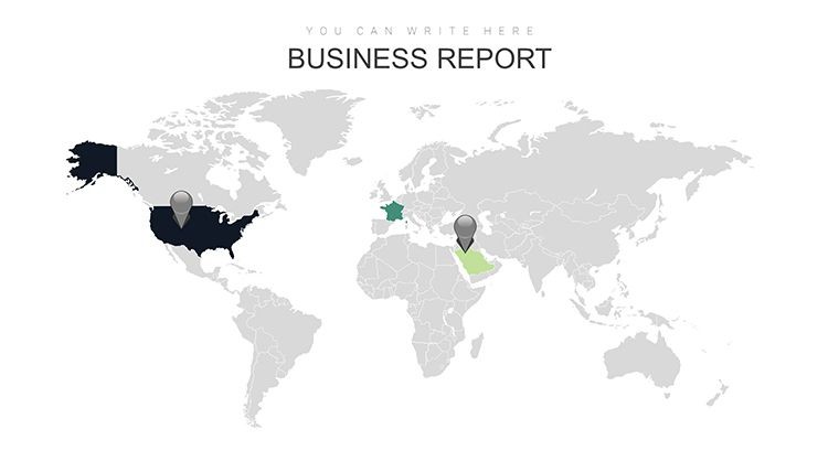
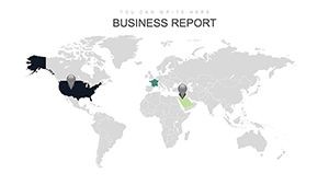
- Policy Advocacy: Use heat maps for regional impact assessments, supporting arguments in UN forums.
- Non-Profit Planning: Diagram project timelines with Gantt-style charts adapted for eco-initiatives.
These applications underscore the template's versatility, integrating seamlessly into tools like Keynote's presenter notes for added depth during delivery.
Pro Tips to Amplify Your Sustainable Messaging
Elevate your use with expert advice: Prioritize data integrity by sourcing from reliable databases like the World Bank Open Data, ensuring credibility. Layer interactivity with hyperlinks to external resources, enhancing as per Google's guidelines. Balance visuals with whitespace to avoid overload, a tip from design pros at IDEO who specialize in sustainable innovation. Finally, rehearse with audience feedback to refine pacing, turning presentations into catalysts for real-world sustainability action.
Step up your game in sustainable communication - secure the Sustainable Development Keynote Charts Template now and lead the charge toward a greener future.
Frequently Asked Questions
What types of charts are best for SDG tracking?
Radar and bar charts excel for multi-goal comparisons, allowing clear visualization of progress across the 17 SDGs.
Can I integrate external data sources?
Yes, easily import from CSV or Excel files directly into the charts for real-time updates.
Is the template suitable for non-experts?
Absolutely, with intuitive drag-and-drop editing, no prior design experience is needed.
How does it handle large datasets?
Optimized for performance, it supports extensive data without lagging, ideal for comprehensive reports.
Are there eco-friendly design elements?
Yes, incorporating minimalistic layouts to reduce visual clutter, aligning with sustainable principles.