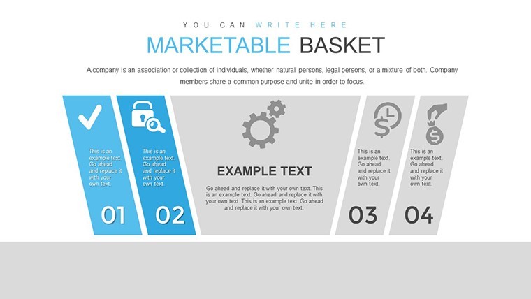
Marketable Basket Matrix Keynote Template for Economic Analysts

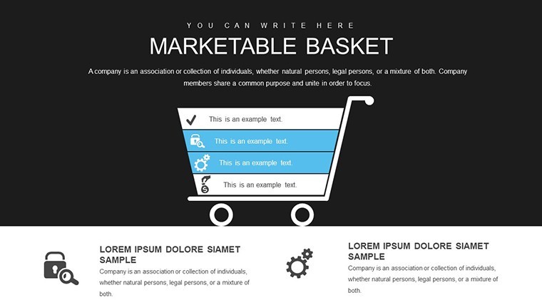
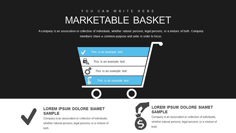
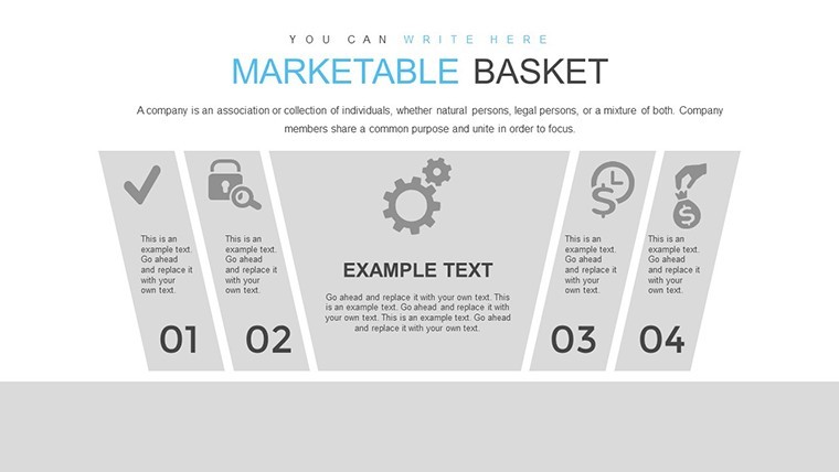
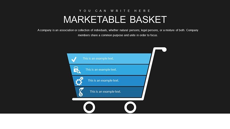
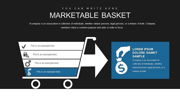
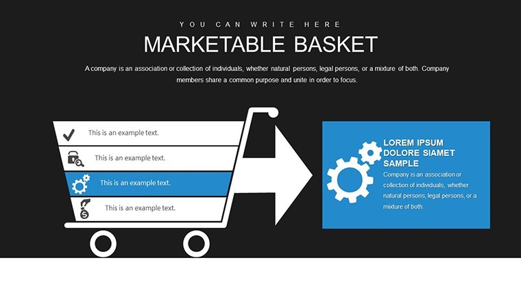
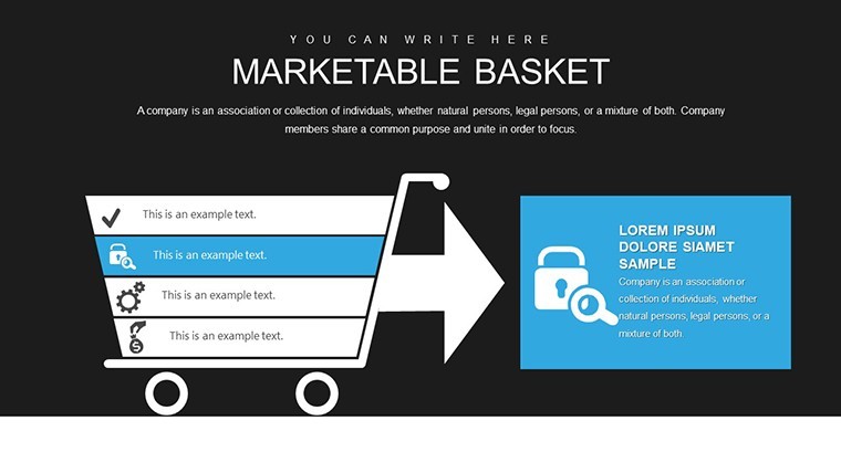
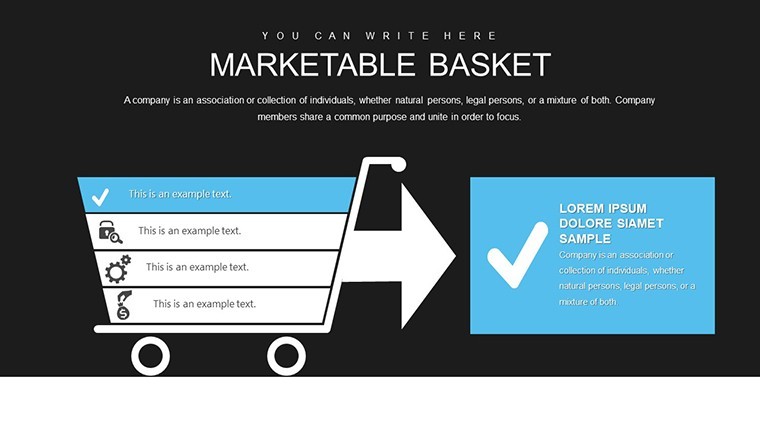

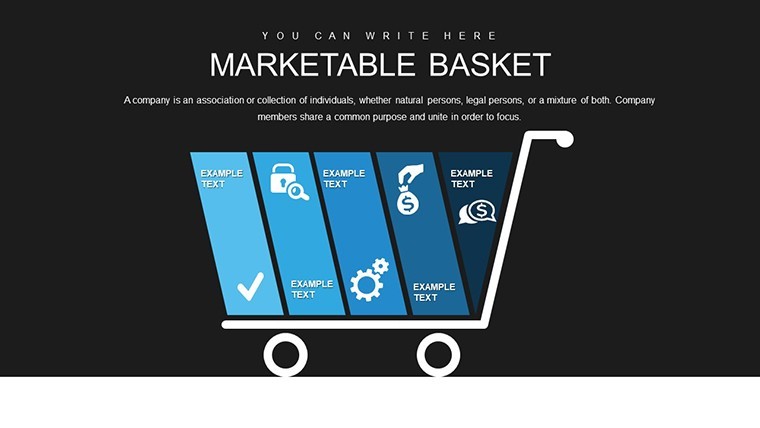


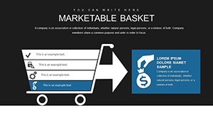
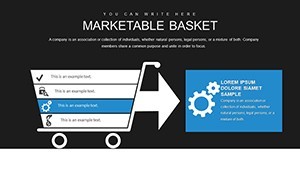
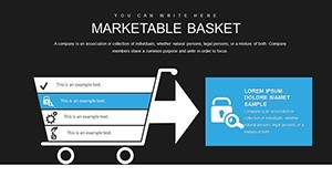
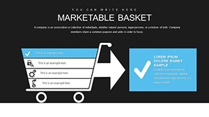


Navigating the complexities of economic analysis requires tools that not only organize data but also reveal hidden patterns and efficiencies. Enter the Marketable Basket Matrix Keynote Template, a powerhouse designed to reflect the outcomes of economic activities through structured visuals. With 38 editable slides, this template is tailored for economic analysts, financial planners, and business strategists who need to demonstrate how resources – from labor to capital – translate into marketable results. Whether you're assessing production efficiencies or forecasting market trends, these matrices provide a clear framework to showcase value creation, helping you turn raw data into strategic narratives that influence decisions at the highest levels.
Harnessing Economic Data with Precision Matrices
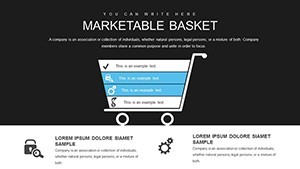
The core of this template lies in its matrix designs, which serve as versatile grids for plotting variables like resource inputs against output values. Imagine mapping a company's material costs versus revenue streams in a grid format, highlighting profitable segments with color-coded cells. This isn't mere charting; it's a method grounded in economic principles, similar to how economists at the World Bank use matrix models to evaluate resource allocation in developing economies. By customizing rows and columns, you can adapt the template to specific scenarios, such as analyzing consumer baskets in inflation studies or optimizing supply chains for cost savings.
Editing is straightforward – select a cell, input your data, and watch the matrix update dynamically. Integrate formulas for calculations like ROI or efficiency ratios directly within Keynote, ensuring your presentations are not static but interactive. For example, in a case study from Harvard Business Review, a retail firm employed matrix analysis to refine their product basket, increasing marketability by identifying underperforming items and reallocating resources, resulting in a 25% uplift in sales.
Essential Features for Analytical Depth
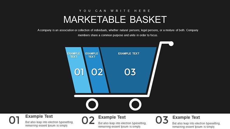
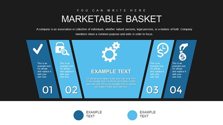
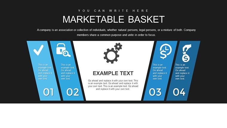
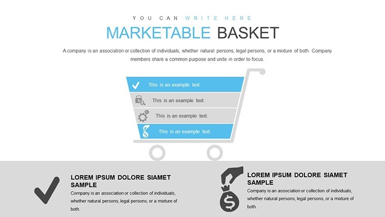
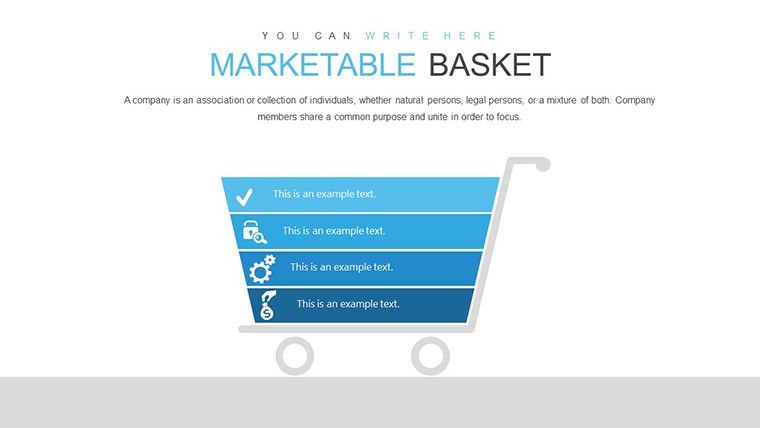
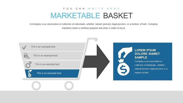
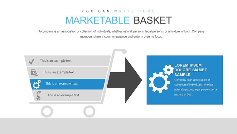
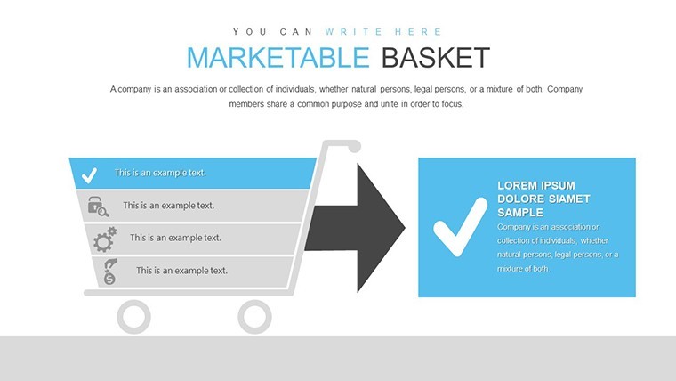
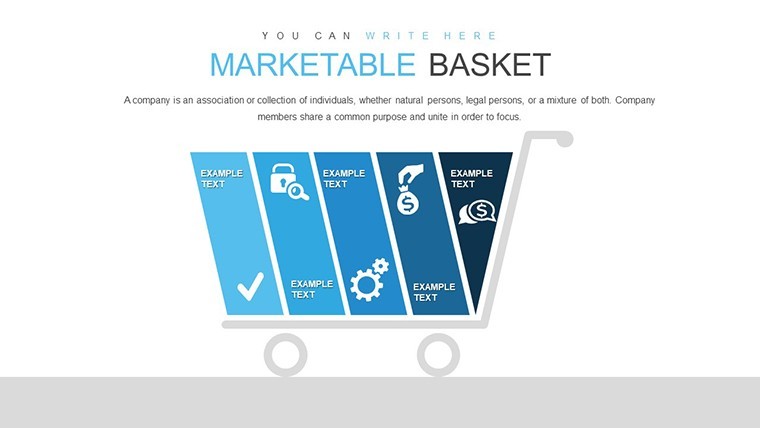
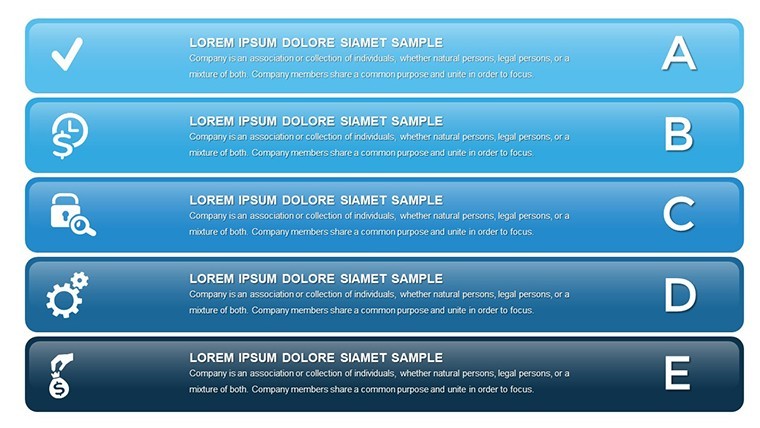
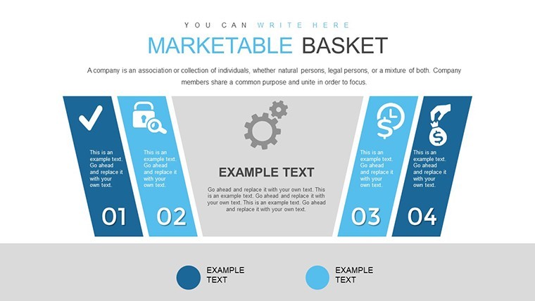
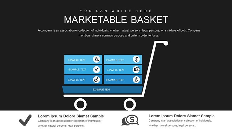
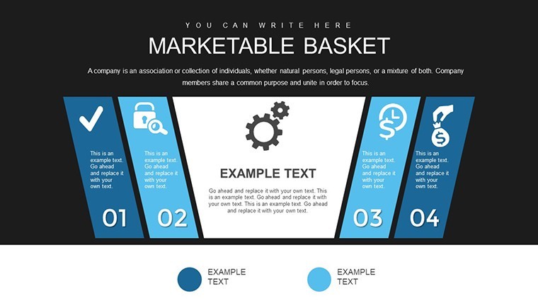
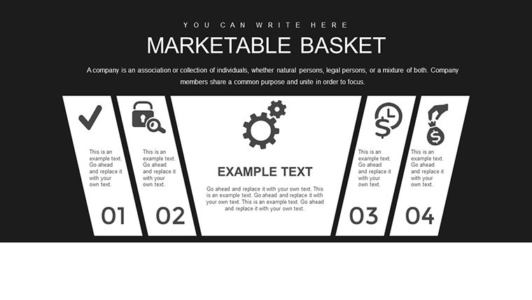
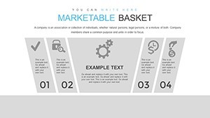
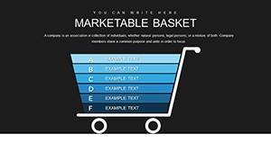
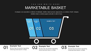
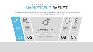
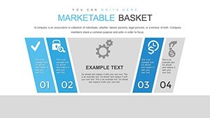
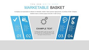
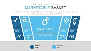
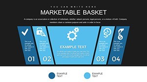
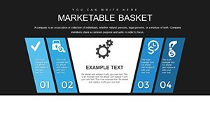
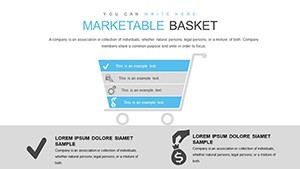
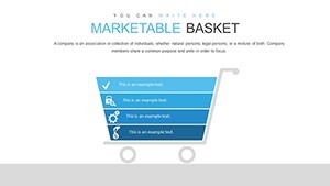
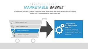
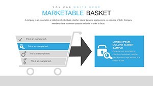
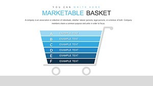
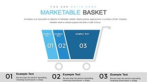
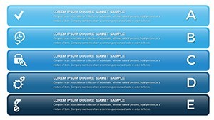
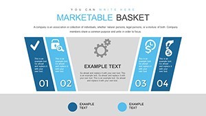
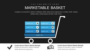
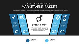
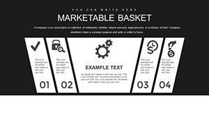
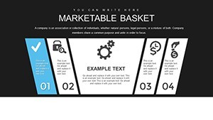
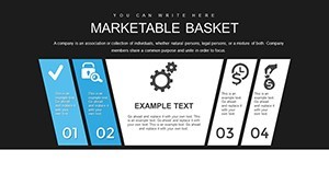
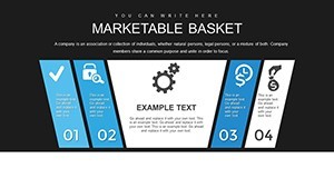
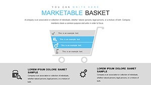
- Extensive Slide Variety: 38 slides covering basic to advanced matrices, including multi-dimensional grids for complex economic modeling.
- Data-Driven Customization: Easily import from spreadsheets, with auto-scaling axes and labels that adjust to your dataset.
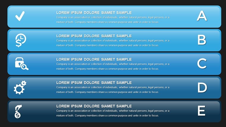
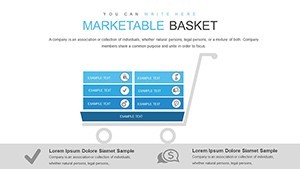
- Visual Enhancements: Use gradients, icons, and annotations to emphasize key insights, making dense economic data accessible.
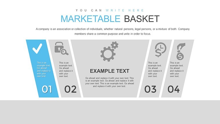
- Professional Themes: Pre-set color schemes aligned with corporate standards, ensuring a polished look without extra effort.
These elements combine to address common challenges in economic presentations, where clarity is paramount. Drawing from authoritative sources like the International Monetary Fund (IMF) reports, which often use matrices to dissect fiscal policies, this template equips you to produce visuals that stand up to scrutiny.
Diverse Applications in Economic Scenarios
Apply this template across a spectrum of use cases. For financial analysts evaluating investment portfolios, use the matrices to compare asset classes against risk factors, aiding in balanced basket recommendations. In macroeconomic planning, governments might visualize trade balances, as seen in EU economic assessments where matrix tools helped optimize export strategies amid global shifts.
Corporate economists can break down production functions, plotting labor hours against output to identify productivity sweet spots. Step-by-step: Open the template, choose a matrix slide, populate with your data via copy-paste from Excel, customize visuals, and add explanatory text. A real-world inspiration comes from Apple's supply chain analysis, where similar matrices streamlined component sourcing, enhancing overall marketability.
In academic settings, professors can use it to teach concepts like input-output models, making abstract theories tangible. For consultants advising on mergers, matrices reveal synergies in combined resource baskets, supporting data-backed recommendations.
Elevating Your Analytical Presentations
What sets this template apart is its focus on user-centric design, ensuring even complex economic models are presented with elegance. Aligned with principles, it draws on proven methodologies from experts like those at Deloitte, who advocate for visual analytics in economic forecasting. Avoid the pitfalls of bland slides; instead, captivate with matrices that tell a compelling story of resource transformation into economic value.
Ready to make your economic insights marketable? Secure this template and start crafting presentations that drive informed actions. Transform ideas into impacts now.
FAQ
- What makes the matrices editable?
- Every element, from cells to labels, can be modified, with support for data imports and formula integrations.
- Is it suitable for beginner analysts?
- Yes, the intuitive interface requires no advanced skills, though familiarity with Keynote helps.
- Can I use this for non-economic presentations?
- Absolutely, the matrix format adapts to any grid-based analysis, like SWOT or risk assessments.
- How do I integrate external data?
- Copy from Excel or CSV files directly into the slides for automatic updates.