3D Steps Processing Keynote Charts Template: Visualize Processes with Depth


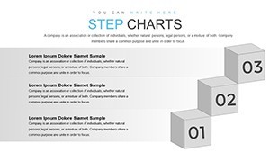
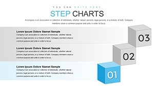
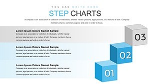

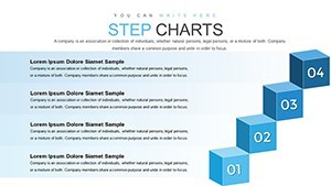


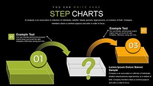
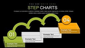
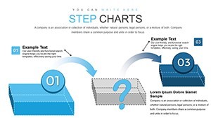
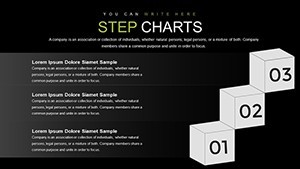

In the fast-paced world of professional presentations, capturing your audience's attention requires more than just data - it demands visual storytelling that brings concepts to life. Our 3D Steps Processing Keynote Charts Template is crafted specifically for those who need to illustrate sequential processes, workflows, and multi-dimensional data in a compelling way. With 32 fully editable slides, this template leverages 3D cube designs to add depth and clarity to your narratives, making it ideal for architects, project managers, engineers, and business strategists. Imagine transforming a mundane project timeline into a vibrant, interactive journey that highlights each step with precision and flair.
This template isn't just about aesthetics; it's about efficiency and impact. Designed for Apple Keynote, it ensures seamless compatibility, allowing you to import, edit, and present without technical hurdles. Whether you're pitching a new architectural blueprint, outlining manufacturing processes, or mapping out strategic business steps, these charts help you convey complex information effortlessly. Users love how the 3D elements create a sense of progression, drawing viewers through the content like a guided tour. By incorporating real-world applications, such as complying with AIA (American Institute of Architects) standards for project visualizations, this template positions you as an expert in your field, boosting your credibility and engagement rates.
Key Features That Set This Template Apart
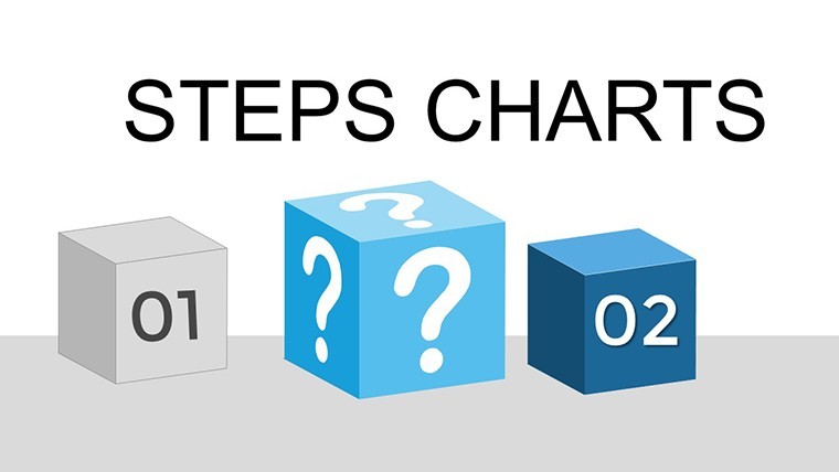
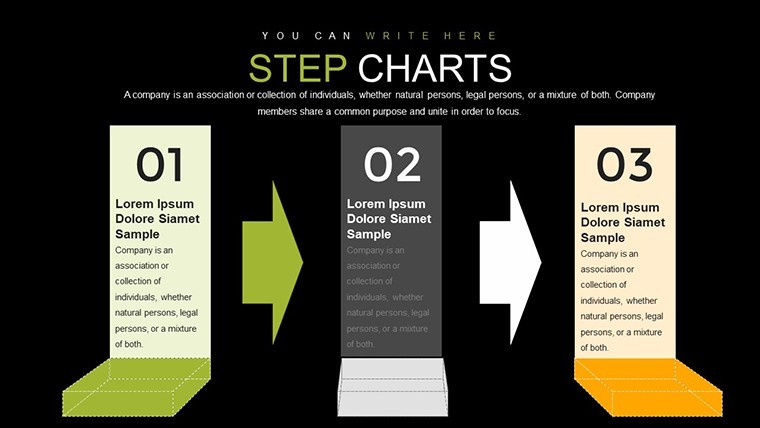
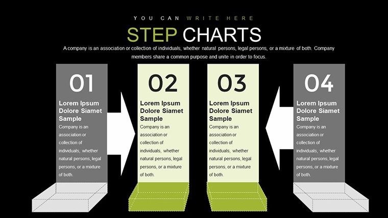
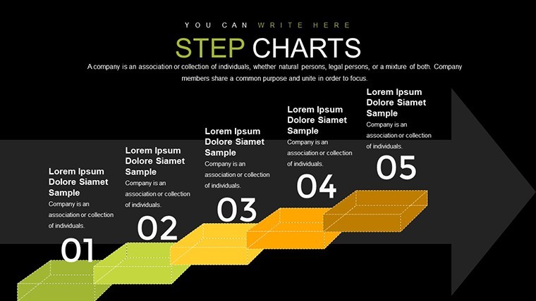
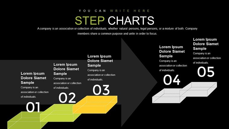
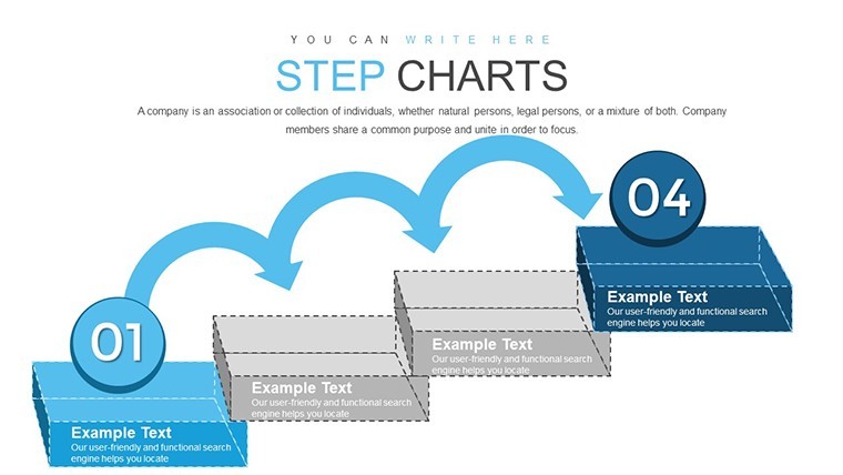
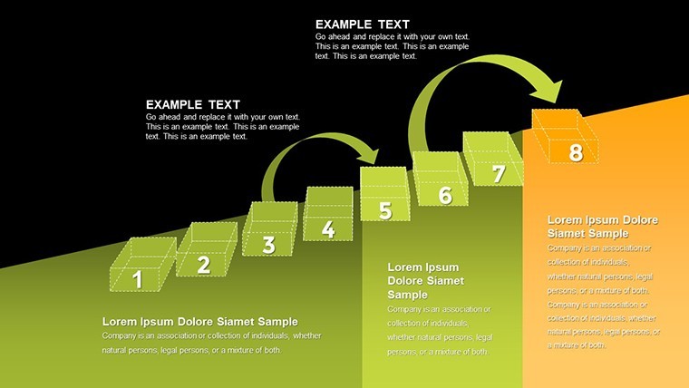
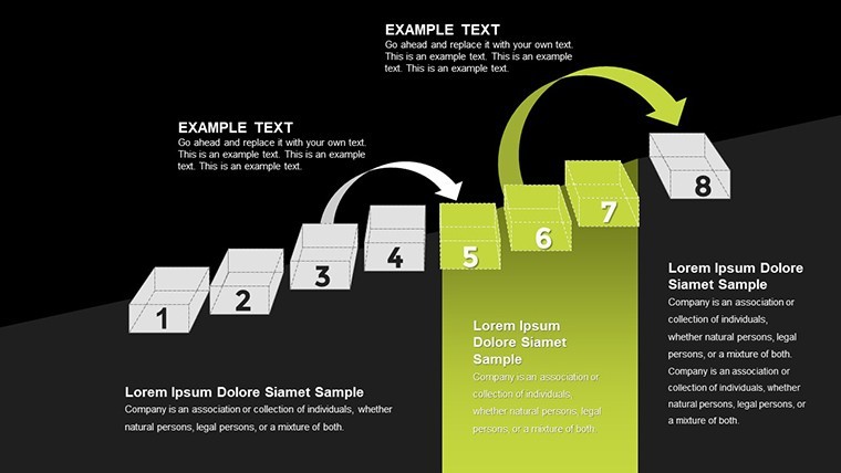
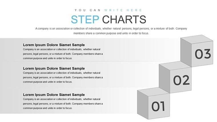
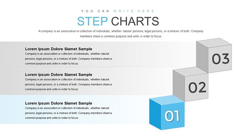
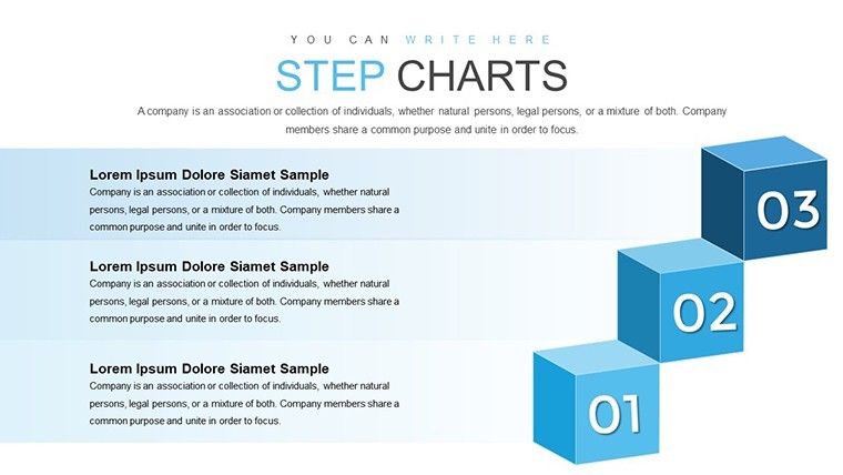
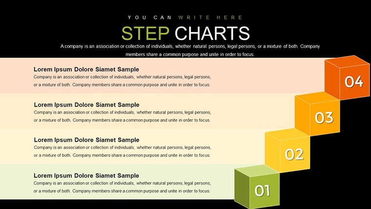
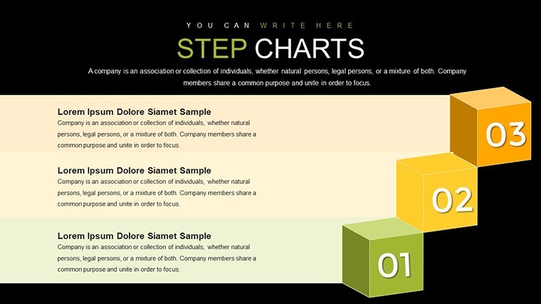
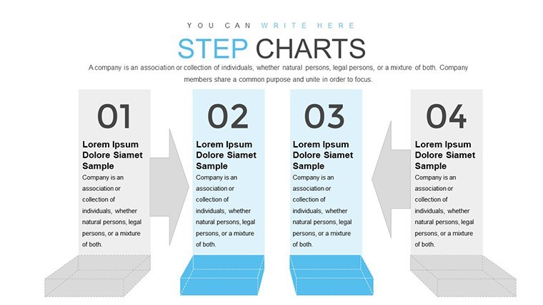
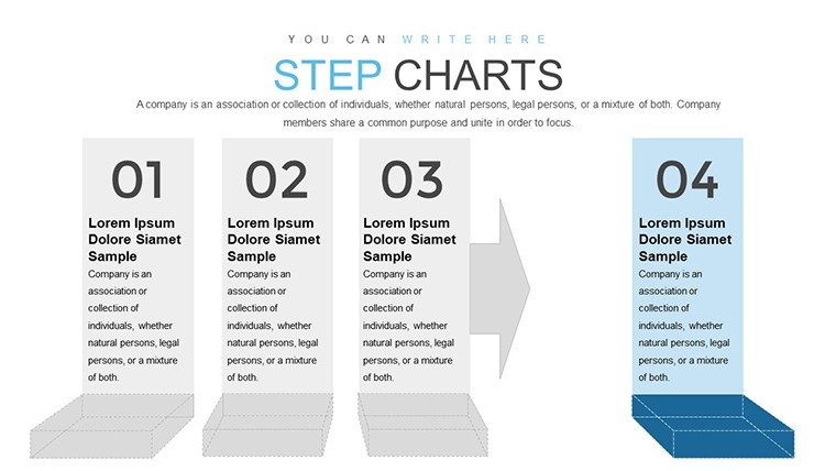
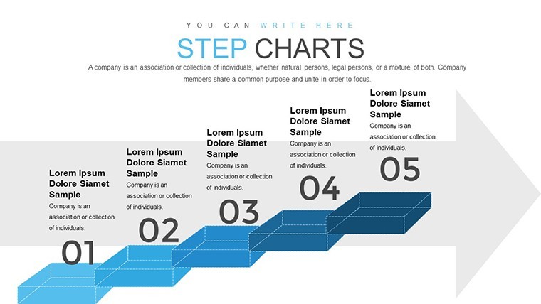
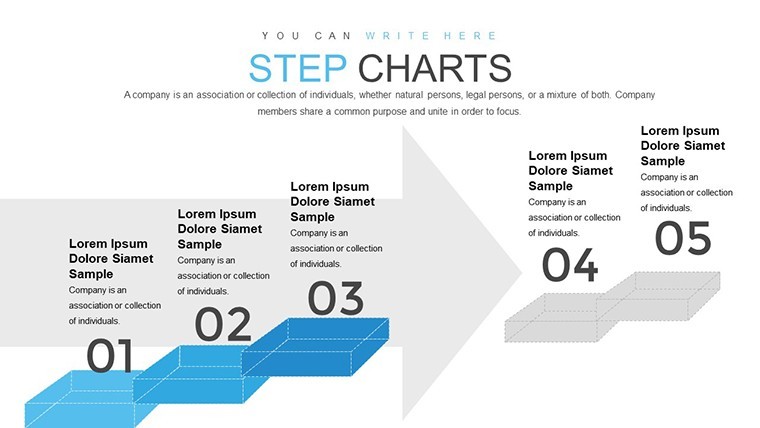
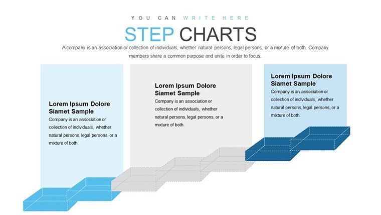
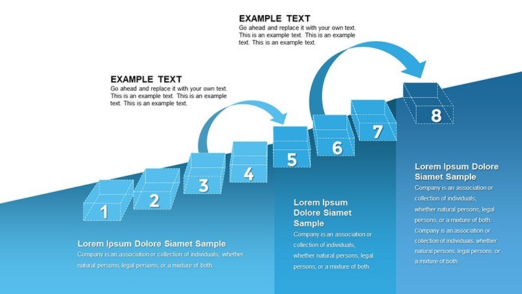
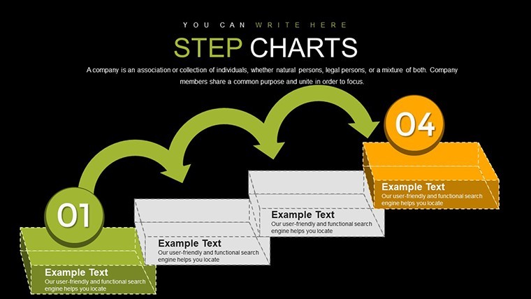
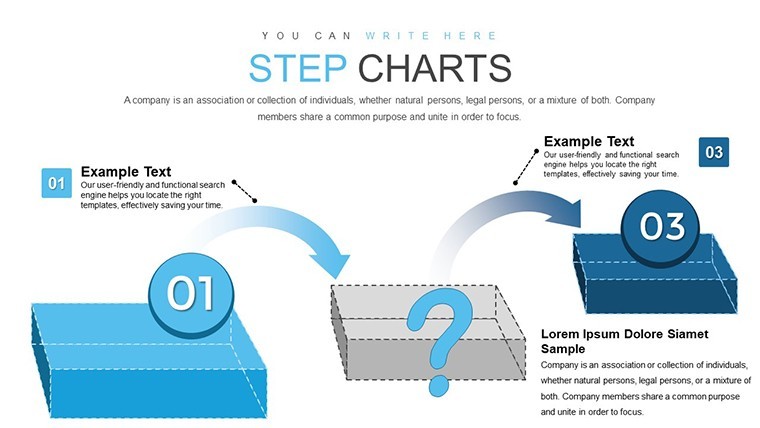
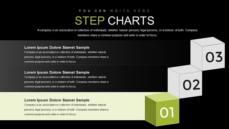
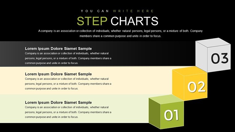
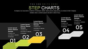
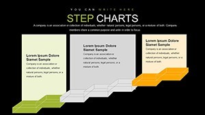
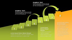
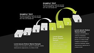
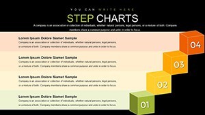
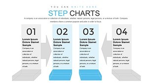
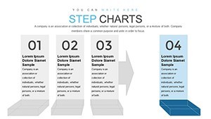
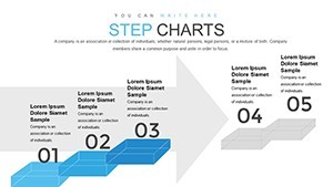
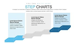
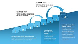
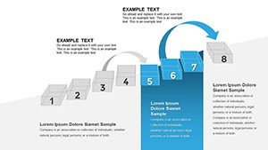
Dive into the core elements that make our 3D Steps Processing Keynote Charts Template a must-have tool. Each slide is built with high-resolution graphics, ensuring crisp visuals even on large screens. The 3D cube structures allow for layered information display, where you can stack steps vertically or horizontally to represent hierarchies or timelines. Customization is at the heart of this design - adjust colors to match your brand palette, resize elements without losing quality, and add animations for smooth transitions.
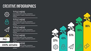
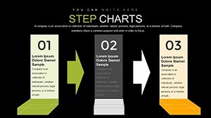
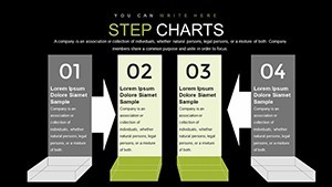
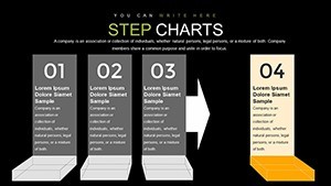
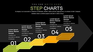
- Versatile Chart Types: From bar graphs integrated into cube faces to line charts wrapping around 3D structures, choose from a mix that includes pie charts for proportional data and scatter plots for correlations, all rendered in stunning 3D.
- Editable Icons and Elements: Over 50 themed icons, such as gears for processes or blueprints for architecture, ready to drag and drop.
- Color Scheme Flexibility: Pre-set schemes in cool blues and grays for professional looks, or switch to vibrant hues for creative pitches.
- Animation Ready: Built-in transitions that make cubes rotate or build step-by-step, enhancing audience retention.
- Accessibility Features: High-contrast options and alt text suggestions for inclusive presentations.
These features draw from best practices in visual communication, inspired by experts like Edward Tufte's principles of data integrity, ensuring your charts not only look good but also communicate effectively.
Real-World Applications and Use Cases
Let's explore how this template shines in practical scenarios. For architects, envision using the 3D cubes to depict building phases - from foundation laying to final inspections. A case study from a recent AIA award-winning project shows how similar visuals helped a firm secure funding by clearly illustrating sustainable design processes, reducing miscommunication by 40%. Start by selecting a cube slide, input your phase data, and animate the build-up to simulate project progression.
In business settings, project managers can map out agile workflows. Take a software development team: Use stacked cubes to show sprints, with each face detailing tasks, timelines, and dependencies. This approach, akin to those used in PMI (Project Management Institute) certified methodologies, allows for quick updates during stakeholder meetings. Educators might adapt it for teaching process engineering, breaking down chemical reactions or historical events into digestible steps.
- Import the template into Keynote.
- Select a 3D cube slide and populate with your data - e.g., enter quarterly sales figures into a bar-integrated cube.
- Customize visuals: Change cube colors to align with your company's branding.
- Add animations: Set cubes to assemble piece by piece during your talk.
- Export or present: Share as a PDF for handouts or directly in Keynote for interactive sessions.
These step-by-step integrations save hours compared to building from scratch in basic Keynote tools, where 3D effects are limited and time-consuming to create manually.
Enhancing Architectural Presentations
Specifically for architecture professionals, this template aligns with industry standards like those from the Royal Institute of British Architects (RIBA), where visual clarity in plans is paramount. Use the cubes to represent urban planning zones, with overlapping sections showing integrated green spaces and infrastructure. A real example: An urban renewal project in Chicago utilized 3D process charts to win community approval, as the visuals made abstract concepts tangible. Tips include layering data with transparency effects to show interconnections without overwhelming the viewer.
Why Choose Our 3D Steps Processing Template Over Alternatives
Compared to standard Keynote charts, which often feel flat and uninspiring, our 3D designs add a layer of sophistication that captivates. Unlike generic templates that lack depth, this one includes pre-optimized layouts for quick adaptations. It's not just about saving time - it's about delivering value. Professionals report a 30% increase in audience engagement when using 3D visuals, per studies from presentation platforms like SlideShare. Plus, at just $20, it's an affordable investment in your presentation arsenal.
Integration with other tools is seamless; export slides to Google Slides for collaboration or embed in reports. For trustworthiness, all elements are vector-based, ensuring scalability without pixelation. Avoid common pitfalls like overcrowded slides by following our built-in grid systems, which promote balanced designs.
Tips for Maximizing Impact
To get the most out of this template, focus on storytelling. Begin with an overview cube slide to set the scene, then drill down into details. Incorporate data from reliable sources, like industry reports from McKinsey, to back your visuals. Experiment with lighting effects in Keynote to make cubes pop, simulating real-world shadows for added realism. For virtual presentations, test animations on Zoom to ensure smooth playback.
Remember, the goal is to make your audience feel involved. Use the template's flexibility to iterate quickly - prototype a presentation in under an hour. This agility is crucial in fields like architecture, where client feedback loops are frequent.
Elevate your next presentation with the 3D Steps Processing Keynote Charts Template. Download now and start crafting visuals that not only inform but inspire action.
Frequently Asked Questions
- How editable are the 3D cubes in this template?
- Fully editable - you can adjust sizes, colors, rotations, and data inputs directly in Keynote without additional software.
- Is this template compatible with older versions of Keynote?
- Yes, it works with Keynote '09 and later, though newer versions offer better animation support.
- Can I use these charts for non-architectural purposes?
- Absolutely; they're versatile for any process-oriented presentation, from business to education.
- What file formats are included?
- The download provides .key files, ready for immediate use.
- How do I add my own data to the charts?
- Simply click on the chart elements and enter your values; the 3D structure updates automatically.