Create Impressive Presentations with Our Data Flow Keynote Templates


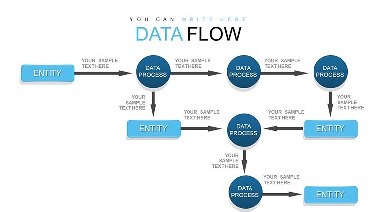


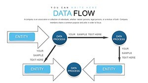


In the dynamic realm of professional communication, where ideas must flow as seamlessly as the data they represent, our Data Flow Keynote Charts Template emerges as a vital tool for presenters seeking to captivate and inform. Designed specifically for Keynote users, this template offers 22 fully editable slides that transform complex information into clear, visually compelling narratives. Whether you're a business analyst mapping out workflows, a project manager illustrating process improvements, or an educator explaining system dynamics, these charts provide the structure and style to make your message resonate. Imagine turning a convoluted supply chain into an intuitive flowchart that guides your audience through each step with ease - that's the power of data flow visualization at your fingertips.
Beyond mere aesthetics, this template addresses the core challenges of modern presentations: clarity in complexity and engagement in data-heavy content. With slides dedicated to process flows, swimlane diagrams, funnel charts, and more, you can customize every element to align with your brand's identity. Adjust colors to match corporate palettes, tweak fonts for readability, and scale diagrams to fit your story's scale. Professionals across industries have leveraged similar tools to streamline their pitches; for instance, in architecture firms adhering to AIA standards, data flow charts have been pivotal in presenting project timelines and resource allocations, ensuring stakeholders grasp the big picture without getting lost in details.
Unlocking the Potential of Data Flow Visualizations
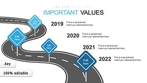
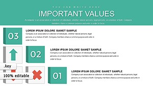
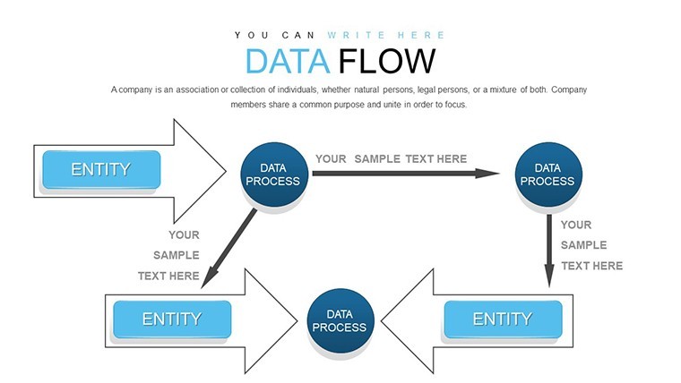
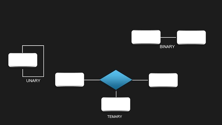
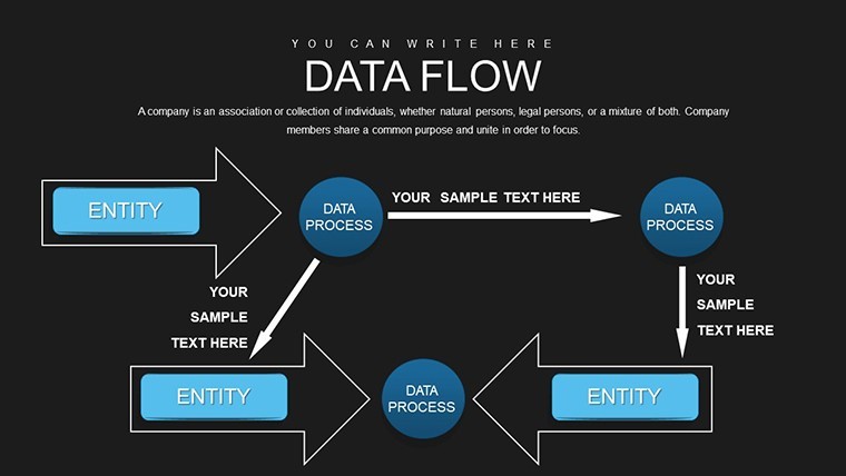
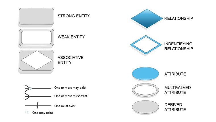
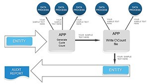
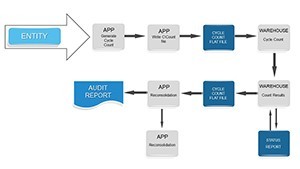
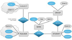
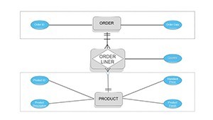
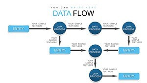
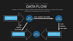
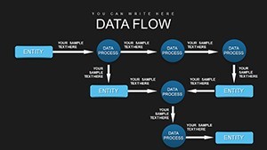
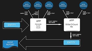
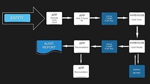
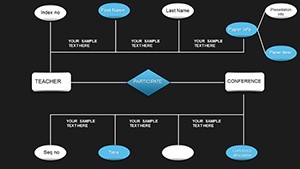
Data flow charts aren't just graphics; they're storytelling devices that bridge the gap between raw data and actionable insights. Our template's 22 slides include a diverse array of options, from basic linear flows to intricate multi-branching diagrams. Start with a simple process chart to outline sequential steps in a manufacturing cycle, or dive into swimlane diagrams that delineate responsibilities across teams in a cross-functional project. Each slide is built with vector-based elements, ensuring crisp resolution even when projected on large screens or shared digitally.
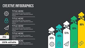
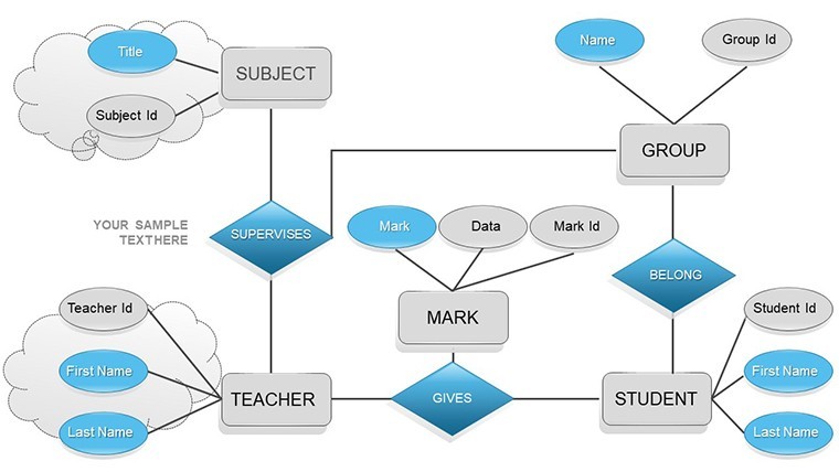
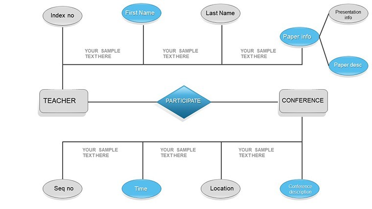
Consider the benefits for specific applications. In marketing, funnel charts within this template can vividly depict customer journeys, highlighting drop-off points and conversion opportunities. For IT professionals, data flow diagrams model system architectures, aiding in troubleshooting and optimization discussions. The template's flexibility extends to educational settings, where teachers use these charts to teach concepts like ecosystem cycles or historical timelines, making abstract ideas tangible and memorable.
Key Features That Set This Template Apart
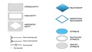
- Fully Customizable Elements: Every chart component - lines, nodes, labels - is editable, allowing for quick adaptations without starting from scratch.
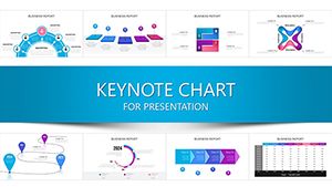
- Varied Chart Types: Includes process flows, swimlanes, funnels, and hierarchical diagrams to cover a broad spectrum of data representation needs.
- Brand Integration: Easily incorporate your company's colors, logos, and fonts for a polished, professional look.
- High-Resolution Graphics: Vector formats ensure scalability and clarity in any presentation format.
- User-Friendly Interface: Drag-and-drop functionality in Keynote makes modifications intuitive, even for beginners.
These features not only save time but also enhance the overall quality of your presentations. A case in point: A design firm used analogous data flow templates to pitch a major urban development project, where swimlane diagrams clarified roles between architects, engineers, and contractors, leading to a successful bid as per industry reports from sources like ArchDaily.
Real-World Applications and Use Cases
Integrating this Data Flow Keynote Template into your workflow can revolutionize how you present information. Let's explore step-by-step use cases tailored to different scenarios. For a business strategy session, begin by selecting a funnel chart slide. Input your sales data: top-of-funnel leads at the wide end, narrowing to conversions at the bottom. Customize arrows to show flow directions, and add annotations for key metrics. This visual instantly communicates efficiency gaps, prompting informed discussions.
In project management, opt for swimlane diagrams. Assign lanes to team members or departments, then map tasks across them. Color-code for urgency - red for critical paths, green for completed items. This not only visualizes dependencies but also fosters collaboration, as seen in agile methodologies where such charts reduce miscommunication by up to 30%, according to PMI studies.
For academic or training purposes, linear process flows excel. Outline a scientific method: hypothesis, experiment, analysis, conclusion. Enhance with icons from the template's library to make it engaging. Educators report higher student retention when using visual aids like these, turning passive listening into active learning.
Expert Tips for Maximizing Impact
- Start with your objective: Define what data story you want to tell before selecting a chart type.
- Keep it simple: Avoid clutter by limiting elements per slide - aim for 5-7 key points.
- Use animations wisely: In Keynote, apply subtle transitions to reveal flow stages progressively.
- Incorporate data validation: Cross-reference your charts with real metrics for credibility.
- Test for accessibility: Ensure color contrasts meet WCAG standards for inclusive presentations.
By following these tips, you'll not only create stunning visuals but also deliver presentations that drive results. Compared to basic Keynote tools, this template offers pre-built sophistication, saving hours of design time while elevating your content's professionalism.
Why Choose Our Data Flow Template?
In a sea of generic presentation aids, our template stands out for its focus on data flow specificity. It's not just about charts; it's about conveying movement, progression, and interconnectedness. Users appreciate the seamless compatibility with Keynote's latest versions, ensuring no glitches during delivery. Plus, with 22 slides, you have ample variety without overwhelming choices.
Think of it as your secret weapon for pitches that persuade. Whether closing a deal or educating a team, these charts turn data into dialogue. Ready to flow with confidence? Customize your presentations today and watch engagement soar.
Frequently Asked Questions
How customizable are the data flow charts?
The charts are 100% editable in Keynote, allowing changes to colors, sizes, texts, and layouts to fit your needs.
Is this template compatible with older Keynote versions?
Yes, it works with Keynote '09 and later, though optimal performance is in the latest updates.
What file format is provided?
The download includes a .key file, ready for immediate use in Apple Keynote.
Can I use these charts for commercial purposes?
Absolutely, the template is licensed for personal and professional use, including client presentations.
Are there tutorials for using the template?
Basic instructions are included, and Keynote's help resources cover advanced customizations.
What's the resolution of the slides?
Slides are in widescreen (16:9) format with vector graphics for high-quality scaling.