Keynote Panel Cycle Charts - Fully Editable | ImagineLayout


Type: Keynote Charts template
Category: Cycle
Sources Available: .key
Product ID: KC00682
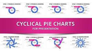
Template incl.: 32 editable slides
Keynote diagram template for cyclic data visualization
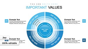
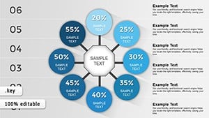
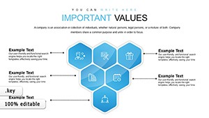
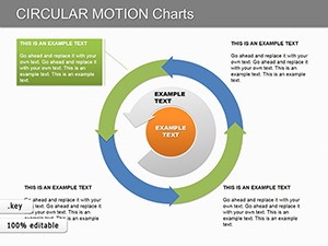
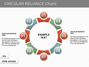
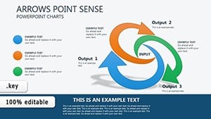
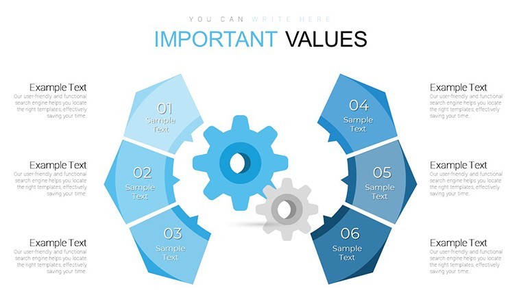
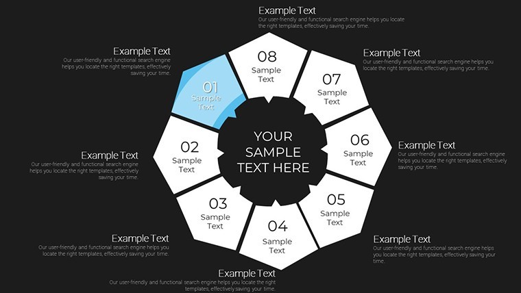
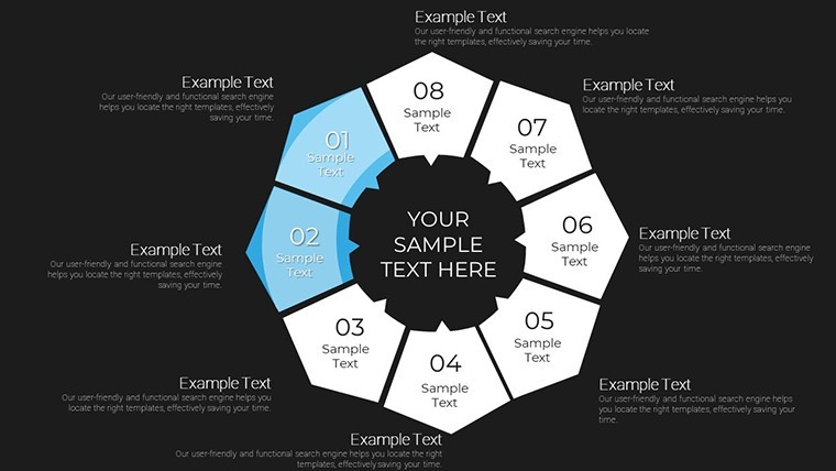
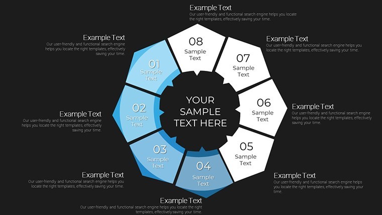
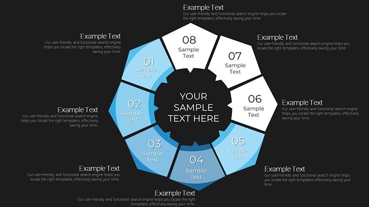
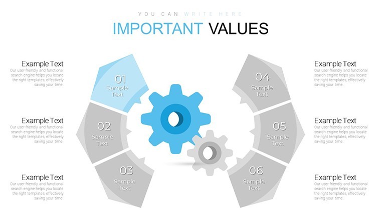
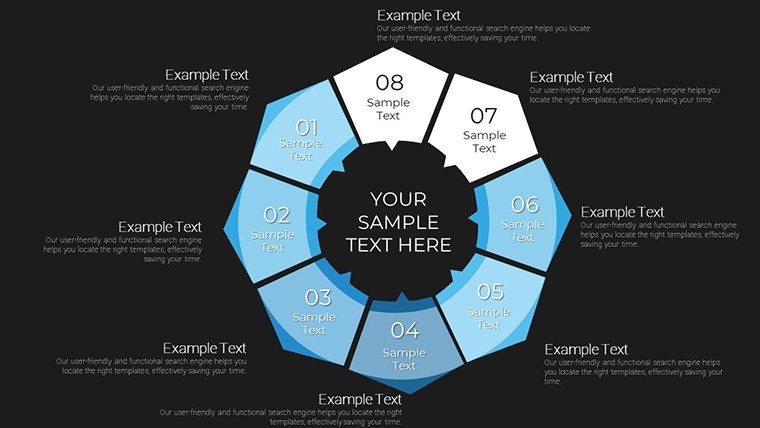
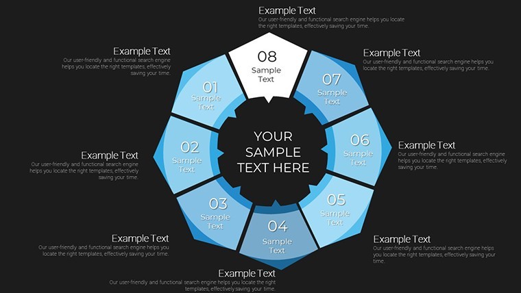
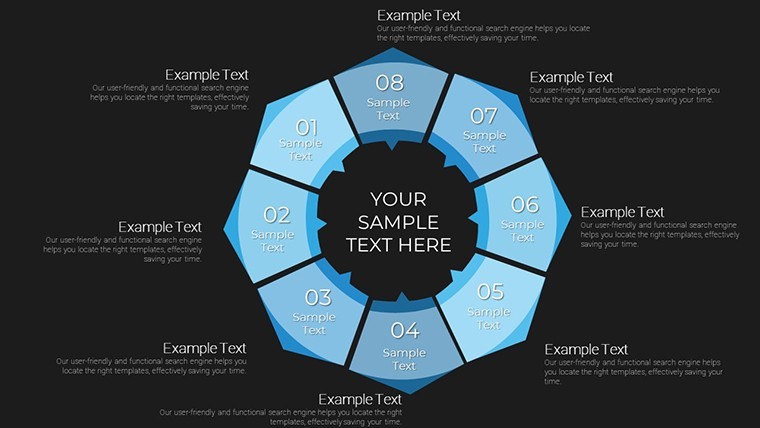
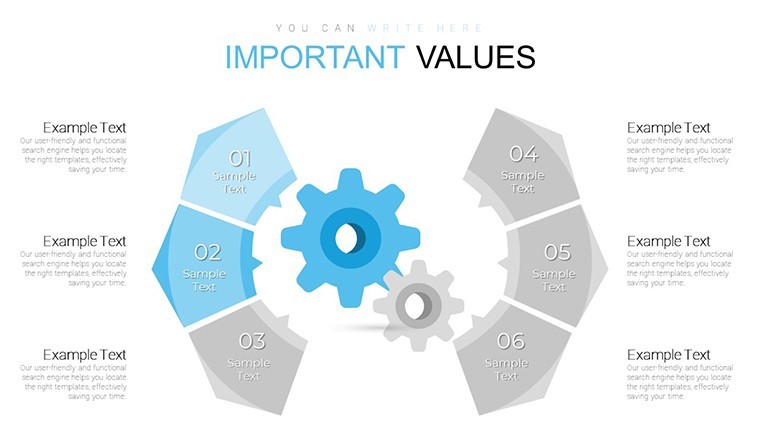
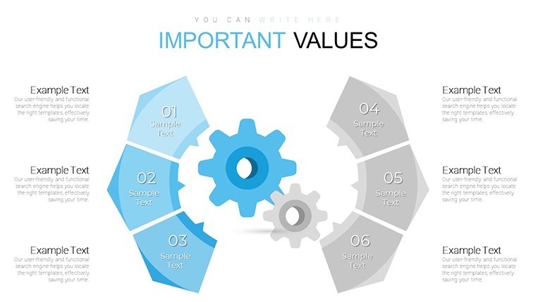
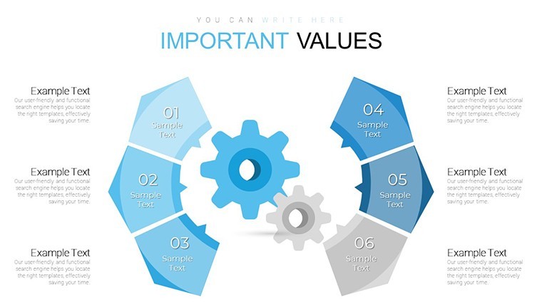
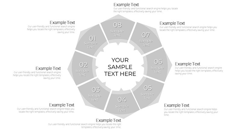
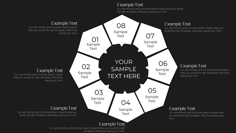
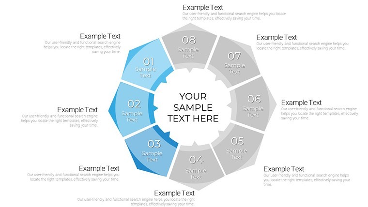
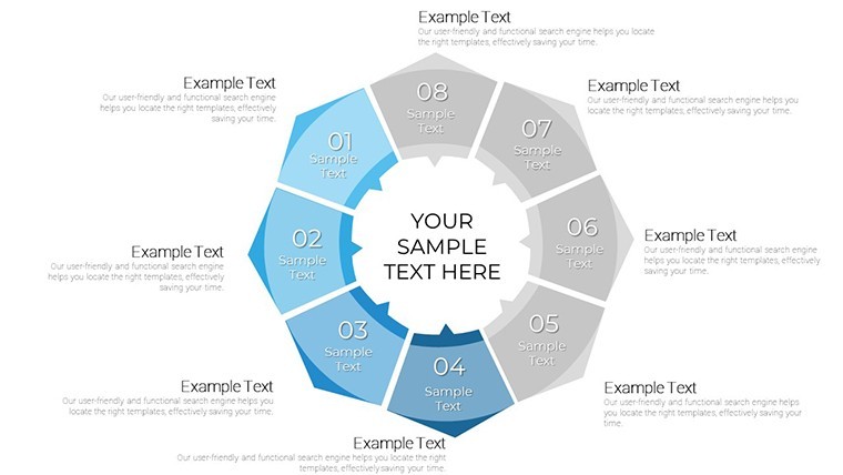
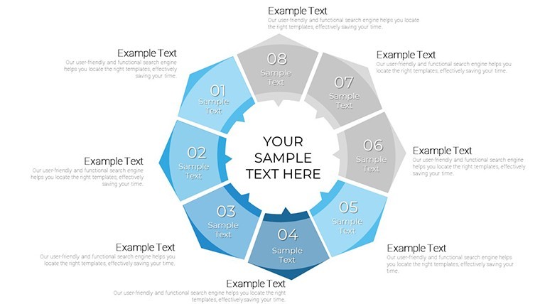
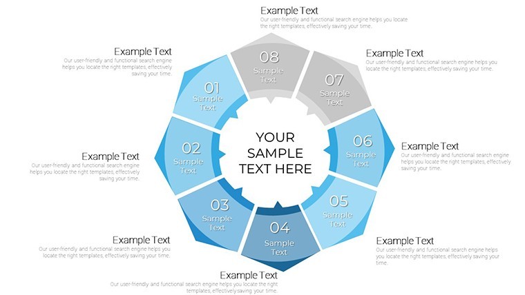
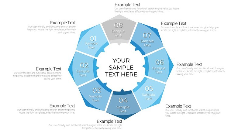
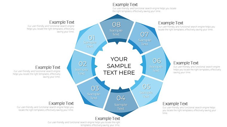
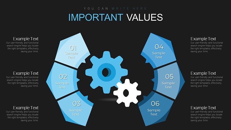
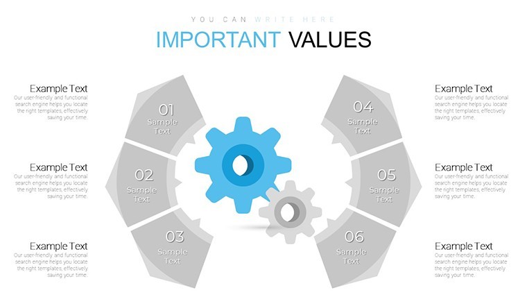
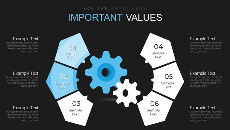
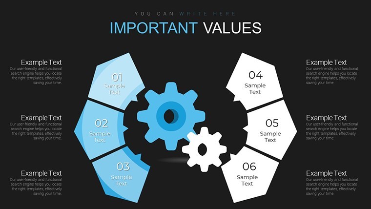
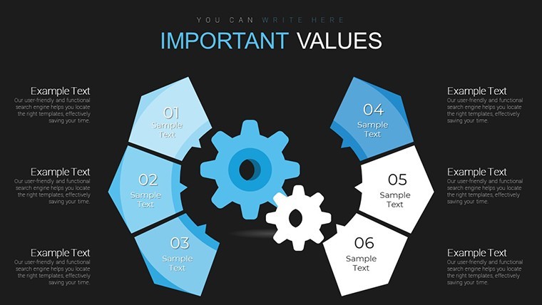
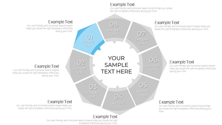
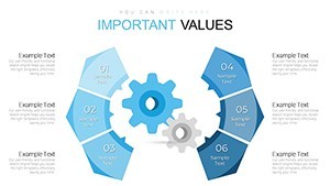
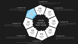
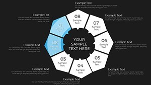
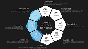
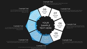
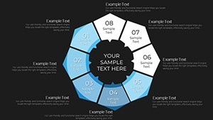
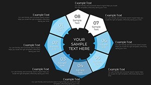
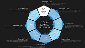
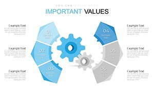
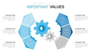
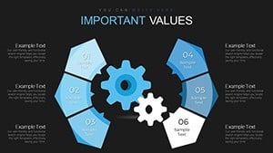
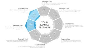
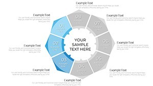
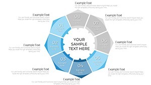
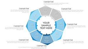
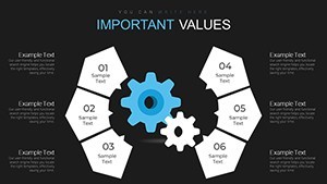
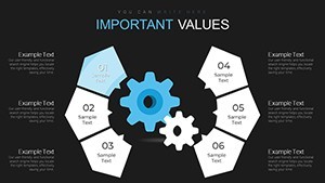
32 panel circle segment charts help teams map cyclic relationships when presenting service flows or idea cycles to stakeholders. You drop in your data and the circular structures keep everything aligned on one slide.
The file uses standard KEY format. In most cases color changes via slide master update all diagrams instantly.
No setup needed.
Analysts and project leads rely on these layouts instead of building diagrams manually in Keynote. The predefined panel segments support process breakdown analysis and help viewers identify recurring patterns that inform resource allocation decisions.
Use this when you need to show interdependence between multiple phases without overcrowded slides. It works across multiple reports once the master is set.
Not ideal for linear timelines or data-heavy dashboards. The circular segment design keeps structure readable yet limits freeform storytelling.
Typically teams replace text and adjust one segment per cycle then export for client presentations.
| Feature | Details |
|---|---|
| Slides / diagrams | 32 panel circle segment charts |
| File format | KEY |
| Software version | Keynote 12+ |
| Color schemes | Not listed on page - update via slide master |
| Editable elements | Text, segment fills and panel borders resize independently |
| Aspect ratio | 16:9 |
| Free vs Paid | Paid unlocks the complete 32-slide set |
| Masters / Backgrounds | Single master for global palette switch |
Download and start editing immediately
How do I change colors across all charts?
Select View > Master Slides first. Update the theme colors in the Format panel on the right. This instantly refreshes every segment and panel in the 32 diagrams. In practice the change takes under 30 seconds and applies globally without touching individual slides.
Can I use these charts for client work?
Yes the license permits commercial use in client presentations. One purchase covers one project. You may not resell the template itself or share the source file. For multiple client projects purchase additional licenses.
What is the difference between free and paid versions?
The page does not list free version details. Paid version provides the complete 32 editable panel circle segment charts in KEY format. Free downloads if offered contain limited previews only.
What are the refund conditions?
Refunds are available within 14 days of purchase if the KEY file fails to open in current Keynote. Submit the support ticket with proof of incompatibility. Refunds are not issued after successful download and editing.
What Keynote version and macOS do I need?
Files work in Keynote 12 or newer on macOS Ventura and later. Older versions may open with reduced editability for advanced segment effects. Test in your current installation before full rollout.
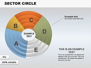
Check more cycle Keynote charts templates or explore Sector Circle Keynote Charts.