Venn Compiled Keynote Charts - Fully Editable | ImagineLayout


Type: Keynote Charts template
Category: Venn
Sources Available: .key
Product ID: KC00668
Template incl.: 28 editable slides
Important Venn Compiled Keynote Charts for Dynamic Presentations
28 editable slides in KEY format give you compiled venn structures ready for comparison tasks in analysis decks.
No setup needed.
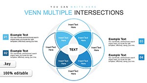
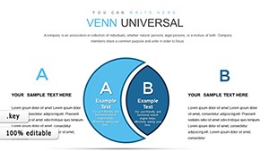
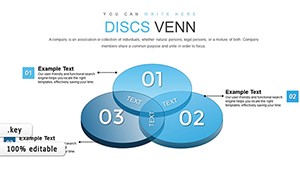
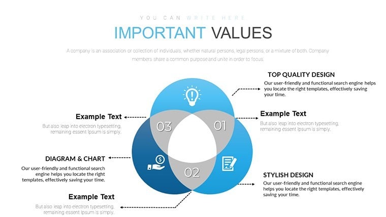
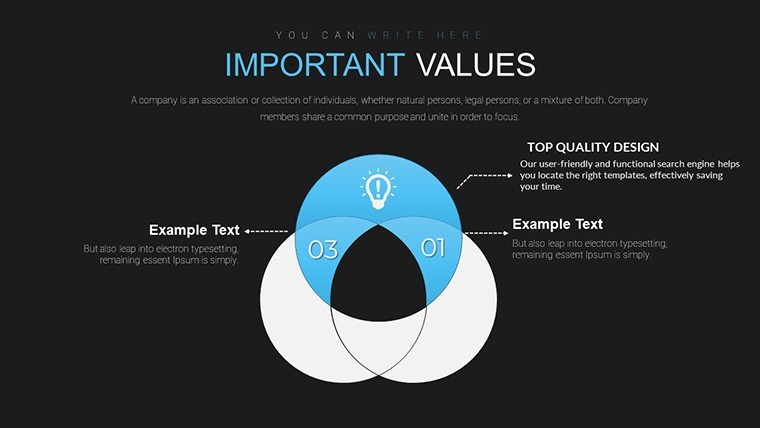
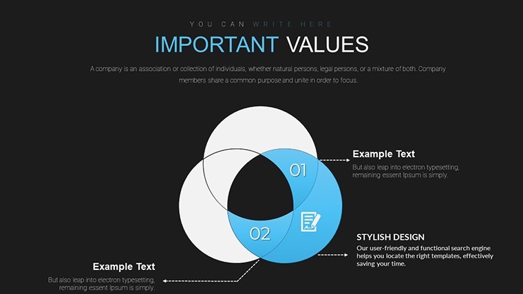
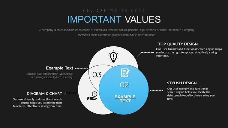
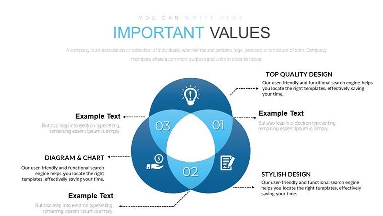
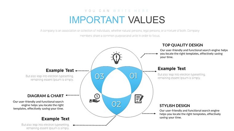
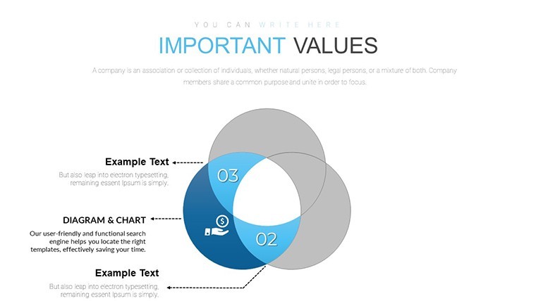
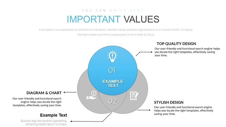
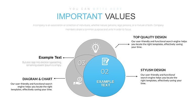
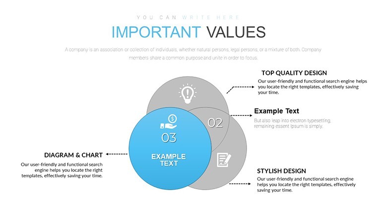
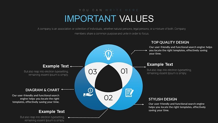
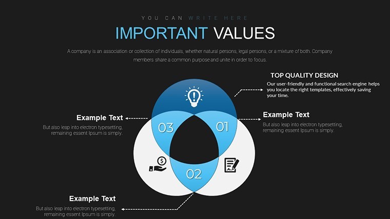
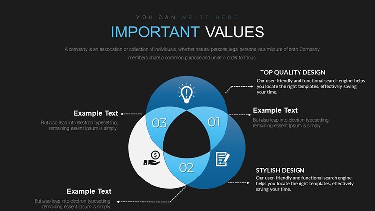
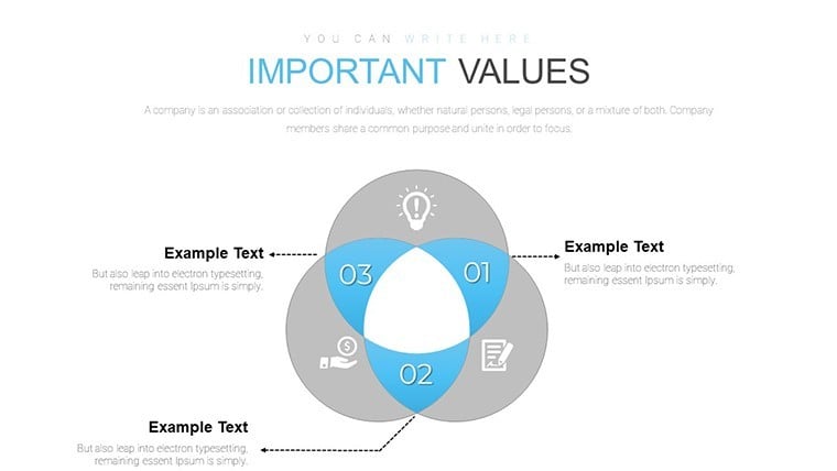
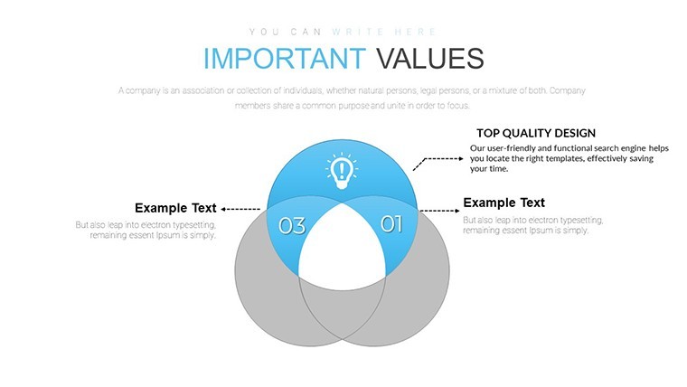
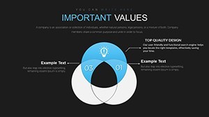
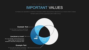
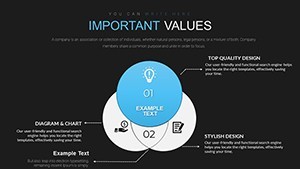
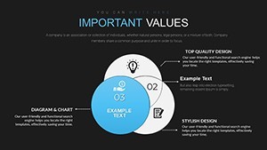
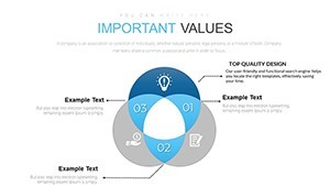
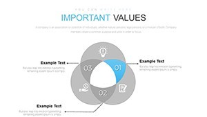
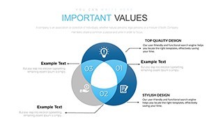
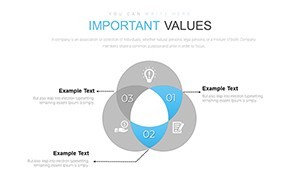
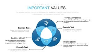
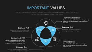
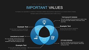
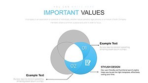
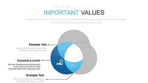
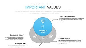
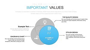
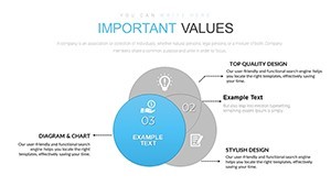
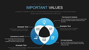
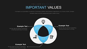
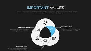
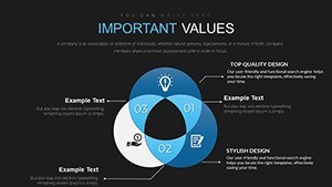
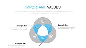
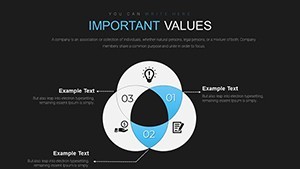
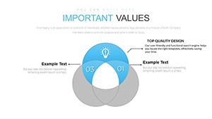
When you need to show overlapping responsibilities to department leads the venn overlaps in this Keynote chart template keep every intersection precise so viewers reach overlap conclusions fast.
The paid version details stay unspecified on the page yet the files follow standard KEY formats compatible with current installations.
You change colors via the slide master in one click across every diagram.
Overlapping circles with clear intersection zones form the specific visual detail with balanced spacing density.
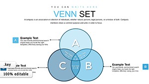
This set suits HR leads presenting role intersections to senior management.
It supports comparison analysis so you identify shared areas and decide resource allocation after viewing the full sets.
In most cases you only replace text and adjust colors.
Typically teams reuse the same diagram across quarterly reviews.
Use this instead of building diagrams manually in Keynote.
The predefined structure keeps everything readable so you avoid adjusting spacing slide by slide.
Best used when sets overlap yet not designed for linear timelines without intersections.
It works best for structured diagrams not creative storytelling slides.
The page does not list the exact number of color schemes but the files follow standard KEY palettes.
| Feature | Details |
|---|---|
| Slides / diagrams | 28 venn compiled layouts with overlapping sets |
| File format | KEY |
| Software version | Keynote 12+ on current macOS |
| Color schemes | Editable via slide master in one step |
| Editable elements | All circles text and colors resize independently |
| Aspect ratio | 16:9 |
| Free vs Paid | Paid includes full 28 slides |
| Masters / Backgrounds | Standard masters for palette switch |
Everything is already structured.
Download and start editing immediately
How do I change colors via slide master?
You change colors via the slide master in Keynote by selecting the master slide first then updating the color scheme there.
This updates all 28 diagrams at once without manual edits per slide.
In practice the change takes under two minutes and works across every venn layout.
Can I use this for client work?
The license allows use for client work as long as the template is not resold or shared as a standalone file.
You can deliver presentations built with the file to clients without extra fees.
One license covers one user for all commercial projects.
What is the difference between free and paid?
The paid version provides the complete set of 28 editable slides with full customization options.
The page does not list free version details but the full file is available upon purchase.
This difference ensures you get all structures without missing elements.
What are the refund conditions?
Refunds are available within 14 days if the file does not work as described in current Keynote.
Contact support with your order number to start the process.
No refunds apply after the file has been downloaded and used.
Which Keynote version and macOS does it require?
The files work in Keynote 12 and newer on macOS Ventura or later.
Older versions may have limited compatibility for some effects.
Test in your version before full use to confirm all venn elements display correctly.
See also Venn Diagram Keynote Charts or Infographic Mastery Venn Unions.