Free Radar Charts Keynote Template - Instant Download | ImagineLayout


Type: Keynote Charts template
Category: Free Templates, Pie
Sources Available: .key
Product ID: KC00646
Template incl.: 8 editable slides
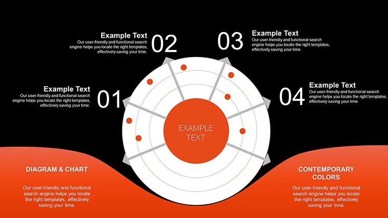
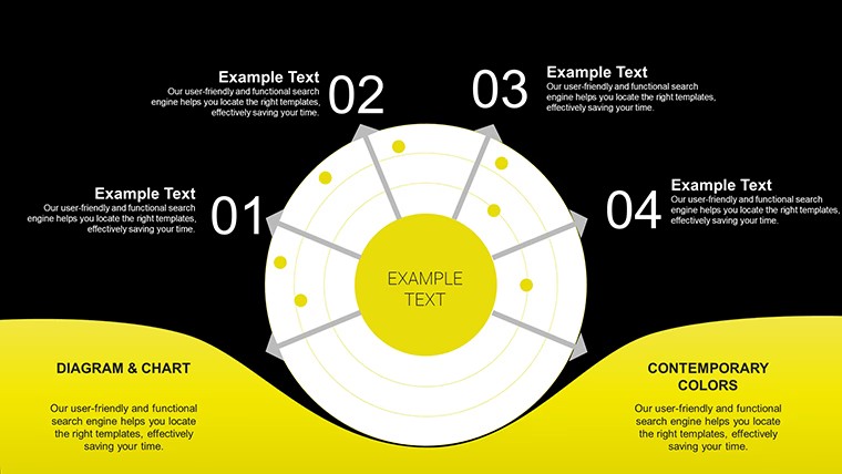
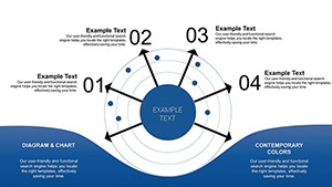
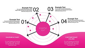
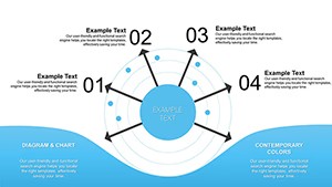
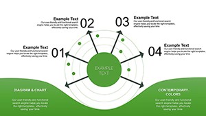
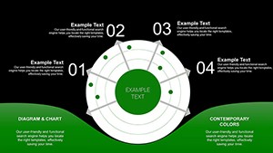
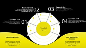
8 Free Keynote Chart Slides - Radar, Pie, Bar, and Line Layouts
Eight editable slides, no cost. The .key file covers four chart types - radar, pie, bar, and line graphs - plus a data table layout, making it one of the more varied free Keynote chart templates in the catalog. It sits in both the Free Templates and Pie categories, which reflects the mix: not every slide is a radar chart, and the variety is the actual utility here.
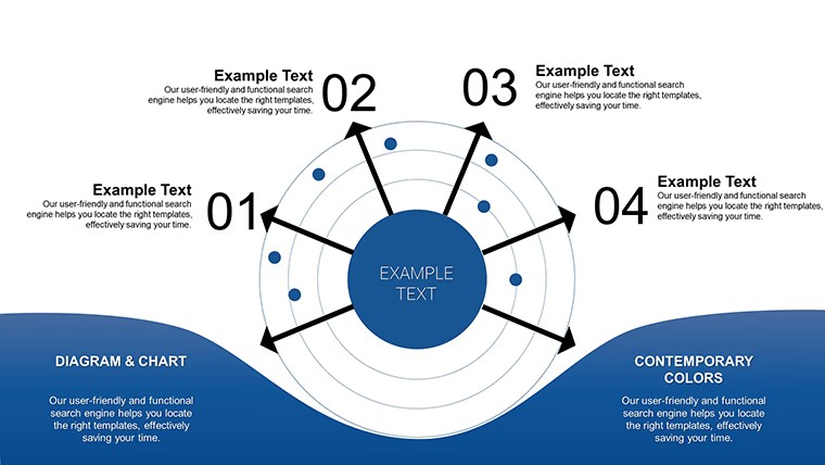
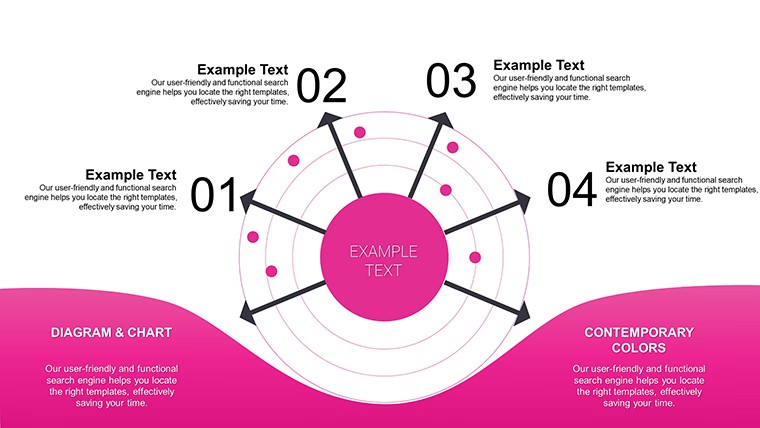
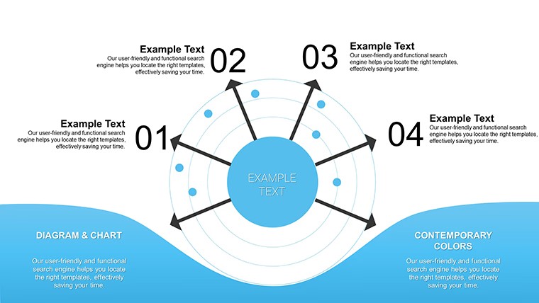
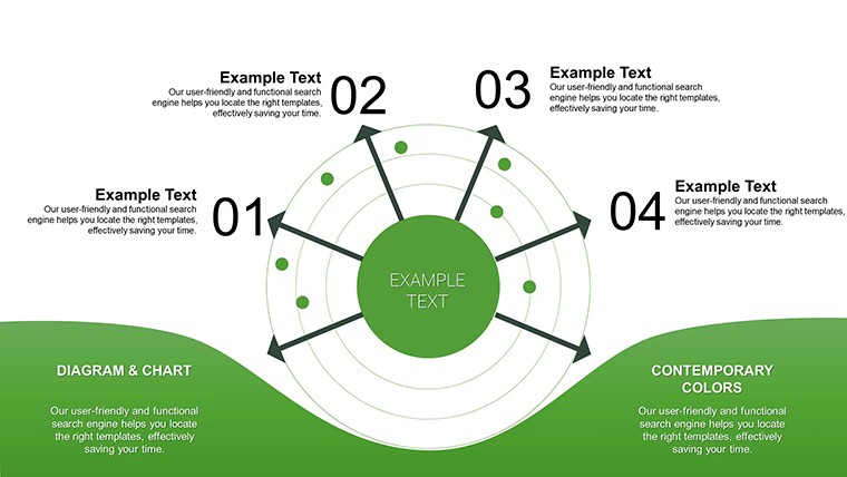
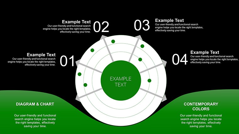
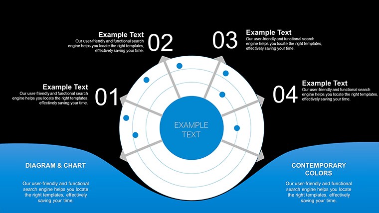
The radar charts use a symmetrical polygon structure with labeled axes radiating outward from a central point - suited for placing 5-7 variables that need to be compared simultaneously across one or more data sets. The polygon fill area changes shape based on the values entered, which makes gaps and strengths immediately visible. Bar and line slides use a standard horizontal-axis layout with editable data series. Spacing across all slides is airy, not compact, which helps readability when projected.
Radar charts work best when you need to show relative performance across multiple dimensions at once - for example, comparing two product lines across cost, quality, speed, support, and reach on a single slide without building the chart framework yourself. A team lead presenting a vendor evaluation, or an analyst showing skill gap data, can drop values into the existing chart structure rather than drawing axes and labels from scratch. That's the time-saving point of this file.
Works best for structured multi-variable comparisons with a fixed set of categories. Not designed for time-series data with many data points, where a line chart built in Keynote's native chart editor would give more control. The predefined axis structure assumes a roughly equal number of variables per dimension - if your data has more than 8 axes, the radar layout will feel crowded.
Since this is a free download, there is no paid upgrade or additional version. You get all 8 slides as-is. In practice, the most common edit is replacing axis labels and adjusting the polygon fill values - the structure itself rarely needs to change. Useful for business analysts, students, or marketing teams who need a fast comparison visual without spending time on chart construction.
No extra setup required. Download and start editing immediately
Specifications
| Feature | Details |
|---|---|
| Slides | 8 editable slides - radar, pie, bar, line chart, and data table layouts |
| File format | .key (Keynote) |
| Software version | Not specified; standard .key format, compatible with current Keynote |
| Color schemes | Not specified; chart fills editable per element via Format panel |
| Editable elements | Axis labels, chart data values, fill colors, text blocks |
| Aspect ratio | Not specified on page |
| Free vs Paid | Free - full 8-slide file, no paid version listed |
| Categories | Free Templates, Pie |
FAQ
How do I update the radar chart data?
In Keynote, click the radar chart to select it, then double-click to open the chart data editor. Replace the sample values with your own figures. The polygon shape updates automatically to reflect your data. You can also relabel each axis directly by editing the category names in the data editor. For color changes, select the chart fill area and update it via the Format sidebar.
Can I use this free template for client or commercial work?
The file is listed as free to download, but commercial use conditions depend on ImagineLayout's Terms of Use at imaginelayout.com/terms/. For presentations you deliver to clients, free templates on the platform are typically usable as-is. Redistribution of the template file itself is generally not permitted. Review the terms page if your use case goes beyond building your own presentations.
Is there a paid or expanded version of this file?
No paid upgrade is listed for this specific product. The free download includes all 8 slides. If you need more chart variety or additional slides, browse the Keynote Charts section at imaginelayout.com/keynote_charts-templates/ for related paid options, including radar and data comparison templates with larger slide counts.
What is the refund or return policy for free downloads?
Since this file is free, there is no purchase transaction and no refund process applies. If you encounter a technical problem with the downloaded file - such as it not opening correctly in Keynote - contact ImagineLayout support via the contact page at imaginelayout.com/contact-us/ and describe the issue with your Keynote version and macOS version.
What Keynote version is needed to open this file?
The page does not specify a minimum Keynote version. The file is in standard .key format and opens in current versions of Keynote on macOS and iPadOS. For full access to chart editing features, Keynote 12 or later is recommended. Earlier versions may open the file but could have limited support for certain chart element types.