Venn Diagram Keynote Charts - Editable Keynote | ImagineLayout


Type: Keynote Charts template
Category: Venn
Sources Available: .key
Product ID: KC00625
Template incl.: 12 editable slides
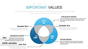
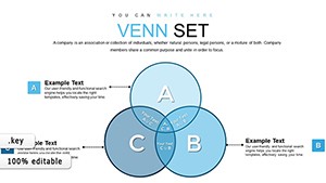
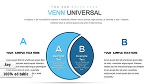
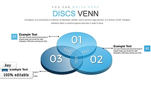
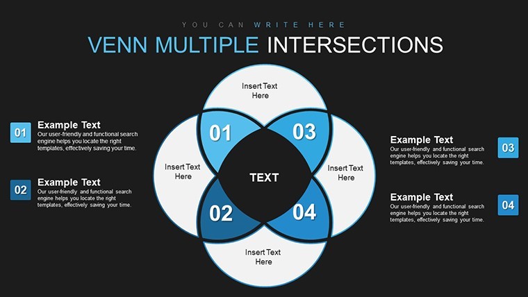
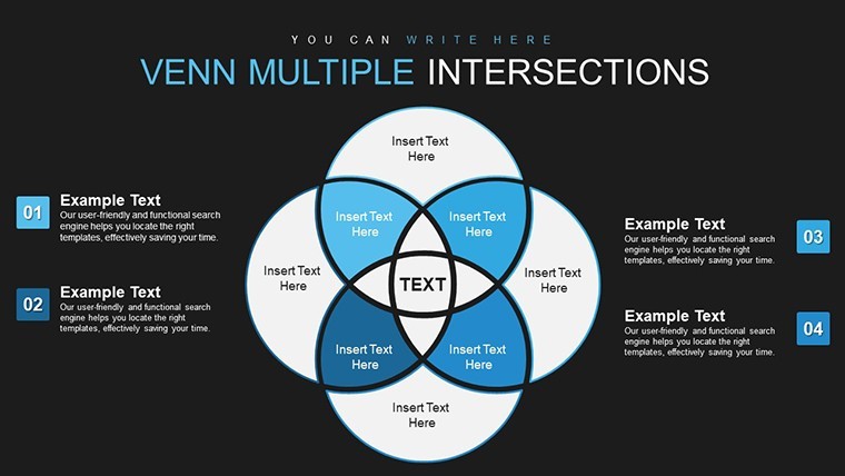
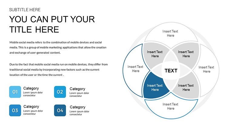
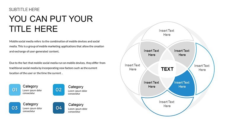
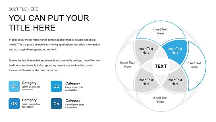
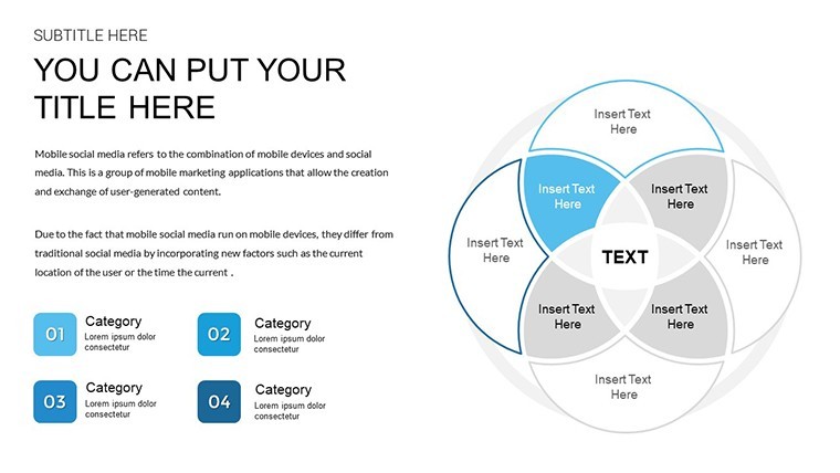
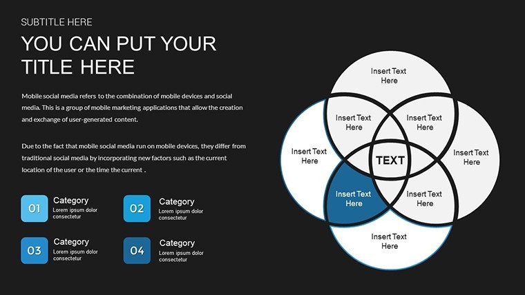
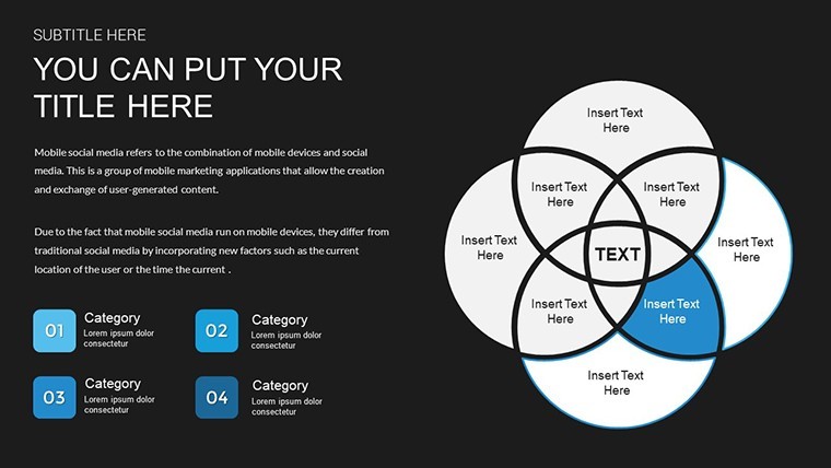
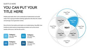
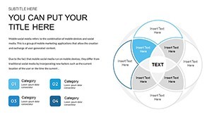
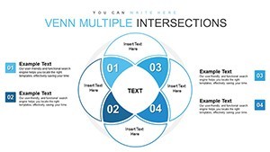
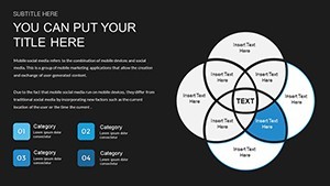
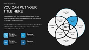
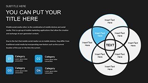
Venn Structures for Relationship Mapping
For data overlap comparisons in stakeholder meetings the 12 Venn diagram slides deliver analysis without manual alignment.
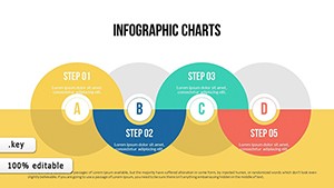
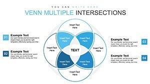
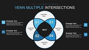
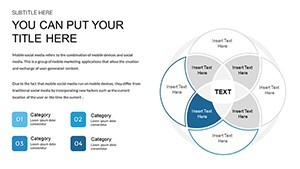
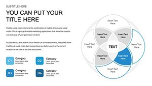
No complex layouts just structured blocks with 2-circle 3-circle and multi-set variants plus hybrid chart combos.
Market analysts drop in numbers and the overlaps show intersections immediately so decisions on shared resources become visible on one slide.
Use this instead of building diagrams manually in Keynote when you need to keep structure readable in a single slide.
The file supports drag-and-drop edits so you replace text and recolor sets in seconds.
Typically you only swap data points and the layout holds.
It works across multiple reports.
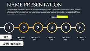
This is best used when presenting set comparisons not for linear process flows.
It is not ideal for highly creative or image-heavy pitch decks.
| Feature | Details |
|---|---|
| Slides / diagrams | 12 Venn diagrams (2-3 circle multi-set hybrid) |
| File format | KEY |
| Software version | Keynote latest version |
| Color schemes | Editable via slide master (overlaps update globally) |
| Editable elements | Sets text colors icons resize independently |
| Aspect ratio | 16:9 widescreen |
| Free vs Paid | Paid includes 30 unique slides; free version not listed |
| Masters / Backgrounds | Slide masters for consistent styling |
You drop in your data and it works.
Download and start editing immediately
How do I change colors via slide master?
Open slide master view in Keynote. Select the circle or overlap element. Update the fill or stroke color and every slide reflects the change instantly.
Can I use this for client work?
The license permits commercial use including client projects. You may not resell or redistribute the original template files. Customized output belongs to you.
What is the difference between free and paid version?
This paid version delivers 30 unique editable slides. Free versions of similar templates may offer fewer slides but exact differences are not listed here.
What are the refund conditions?
Refunds are available within 14 days if the file does not work as expected and has not been used in any project. Contact support with order details.
Can I apply this template to an existing presentation?
Yes import the master slides into your current deck. Apply the Venn styles and the layouts transfer without breaking existing content.
Important Venn Compiled Keynote Charts or Universal Venn Keynote Charts Template.