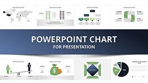
Explore our wide range of free PowerPoint templates featuring customizable tables and charts, tailored to meet all your presentation needs. Whether you`re a business professional aiming to win over clients with professional table charts or a student striving for top grades with clear visuals, these editable slides are your perfect starting point. Easily display your data and deliver your message with user-friendly designs crafted by experts. Save time and customize every detail to fit your style - download now and create impactful presentations effortlessly!

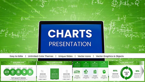
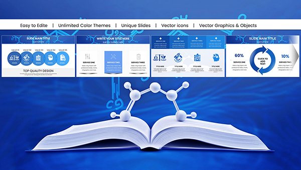
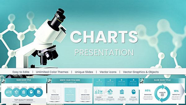
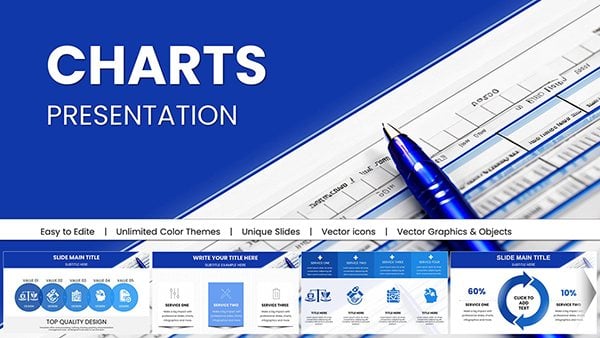
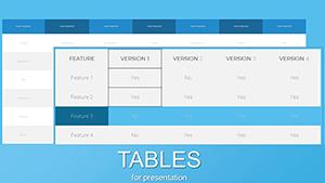


Need to present data clearly and professionally? Our Tables PowerPoint Charts Templates offer a powerful solution for creating stunning presentations fast. Whether you`re a business professional preparing a report, a teacher organizing lesson content, or a marketer showcasing analytics, these free PowerPoint table templates simplify data visualization. Download now and transform your slides into engaging, structured visuals that captivate your audience.
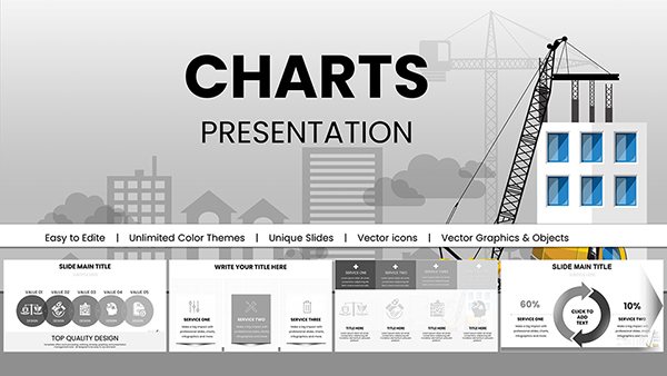
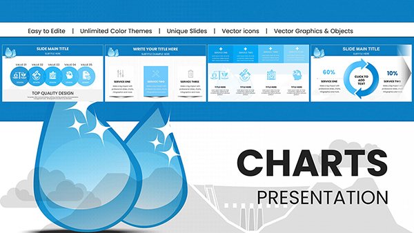
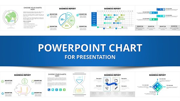
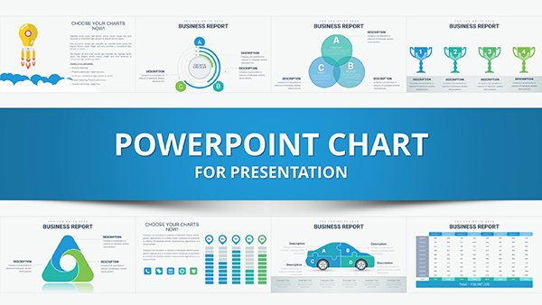
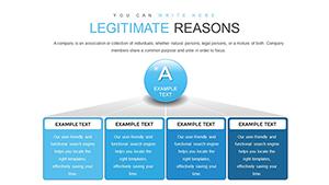
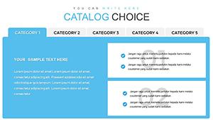
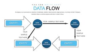
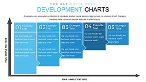
Tables PowerPoint Charts Templates are expertly designed slides that help you organize data into rows and columns for maximum clarity. Perfect for business presentations, educational lectures, or financial reports, these templates are 100% customizable. Adjust colors, fonts, and layouts to match your brand or theme, ensuring your data visualization stands out.
1. Keep It Simple: Limit rows and columns to avoid clutter.
2. Use Colors Wisely: Highlight key data with subtle shades.
3. Add Visuals: Pair tables with icons or charts for impact.
4. Test Readability: Ensure text is legible on all screen sizes.
Ready to elevate your presentations? Download our Tables PowerPoint Charts Templates today and create impactful, professional slides in minutes!
Copyright © 2009-2025 ImagineLayout All rights reserved.