Present climate data with clarity and impact using world weather Keynote map templates designed for professional storytelling. Whether you are preparing a global forecast briefing a climate research report or an educational geography lesson these ready to use slides help you visualize temperature zones precipitation patterns storm tracking and seasonal changes across continents.
Each template features fully editable maps intuitive layouts and clean design elements that make complex meteorological data easy to understand. Add icons highlight regions adjust colors or overlay charts to create a presentation that looks modern and authoritative. From business weather risk analysis to academic climate studies these Keynote maps transform raw data into compelling visual narratives that engage your audience from the first slide.
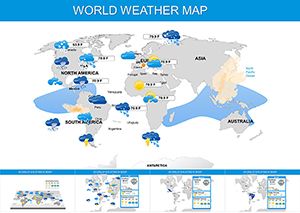
Weather and climate data are inherently visual. When presented in plain text or standard tables the message often gets lost. Professional world weather Keynote maps allow you to display temperature ranges wind directions rainfall intensity and seasonal trends directly on a global map making patterns instantly recognizable.
Instead of building complex maps from scratch you can start with structured layouts that are ready for customization. Simply replace placeholder data with your own insights and your presentation will look polished and consistent across every slide.
Standard map shapes in Keynote provide only basic outlines. World weather templates go further by offering:
This saves hours of formatting and ensures visual consistency across complex multi slide decks.
Apply warm tones for higher temperatures and cool tones for lower ones. Maintain consistent scales across slides to avoid confusion.
Pair a global map with a side bar chart showing rainfall totals or temperature changes to provide context and depth.
Instead of listing numbers emphasize movement such as shifting climate zones or expanding storm paths.
Show one key message per slide. Use map callouts to guide attention and avoid overcrowding.
These world weather Keynote maps are ideal for meteorologists climate analysts environmental researchers educators consultants and corporate strategists who need reliable visuals. The editable structure ensures adaptability for both technical audiences and general viewers.
Ready to transform your global weather data into compelling visuals Download a professional template and create a presentation that informs and impresses.
Yes all regions colors icons and text elements can be edited directly in Keynote allowing full customization for your data and branding.
Absolutely they are suitable for university lectures research conferences and scientific reporting thanks to their clear and professional layouts.
Yes many slides include built in weather icons temperature gradients and precipitation scales that can be adjusted to match your dataset.
Yes they are perfect for logistics planning agriculture forecasts energy sector analysis and any business affected by weather conditions.
Copyright © 2009-2026 ImagineLayout All rights reserved.