Step up your presentation game with our visualization chart templates for PowerPoint. Engineered for clarity, these assets help data enthusiasts and presenters alike distill intricate information into digestible visuals. Perfect for quarterly reviews, academic symposiums, or creative brainstorming, they bridge the gap between numbers and narratives.
Fully vector-based for sharp scaling, our templates integrate effortlessly with PowerPoint`s toolkit. Marketers love them for campaign analytics, while developers use them to diagram code flows. The key benefit? Effortless customization that preserves design integrity, allowing focus on your unique message.
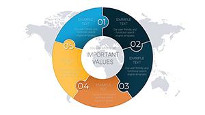
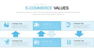
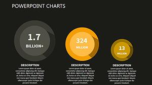
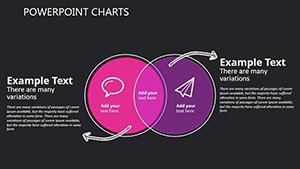
From radial trees to sankey diagrams, our library empowers you to choose the right tool for every scenario. With built-in color schemes and icons, crafting slides becomes intuitive and fun. Peruse our offerings and elevate your content from ordinary to extraordinary today.


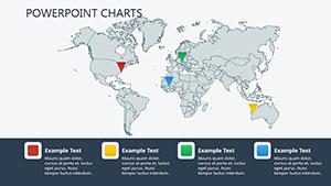
Visualization charts in PowerPoint excel at unveiling hidden patterns, such as correlations in sales data or hierarchies in organizational structures. They outperform text-heavy slides by leveraging spatial arrangement, aiding quick comprehension in fast-paced settings like investor meetings or team huddles.
Our edge over defaults: Sophisticated layering and morph transitions that standard charts lack, saving redesign time and amplifying polish. Industries from healthcare (patient flow maps) to retail (inventory visuals) thrive on this precision.
Adopt guidelines like logical color progression and axis labeling for accessibility. Creatively, fuse charts with images - a stock photo backdrop for environmental data - to evoke emotion alongside facts.
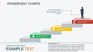
Harness slide master integration for consistent theming across decks. A standout use: In project status updates, employ waterfall charts to cascade achievements, visually tallying variances. This method clarifies progress, fostering trust and alignment.
Versus competitors, ours boast embeddable formulas for live calculations, ideal for dynamic reports. Enhance with hyperlinks to sources, promoting transparency.
Intrigued? Secure your visualization template here and innovate freely.
These habits yield slides that command attention and drive results.
Picture a CEO unveiling a bubble chart of market segments: Size denotes volume, color risk levels - instantly strategizing expansions. In academia, network graphs trace citation webs, spotlighting influential works.
For fun, game designers plot level progressions circularly, gamifying tutorials. Our value: Eco-friendly vectors that print flawlessly, extending utility offline.
Revolutionize your visuals with expert-grade tools. Download PowerPoint visualization charts now and captivate every audience.
Copyright © 2009-2026 ImagineLayout All rights reserved.