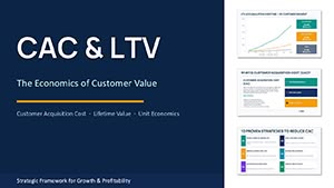
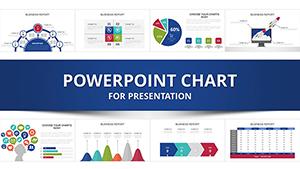
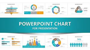
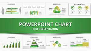
Enhance your Microsoft PowerPoint presentations with our specialized chart templates, crafted to turn numbers into narratives. These designs cater to analysts, managers, and presenters seeking precision without complexity, featuring everything from radar charts to hierarchical trees.
Built for Windows and Mac compatibility, they integrate smoothly with Excel data imports, automating updates for live accuracy. Businesses use them for performance dashboards, educators for statistical overviews, and teams for collaborative brainstorming sessions.
Discover benefits like reduced design time and heightened audience comprehension. With intuitive editing, align charts to your theme in minutes. Browse our selection and elevate your slides to professional heights.

PowerPoint chart templates streamline data visualization, enabling users to focus on insights rather than formatting. Sales directors deploy bubble charts to correlate variables, revealing opportunity clusters. Researchers illustrate survey results via heat maps, uncovering patterns intuitively.
These templates support dynamic linking, where edits in source data reflect instantly, ideal for evolving reports.
Project managers track timelines with Gantt integrations, assigning colors to phases for quick scans. In marketing, Sankey diagrams flow campaign metrics, showing conversion paths vividly.
Students graph literary themes chronologically, enriching analyses. Such uses highlight templates` broad appeal.
Built-in PowerPoint charts suffice for basics but lack thematic flair. Our templates add curated palettes and modular components for cohesive decks.
| Element | Default Charts | Enhanced Templates |
|---|---|---|
| Styling Options | Minimal | Extensive themes |
| Data Handling | Static | Dynamic links |
| Animation Controls | Basic entrances | Custom sequences |
This edge ensures standout slides every time.
Follow these for compelling, error-free visuals.
Blend charts with SmartArt for hybrid infographics, like process flows with embedded metrics. For conferences, animate column charts to simulate growth trajectories, engaging remote viewers.
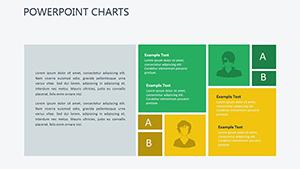
Corporate trainers embed quizzes beside pie charts, testing comprehension on the fly. Templates` extensibility fosters innovation across scenarios.
Incorporate AI-suggested layouts for rapid prototyping, blending human creativity with tech efficiency.
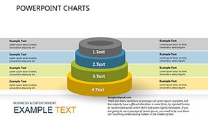
Finance experts dissect P&Ls with combo charts, layering bars and lines. HR visuals org structures via sunburst designs, clarifying reporting lines.
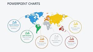
Environmental reports map impacts with geo-charts, advocating change effectively. Precision meets purpose here.
Ready for clarity? Download a template and chart your path to persuasive presentations.
These insights pave the way for smooth implementation.
Expand your toolkit? Explore brochure templates for complementary marketing materials.
Copyright © 2009-2026 ImagineLayout All rights reserved.