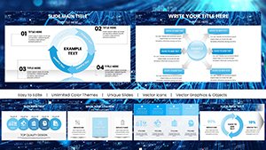
For Apple enthusiasts leading training, our Keynote chart templates offer sleek, native designs that harness the platform`s strengths in animation and typography. Geared toward creative directors, educators, and consultants, they simplify data presentation in workshops or keynotes.
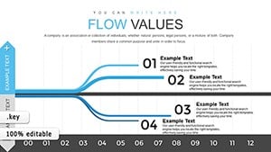
From scatter plots for correlation studies to hierarchical trees for organizational breakdowns, these charts blend minimalism with impact. They address the need for fluid, device-synced visuals in iPad-led sessions.
Highlights: Magic Move-ready transitions, high-fidelity vectors, and theme harmony with macOS aesthetics. Cut prep time and amplify professionalism across your training arsenal.
Review our selection and snag charts that elevate your narrative. Make every slide a revelation - get started customizing!
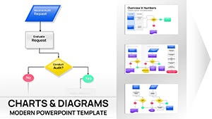

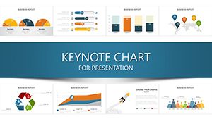
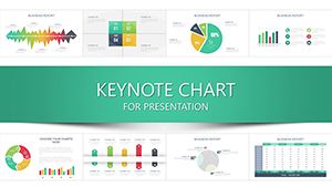
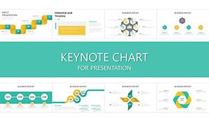
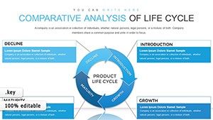
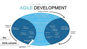
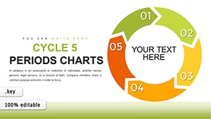
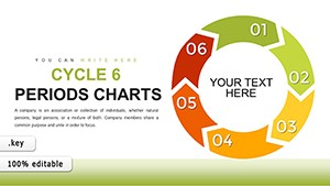
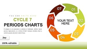
Keynote`s chart prowess shines in training, where visuals must captivate on large screens or portable devices. Our templates facilitate this for leadership retreats, using pyramid charts to depict hierarchy shifts, or product trainings with process flows.
Unlike clunky imports, native Keynote charts in our set animate smoothly, syncing with gestures for interactive reveals. This interactivity turns data dumps into dialogues.
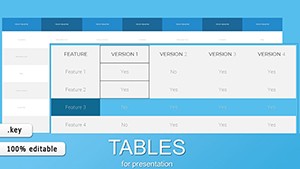
These empower precise, engaging breakdowns.
Defaults demand manual styling per instance, tedious for multi-slide decks. Ours pre-style with consistent palettes and legends, plus build paths for phased disclosures - saving 40% on build time.
Optimized for Continuity, they hand off flawlessly to iPhone previews. Enhanced engagement stems from subtle shadows and gradients, absent in basics.
Unique perk: Exportable to Pages for handout synergy. Tip: Anchor data to external sheets for live updates during extended trainings. Creatively, morph charts via Magic Move for evolutionary storytelling.
Or, embed live web data for real-time market simulations.
Ready to dazzle? Pick your template and animate your data story.
A design firm wowed clients with evolving org charts in pitch trainings, boosting win rates. Sustainability workshops used carbon footprint radars, visualizing impacts vividly.
Innovate with 360-degree spins on pie slices for multi-angle views, or layer audio annotations for self-guided modules.
Incorporate alt descriptions and high-contrast modes, ensuring all trainees access insights equally.
Transform training with Keynote flair. Download today and chart your success.
Copyright © 2009-2026 ImagineLayout All rights reserved.