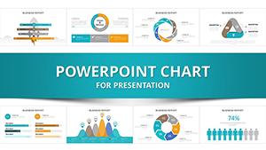
Harness the power of data visualization with our PowerPoint chart templates optimized for trading professionals. These tools turn raw numbers into strategic narratives, ideal for reports, pitches, and analyses.
Featuring a variety of chart types from Gantt for project timelines to radar for multi-asset comparisons, our templates integrate smoothly into Microsoft PowerPoint. Traders benefit from intuitive editing, ensuring focus remains on insights rather than formatting.
Boost your presentation`s persuasiveness and professionalism. Whether preparing for stakeholder meetings or internal reviews, these charts deliver clarity and impact. Start selecting from our library now.
PowerPoint chart templates streamline the depiction of trading dynamics, making volatile data digestible. Tailored for forex specialists, commodity traders, and analysts, they emphasize accuracy in representing peaks, troughs, and equilibria.
Benefits include cross-platform compatibility and export options for PDFs or videos, enhancing shareability in global teams.
Diverse Use Cases for Traders
Performance Reviews: Column charts track monthly gains, spotlighting top performers.
Risk Assessments: Heat maps color-code exposure levels across portfolios.
Forecasting Workshops: Bubble charts project scenarios based on economic indicators.
Applicable in academia for finance courses or startups pitching to VCs.
Advantages Over Basic PowerPoint Charts
Basic inserts require manual styling, leading to inconsistencies. Our templates provide themed palettes inspired by trading terminals, auto-scaling axes, and legend placements that enhance flow.
They also support VBA macros for automated updates, a feature absent in defaults.
Core Value Propositions
Precision Tools: Built-in error bars for statistical confidence in trade predictions.
Accessibility Features: High-contrast options for color-blind users in diverse audiences.
Efficiency Gains: One-click data refresh from CSV files speeds up iterations.
Optimizing PowerPoint Charts for Trading Talks
Select charts that match data dimensionality - histograms for distribution analysis in options pricing. Incorporate tooltips for hover details during virtual meetings. Innovate with 3D rotations for volume trading visuals, but use sparingly to maintain focus.
Pro tip: Align chart orientations with reading flow, left-to-right for Western markets.
Transform your data stories. Grab a chart template and iterate.
Frequently Asked Questions
Delve deeper into trading visuals for continued growth.