Symbols and icons speak louder than words, turning ordinary slides into compelling visual stories. Our symbol chart collection for Keynote offers more than 100 expertly designed templates that integrate high-quality icons seamlessly into data visualizations.
Perfect for reducing text overload while increasing comprehension, these charts help audiences grasp ideas at a glance.
Enjoy modern layouts with smooth animations that bring symbols to life and keep viewers engaged throughout your presentation.
All templates are completely editable, so you can swap icons, adjust colors, and input your data in minutes.
Dive into the collection and discover how symbolic visuals can transform your next Keynote deck.
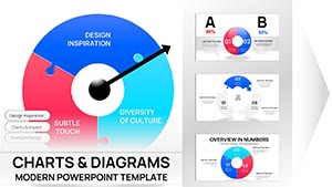
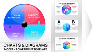
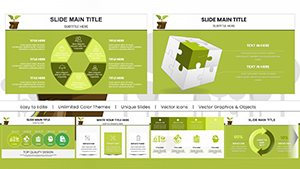
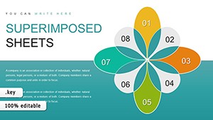
Creative Thinking Keynote Charts: Where Ideas Take Flight
ID: #KC00533
$23.00
The Power of Symbols in Presentation Design
Icons make information universal and instantly recognizable, especially for diverse or international audiences. Symbol-rich charts reduce cognitive load and improve message retention compared to text-only slides.
Our templates provide consistent, high-quality icon sets that look polished and professional.
Practical Applications for Symbol Charts
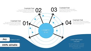
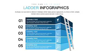
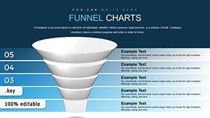
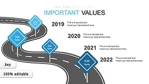
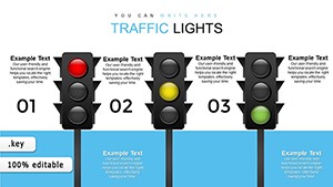
Marketing teams use icon-based feature comparisons to highlight product benefits. Trainers illustrate processes with symbolic flowcharts.
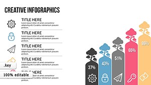
Business reports: Represent KPIs with intuitive icons.
Pitch decks: Showcase services visually instead of lists.
Infographics: Combine symbols with minimal data for shareable content.
Dashboard summaries: Display metrics at a glance.
Design Tips for Symbol-Heavy Charts
Maintain consistent icon style throughout your presentation.
Use color strategically to draw attention to important symbols.
Balance icons with white space for clean readability.
Animate icons to appear sequentially for storytelling effect.
Our ready-to-use templates already incorporate these principles.
Why Choose Premium Symbol Charts
Default options lack diverse, high-resolution icon libraries and sophisticated animations. Our designs deliver contemporary style and flexibility for presentations.
Ready for more visual impact? Download a symbol chart template now and see the difference.
Frequently Asked Questions
What kinds of symbols are included?
We feature business, technology, people, nature, arrows, and abstract icons in various styles.
Can I change or add my own icons?
Yes, all icons are fully editable, and you can import additional ones easily.
Are the charts animated?
Many include subtle animations that make symbols appear or move dynamically.
Are free symbol chart templates offered?
Yes, start with free options and upgrade to premium for larger icon libraries.