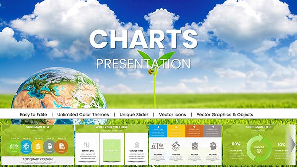
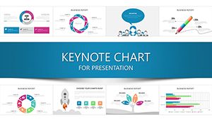
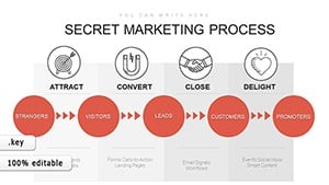
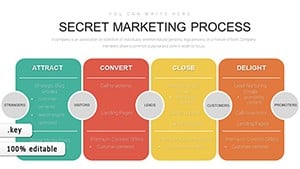
Bring your data to life with our versatile Keynote chart templates, crafted to make complex datasets accessible and engaging. From bar graphs to pie slices, these designs help you highlight trends and insights without overwhelming your audience.
Targeted at data enthusiasts, marketers, and educators, our charts emphasize clarity and impact, saving you hours on manual graphing. Customize effortlessly with Keynote`s tools to fit your story, whether forecasting sales or comparing metrics.
Browse our selection for templates that blend precision with visual appeal. Elevate everyday reports into standout presentations that inform and inspire action. Get started now and transform how you present information.

Unlike basic built-in charts that lack flair, our templates incorporate layered elements and subtle effects for depth. They excel in revealing patterns - think stacked bars for segmented growth or scatter plots for correlations - that standard options often muddle.
In business settings, use line charts to track quarterly performance, smoothing volatility into clear trajectories. Educators employ area charts for historical overviews, shading regions to denote eras vividly. Creatives opt for radar charts to compare multifaceted profiles, like product features against competitors.
These templates shine brighter than defaults by including responsive scales and legend placements that adapt to content volume, ensuring legibility across slide sizes.
Begin with your key takeaway - design the chart around it, not vice versa. Use contrasting colors for emphasis, like bold reds for highs and cool blues for lows. Limit categories to six for quick comprehension, and annotate sparingly to guide without distracting.
Example: A marketing team visualized campaign ROI with our donut chart template, slicing segments to show channel contributions, which clarified budget reallocations instantly. In academia, professors used heat maps to grade distributions, color-coding intensities for at-a-glance equity assessments.
Incorporate these into annual summaries or pitch decks for narratives that stick. For seasonal trends, waterfall charts break down cumulative effects, ideal for budgeting talks.
Enhance your arsenal - explore and download today for charts that command attention.
Delve into specifics like combo charts merging lines and bars for hybrid analyses, perfect for sales forecasts blending volume and value. Or treemaps for hierarchical data, where nested rectangles proportion resources intuitively.
Business analysts praise column charts for vertical comparisons, stacking variances to spotlight deviations. Non-profits utilize gauge charts for progress meters, dialling in goal achievements dynamically.
Avoid pitfalls like 3D effects that distort perceptions; stick to 2D for accuracy. Pair with icons for categorical labels, enriching without excess text.
For webinars, embed clickable elements if using iPad, turning static charts interactive. In team huddles, polar area charts fan out priorities, equalizing views for balanced debates.
Our premium chart collection awaits - tailored to fuel your data storytelling with elegance and ease.
Copyright © 2009-2026 ImagineLayout All rights reserved.